
- 1GitHub 下载加速方法_github加速下载文件
- 2python怎么画图片 wafer map_如何用python在地图上画比例?
- 3HDFS读写数据流程_hdfs中读取数据的流程
- 4人工智能----语音助手
- 5lobechat聊天机器人介绍与docker部署(有坑需注意)_docker 二次启动lobechat
- 6常见的数据结构
- 7Yolov8 obb旋转目标检测训练自己的数据集_yolov8 obb 训练
- 8Flink 实时数仓(七)【DWS 层搭建(一)流量域汇总表创建】
- 9CocosCreator2.2.x以及原生平台(Android&IOS)的热更方案的底层源码最彻底的分析,并开源更好的学习Demo_cocoscreate android ios 原生
- 10六种常用的文本聚类算法介绍
Qt Quick 常用元素:RadioButton(单选框),CheckBox(复选框) 与 GroupBox(分组框)_qml radiobutton
赞
踩
先介绍一下 ExclusiveGroup。
ExclusiveGroup (互斥分组)本身是不可见元素,用于将若干个可选择元素组合在一起, 供用户选择其中的一个选项。你可以在 ExclusiveGroup 对象中定义 RadioButton、CheckBox、Action 等元素,此时不需要设置它们的 exclusiveGroup 属性;也可以定义一个只设置了 id 属性的 ExclusiveGroup 对象,在别处定义 RadioButton、CheckBox、Action 等元素时通过 id 初始化这些元素的 exclusiveGroup 属性。current 属性指向互斥分组中第一个选中的元素。
一、RadioButton
RadioButton用于多选一的场景,使用时需要通过 exclusiveGroup 属性为其指定一个分组。 它也可以和GroupBox结合使用。要使用RadioButton,需要导入Controls模块,这样: import QtQuick.Controls 1.2。
-
text 属性存储单选按钮的文本。
-
单选按钮还有一个指示选中与否的小图标,一般显示在文本前面。给 style 属性设置自定义的 RadioButtonStyle 对象,可以定制 RadioButton 的外观。 checked 属性指示 RadioButton 是否被选中,也可以设置它来选中或取消选中。
-
hovered 是只读属性,指示鼠标是否悬停在 RadioButton 上。
-
pressed 属性在按钮被按下时为 true;当单选按钮被按下时,activeFocusOnPress 属性为 true,按钮获得焦点。
-
如果你点击了一个单选按钮,则会触发clicked()信号。
1.1 RadioButtonStyle
RadioButtonStyle 用来定制一个 RadioButton,要使用它需要引入 QtQuick.Controls.Styles 1.x 模块。
-
background 属性定制背景,indicator 定制选中指示图标,label 定制单选按钮的文本,它们的类型都是 Component。
-
spacing 指定图标和文本之间的间隔。
-
control 指向使用 style 的 RadioButton 对象,组件内的对象可以通过 control 访问 RadioButton 的各种属性,如 focus、activeFocus、hovered 等。
下面的实例中我们会使用 RadioButtonStyle 来定制 RadioButton。
1.2 实例:选择你喜欢的手机操作系统
提供一个简单的实例,preferred_mobile_os.qml,内容如下:
- import QtQuick 2.2
- import QtQuick.Controls 1.2
- import QtQuick.Controls.Styles 1.2
-
- Rectangle {
- width: 320;
- height: 300;
- color: "#d0d0d0";
-
- Rectangle {
- id: resultHolder;
- color: "#a0a0a0";
- width: 200;
- height: 60;
- anchors.centerIn: parent;
- visible: false;
- z: 2;
- opacity: 0.8;
- border.width: 2;
- border.color: "#808080";
- Text {
- id: result;
- anchors.centerIn: parent;
- font.pointSize: 20;
- color: "blue";
- font.bold: true;
- }
- }
-
- ExclusiveGroup {
- id: mos;
- }
-
- Component {
- id: radioStyle;
- RadioButtonStyle {
- indicator: Rectangle {
- implicitWidth: 16;
- implicitHeight: 12;
- radius: 6;
- border.color: control.hovered ? "darkblue" : "gray";
- border.width: 1;
- Rectangle {
- anchors.fill: parent;
- visible: control.checked;
- color: "#0000A0";
- radius: 5;
- anchors.margins: 3;
- }
- }
- label: Text {
- color: control.activeFocus ? "blue" : "black";
- text: control.text;
- }
- }
- }
-
- Text {
- id: notation;
- text: "Please select the best mobile os:"
- anchors.top: parent.top;
- anchors.topMargin: 16;
- anchors.left: parent.left;
- anchors.leftMargin: 8;
- }
-
- RadioButton {
- id: android;
- text: "Android";
- exclusiveGroup: mos;
- anchors.top: notation.bottom;
- anchors.topMargin: 4;
- anchors.left: notation.left;
- anchors.leftMargin: 20;
- checked: true;
- focus: true;
- activeFocusOnPress: true;
- style: radioStyle;
- onClicked: resultHolder.visible = false;
- }
- RadioButton {
- id: ios;
- text: "iOS";
- exclusiveGroup: mos;
- anchors.top: android.bottom;
- anchors.topMargin: 4;
- anchors.left: android.left;
- activeFocusOnPress: true;
- style: radioStyle;
- onClicked: resultHolder.visible = false;
- }
- RadioButton {
- id: wp;
- text: "Windows Phone";
- exclusiveGroup: mos;
- anchors.top: ios.bottom;
- anchors.topMargin: 4;
- anchors.left: android.left;
- activeFocusOnPress: true;
- style: radioStyle;
- onClicked: resultHolder.visible = false;
- }
- RadioButton {
- id: firefox;
- text: "Firefox OS";
- exclusiveGroup: mos;
- anchors.top: wp.bottom;
- anchors.topMargin: 4;
- anchors.left: android.left;
- activeFocusOnPress: true;
- style: radioStyle;
- onClicked: resultHolder.visible = false;
- }
- RadioButton {
- id: sailfish;
- text: "Sailfish OS";
- exclusiveGroup: mos;
- anchors.top: firefox.bottom;
- anchors.topMargin: 4;
- anchors.left: android.left;
- activeFocusOnPress: true;
- style: radioStyle;
- onClicked: resultHolder.visible = false;
- }
-
- Button {
- id: confirm;
- text: "Confirm";
- anchors.top: sailfish.bottom;
- anchors.topMargin: 8;
- anchors.left: notation.left;
- onClicked: {
- result.text = mos.current.text;
- resultHolder.visible = true;
- }
- }
- }

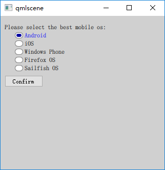
实例定义了 5 个 RadioButton,分别代表 5 个移动操作系统,这些单选按钮同属于 mos 这个 ExclusiveGroup。我使用锚布局来安排界面元素的位置。
用于显示结果的 Text 对象处于界面中央,一开始是隐藏的,当点击 “Confirm” 按钮时显示用户的选择结果。当用户点击某个 RadioButton 时触发 clicked 信号,我在 onClicked 信号处理器内隐藏显示结果的 Text 对象。
QML 文件内嵌入了一个 RadioButtonStyle 组件,将选中图标变成了椭圆形,将选中时的文字变成了蓝色。RadioButton 通过 radioStyle 这个id来引用组件。
执行 “qmlscene preferred_mobile_os.qml” 命令,效果如下图所示。
二、CheckBox
CheckBox,复选框,顾名思义,你可以在一组选项中选择一个或多个选项,这些选项之间互不影响。像 RadioButton —样,CheckBox 可以显示一个提示选中与否的小图标,以及一行简单的文本。
相比 RadioButton,CheckBox 多了两个属性:partiallyCheckedEnabled 属性指示是否允许部分选中状态,默认为 false;checkedState 记录选中状态,它的值可能是 Qt.UnChecked、 Qt.Checked 或 Qt.PartiallyChecked。
2.1 CheckBoxStyle
与 RadioButtonStyle 类似,CheckBoxStyle 用来定制 CheckBox。需要注意的是,如果你指定了 exdusiveGroup 属性,那么同属于一个互斥组的复选框, 也可以达到多选一的效果。CheckBoxStyle 的属性与 RadioButtonStyle 几乎完全一样,唯一不同的是 control 属性的类型是 CheckBox。
2.2 实例:那些你喜欢的爱情电影
一个简单的实例,preferred_movies.qml,内容如下:
- import QtQuick 2.2
- import QtQuick.Controls 1.2
- import QtQuick.Controls.Styles 1.2
-
- Rectangle {
- width: 320;
- height: 300;
- color: "#d0d0d0";
-
- Rectangle {
- id: resultHolder;
- color: "#a0a0a0";
- width: 220;
- height: 80;
- anchors.centerIn: parent;
- visible: false;
- z: 2;
- opacity: 0.8;
- border.width: 2;
- border.color: "#808080";
- radius: 8;
- Text {
- id: result;
- anchors.fill: parent;
- anchors.margins: 5;
- font.pointSize: 16;
- color: "blue";
- font.bold: true;
- wrapMode: Text.Wrap;
- }
- }
-
- Component {
- id: checkStyle;
- CheckBoxStyle {
- indicator: Rectangle {
- implicitWidth: 14;
- implicitHeight: 14;
- border.color: control.hovered ? "darkblue" : "gray";
- border.width: 1;
- Canvas {
- anchors.fill: parent;
- anchors.margins: 3;
- visible: control.checked;
- onPaint: {
- var ctx = getContext("2d");
- ctx.save();
- ctx.strokeStyle = "#C00020";
- ctx.lineWidth = 2;
- ctx.beginPath();
- ctx.moveTo(0, 0);
- ctx.lineTo(width, height);
- ctx.moveTo(0, height);
- ctx.lineTo(width, 0);
- ctx.stroke();
- ctx.restore();
- }
- }
- }
- label: Text {
- color: control.checked ? "blue" : "black";
- text: control.text;
- }
- }
- }
-
- Text {
- id: notation;
- text: "Please select the best love movies:"
- anchors.top: parent.top;
- anchors.topMargin: 16;
- anchors.left: parent.left;
- anchors.leftMargin: 8;
- }
-
- Column {
- id: movies;
- anchors.top: notation.bottom;
- anchors.topMargin: 8;
- anchors.left: notation.left;
- anchors.leftMargin: 20;
- spacing: 8;
- CheckBox {
- text: "廊桥遗梦";
- style: checkStyle;
- onClicked: resultHolder.visible = false;
- }
- CheckBox {
- text: "人鬼情未了";
- style: checkStyle;
- onClicked: resultHolder.visible = false;
- }
- CheckBox {
- text: "触不到的恋人";
- style: checkStyle;
- onClicked: resultHolder.visible = false;
- }
- CheckBox {
- text: "西雅图夜未眠";
- style: checkStyle;
- onClicked: resultHolder.visible = false;
- }
- }
-
- Button {
- id: confirm;
- text: "Confirm";
- anchors.top: movies.bottom;
- anchors.topMargin: 8;
- anchors.left: notation.left;
- onClicked: {
- var str = new Array();
- var index = 0;
- var count = movies.children.length;
- for(var i = 0; i < count; i++){
- if(movies.children[i].checked){
- str[index] = movies.children[i].text;
- index++;
- }
- }
- if(index > 0){
- result.text = str.join();
- resultHolder.visible = true;
- }
- }
- }
- }
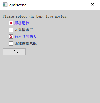
我选择 4 部经典爱情片供用户选择,使用 Row 管理对应的 CheckBox。定义了一个 CheckBoxStyle 组件,将选中图标的选中状态变为方框内嵌红叉,将选中时的文字变成了蓝色。CheckBox 通过 checkStyle 这个 id 来引用组件。
执行 “qmlscene preferred_movies.qml” 命令,效果如下图所示。
三、GroupBox
GmupBox (分组框),用于将其他的窗口部件组合在一起显示,最常用的是将单选按钮或复选框放在分组框中显示,不过也可以将任何控件放在分组框内。使用分组框需要导入 QtQuick.Controls 1.x 模块。
-
分组框一般在顶部有一个标题(title 属性),说明其用途。默认带有边框,不过可以设置 flat 属性为 true 来去掉左、右、底三条边的边框。
-
GroupBox 本身也支持选中,可以通过 checkable 属性来设置。当你设置 checkable 为 true 时,它的标题栏会出现一个复选框,如果你勾选了它,那么它的子控件就是可选中的,否则它的子控件就不可操作。当分组框可选时,checked 属性保存其选中状态。
-
分组框的尺寸根据它的孩子们的尺寸计算而来。如果你想使用锚布局来管理分组框的孩子们,则需要显式指定分组框本身的尺寸。
-
contentltem 指向一个 Item 对象,代表分组框的内容区,在分组框内声明的孩子们,它们的父会被自动设置为 contentltem。而如果你动态创建分组框的孩子们,则需要显式地将 contentltem 指定为它们的父。
我们修改 4.2 节的实例,使用分组框将表示电影的 CheckBox 组合在一块。新的 QML 文档是preferred_movies_groupbox.qml,内容如下(注意,我略掉了与 4.2 节相同的部分):
- Rectangle {
- ...
-
- GroupBox {
- id: groupbox;
- title: "请选择你最喜欢的爱情电影:";
- anchors.top: parent.top;
- anchors.topMargin: 8;
- anchors.left: parent.left;
- anchors.leftMargin: 20;
- width: 280;
- height: 160;
- Column {
- id: movies;
- anchors.top: parent.top;
- anchors.topMargin: 8;
- spacing: 8;
- CheckBox {
- text: "廊桥遗梦";
- style: checkStyle;
- onClicked: resultHolder.visible = false;
- }
- CheckBox {
- text: "人鬼情未了";
- style: checkStyle;
- onClicked: resultHolder.visible = false;
- }
- CheckBox {
- text: "触不到的恋人";
- style: checkStyle;
- onClicked: resultHolder.visible = false;
- }
- CheckBox {
- text: "西雅图夜未眠";
- style: checkStyle;
- onClicked: resultHolder.visible = false;
- }
- }
- }
-
- Button {
- id: confirm;
- text: "确认";
- anchors.top: groupbox.bottom;
- anchors.topMargin: 8;
- anchors.left: parent.left;
- anchors.leftMargin: 20;
- onClicked: {
- var str = new Array();
- var index = 0;
- var count = movies.children.length;
- for(var i = 0; i < count; i++){
- if(movies.children[i].checked){
- str[index] = movies.children[i].text;
- index++;
- }
- }
- if(index > 0){
- result.text = str.join();
- resultHolder.visible = true;
- }
- }
- }
- }
-
JS 折叠 复制 全屏
使用 qmlscene 加载 preferred_movies_groupbox.qml,效果如下图所示。
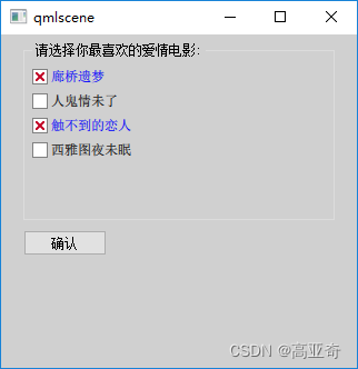
请对照下图和 4.2 节的图,看看使用分组框的效果与不使用分组框时的效果有何不同。

