
热门标签
热门文章
- 1jenkins 配置git_jenkins配置git
- 2边循环边删除List中的数据_循环list的过程中,删除list数据,循环受影响吗
- 3Android7.1 Selinux使用_手机selinux在哪
- 4创建Gitee远程仓库_gitee创建远程仓库
- 5自然语言处理--趋势篇_自然语言处理新方向
- 6WebSocket使用javax.websocket.RemoteEndpoint.Basic.sendObject(Object arg0)向页面方法发送对象
- 7低差异序列(一)- 常见序列的定义及性质
- 8文心一言与ChatGPT:两大AI对话引擎的技术对比_智子引擎和文心引擎区别
- 9如何区分GPT3.5和4?
- 10【NI-DAQmx入门】数据采集波形时间戳的准确性_labview daq 时间戳
当前位置: article > 正文
Vue3标签页(Tabs)_vue tabs标签页
作者:黑客灵魂 | 2024-07-30 09:53:48
赞
踩
vue tabs标签页
可自定义设置以下属性:
-
标签页数组(tabPages),类型:Array<{key: string|number, tab: string, content?: string | slot, disabled?: boolean}>,默认 []
-
标签是否居中展示(centered),类型:boolean,默认 false
-
标签页大小(size),类型:'small' | 'middle' | 'large',默认 'middle'
-
标签页的样式(type),类型:'line' | 'card',默认 'line'
-
tabs 之前的间隙大小(gutter),单位px,类型:number,默认 undefined
-
当前激活 tab 面板的 key(v-model:activeKey),类型:string | number,默认 ''
效果如下图:在线预览
注:组件引用方法 import { rafTimeout } from '../utils' 请参考以下博客:
 https://blog.csdn.net/Dandrose/article/details/130167061
其中引入使用了以下工具函数:
①创建标签页组件Tabs.vue:
- <script setup lang="ts">
- import { ref, watch, onMounted, computed } from 'vue'
- import { useResizeObserver, rafTimeout, cancelRaf } from '../utils'
- interface Tab {
- key: string | number // 对应 activeKey
- tab: string // 标签页显示文字
- content?: string // 标签页内容 string | slot
- disabled?: boolean // 禁用对应标签页
- }
- interface Props {
- tabPages?: Tab[] // 标签页数组
- centered?: boolean // 标签是否居中展示
- size?: 'small' | 'middle' | 'large' // 标签页大小
- type?: 'line' | 'card' // 标签页的样式
- gutter?: number // tabs 之前的间隙大小,单位 px
- activeKey?: string | number // v-model 当前激活 tab 面板的 key
- }
- const props = withDefaults(defineProps<Props>(), {
- tabPages: () => [],
- centered: false,
- size: 'middle',
- type: 'line',
- gutter: undefined,
- activeKey: ''
- })
- const tabs = ref() // 所有 tabs 的 ref 模板引用
- const left = ref(0)
- const width = ref(0)
- const wrap = ref()
- const wrapWidth = ref()
- const nav = ref()
- const navWidth = ref()
- const rafId = ref()
- const showWheel = ref(false) // 导航是否有滚动
- const scrollMax = ref(0) // 最大滚动距离
- const scrollLeft = ref(0) // 滚动距离
- const activeIndex = computed(() => {
- return props.tabPages.findIndex((page) => page.key === props.activeKey)
- })
- watch(
- () => props.activeKey,
- () => {
- getBarDisplay()
- },
- {
- flush: 'post'
- }
- )
- useResizeObserver([wrap, nav], () => {
- getNavWidth()
- })
- onMounted(() => {
- getNavWidth()
- })
- const emits = defineEmits(['update:activeKey', 'change'])
- const transition = ref(false)
- function getBarDisplay() {
- const el = tabs.value[activeIndex.value]
- if (el) {
- left.value = el.offsetLeft
- width.value = el.offsetWidth
- if (showWheel.value) {
- if (left.value < scrollLeft.value) {
- transition.value = true
- scrollLeft.value = left.value
- rafId.value && cancelRaf(rafId.value)
- rafId.value = rafTimeout(() => {
- transition.value = false
- }, 150)
- }
- const targetScroll = left.value + width.value - wrapWidth.value
- if (targetScroll > scrollLeft.value) {
- transition.value = true
- scrollLeft.value = targetScroll
- rafId.value && cancelRaf(rafId.value)
- rafId.value = rafTimeout(() => {
- transition.value = false
- }, 150)
- }
- }
- } else {
- left.value = 0
- width.value = 0
- }
- }
- function getNavWidth() {
- wrapWidth.value = wrap.value.offsetWidth
- navWidth.value = nav.value.offsetWidth
- if (navWidth.value > wrapWidth.value) {
- showWheel.value = true
- scrollMax.value = navWidth.value - wrapWidth.value
- scrollLeft.value = scrollMax.value
- } else {
- showWheel.value = false
- scrollLeft.value = 0
- }
- getBarDisplay()
- }
- function onTab(key: string | number) {
- emits('update:activeKey', key)
- emits('change', key)
- }
- /*
- (触摸板滑动也会触发)监听滚轮事件,结合 transform: translate(${scrollLeft}px, 0) 模拟滚动效果
- 参考文档:https://developer.mozilla.org/zh-CN/docs/Web/API/Element/wheel_event
- WheelEvent:
- 事件属性:
- WheelEvent.deltaX 只读:返回一个浮点数(double),表示水平方向的滚动量。
- WheelEvent.deltaY 只读:返回一个浮点数(double),表示垂直方向的滚动量。
- WheelEvent.deltaZ 只读:返回一个浮点数(double)表示 z 轴方向的滚动量。
- WheelEvent.deltaMode 只读:返回一个无符号长整型数(unsigned long),表示 delta* 值滚动量的单位。
- */
- function onWheel(e: WheelEvent) {
- if (e.deltaX !== 0) {
- // 防止标签页处触摸板上下滚动不生效
- // e.preventDefault() // 禁止浏览器捕获触摸板滑动事件
- const scrollX = e.deltaX * 1 // 滚轮的横向滚动量
- if (scrollLeft.value + scrollX > scrollMax.value) {
- scrollLeft.value = scrollMax.value
- } else if (scrollLeft.value + scrollX < 0) {
- scrollLeft.value = 0
- } else {
- scrollLeft.value += scrollX
- }
- }
- }
- </script>
- <template>
- <div class="m-tabs">
- <div class="m-tabs-nav">
- <div
- ref="wrap"
- class="m-tabs-nav-wrap"
- :class="{
- 'tabs-center': centered,
- 'before-shadow-active': showWheel && scrollLeft > 0,
- 'after-shadow-active': showWheel && scrollLeft < scrollMax
- }"
- >
- <div
- ref="nav"
- :class="['m-tabs-nav-list', { transition: transition }]"
- @wheel.stop.prevent="showWheel ? onWheel($event) : () => false"
- :style="`transform: translate(${-scrollLeft}px, 0)`"
- >
- <div
- ref="tabs"
- class="u-tab"
- :class="[
- `u-tab-${size}`,
- { 'u-tab-card': type === 'card', 'u-tab-disabled': page.disabled },
- { 'u-tab-line-active': activeKey === page.key && type === 'line' },
- { 'u-tab-card-active': activeKey === page.key && type === 'card' }
- ]"
- :style="`margin-left: ${index !== 0 ? gutter : null}px;`"
- @click="page.disabled ? () => false : onTab(page.key)"
- v-for="(page, index) in tabPages"
- :key="index"
- >
- {{ page.tab }}
- </div>
- <div
- class="u-tab-bar"
- :class="{ 'u-card-hidden': type === 'card' }"
- :style="`left: ${left}px; width: ${width}px;`"
- ></div>
- </div>
- </div>
- </div>
- <div class="m-tabs-page">
- <div class="m-tabs-content" v-show="activeKey === page.key" v-for="page in tabPages" :key="page.key">
- <slot :name="page.key">{{ page.content }}</slot>
- </div>
- </div>
- </div>
- </template>
- <style lang="less" scoped>
- .m-tabs {
- display: flex;
- color: rgba(0, 0, 0, 0.88);
- line-height: 1.5714285714285714;
- flex-direction: column; // 子元素将垂直显示,正如一个列一样。
- .m-tabs-nav {
- position: relative;
- display: flex;
- flex: none;
- align-items: center;
- margin: 0 0 16px 0;
- &::before {
- position: absolute;
- right: 0;
- left: 0;
- bottom: 0;
- border-bottom: 1px solid rgba(5, 5, 5, 0.06);
- content: '';
- }
- .m-tabs-nav-wrap {
- position: relative;
- display: flex;
- flex: auto;
- align-self: stretch;
- overflow: hidden;
- white-space: nowrap;
- transform: translate(0);
- .shadow {
- position: absolute;
- z-index: 1;
- opacity: 0;
- transition: opacity 0.3s;
- content: '';
- pointer-events: none;
- top: 0;
- bottom: 0;
- width: 32px;
- }
- &::before {
- .shadow();
- left: 0;
- box-shadow: inset 10px 0 8px -8px rgba(0, 0, 0, 0.08);
- }
- &::after {
- .shadow();
- right: 0;
- box-shadow: inset -10px 0 8px -8px rgba(0, 0, 0, 0.08);
- }
- .transition {
- transition: all 0.15s;
- }
- .m-tabs-nav-list {
- position: relative;
- display: flex;
- .u-tab {
- position: relative;
- display: inline-flex;
- align-items: center;
- padding: 12px 0;
- font-size: 14px;
- background: transparent;
- border: 0;
- outline: none;
- cursor: pointer;
- transition: all 0.3s;
- &:not(:first-child) {
- margin-left: 32px;
- }
- &:hover {
- color: @themeColor;
- }
- }
- .u-tab-small {
- font-size: 14px;
- padding: 8px 0;
- }
- .u-tab-large {
- font-size: 16px;
- padding: 16px 0;
- }
- .u-tab-card {
- border-radius: 8px 8px 0 0;
- padding: 8px 16px;
- background: rgba(0, 0, 0, 0.02);
- border: 1px solid rgba(5, 5, 5, 0.06);
- transition: all 0.3s cubic-bezier(0.645, 0.045, 0.355, 1);
- &:not(:first-child) {
- margin-left: 2px;
- }
- }
- .u-tab-line-active {
- color: @themeColor;
- text-shadow: 0 0 0.25px currentcolor;
- }
- .u-tab-card-active {
- border-bottom-color: #ffffff;
- color: @themeColor;
- background: #ffffff;
- text-shadow: 0 0 0.25px currentcolor;
- }
- .u-tab-disabled {
- color: rgba(0, 0, 0, 0.25);
- cursor: not-allowed;
- &:hover {
- color: rgba(0, 0, 0, 0.25);
- }
- }
- .u-tab-bar {
- position: absolute;
- background: @themeColor;
- pointer-events: none;
- height: 2px;
- transition:
- width 0.3s,
- left 0.3s,
- right 0.3s;
- bottom: 0;
- }
- .u-card-hidden {
- visibility: hidden;
- }
- }
- }
- .tabs-center {
- justify-content: center;
- }
- .before-shadow-active {
- &::before {
- opacity: 1;
- }
- }
- .after-shadow-active {
- &::after {
- opacity: 1;
- }
- }
- }
- .m-tabs-page {
- font-size: 14px;
- flex: auto;
- min-width: 0;
- min-height: 0;
- .m-tabs-content {
- position: relative;
- width: 100%;
- height: 100%;
- }
- }
- }
- </style>

②在要使用的页面引入:
其中引入使用了 Vue3单选按钮(Radio) 组件
- <script setup lang="ts">
- import Tabs from './Tabs.vue'
- import { ref, watchEffect } from 'vue'
- const tabPages = ref([
- {
- key: '1',
- tab: 'Tab 1',
- content: 'Content of Tab Pane 1'
- },
- {
- key: '2',
- tab: 'Tab 2',
- content: 'Content of Tab Pane 2'
- },
- {
- key: '3',
- tab: 'Tab 3',
- content: 'Content of Tab Pane 3'
- },
- {
- key: '4',
- tab: 'Tab 4',
- content: 'Content of Tab Pane 4'
- },
- {
- key: '5',
- tab: 'Tab 5',
- content: 'Content of Tab Pane 5'
- },
- {
- key: '6',
- tab: 'Tab 6',
- content: 'Content of Tab Pane 6'
- }
- ])
- const tabPagesDisabled = ref([
- {
- key: '1',
- tab: 'Tab 1',
- content: 'Content of Tab Pane 1'
- },
- {
- key: '2',
- tab: 'Tab 2',
- content: 'Content of Tab Pane 2'
- },
- {
- key: '3',
- tab: 'Tab 3',
- disabled: true,
- content: 'Content of Tab Pane 3'
- },
- {
- key: '4',
- tab: 'Tab 4',
- content: 'Content of Tab Pane 4'
- },
- {
- key: '5',
- tab: 'Tab 5',
- content: 'Content of Tab Pane 5'
- },
- {
- key: '6',
- tab: 'Tab 6',
- content: 'Content of Tab Pane 6'
- }
- ])
- const activeKey = ref('1')
- watchEffect(() => { // 回调立即执行一次,同时会自动跟踪回调中所依赖的所有响应式依赖
- console.log('activeKey:', activeKey.value)
- })
- const options = ref([
- {
- label: 'Small',
- value: 'small'
- },
- {
- label: 'Middle',
- value: 'middle'
- },
- {
- label: 'Large',
- value: 'large'
- }
- ])
- const size = ref('middle')
- function onChange (key: string|number) {
- console.log('key:', key)
- }
- </script>
- <template>
- <div>
- <h1>Tabs 标签页</h1>
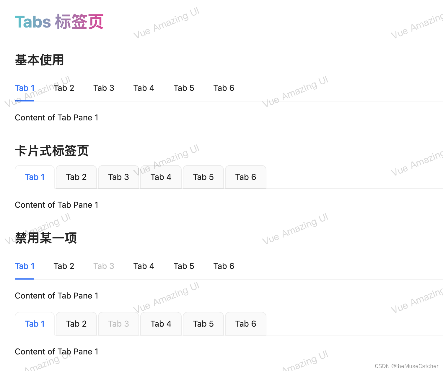
- <h2 class="mt30 mb10">基本使用</h2>
- <Tabs
- :tab-pages="tabPages"
- v-model:active-key="activeKey"
- @change="onChange" />
- <h2 class="mt30 mb10">卡片式标签页</h2>
- <Tabs
- type="card"
- :tab-pages="tabPages"
- v-model:active-key="activeKey"
- @change="onChange" />
- <h2 class="mt30 mb10">禁用某一项</h2>
- <Tabs
- :tab-pages="tabPagesDisabled"
- v-model:active-key="activeKey"
- @change="onChange" />
- <br/>
- <Tabs
- type="card"
- :tab-pages="tabPagesDisabled"
- v-model:active-key="activeKey"
- @change="onChange" />
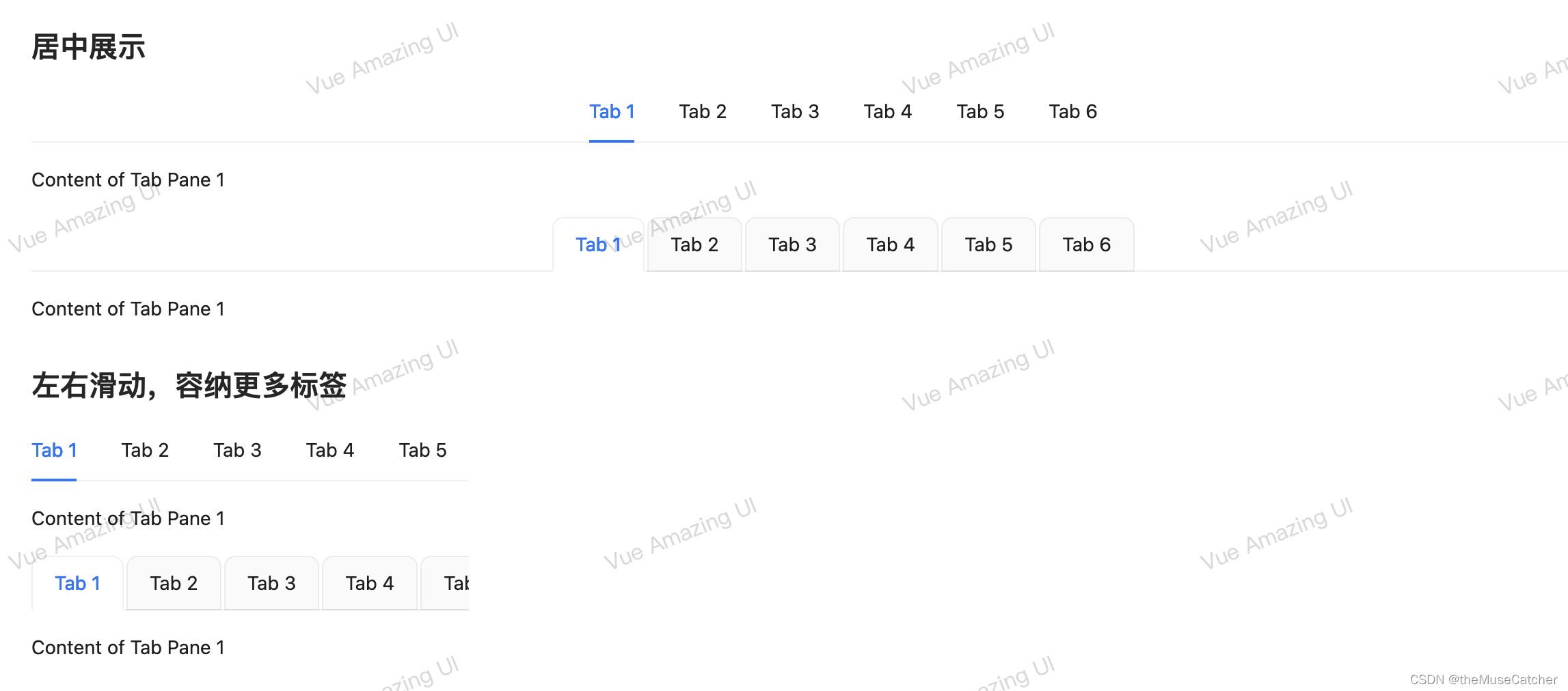
- <h2 class="mt30 mb10">居中展示</h2>
- <Tabs
- centered
- :tab-pages="tabPages"
- v-model:active-key="activeKey"
- @change="onChange" />
- <br/>
- <Tabs
- centered
- type="card"
- :tab-pages="tabPages"
- v-model:active-key="activeKey"
- @change="onChange" />
- <h2 class="mt30 mb10">左右滑动,容纳更多标签</h2>
- <Tabs
- style="width: 320px;"
- :tab-pages="tabPages"
- v-model:active-key="activeKey"
- @change="onChange" />
- <br/>
- <Tabs
- style="width: 320px;"
- type="card"
- :tab-pages="tabPages"
- v-model:active-key="activeKey"
- @change="onChange" />
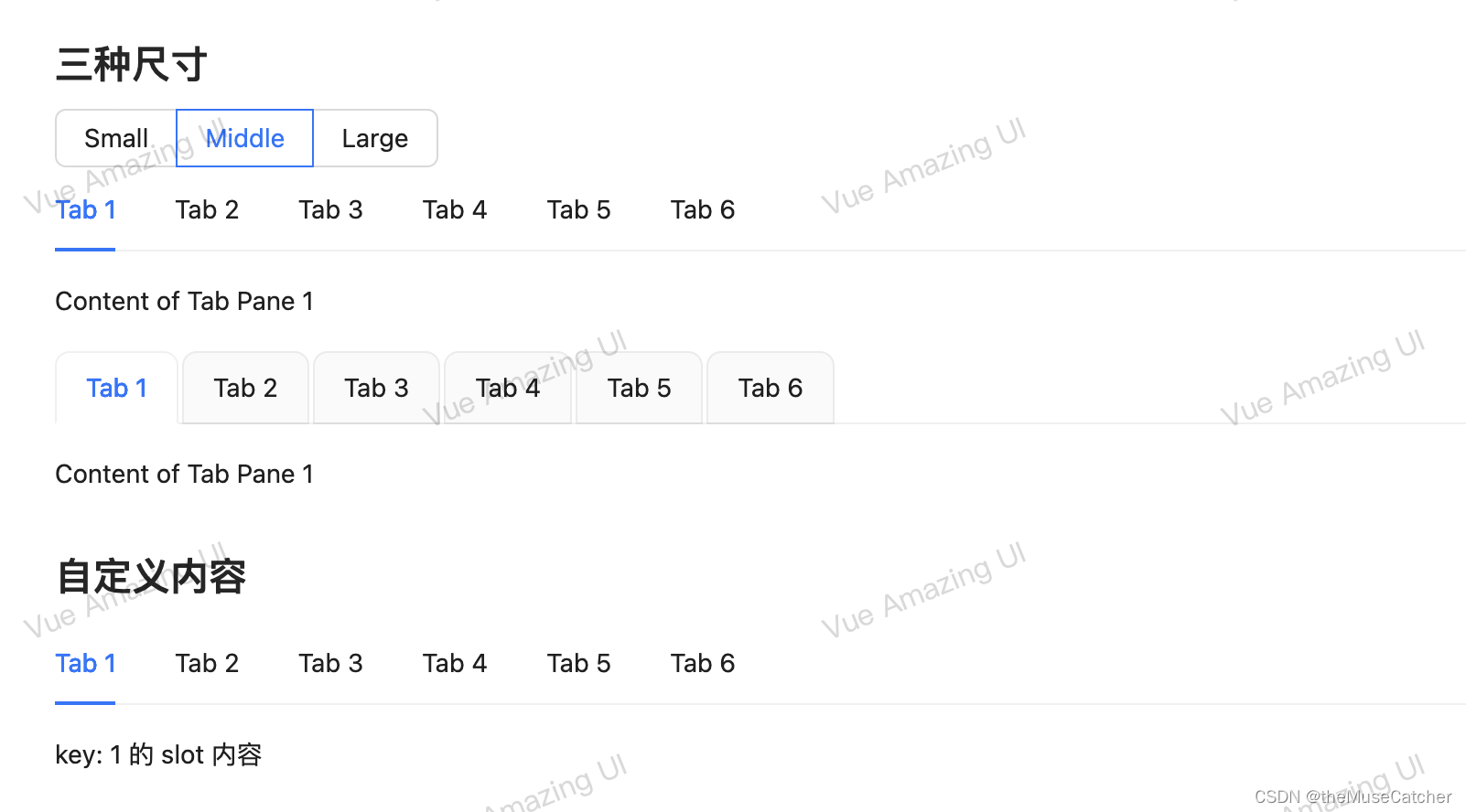
- <h2 class="mt30 mb10">三种尺寸</h2>
- <Radio :options="options" v-model:value="size" button />
- <br/>
- <Tabs
- :size="size"
- :tab-pages="tabPages"
- v-model:active-key="activeKey"
- @change="onChange" />
- <br/>
- <Tabs
- type="card"
- :size="size"
- :tab-pages="tabPages"
- v-model:active-key="activeKey"
- @change="onChange" />
- <h2 class="mt30 mb10">自定义内容</h2>
- <Tabs
- :tab-pages="tabPages"
- v-model:active-key="activeKey"
- @change="onChange">
- <template #1>
- <p>key: 1 的 slot 内容</p>
- </template>
- <template #2>
- <p>key: 2 的 slot 内容</p>
- </template>
- <template #3>
- <p>key: 3 的 slot 内容</p>
- </template>
- </Tabs>
- </div>
- </template>
声明:本文内容由网友自发贡献,不代表【wpsshop博客】立场,版权归原作者所有,本站不承担相应法律责任。如您发现有侵权的内容,请联系我们。转载请注明出处:https://www.wpsshop.cn/w/黑客灵魂/article/detail/903203
推荐阅读
相关标签

