- 1【面试答疑】贝壳找房25实习生集中面试即将开启!HR当天答疑_贝壳找房实习怎么看挂没挂
- 2mac上 文件批量重命名001到100_mac文件批量命名
- 32025年大数据专业毕设必过选题_大数据毕设选题
- 4DENIED Redis is running in protected mode报错解决办法_error reply to ping from master: '-denied redis is
- 5高级DBA带你处理Mysql数据库10亿大数据条件下迁移实战_数据库迁移
- 6[C语言]C语言基础知识概述_c语言csdn
- 7python生成动态图_pythin实现动态图
- 8vue仿chatgpt的ai聊天功能--通义千问(阿里云)_vue 对接通义千问
- 9各种光学仪器成像原理最全解读!
- 10Python 修复 TypeError: ‘float‘ object Cannot Be Interpreted as an Integer 错误_python2.7'float' object cannot be interpreted as a
Vue表单生成器form-create的使用详解_form-create教程
赞
踩
Vue表单生成器form-create的使用详解
可以通过 JSON 生成具有动态渲染、数据收集、验证和提交功能的表单生成器
介绍
轻松搞定 form 表单,让你不在为表单而烦恼
form-create 是一个可以通过 JSON 生成具有动态渲染、数据收集、验证和提交功能的表单生成器。并且支持生成任何 Vue 组件。结合内置17种常用表单组件和自定义组件,再复杂的表单都可以轻松搞定。
安装
ElementUI
npm i @form-create/element-ui
- 1
Iview 2.x|3.x
npm i @form-create/iview
- 1
Iview 4.x
npm i @form-create/iview4
- 1
导航
功能
- 自定义组件
- 可生成任何Vue组件
- 自带数据验证
- 可快速扩展
- 轻松转换为表单组件
- 通过 JSON 生成表单
- 通过 Maker 生成表单
- 全局配置
- 可以设置表单配置
- 可以设置指定组件全局配置
- 可以设置所有组件公共的全局配置
- 强大的API,可快速操作表单
- 双向数据绑定
- 事件扩展
- 局部更新
- 数据验证
- 栅格布局
- 内置组件
- hidden
- input
- inputNumber
- checkbox
- radio
- switch
- select
- autoComplete
- cascader
- colorPicker
- datePicker
- timePicker
- rate
- slider
- upload
- tree
- frame
快速上手
本节将以iview版本为例介绍如何在项目中使用 form-create
引入 form-create V2
浏览器
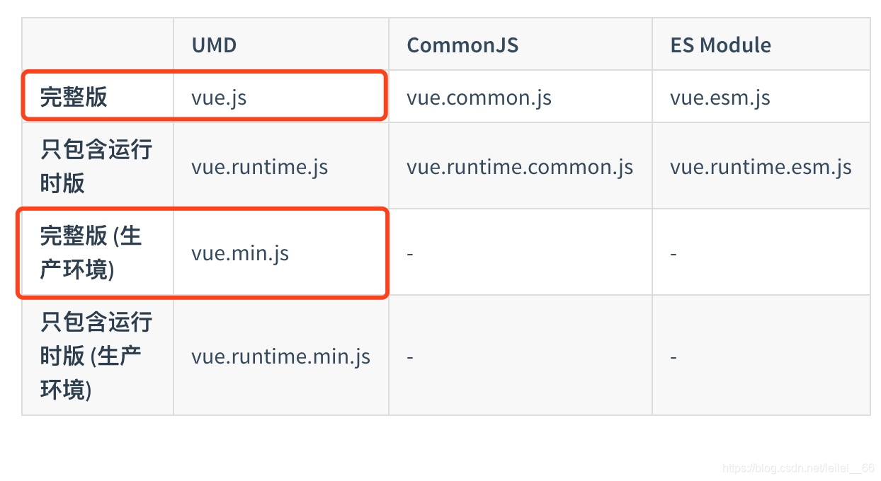
<!-- import Vue 2.5-->
<script src="https://cdn.jsdelivr.net/npm/vue@2.5.16/dist/vue.min.js"></script>

<!-- import iview 2.14.3-->
<link rel="stylesheet" href="https://cdn.jsdelivr.net/npm/iview@2.14.3/dist/styles/iview.css">
<script src="https://cdn.jsdelivr.net/npm/iview@2.14.3/dist/iview.min.js"></script>

<!-- 省市区三级联动json数据,不使用三级联动不需要引入 -->
<script src="https://cdn.jsdelivr.net/npm/@form-create/data/dist/province_city_area.js"></script>

<!-- import formCreate -->
<script src="https://cdn.jsdelivr.net/npm/@form-create/iview/dist/form-create.min.js"></script>
- 1
- 2
- 3
- 4
- 5
- 6
- 7
- 8
- 9
- 10
- 11
- 12
NodeJs
在 main.js 中写入以下内容:
import Vue from 'vue';
import iView from 'iview';
import 'iview/dist/styles/iview.css';

import formCreate from '@form-create/iview'
//获取生成器
import { maker } from '@form-create/iview'

Vue.use(iView);
Vue.use(formCreate);
- 1
- 2
- 3
- 4
- 5
- 6
- 7
- 8
- 9
- 10
生成表单
可使用3种方式创建表单:
组件模式, Vue 原型方法, Window 全局方法
组件模式
使用 标签创建表单
<div id="app1">
    <form-create v-model="fApi" :rule="rule" :option="option"></form-create>
</div>
- 1
- 2
- 3
NodeJs
export default {
  data () {
    return {
     //实例对象
     fApi:{},
     //表单生成规则
     rule:[
       {
          type:'input',
          field:'goods_name',
          title:'商品名称'
        },
        {
          type:'datePicker',
          field:'created_at',
          title:'创建时间'
        }
     ],
     //组件参数配置
     option:{
       //表单提交事件
       onSubmit:function (formData) {
         alert(JSON.stringify(formData));
       }
     }
    };
  }
};

- 1
- 2
- 3
- 4
- 5
- 6
- 7
- 8
- 9
- 10
- 11
- 12
- 13
- 14
- 15
- 16
- 17
- 18
- 19
- 20
- 21
- 22
- 23
- 24
- 25
- 26
- 27
- 28
浏览器
new Vue({
  el:'#app1',
  data:{
    fApi:{},
    rule:[
      {
        type:'input',
        field:'goods_name',
        title:'商品名称'
      },
      {
        type:'datePicker',
        field:'created_at',
        title:'创建时间'
      }
    ],
    option:{
      onSubmit:function (formData) {
        alert(JSON.stringify(formData));
      }
    }
  }
});
- 1
- 2
- 3
- 4
- 5
- 6
- 7
- 8
- 9
- 10
- 11
- 12
- 13
- 14
- 15
- 16
- 17
- 18
- 19
- 20
- 21
- 22
- 23
Vue 原型方法
使用 vue 原型方法$formCreate(rule,option) 创建表单
<div id="app2">
    <div id="form-create"></div>
</div>
new Vue({
  el:'#app2',
  data:{
      fApi:{},
      model:{}
  },
  mounted:function () {
    //表单插入的节点
    const root = document.getElementById('form-create');
    //fApi为表单api
    this.fApi = this.$formCreate(
      //表单生成规则
      [
    	this.$formCreate.maker.input('商品名称','goods_name',''),
      	this.$formCreate.maker.date('创建时间','created_at')
      ],
      //组件参数配置
      {
        el:root,
        //表单提交事件
        onSubmit:function (formData,fApi) {
          fApi.btn.loading();
        }
    });
  }
})
- 1
- 2
- 3
- 4
- 5
- 6
- 7
- 8
- 9
- 10
- 11
- 12
- 13
- 14
- 15
- 16
- 17
- 18
- 19
- 20
- 21
- 22
- 23
- 24
- 25
- 26
- 27
- 28
- 29
全局方法
使用 window 全局方法formCreate.create(rule,option)创建表单
<div id="app3">
    <div id="form-create"></div>
</div>
//表单插入的节点
const root = document.getElementById('form-create');

//$f为表单api
const $f = window.formCreate.create(
  //表单生成规则
  [
    {
      type:'input',
      field:'goods_name',
      title:'商品名称'
    },
    {
      type:'datePicker',
      field:'created_at',
      title:'创建时间'
    }
  ],
  //组件参数配置
  {
    el:root,
    //显示表单重置按钮
    resetBtn:true,
    //表单提交事件
    onSubmit:function (formData) {
      //按钮进入提交状态
      $f.btn.loading();
    }
});
- 1
- 2
- 3
- 4
- 5
- 6
- 7
- 8
- 9
- 10
- 11
- 12
- 13
- 14
- 15
- 16
- 17
- 18
- 19
- 20
- 21
- 22
- 23
- 24
- 25
- 26
- 27
- 28
- 29
- 30
- 31
- 32
JSON
使用 JSON 生成表单
<div id="app3">
    <div id="form-create"></div>
</div>
//JSON 规则
const rule = [
  {"type":"input","field":"goods_name","title":"商品名称","value":"mi"},
  {"type":"inputNumber","field":"goods_price","title":"商品价格","value":12}
]
//表单插入的节点
const root = document.getElementById('form-create');

//$f为表单api
const $f = window.formCreate.create(
  //表单生成规则
  rule,
  //组件参数配置
  {
    el:root,
    //显示表单重置按钮
    resetBtn:true,
    //表单提交事件
    onSubmit:function (formData) {
      //按钮进入提交状态
      $f.btn.loading();
    }
});
- 1
- 2
- 3
- 4
- 5
- 6
- 7
- 8
- 9
- 10
- 11
- 12
- 13
- 14
- 15
- 16
- 17
- 18
- 19
- 20
- 21
- 22
- 23
- 24
- 25
- 26
在线示例
以下是 from-create 的功能演示和参考案例
案例
- CRMEB客户管理+电商管理系统 (演示站
账号:demo 密码:crmeb.com) - 深入使用 maker 自定义组件案例
组件示例
- Input 输入框
- AutoComplete 自动生成
- Radio 单选框
- Cascader 多级联动
- Upload 上传
- Select 下拉选择框
- Checkbox 多选框
- InputNumber 数字输入框
- TimePicker 时间选择器
- DatePicker 日期选择器
- Switch 开关
- ColorPicker 颜色选择框
- Rate 评分
- Slider 滑块
- Tree 树形组件
- Frame 框架
功能示例
- 使用 json 参数生成表单
- 使用 maker 生成器生成表单
- Validator 表单验证
- Dynamic Add 动态添加组件
- Bind 双向数据绑定
- Generate 生成任意组件
- Event 事件扩展
- Col 栅格布局规则
挂载组件
formCreate
全局挂载
Vue.use(formCreate);
- 1
局部挂载
//Vue 组件
{
   components: {
       formCreate: formCreate.$form()
   }
}
- 1
- 2
- 3
- 4
- 5
- 6
自定义组件
通过 form-create 生成的组件需要先通过以下方式挂载后才可以生成. 必须在挂载 formCreate 之前挂载所有需要生成的自定义组件
全局挂载
//自定义组件
Vue.component(TestComponent);
//或者
formCreate.component(TestComponent.name, TestComponent);

Vue.use(formCreate);
- 1
- 2
- 3
- 4
- 5
- 6
局部挂载
//自定义组件
formCreate.component(TestComponent.name, TestComponent);

//Vue 组件
{
   components: {
       formCreate: formCreate.$form()
   }
}
- 1
- 2
- 3
- 4
- 5
- 6
- 7
- 8
- 9
绑定事件
例如给i-input组件添加on-change事件,事件名称参考Input
{
    type:'input',
    field: 'test',
    title: 'test',
    value: '',
    on: {
        'on-change': function(){
            console.log('value 发生变化');
        }
    }
}
- 1
- 2
- 3
- 4
- 5
- 6
- 7
- 8
- 9
- 10
- 11
通过 emit 方式绑定事件
只支持在组件模式下
//rule
[{
     type:'input',
     field: 'test',
     title: 'test',
     value: '',
     emit: ['on-change']
 }]
- 1
- 2
- 3
- 4
- 5
- 6
- 7
- 8
事件名称为$ {field}-${eventName}
<form-create :rule="rule" test-on-change="onChange"> </form-create>
- 1
通过 emitPrefix 自定义事件前缀
//rule
[{
     type:'input',
     field: 'test',
     title: 'test',
     value: '',
     emit: ['on-change'],
     emitPrefix: 'xaboy',
 }]
- 1
- 2
- 3
- 4
- 5
- 6
- 7
- 8
- 9
事件名称为$ {emitPrefix}-${eventName}
<form-create :rule="rule" xaboy-on-change="onChange"> </form-create>
- 1
通过 on 方法绑定事件 1.0.2+
//rule
[{
     type:'input',
     field: 'test',
     title: 'test',
     value: '',
     emit: ['on-change'],
     emitPrefix: 'xaboy',
 }]
- 1
- 2
- 3
- 4
- 5
- 6
- 7
- 8
- 9
- 10
- 11
- 12
 $f.on('xaboy-on-change',function(){
    //TODO
})
- 1
- 2
- 3
向事件中注入$f和自定义参数
//rule
[{
     type:'input',
     field: 'test',
     title: 'test',
     value: '',
     emit: [{
        name: 'on-change',
        inject: ['自定义参数,数据类型不限']
     }],
     emitPrefix: 'xaboy',
 }]
<form-create :rule="rule" xaboy-on-change="onChange"> </form-create>
- 1
- 2
- 3
- 4
- 5
- 6
- 7
- 8
- 9
- 10
- 11
- 12
- 13
向事件中注入参数后,事件会额外增加一个参数
//未注入
{
    onChange: function(val){

    }
}
//注入后
{
    onChange: function(inject, val){

    }
}
- 1
- 2
- 3
- 4
- 5
- 6
- 7
- 8
- 9
- 10
- 11
- 12
inject 参数的数据结构
{
    $f:Object,//api
    rule:Array,//生成规则
    self:Object,//当前生成规则
    option:Object,//全局配置
    inject:Any,//自定义注入的参数
}
- 1
- 2
- 3
- 4
- 5
- 6
- 7
参数注入也可以通过全局配置项injectEvent:true开启
自定义布局
通过设置生成规则的col配置项可以实现组件的布局
示例1:

[
	{
		type:'input',
		field:'test-1',
		title:'col-12',
		value:'',
		col:{
			span:12
		}
	},
	{
		type:'input',
		field:'test-2',
		title:'col-12',
		value:'',
		col:{
			span:12
		}
	}
]
- 1
- 2
- 3
- 4
- 5
- 6
- 7
- 8
- 9
- 10
- 11
- 12
- 13
- 14
- 15
- 16
- 17
- 18
- 19
- 20
示例2:
示例中使用的是 ElementU
I
当没有设置col时默认为{span:24}

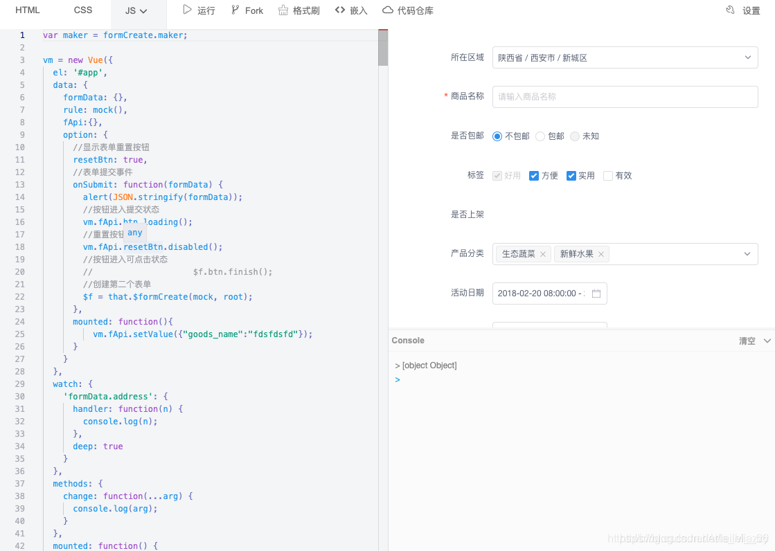
[
	{
	    type: 'el-row',
	    native: true,
	    children: [
	        {
	            type: 'el-col',
	            props: {
	                span: 12
	            },
	            children: [
	            	{
	            		type:'datePicker',
	            		title: '活动日期',
	            		field: 'section_day',
	            		value: ['2018-02-20 12:12:12', '2018-03-20 12:12:12'],
	            		props:{
	            			type:'datetimerange'
	            		}

	            	},
	            	{
	            		type:'timePicker',
	            		title: '活动时间',
	            		field: 'section_time',
	            		value: ['11:11:11', '22:22:22'],
	            		props:{
	            			isRange: true,
	                    	placeholder: "请选择活动时间"
	            		}

	            	},
	            ]
	        },
	        {
	            type: 'el-col',
	            props: {
	                span: 12
	            },
	            children: [
	            	{
	            		type:'inputNumber',
	            		title: '排序',
	            		field: 'sort',
	            		value: 0,
	            		props:{
	            			precision: 2
	            		},
	            		col:{
	            			span: 12
	            		},
	            		validate: [{require: true, type: 'number', min: 10}]
	            	},
	            	{
	            		type:'colorPicker',
	            		title: '颜色',
	            		field: 'color',
	            		value: '#ff7271',
	            		props:{
	            			hue: true,
	            			format: 'hex'
	            		},
	            		col:{
	            			span: 12
	            		}
	            	},
	            ]
	        }
	    ]
	}
]
- 1
- 2
- 3
- 4
- 5
- 6
- 7
- 8
- 9
- 10
- 11
- 12
- 13
- 14
- 15
- 16
- 17
- 18
- 19
- 20
- 21
- 22
- 23
- 24
- 25
- 26
- 27
- 28
- 29
- 30
- 31
- 32
- 33
- 34
- 35
- 36
- 37
- 38
- 39
- 40
- 41
- 42
- 43
- 44
- 45
- 46
- 47
- 48
- 49
- 50
- 51
- 52
- 53
- 54
- 55
- 56
- 57
- 58
- 59
- 60
- 61
- 62
- 63
- 64
- 65
- 66
- 67
- 68
- 69
- 70
- 71
- 72
校验规则
可以通过 validate 配置项设置组件的验证规则,自定义的表单组件也支持校验
type 需要根据组件的 value 类型定义
示例
验证 input 组件必填
{
    type:'input',
    //...
    validate: [{type: 'string', required: true}]
}
- 1
- 2
- 3
- 4
- 5
验证 date 组件必填
{
    type:'datePicker',
    //...
    validate: [{type: 'date', required: true}]
}
- 1
- 2
- 3
- 4
- 5
- 6
验证 checkbox 组件 最少选择三个
{
    type:'checkbox',
    //...
    validate: [{type: 'array', required: true, min:3}]
}
- 1
- 2
- 3
- 4
- 5
- 6
参数说明
| 参数 | 说明 | 类型 | 默认值 |
|---|---|---|---|
| enum | 枚举类型 | string | - |
| len | 字段长度 | number | - |
| max | 最大长度 | number | - |
| message | 校验文案 | string | - |
| min | 最小长度 | number | - |
| pattern | 正则表达式校验 | RegExp | - |
| required | 是否必选 | boolean | false |
| transform | 校验钱转换字段值 | function(value) => transformedValue:any | - |
| type | 内建校验类型 | string | ‘string’ |
| validator | 自定义校验 | function(rule, value, callback) | - |
| whitespace | 必选时,空格是否会被视为错误 | boolean | false |
更多高级用法可研究 async-validator。
修改默认按钮
本文将介绍如何使用自定义组件按钮代替默认按钮
隐藏默认按钮
首先通过设置全局配置隐藏默认的提交按钮和重置按钮
{
  submitBtn: false,
  resetBtn: false
}
- 1
- 2
- 3
- 4
生成自定义按钮组件
示例中使用的是 ElementUI

[
	{
		type: 'input',
		field: 'field-1',
		title: 'test',
		value: 'test submit',
		col: {
			span:6
		}

	},
	{
		type: 'el-button',
		on: {
			click: function(){
				//TODO 提交表单
				$f.submit();
				//或者
				$f.resetFields();
			}
	    },
		col: {
			span:3,
			push: 1
		},
		children: ['submit']

	}
]
- 1
- 2
- 3
- 4
- 5
- 6
- 7
- 8
- 9
- 10
- 11
- 12
- 13
- 14
- 15
- 16
- 17
- 18
- 19
- 20
- 21
- 22
- 23
- 24
- 25
- 26
- 27
- 28
- 29
组件公共配置
通过全局配置中的global配置项可实现组件的公共配置,支持设置组件所有的配置项
设置所有组件的col为{span:6},并且禁用
{
    global: {
      '*': {
          props: {
              disabled: true
          },
          col: {
              span: 6
          }
      }
    }
}
- 1
- 2
- 3
- 4
- 5
- 6
- 7
- 8
- 9
- 10
- 11
- 12
设置 upload 组件上传成功的回调事件
{
    global: {
      upload: {
          props: {
              onSuccess: function(res, file){
                file.url = res.data.url;
              }
          }
      }
    }
}
- 1
- 2
- 3
- 4
- 5
- 6
- 7
- 8
- 9
- 10
- 11
更新生成规则
表单组件
生成规则
rule = [{
     type:'input',
     field: 'test',
     title: 'test',
     value: '',
     props: {
        disabled: false
     },
     emit: ['on-change']
 }]
- 1
- 2
- 3
- 4
- 5
- 6
- 7
- 8
- 9
- 10
直接修改生成规则
rule[0].props.disabled = true;
rule[0].value = "update";
- 1
- 2
通过$ f修改
获取$f
//通过`field`获取生成规则
const rule = $f.getRule('test');
//修改方法通过同上
- 1
- 2
- 3
const $model = $f.model();
const rule = $model.test;
- 1
- 2
$f.updateRule('test',{
    value: 'update',
    props: {
        disabled: true
    }
});
- 1
- 2
- 3
- 4
- 5
- 6
修改组件的 value
修改指定组件
$f.setValue('test', "update");
- 1
批量修改
$f.setValue({
    test: "update"
});
- 1
- 2
- 3
- 4
自定义组件
自定义组件如果需要通过$f的方法需要定义name或者field 字段,自定义表单组件使用field,其他自定义组件使用name
生成规则
rule = [{
    type:'i-button',
    name: 'btn',
    props: {
    disabled: false
    },
    children: ['test Button']
}]
- 1
- 2
- 3
- 4
- 5
- 6
- 7
- 8
#直接修改生成规则
rule[0].props.disabled = true;
通过$ f修改
获取$f
//通过field获取生成规则
const rule = $f.getRule('btn');
//修改方法通过同上
const $component = $f.component();
const rule = $component.btn;
$f.updateRule('btn',{
    props: {
        disabled: true
    }
});
- 1
- 2
- 3
- 4
- 5
- 6
- 7
- 8
- 9
更新规则
在尾部增加规则
rule.push({
   type:"input",
   title:"商品简介",
   field:"goods_info",
   value:"",
   props: {
       "type": "text",
       "placeholder": "请输入商品简介",
   },
   validate:[
       { required: true, message: '请输入商品简介', trigger: 'blur' },
   ],
})
- 1
- 2
- 3
- 4
- 5
- 6
- 7
- 8
- 9
- 10
- 11
- 12
- 13
通过$f添加规则
在 goods_name 字段后面增加一份图片上传组件,默认添加到尾部
$f.append({
    type:"input",
    title:"商品简介",
    field:"goods_info",
    value:"",
    props: {
     "type": "text",
     "placeholder": "请输入商品简介",
    },
    validate:[
     { required: true, message: '请输入商品简介', trigger: 'blur' },
    ],
},'goods_name');
- 1
- 2
- 3
- 4
- 5
- 6
- 7
- 8
- 9
- 10
- 11
- 12
- 13
在 goods_name 字段之前增加一份 input 组件,默认添加到头部
$f.prepend({
    type:"input",
    title:"商品简介",
    field:"goods_info",
    value:"",
    props: {
      "type": "text",
      "placeholder": "请输入商品简介",
    },
    validate:[
      { required: true, message: '请输入商品简介', trigger: 'blur' },
    ],
},'goods_name');
- 1
- 2
- 3
- 4
- 5
- 6
- 7
- 8
- 9
- 10
- 11
- 12
- 13
删除第一条规则
rule.splice(0,1);
- 1
删除表单组件
$f.removeField('test');
- 1
删除自定义组件
$f.removeField('btn');
- 1
设置组件的插槽 slot
例如给i-input组件通过prefix和suffix设置前缀及后缀图标 Input
{
    type:'input',
    field: 'test',
    title: 'test',
    value: '',
    children: [
        {
            type:'i-con',
            props: {
                type: 'ios-contact'
            },
            slot: 'prefix' //前置插槽的名称
        },
        {
            type:'i-con',
            props: {
                type: 'ios-search'
            },
            slot: 'suffix' //后置插槽的名称
        },
    ]
}
- 1
- 2
- 3
- 4
- 5
- 6
- 7
- 8
- 9
- 10
- 11
- 12
- 13
- 14
- 15
- 16
- 17
- 18
- 19
- 20
- 21
- 22
- 23
省市区联动数据
安装
npm install @form-create/data
- 1
导入
//省市二级联动
import province_city from "@form-create/data/dist/province_city.js"
//省市二级联动(id)
import province_city_code from "@form-create/data/dist/province_city_code.js"
//省市区三级联动
import province_city_area from "@form-create/data/dist/province_city_area.js"
//省市区三级联动(id)
import province_city_area_code from "@form-create/data/dist/province_city_area_code.js"
- 1
- 2
- 3
- 4
- 5
- 6
- 7
浏览器
<!-- 省市二级联动 -->
<script src="https://cdn.jsdelivr.net/npm/@form-create/data/dist/province_city.js"></script>
<!-- 省市二级联动(id) -->
<script src="https://cdn.jsdelivr.net/npm/@form-create/data/dist/province_city_code.js"></script>
<!-- 省市区三级联动 -->
<script src="https://cdn.jsdelivr.net/npm/@form-create/data/dist/province_city_area.js"></script>
<!-- 省市区三级联动(id) -->
<script src="https://cdn.jsdelivr.net/npm/@form-create/data/dist/province_city_area_code.js"></script>
- 1
- 2
- 3
- 4
- 5
- 6
- 7
- 8
访问,以省市二级联动为例
formCreate.data.province_city
//或者
window.province_city
- 1
- 2
- 3
常见问题
$f为创建表单后返回的实例,field 为字段名称,rule 为表单生成规则
手动修改某个字段的值
- $f.bind()[field] = ‘修改后的值’
- $f.model()[field].value = ‘修改后的值’
- rule[2].value = ‘修改后的值’ //rule[2]是field字段的生成规则
- $f.setValue(field,value)
说明: 如果修改的值为数组必须直接赋值或使用push,splice等方法修改
批量赋值
$f.setValue({[field1]:value1,[field2]:value2})
- 1
动态修改表单规则
$f.model()[field].props.disabled = false
rule[2].props.disabled = false //rule[2]是要修改的生成规则
- 1
- 2
说明: 修改的属性需要提前在生成规则里预定义
追加表单字段
在 goods_name 字段后面增加一份图片上传组件,默认添加到尾部
$f.append($formCreate.maker.upload(
    '产品主图',
    'logo',
    'http://img1.touxiang.cn/uploads/20131030/30-075657_191.jpg'
).props({
          "action": "",
          "maxLength": 1,
          "multiple": false,
          "type": "select",
          "uploadType": "image",
          "name": "file",
          "onSuccess": function () {
              return 'http://img1.touxiang.cn/uploads/20131030/30-075657_191.jpg';
          }
     })
     .validate({required:true, type: 'array', min: 1, message: '请上传1张图片', trigger: 'change'}
),'goods_name');
- 1
- 2
- 3
- 4
- 5
- 6
- 7
- 8
- 9
- 10
- 11
- 12
- 13
- 14
- 15
- 16
- 17
在 goods_name 字段之前增加一份 input 组件,默认添加到头部
$f.prepend({
       type:"input",
       title:"商品简介",
       field:"goods_info",
       value:"",
       props: {
           "type": "text",
           "placeholder": "请输入商品简介",
       },
       validate:[
           { required: true, message: '请输入商品简介', trigger: 'blur' },
       ],
},'goods_name');
- 1
- 2
- 3
- 4
- 5
- 6
- 7
- 8
- 9
- 10
- 11
- 12
- 13
在表单尾部追加一个 input 组件
rules.push({
       type:"input",
       title:"商品简介",
       field:"goods_info",
       value:"",
       props: {
           "type": "text",
           "placeholder": "请输入商品简介",
       },
       validate:[
           { required: true, message: '请输入商品简介', trigger: 'blur' },
       ],
})
- 1
- 2
- 3
- 4
- 5
- 6
- 7
- 8
- 9
- 10
- 11
- 12
- 13
删除表单字段
删除指定字段
$f.removeField(field);
- 1
删除最后一个字段
rules.pop()
- 1
隐藏指定字段
$f.hidden(true, field)
- 1
根据后台返回的规则生成表单
fetch('api').then(rule=>{
    $f = formCreate.create(rule,{
        onSubmit(formData){
            // 表单提交事件
            $f.btn.loading(true);
            //TODO 提交表单
        }
    })
})
- 1
- 2
- 3
- 4
- 5
- 6
- 7
- 8
- 9
隐藏默认提交按钮
设置全局配置options.submitBtn = false即可隐藏
定制默认提交按钮
 option: {
      submitBtn: {
        type: "basic",
        size: "mini",
        icon: "",
        shape: "round",
        innerText: "submit",
        col: {
          span: 4,
          offset: 10
        }
      }
  }
- 1
- 2
- 3
- 4
- 5
- 6
- 7
- 8
- 9
- 10
- 11
- 12
- 13
显示默认重置按钮
设置全局配置options.resetBtn = true即可显示
Vue 版本不支持 compile
获取 $f 参考
在配置项中调用外层组件的方法 参考 #51
规则正在其他form-create中使用
一个生成规则rule只能同时在一个中使用. 如果需要多次使用:
- 在使用前自行深拷贝
- 从被使用的中移除
验证规则无效
请注意 value 的数据类型.如果组件为多选或区间选择时 value 的数据类型为Array,需要在验证规则中设置type:‘array’
switch 组件不显示
将 slot 配置项配置在 props 中
props: {
    "trueValue":"1",
    "falseValue":"0",
    "slot": {
        open:"上架",
        close:"下架",
    },
}
- 1
- 2
- 3
- 4
- 5
- 6
- 7
- 8
修改组件值后页面没有更新
在表单创建后到成功渲染之前修改是无效的
- 在生成表单之前修改
- 在option.mounted中修改
- 在首次表单渲染后修改
———————————————
版权声明:本文为CSDN博主「星河子_YumWisdom」的原创文章,遵循CC 4.0 BY-SA版权协议,转载请附上原文出处链接及本声明。
原文链接:https://blog.csdn.net/Aria_Miazzy/article/details/103746336
以下代码是自己改编玩耍的
父级
<template>
  <div>
    <div ref="window_bl">
    </div>
    <div id="dome"></div>
  </div>
</template>

<script>
export default {
  data() {
    return {
      fc: null,
      message:'',
    };
  },
  mounted: function () {
    this.create();
  },
  methods: {
    create() {
      let rules = [
        {
          type: "child",
          field: "child",
          title: "找子组件哇!",
          props: {
            title: "是子组件哇!",
            message: "找我干什么?",
          },
          on: {
            destoryed: (param) => {
              let x;
              let cm = confirm('按下呼叫?');
              if(cm == true){
                x = '你是呼叫谁?'
              }else {
                x = "不了不了,再见!"
              }
              document.getElementById('dome').innerHTML = x;
              document.getElementById('dome').innerHTML += param.name +"~~~" + param.study;
            },
            alert: (param) => {
              console.log(param);
              alert(param)
            },
          },
        },
      ];

      this.fc = this.$formCreate(rules, {
        el: this.$refs.window_bl,
        resetBtn: true,
        submitBtn: false,
      });
    },
  },
};
</script>

<style>
</style>
- 1
- 2
- 3
- 4
- 5
- 6
- 7
- 8
- 9
- 10
- 11
- 12
- 13
- 14
- 15
- 16
- 17
- 18
- 19
- 20
- 21
- 22
- 23
- 24
- 25
- 26
- 27
- 28
- 29
- 30
- 31
- 32
- 33
- 34
- 35
- 36
- 37
- 38
- 39
- 40
- 41
- 42
- 43
- 44
- 45
- 46
- 47
- 48
- 49
- 50
- 51
- 52
- 53
- 54
- 55
- 56
- 57
- 58
- 59
- 60
- 61
- 62
子级
<template>
  <div>
    <h3>{{ title }}</h3>
    <div>{{ message }}</div>
    <div>
      <button @click="destoryed">关闭</button>
      <button @click="alert">提问</button>
    </div>
  </div>
</template>

<script>
export default {
  methods: {},
  props: {
    title: {
      type: String,
      default: "哈喽",
    },
    message: {
      type: String,
      default: "我在这",
    },
  },
  methods: {
    destoryed() {
      let data = {
        name: "ll",
        study: "学习html",
      };
      this.$emit("destoryed", data);
    },
    alert() {
      this.$emit("alert", "你猜我现在想干嘛?");
    },
  },
};
</script>

<style>
button {
  width: 80px;
  height: 50px;
  border: none;
  font-size: 18px;
  background: #cccbcb;
  color: aquamarine;
}
</style>
- 1
- 2
- 3
- 4
- 5
- 6
- 7
- 8
- 9
- 10
- 11
- 12
- 13
- 14
- 15
- 16
- 17
- 18
- 19
- 20
- 21
- 22
- 23
- 24
- 25
- 26
- 27
- 28
- 29
- 30
- 31
- 32
- 33
- 34
- 35
- 36
- 37
- 38
- 39
- 40
- 41
- 42
- 43
- 44
- 45
- 46
- 47
- 48
- 49
子组件在使用之前需要先注册
可将以下代码添加到一个新建的文件下:我直接放在config-> index.js了
import child from '@/components/child';
Vue.component('child', child)
- 1
- 2
部分效果预览