
- 1xuniren(Fay数字人开源社区项目)NeRF模型训练教程_fay数字人搭建流程
- 2边缘计算盒子与云计算:谁更适合您的业务需求?
- 3这些年来,编程领域有什么重要进展?回顾过去,展望未来
- 4使用FileStream来读取数据_iformfile 读取文件内容
- 5抛弃torch.cat,拥抱AFF_aff注意力
- 6CUDA各版本官方下载地址_cuda12.0下载网址
- 7大模型和向量数据库怎么搭建 RAG 系统?Step by step 例子来了。
- 8spacy包及trained pipelines安装教程_spacy python包
- 9NeurIPS2023 大语言模型(LLM)方向优质论文汇总!_llm模型相关论文
- 102021-07/08收集字节跳动---Java提前批面试题_字节提前批面试 算法
Carson带你学Android:最全面、最易懂的屏幕适配解决方案_android carson_ho最全面
赞
踩
前言
Android的屏幕适配一直以来都在折磨着我们Android开发者,本文将结合:
- Google的官方权威适配文档
- 郭霖: Android官方提供的支持不同屏幕大小的全部方法
- Stormzhang:Android 屏幕适配
- 鸿洋:Android 屏幕适配方案
- 凯子: Android屏幕适配全攻略(最权威的官方适配指导)
- 自身的思考&实践
给你带来一种全新、全面而逻辑清晰的Android屏幕适配思路,只要你认真阅读,保证你能解决Android的屏幕适配问题!
目录
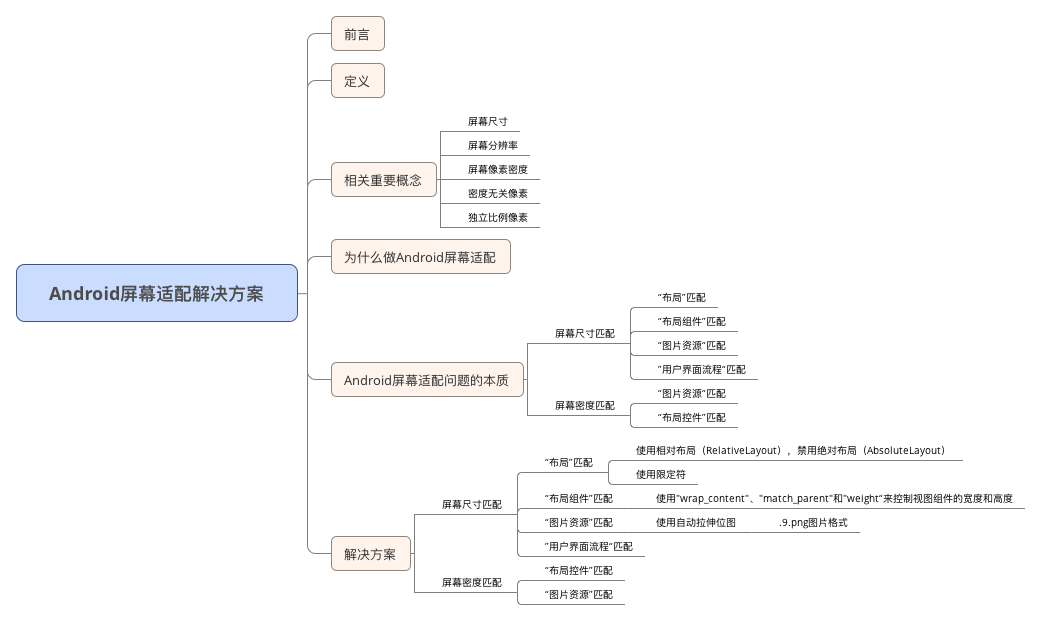
定义
使得某一元素在Android不同尺寸、不同分辨率的手机上具备相同的显示效果
相关重要概念
屏幕尺寸
- 含义:手机对角线的物理尺寸
- 单位:英寸(inch),1英寸=2.54cm
Android手机常见的尺寸有5寸、5.5寸、6寸等等
屏幕分辨率
- 含义:手机在横向、纵向上的像素点数总和
- 一般描述成屏幕的"宽x高”=AxB
- 含义:屏幕在横向方向(宽度)上有A个像素点,在纵向方向
(高)有B个像素点- 例子:1080x1920,即宽度方向上有1080个像素点,在高度方向上有1920个像素点
- 单位:px(pixel),1px=1像素点
UI设计师的设计图会以px作为统一的计量单位
- Android手机常见的分辨率:320x480、480x800、720x1280、1080x1920
屏幕像素密度
- 含义:每英寸的像素点数
- 单位:dpi(dots per ich)
假设设备内每英寸有160个像素,那么该设备的屏幕像素密度=160dpi
- 安卓手机对于每类手机屏幕大小都有一个相应的屏幕像素密度:
| 密度类型 | 代表的分辨率(px) | 屏幕像素密度(dpi) |
|---|---|---|
| 低密度(ldpi) | 240x320 | 120 |
| 中密度(mdpi) | 320x480 | 160 |
| 高密度(hdpi) | 480x800 | 240 |
| 超高密度(xhdpi) | 720x1280 | 320 |
| 超超高密度(xxhdpi) | 1080x1920 | 480 |
屏幕尺寸、分辨率、像素密度三者关系
一部手机的分辨率是宽x高,屏幕大小是以寸为单位,那么三者的关系是:
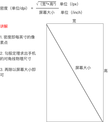
数学不太差的人应该能懂…吧?
不懂没关系,在这里举个例子
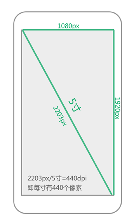
假设一部手机的分辨率是1080x1920(px),屏幕大小是5寸,问密度是多少?
解:请直接套公式
密度无关像素
- 含义:density-independent pixel,叫dp或dip,与终端上的实际物理像素点无关。
- 单位:dp,可以保证在不同屏幕像素密度的设备上显示相同的效果
- Android开发时用dp而不是px单位设置图片大小,是Android特有的单位
- 场景:假如同样都是画一条长度是屏幕一半的线,如果使用px作为计量单位,那么在480x800分辨率手机上设置应为240px;在320x480的手机上应设置为160px,二者设置就不同了;如果使用dp为单位,在这两种分辨率下,160dp都显示为屏幕一半的长度。
- dp与px的转换
因为ui设计师给你的设计图是以px为单位的,Android开发则是使用dp作为单位的,那么我们需要进行转换:
| 密度类型 | 代表的分辨率(px) | 屏幕密度(dpi) | 换算(px/dp) | 比例 |
|---|---|---|---|---|
| 低密度(ldpi) | 240x320 | 120 | 1dp=0.75px | 3 |
| 中密度(mdpi) | 320x480 | 160 | 1dp=1px | 4 |
| 高密度(hdpi) | 480x800 | 240 | 1dp=1.5px | 6 |
| 超高密度(xhdpi) | 720x1280 | 320 | 1dp=2px | 8 |
| 超超高密度(xxhdpi) | 1080x1920 | 480 | 1dp=3px | 12 |
在Android中,规定以160dpi(即屏幕分辨率为320x480)为基准:1dp=1px
独立比例像素
- 含义:scale-independent pixel,叫sp或sip
- 单位:sp
- Android开发时用此单位设置文字大小,可根据字体大小首选项进行缩放
- 推荐使用12sp、14sp、18sp、22sp作为字体设置的大小,不推荐使用奇数和小数,容易造成精度的丢失问题;小于12sp的字体会太小导致用户看不清
请把上面的概念记住,因为下面讲解都会用到!
为什么要进行Android屏幕适配
由于Android系统的开放性,任何用户、开发者、OEM厂商、运营商都可以对Android进行定制,于是导致:
- Android系统碎片化:小米定制的MIUI、魅族定制的flyme、华为定制的EMUI等等
当然都是基于Google原生系统定制的
- Android机型屏幕尺寸碎片化:5寸、5.5寸、6寸等等
- Android屏幕分辨率碎片化:320x480、480x800、720x1280、1080x1920
据友盟指数显示,统计至2015年12月,支持Android的设备共有27796种
当Android系统、屏幕尺寸、屏幕密度出现碎片化的时候,就很容易出现同一元素在不同手机上显示不同的问题。
试想一下这么一个场景:
为4.3寸屏幕准备的UI设计图,运行在5.0寸的屏幕上,很可能在右侧和下侧存在大量的空白;而5.0寸的UI设计图运行到4.3寸的设备上,很可能显示不下。
为了保证用户获得一致的用户体验效果:
使得某一元素在Android不同尺寸、不同分辨率的手机上具备相同的显示效果
于是,我们便需要对Android屏幕进行适配。
屏幕适配问题的本质
- 使得“布局”、“布局组件”、“图片资源”、“用户界面流程”匹配不同的屏幕尺寸
使得布局、布局组件自适应屏幕尺寸;
根据屏幕的配置来加载相应的UI布局、用户界面流程
- 使得“图片资源”匹配不同的屏幕密度
解决方案
- 问题:如何进行屏幕尺寸匹配?
- 答:
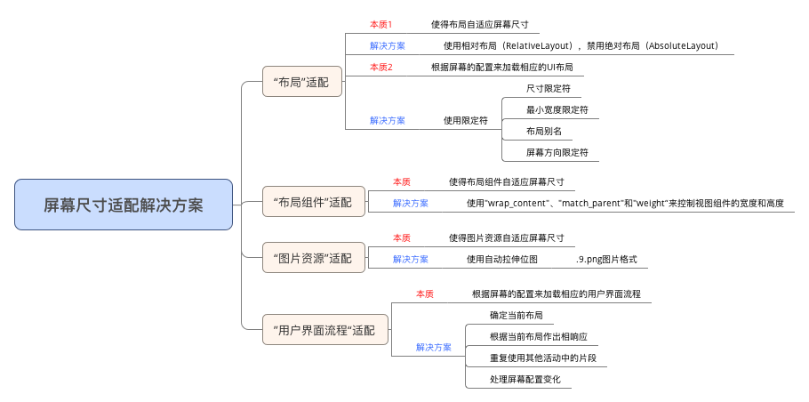
“布局”匹配
本质1:使得布局元素自适应屏幕尺寸
- 做法
使用相对布局(RelativeLayout),禁用绝对布局(AbsoluteLayout)
开发中,我们使用的布局一般有:
- 线性布局(Linearlayout)
- 相对布局(RelativeLayout)
- 帧布局(FrameLayout)
- 绝对布局(AbsoluteLayout)
由于绝对布局(AbsoluteLayout)适配性极差,所以极少使用。
对于线性布局(Linearlayout)、相对布局(RelativeLayout)和帧布局(FrameLayout)需要根据需求进行选择,但要记住:
- RelativeLayout
布局的子控件之间使用相对位置的方式排列,因为RelativeLayout讲究的是相对位置,即使屏幕的大小改变,视图之前的相对位置都不会变化,与屏幕大小无关,灵活性很强 - LinearLayout
通过多层嵌套LinearLayout和组合使
用"wrap_content"和"match_parent"已经可以构建出足够复杂的布局。但是LinearLayout无法准确地控制子视图之间的位置关系,只能简单的一个挨着一个地排列
所以,对于屏幕适配来说,使用相对布局(RelativeLayout)将会是更好的解决方案
本质2:根据屏幕的配置来加载相应的UI布局
应用场景:需要为不同屏幕尺寸的设备设计不同的布局
-
做法:使用限定符
-
作用:通过配置限定符使得程序在运行时根据当前设备的配置(屏幕尺寸)自动加载合适的布局资源
-
限定符类型:
-
尺寸(size)限定符
-
最小宽度(Smallest-width)限定符
-
布局别名
-
屏幕方向(Orientation)限定符
尺寸(size)限定符
- 使用场景:当一款应用显示的内容较多,希望进行以下设置:
- 在平板电脑和电视的屏幕(>7英寸)上:实施**“双面板”**模式以同时显示更多内容
- 在手机较小的屏幕上:使用单面板分别显示内容
因此,我们可以使用尺寸限定符(layout-large)通过创建一个文件
res/layout-large/main.xml
- 1
来完成上述设定:
- 让系统在屏幕尺寸>7英寸时采用适配平板的双面板布局
- 反之(默认情况下)采用适配手机的单面板布局
文件配置如下:
- 适配手机的单面板(默认)布局:res/layout/main.xml
<LinearLayout xmlns:android="http://schemas.android.com/apk/res/android"
    android:orientation="vertical"
    android:layout_width="match_parent"
    android:layout_height="match_parent">

    <fragment android:id="@+id/headlines"
              android:layout_height="fill_parent"
              android:name="com.example.android.newsreader.HeadlinesFragment"
              android:layout_width="match_parent" />
</LinearLayout>
- 1
- 2
- 3
- 4
- 5
- 6
- 7
- 8
- 9
- 10
- 适配尺寸>7寸平板的双面板布局::res/layout-large/main.xml
<LinearLayout xmlns:android="http://schemas.android.com/apk/res/android"
    android:layout_width="fill_parent"
    android:layout_height="fill_parent"
    android:orientation="horizontal">
    <fragment android:id="@+id/headlines"
              android:layout_height="fill_parent"
              android:name="com.example.android.newsreader.HeadlinesFragment"
              android:layout_width="400dp"
              android:layout_marginRight="10dp"/>
    <fragment android:id="@+id/article"
              android:layout_height="fill_parent"
              android:name="com.example.android.newsreader.ArticleFragment"
              android:layout_width="fill_parent" />
</LinearLayout>
- 1
- 2
- 3
- 4
- 5
- 6
- 7
- 8
- 9
- 10
- 11
- 12
- 13
- 14
请注意:
- 两个布局名称均为main.xml,只有布局的目录名不同:第一个布局的目录名为:layout,第二个布局的目录名为:layout-large,包含了尺寸限定符(large)
- 被定义为大屏的设备(7寸以上的平板)会自动加载包含了large限定符目录的布局,而小屏设备会加载另一个默认的布局
但要注意的是,这种方式只适合Android 3.2版本之前。
最小宽度(Smallest-width)限定符
- 背景:上述提到的限定符“large”具体是指多大呢?似乎没有一个定量的指标,这便意味着可能没办法准确地根据当前设备的配置(屏幕尺寸)自动加载合适的布局资源
- 例子:比如说large同时包含着5寸和7寸,这意味着使用“large”限定符的话我没办法实现为5寸和7寸的平板电脑分别加载不同的布局
于是,在Android 3.2及之后版本,引入了最小宽度(Smallest-width)限定符
定义:通过指定某个最小宽度(以 dp 为单位)来精确定位屏幕从而加载不同的UI资源
- 使用场景
你需要为标准 7 英寸平板电脑匹配双面板布局(其最小宽度为 600 dp),在手机(较小的屏幕上)匹配单面板布局
解决方案:您可以使用上文中所述的单面板和双面板这两种布局,但您应使用 sw600dp 指明双面板布局仅适用于最小宽度为 600 dp 的屏幕,而不是使用 large 尺寸限定符。
- sw xxxdp,即small width的缩写,其不区分方向,即无论是宽度还是高度,只要大于 xxxdp,就采用次此布局
- 例子:使用了layout-sw 600dp的最小宽度限定符,即无论是宽度还是高度,只要大于600dp,就采用layout-sw 600dp目录下的布局
代码展示:
- 适配手机的单面板(默认)布局:res/layout/main.xml
<LinearLayout xmlns:android="http://schemas.android.com/apk/res/android"
    android:orientation="vertical"
    android:layout_width="match_parent"
    android:layout_height="match_parent">

    <fragment android:id="@+id/headlines"
              android:layout_height="fill_parent"
              android:name="com.example.android.newsreader.HeadlinesFragment"
              android:layout_width="match_parent" />
</LinearLayout>
- 1
- 2
- 3
- 4
- 5
- 6
- 7
- 8
- 9
- 10
- 适配尺寸>7寸平板的双面板布局:res/layout-sw600dp/main.xml
<LinearLayout xmlns:android="http://schemas.android.com/apk/res/android"
    android:layout_width="fill_parent"
    android:layout_height="fill_parent"
    android:orientation="horizontal">
    <fragment android:id="@+id/headlines"
              android:layout_height="fill_parent"
              android:name="com.example.android.newsreader.HeadlinesFragment"
              android:layout_width="400dp"
              android:layout_marginRight="10dp"/>
    <fragment android:id="@+id/article"
              android:layout_height="fill_parent"
              android:name="com.example.android.newsreader.ArticleFragment"
              android:layout_width="fill_parent" />
</LinearLayout>
- 1
- 2
- 3
- 4
- 5
- 6
- 7
- 8
- 9
- 10
- 11
- 12
- 13
- 14
- 对于最小宽度≥ 600 dp 的设备
系统会自动加载 layout-sw600dp/main.xml(双面板)布局,否则系统就会选择 layout/main.xml(单面板)布局
(这个选择过程是Android系统自动选择的)
使用布局别名
设想这么一个场景
当你需要同时为Android 3.2版本前和Android 3.2版本后的手机进行屏幕尺寸适配的时候,由于尺寸限定符仅用于Android 3.2版本前,最小宽度限定符仅用于Android 3.2版本后,所以这会带来一个问题,为了很好地进行屏幕尺寸的适配,你需要同时维护layout-sw600dp和layout-large的两套main.xml平板布局,如下:
- 适配手机的单面板(默认)布局:res/layout/main.xml
- 适配尺寸>7寸平板的双面板布局(Android 3.2前):res/layout-large/main.xml
- 适配尺寸>7寸平板的双面板布局(Android 3.2后)res/layout-sw600dp/main.xml
最后的两个文件的xml内容是完全相同的,这会带来:文件名的重复从而带来一些列后期维护的问题
于是为了要解决这种重复问题,我们引入了“布局别名”
还是上面的例子,你可以定义以下布局:
- 适配手机的单面板(默认)布局:res/layout/main.xml
- 适配尺寸>7寸平板的双面板布局:res/layout/main_twopanes.xml
然后加入以下两个文件,以便进行Android 3.2前和Android 3.2后的版本双面板布局适配:
- res/values-large/layout.xml(Android 3.2之前的双面板布局)
<resources>
    <item name="main" type="layout">@layout/main_twopanes</item>
</resources>
- 1
- 2
- 3
- res/values-sw600dp/layout.xml(Android 3.2及之后的双面板布局)
<resources>
<item name="main" type="layout">@layout/main_twopanes</item>
</resources>
- 1
- 2
- 3
注:
- 最后两个文件有着相同的内容,但是它们并没有真正去定义布局,它们仅仅只是将main设置成了@layout/main_twopanes的别名
- 由于这些文件包含 large 和 sw600dp 选择器,因此,系统会将此文件匹配到不同版本的>7寸平板上:
a. 版本低于 3.2 的平板会匹配 large的文件
b. 版本高于 3.2 的平板会匹配 sw600dp的文件
这样两个layout.xml都只是引用了@layout/main_twopanes,就避免了重复定义布局文件的情况
屏幕方向(Orientation)限定符
- 使用场景:根据屏幕方向进行布局的调整
取以下为例子:
- 小屏幕, 竖屏: 单面板
- 小屏幕, 横屏: 单面板
- 7 英寸平板电脑,纵向:单面板,带操作栏
- 7 英寸平板电脑,横向:双面板,宽,带操作栏
- 10 英寸平板电脑,纵向:双面板,窄,带操作栏
- 10 英寸平板电脑,横向:双面板,宽,带操作栏
- 电视,横向:双面板,宽,带操作栏
方法是:
- 先定义类别:单/双面板、是否带操作栏、宽/窄
定义在 res/layout/ 目录下的某个 XML 文件中
- 再进行相应的匹配:屏幕尺寸(小屏、7寸、10寸)、方向(横、纵)
使用布局别名进行匹配
- 在 res/layout/ 目录下的某个 XML 文件中定义所需要的布局类别
(单/双面板、是否带操作栏、宽/窄)
res/layout/onepane.xml:(单面板)
<LinearLayout xmlns:android="http://schemas.android.com/apk/res/android"
    android:orientation="vertical"
    android:layout_width="match_parent"
    android:layout_height="match_parent">

    <fragment android:id="@+id/headlines"
              android:layout_height="fill_parent"
              android:name="com.example.android.newsreader.HeadlinesFragment"
              android:layout_width="match_parent" />
</LinearLayout>
- 1
- 2
- 3
- 4
- 5
- 6
- 7
- 8
- 9
- 10
res/layout/onepane_with_bar.xml:(单面板带操作栏)
<LinearLayout xmlns:android="http://schemas.android.com/apk/res/android"
    android:orientation="vertical"
    android:layout_width="match_parent"
    android:layout_height="match_parent">
    <LinearLayout android:layout_width="match_parent"
                  android:id="@+id/linearLayout1"
                  android:gravity="center"
                  android:layout_height="50dp">
        <ImageView android:id="@+id/imageView1"
                   android:layout_height="wrap_content"
                   android:layout_width="wrap_content"
                   android:src="@drawable/logo"
                   android:paddingRight="30dp"
                   android:layout_gravity="left"
                   android:layout_weight="0" />
        <View android:layout_height="wrap_content"
              android:id="@+id/view1"
              android:layout_width="wrap_content"
              android:layout_weight="1" />
        <Button android:id="@+id/categorybutton"
                android:background="@drawable/button_bg"
                android:layout_height="match_parent"
                android:layout_weight="0"
                android:layout_width="120dp"
                style="@style/CategoryButtonStyle"/>
    </LinearLayout>

    <fragment android:id="@+id/headlines"
              android:layout_height="fill_parent"
              android:name="com.example.android.newsreader.HeadlinesFragment"
              android:layout_width="match_parent" />
</LinearLayout>

- 1
- 2
- 3
- 4
- 5
- 6
- 7
- 8
- 9
- 10
- 11
- 12
- 13
- 14
- 15
- 16
- 17
- 18
- 19
- 20
- 21
- 22
- 23
- 24
- 25
- 26
- 27
- 28
- 29
- 30
- 31
- 32
res/layout/twopanes.xml:(双面板,宽布局)
<LinearLayout xmlns:android="http://schemas.android.com/apk/res/android"
    android:layout_width="fill_parent"
    android:layout_height="fill_parent"
    android:orientation="horizontal">
    <fragment android:id="@+id/headlines"
              android:layout_height="fill_parent"
              android:name="com.example.android.newsreader.HeadlinesFragment"
              android:layout_width="400dp"
              android:layout_marginRight="10dp"/>
    <fragment android:id="@+id/article"
              android:layout_height="fill_parent"
              android:name="com.example.android.newsreader.ArticleFragment"
              android:layout_width="fill_parent" />
</LinearLayout>
- 1
- 2
- 3
- 4
- 5
- 6
- 7
- 8
- 9
- 10
- 11
- 12
- 13
- 14
res/layout/twopanes_narrow.xml:(双面板,窄布局)
<LinearLayout xmlns:android="http://schemas.android.com/apk/res/android"
    android:layout_width="fill_parent"
    android:layout_height="fill_parent"
    android:orientation="horizontal">
    <fragment android:id="@+id/headlines"
              android:layout_height="fill_parent"
              android:name="com.example.android.newsreader.HeadlinesFragment"
              android:layout_width="200dp"
              android:layout_marginRight="10dp"/>
    <fragment android:id="@+id/article"
              android:layout_height="fill_parent"
              android:name="com.example.android.newsreader.ArticleFragment"
              android:layout_width="fill_parent" />
</LinearLayout>
- 1
- 2
- 3
- 4
- 5
- 6
- 7
- 8
- 9
- 10
- 11
- 12
- 13
- 14
2.使用布局别名进行相应的匹配
(屏幕尺寸(小屏、7寸、10寸)、方向(横、纵))
res/values/layouts.xml:(默认布局)
<resources>
    <item name="main_layout" type="layout">@layout/onepane_with_bar</item>
    <bool name="has_two_panes">false</bool>
</resources>
- 1
- 2
- 3
- 4
可为resources设置bool,通过获取其值来动态判断目前已处在哪个适配布局
res/values-sw600dp-land/layouts.xml
(大屏、横向、双面板、宽-Andorid 3.2版本后)
<resources>
    <item name="main_layout" type="layout">@layout/twopanes</item>
    <bool name="has_two_panes">true</bool>
</resources>
- 1
- 2
- 3
- 4
res/values-sw600dp-port/layouts.xml
(大屏、纵向、单面板带操作栏-Andorid 3.2版本后)
<resources>
    <item name="main_layout" type="layout">@layout/onepane</item>
    <bool name="has_two_panes">false</bool>
</resources>
- 1
- 2
- 3
- 4
res/values-large-land/layouts.xml
(大屏、横向、双面板、宽-Andorid 3.2版本前)
<resources>
    <item name="main_layout" type="layout">@layout/twopanes</item>
    <bool name="has_two_panes">true</bool>
</resources>
- 1
- 2
- 3
- 4
res/values-large-port/layouts.xml
(大屏、纵向、单面板带操作栏-Andorid 3.2版本前)
<resources>
    <item name="main_layout" type="layout">@layout/onepane</item>
    <bool name="has_two_panes">false</bool>
</resources>
- 1
- 2
- 3
- 4
这里没有完全把全部尺寸匹配类型的代码贴出来,大家可以自己去尝试把其补充完整
“布局组件”匹配
本质:使得布局组件自适应屏幕尺寸
- 做法
使用"wrap_content"、"match_parent"和"weight“来控制视图组件的宽度和高度
- “wrap_content”
相应视图的宽和高就会被设定成所需的最小尺寸以适应视图中的内容- “match_parent”(在Android API 8之前叫作"fill_parent")
视图的宽和高延伸至充满整个父布局- “weight”
1.定义:是线性布局(Linelayout)的一个独特比例分配属性
2.作用:使用此属性设置权重,然后按照比例对界面进行空间的分配,公式计算是:控件宽度=控件设置宽度+剩余空间所占百分比宽幅
具体可以参考这篇文章,讲解得非常详细
通过使用"wrap_content"、"match_parent"和"weight"来替代硬编码的方式定义视图大小&位置,你的视图要么仅仅使用了需要的那边一点空间,要么就会充满所有可用的空间,即按需占据空间大小,能让你的布局元素充分适应你的屏幕尺寸
“图片资源”匹配
本质:使得图片资源在不同屏幕密度上显示相同的像素效果
- 做法:使用自动拉伸位图:Nine-Patch的图片类型
假设需要匹配不同屏幕大小,你的图片资源也必须自动适应各种屏幕尺寸
使用场景:一个按钮的背景图片必须能够随着按钮大小的改变而改变。
使用普通的图片将无法实现上述功能,因为运行时会均匀地拉伸或压缩你的图片
- 解决方案:使用自动拉伸位图(nine-patch图片),后缀名是.9.png,它是一种被特殊处理过的PNG图片,设计时可以指定图片的拉伸区域和非拉伸区域;使用时,系统就会根据控件的大小自动地拉伸你想要拉伸的部分
1.必须要使用.9.png后缀名,因为系统就是根据这个来区别nine-patch图片和普通的PNG图片的;
2.当你需要在一个控件中使用nine-patch图片时,如
android:background="@drawable/button"
- 1
系统就会根据控件的大小自动地拉伸你想要拉伸的部分
”用户界面流程“匹配
- 使用场景:我们会根据设备特点显示恰当的布局,但是这样做,会使得用户界面流程可能会有所不同。
- 例如,如果应用处于双面板模式下,点击左侧面板上的项即可直接在右侧面板上显示相关内容;而如果该应用处于单面板模式下,点击相关的内容应该跳转到另外一个Activity进行后续的处理。
本质:根据屏幕的配置来加载相应的用户界面流程
- 做法
进行用户界面流程的自适应配置:
- 确定当前布局
- 根据当前布局做出响应
- 重复使用其他活动中的片段
- 处理屏幕配置变化
- 步骤1:确定当前布局
由于每种布局的实施都会稍有不同,因此我们需要先确定当前向用户显示的布局。例如,我们可以先了解用户所处的是“单面板”模式还是“双面板”模式。要做到这一点,可以通过查询指定视图是否存在以及是否已显示出来。
public class NewsReaderActivity extends FragmentActivity {
    boolean mIsDualPane;

    @Override
    public void onCreate(Bundle savedInstanceState) {
        super.onCreate(savedInstanceState);
        setContentView(R.layout.main_layout);

        View articleView = findViewById(R.id.article);
        mIsDualPane = articleView != null &&
                        articleView.getVisibility() == View.VISIBLE;
    }
}
- 1
- 2
- 3
- 4
- 5
- 6
- 7
- 8
- 9
- 10
- 11
- 12
- 13
这段代码用于查询“报道”面板是否可用,与针对具体布局的硬编码查询相比,这段代码的灵活性要大得多。
- 步骤2:根据当前布局做出响应
有些操作可能会因当前的具体布局而产生不同的结果。
例如,在新闻阅读器示例中,如果用户界面处于双面板模式下,那么点击标题列表中的标题就会在右侧面板中打开相应报道;但如果用户界面处于单面板模式下,那么上述操作就会启动一个独立活动:
@Override
public void onHeadlineSelected(int index) {
    mArtIndex = index;
    if (mIsDualPane) {
        /* display article on the right pane */
        mArticleFragment.displayArticle(mCurrentCat.getArticle(index));
    } else {
        /* start a separate activity */
        Intent intent = new Intent(this, ArticleActivity.class);
        intent.putExtra("catIndex", mCatIndex);
        intent.putExtra("artIndex", index);
        startActivity(intent);
    }
}
- 1
- 2
- 3
- 4
- 5
- 6
- 7
- 8
- 9
- 10
- 11
- 12
- 13
- 14
- 步骤3:重复使用其他活动中的片段
多屏幕设计中的重复模式是指,对于某些屏幕配置,已实施界面的一部分会用作面板;但对于其他配置,这部分就会以独立活动的形式存在。
例如,在新闻阅读器示例中,对于较大的屏幕,新闻报道文本会显示在右侧面板中;但对于较小的屏幕,这些文本就会以独立活动的形式存在。
在类似情况下,通常可以在多个活动中重复使用相同的 Fragment 子类以避免代码重复。例如,在双面板布局中使用了 ArticleFragment:
<LinearLayout xmlns:android="http://schemas.android.com/apk/res/android"
    android:layout_width="fill_parent"
    android:layout_height="fill_parent"
    android:orientation="horizontal">
    <fragment android:id="@+id/headlines"
              android:layout_height="fill_parent"
              android:name="com.example.android.newsreader.HeadlinesFragment"
              android:layout_width="400dp"
              android:layout_marginRight="10dp"/>
    <fragment android:id="@+id/article"
              android:layout_height="fill_parent"
              android:name="com.example.android.newsreader.ArticleFragment"
              android:layout_width="fill_parent" />
</LinearLayout>
- 1
- 2
- 3
- 4
- 5
- 6
- 7
- 8
- 9
- 10
- 11
- 12
- 13
- 14
然后又在小屏幕的Activity布局中重复使用了它 :
ArticleFragment frag = new ArticleFragment();
getSupportFragmentManager().beginTransaction().add(android.R.id.content, frag).commit();
- 1
- 2
- 步骤3:处理屏幕配置变化
如果我们使用独立Activity实施界面的独立部分,那么请注意,我们可能需要对特定配置变化(例如屏幕方向的变化)做出响应,以便保持界面的一致性。
例如,在运行 Android 3.0 或更高版本的标准 7 英寸平板电脑上,如果新闻阅读器示例应用运行在纵向模式下,就会在使用独立活动显示新闻报道;但如果该应用运行在横向模式下,就会使用双面板布局。
也就是说,如果用户处于纵向模式下且屏幕上显示的是用于阅读报道的活动,那么就需要在检测到屏幕方向变化(变成横向模式)后执行相应操作,即停止上述活动并返回主活动,以便在双面板布局中显示相关内容:
public class ArticleActivity extends FragmentActivity {
    int mCatIndex, mArtIndex;

    @Override
    protected void onCreate(Bundle savedInstanceState) {
        super.onCreate(savedInstanceState);
        mCatIndex = getIntent().getExtras().getInt("catIndex", 0);
        mArtIndex = getIntent().getExtras().getInt("artIndex", 0);

        // If should be in two-pane mode, finish to return to main activity
        if (getResources().getBoolean(R.bool.has_two_panes)) {
            finish();
            return;
        }
        ...
}
- 1
- 2
- 3
- 4
- 5
- 6
- 7
- 8
- 9
- 10
- 11
- 12
- 13
- 14
- 15
- 16
通过上面一系列步骤,我们就完全可以建立一个可以根据用户界面配置进行自适应的应用程序App了。
总结
经过上面的介绍,对于屏幕尺寸大小适配问题应该是不成问题了。
解决方案
- 问题:如何进行屏幕密度匹配?
- 答:
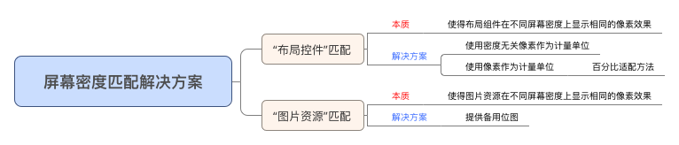
“布局控件”匹配
本质:使得布局组件在不同屏幕密度上显示相同的像素效果
- 做法1:使用密度无关像素
由于各种屏幕的像素密度都有所不同,因此相同数量的像素在不同设备上的实际大小也有所差异,这样使用像素(px)定义布局尺寸就会产生问题。
因此,请务必使用密度无关像素 dp 或**独立比例像素 sp **单位指定尺寸。 - 相关概念介绍
密度无关像素 - 含义:density-independent pixel,叫dp或dip,与终端上的实际物理像素点无关。
- 单位:dp,可以保证在不同屏幕像素密度的设备上显示相同的效果
- Android开发时用dp而不是px单位设置图片大小,是Android特有的单位
- 场景:假如同样都是画一条长度是屏幕一半的线,如果使用px作为计量单位,那么在480x800分辨率手机上设置应为240px;在320x480的手机上应设置为160px,二者设置就不同了;如果使用dp为单位,在这两种分辨率下,160dp都显示为屏幕一半的长度。
- dp与px的转换
因为ui给你的设计图是以px为单位的,Android开发则是使用dp作为单位的,那么该如何转换呢?
| 密度类型 | 代表的分辨率(px) | 屏幕密度(dpi)|换算(px/dp) |比例|
| ------------- |:-------------
[详细] -->赞
踩
Copyright © 2003-2013 www.wpsshop.cn 版权所有,并保留所有权利。

