
热门标签
当前位置: article > 正文
【VUE】UniAPP之uview组件库,自定义tag封装,支持添加u-icon图标
作者:算法构造者 | 2024-02-06 12:29:48
赞
踩
【VUE】UniAPP之uview组件库,自定义tag封装,支持添加u-icon图标
组件代码
<template>
    <view class="tag" :class="[props.mode, props.shape]">
        <slot name="left">
            <!-- icon图标 没有传入图标时不显示 -->
            <u-icon v-if="props.icon !== ''" :name="props.icon" :color="props.color" size="20" />
        </slot>
        {{ props.text }}
        <slot name="right"></slot>
    </view>
</template>

<script lang="ts" setup>
import { defineProps } from 'vue'
const props = defineProps({
    text: { //显示文本
        type: String,
        default: '自定义33'
    },
    color: { //颜色 主体颜色
        type: String,
        default: 'red'
    },
    mode: { //light	dark / plain
        type: String,
        default: 'light'
    },
    shape: { //形状square circle / circleLeft / circleRight
        type: String,
        default: 'circle'
    },
    icon: { //icon图标
        type: String,
        default: ''
    }

})
</script>

<style lang="scss" scoped>
$color: v-bind(color);

.tag {
    padding: 8rpx 22rpx;
    font-size: 20rpx;
    // border-radius: 36rpx;
    text-align: center;
    position: relative;
    z-index: 1;

    &::before {
        content: "";
        display: block;
        border-radius: 36rpx;
        position: absolute;
        left: 0;
        top: 0;
        width: 100%;
        height: 100%;
        opacity: 0.07;
        z-index: 0;
    }
}

// 形状
.tag.circle {
    border-radius: 36rpx;
}

.tag.circleLeft {
    border-radius: 36rpx;
    border-bottom-left-radius: 0;
    border-top-left-radius: 0;
}

.tag.circleRight {
    border-radius: 36rpx;
    border-bottom-right-radius: 0;
    border-top-right-radius: 0;
}

// 模式

.tag.light {
    color: $color;
    border: 2rpx solid $color;

    &::before {

        background-color: $color;
    }
}

.tag.light2 {
    color: $color;

    &::before {

        background-color: $color;
    }
}

.tag.light3 {
    color: $color;
    background-color: #fff;

    &::before {
        // background-color: #fff;
        border: 1rpx solid $color;
    }
}

.tag.dark {
    color: #fff;
    background-color: $color;
}

.tag.plain {
    color: $color;
    border: 2rpx solid $color;
}
</style>

- 1
- 2
- 3
- 4
- 5
- 6
- 7
- 8
- 9
- 10
- 11
- 12
- 13
- 14
- 15
- 16
- 17
- 18
- 19
- 20
- 21
- 22
- 23
- 24
- 25
- 26
- 27
- 28
- 29
- 30
- 31
- 32
- 33
- 34
- 35
- 36
- 37
- 38
- 39
- 40
- 41
- 42
- 43
- 44
- 45
- 46
- 47
- 48
- 49
- 50
- 51
- 52
- 53
- 54
- 55
- 56
- 57
- 58
- 59
- 60
- 61
- 62
- 63
- 64
- 65
- 66
- 67
- 68
- 69
- 70
- 71
- 72
- 73
- 74
- 75
- 76
- 77
- 78
- 79
- 80
- 81
- 82
- 83
- 84
- 85
- 86
- 87
- 88
- 89
- 90
- 91
- 92
- 93
- 94
- 95
- 96
- 97
- 98
- 99
- 100
- 101
- 102
- 103
- 104
- 105
- 106
- 107
- 108
- 109
- 110
- 111
- 112
- 113
- 114
- 115
- 116
- 117
- 118
- 119
- 120
- 121
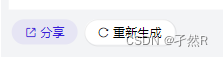
使用案例
<tag text="分享" mode="light2" icon="zhuanfa" color="#3820d9" />
<tag text="重新生成" mode="light3" icon="reload" color="#000" />
- 1
- 2
效果展示
声明:本文内容由网友自发贡献,不代表【wpsshop博客】立场,版权归原作者所有,本站不承担相应法律责任。如您发现有侵权的内容,请联系我们。转载请注明出处:https://www.wpsshop.cn/w/算法构造者/article/detail/62755
推荐阅读
相关标签

