
热门标签
热门文章
- 1解决更新Android Studio后下载Gradle超时_android studio下载grade超时
- 2电商交易数据分析_电商平台交易数据
- 3为什么有了MAC还需要IP?
- 4掌握简单有效的被动加好友技巧,让你24小时轻松引流!_被动加人
- 5你想在本地部署大模型吗?本地部署大模型的三种工具_怎么部署大模型
- 6PostgreSQL的安装和卸载,远程连接_pgsql数据库的卸载与安装
- 7大模型学习路线(10)——模型评测指标_大模型评测指标
- 8Java使用Hutool工具类轻松生成验证码_hutool 验证码
- 9解决Class com.sun.tools.javac.tree.JCTree$JCImport does not have member field ‘com.sun.tools.javac.tre
- 10Python 使用pyecharts生成echarts图像_pyecharts生成图片
当前位置: article > 正文
【React】实现输入框切换
作者:空白诗007 | 2024-08-10 01:23:15
赞
踩
【React】实现输入框切换
需求
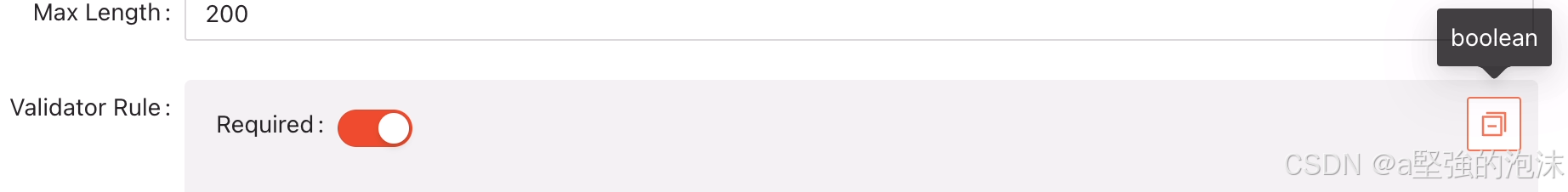
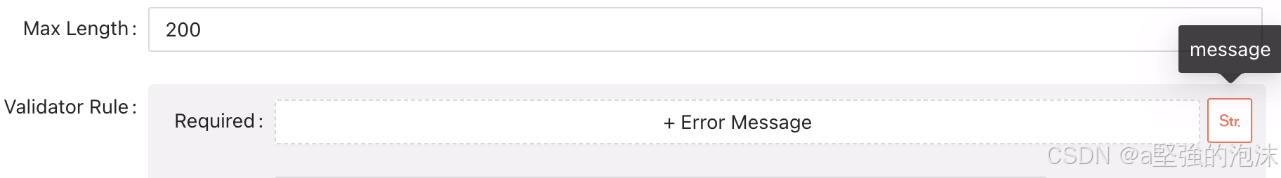
类似designable-antd平台的这个切换功能:
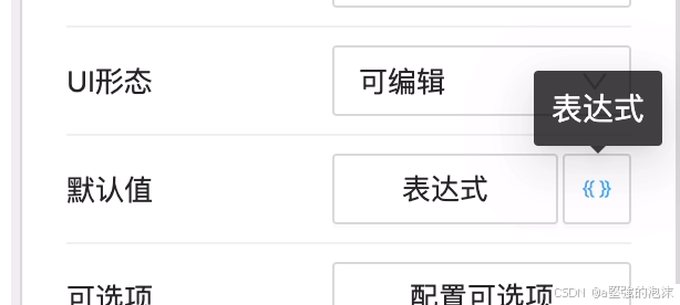
- 点击右边按钮,可以切换不同的输入框样式。
实现
- 维护一个type-component的类型数组
- 遍历数组,找到当前组件类型并渲染
- 当切换输入框样式的时候,获取下一个组件类型并渲染。如果为最后一个组件,则重新循环为第一个组件类型并展示
- 初始化的时候,需要根据value校验当前组件的类型,并渲染
polyInput.tsx:
import React, { useEffect, useState, useMemo } from 'react';
import { Button, Row, Tooltip } from 'antd';
import { useField } from '@formily/react';
import { Field } from '@formily/core';

export interface IInput {
  value: any;
  onChange: (value: any) => void;
}

export interface IPolyType {
  type: string;
  icon: JSX.Element;
  component?: any;
  checker: (value: any) => boolean;
}

export type PolyTypes = IPolyType[];

export function createPolyInput(polyTypes: PolyTypes = []): React.FC<IInput> {
  return ({ value, ...props }) => {
    const [curType, setCurType] = useState(polyTypes[0]?.type);

    const field: Field = useField();

    const curTypeItem = polyTypes.filter((i) => i.type === curType)[0];

    useEffect(() => {
      // 设置默认类型
      polyTypes?.forEach(({ checker, type }) => {
        if (checker(value)) { // here
          setCurType(type);
        }
      });
    }, []);

    const getNextType = () => {
      const currentIndex = polyTypes?.findIndex(({ type }) => type === curType);
      const nextIndex = currentIndex + 1 > polyTypes?.length - 1 ? 0 : currentIndex + 1;
      return polyTypes[nextIndex];
    };

    const renderContent = useMemo(() => {
      return (
        <>
          {curTypeItem?.component && (
            <div style={{ flex: 1, marginRight: 5 }}>
              {/* @ts-ignore */}
              {React.createElement(curTypeItem?.component, {
                ...props, // here
                value,
              })}
            </div>
          )}
          <Tooltip title={curTypeItem.type}>
            <Button
              icon={curTypeItem.icon}
              onClick={() => {
                const nextType = getNextType(); // here
                if (nextType.type === curType) {
                  return;
                }
                setCurType(nextType?.type);
                field?.setValue(undefined); // 切换类型的时候,赋空值
              }}
            />
          </Tooltip>
        </>
      );
    }, [curTypeItem]);

    return <Row justify="start">{renderContent}</Row>;
  };
}

- 1
- 2
- 3
- 4
- 5
- 6
- 7
- 8
- 9
- 10
- 11
- 12
- 13
- 14
- 15
- 16
- 17
- 18
- 19
- 20
- 21
- 22
- 23
- 24
- 25
- 26
- 27
- 28
- 29
- 30
- 31
- 32
- 33
- 34
- 35
- 36
- 37
- 38
- 39
- 40
- 41
- 42
- 43
- 44
- 45
- 46
- 47
- 48
- 49
- 50
- 51
- 52
- 53
- 54
- 55
- 56
- 57
- 58
- 59
- 60
- 61
- 62
- 63
- 64
- 65
- 66
- 67
- 68
- 69
- 70
- 71
- 72
- 73
- 74
使用:
import { FieldStringOutlined, SwitcherOutlined } from '@ant-design/icons';
import { isObject } from 'lodash';
import { Switch } from '@formily/antd';
import LanguageTextRule, { LanguageComponentType } from '../LanguageTextRule';
import { createPolyInput } from '../PolyInput';

export enum ValidatorType {
  BOOLEAN = 'boolean',
  LANGUAGE_MESSAGE = 'message',
}

export const isBoolean = (value: any) => typeof value === 'boolean';
export const isObj = (value: any) => isObject(value);

export const ValidatorTypesMap = [
  {
    type: ValidatorType.BOOLEAN,
    icon: <SwitcherOutlined />,
    component: Switch,
    checker: isBoolean,
  },
  {
    type: ValidatorType.LANGUAGE_MESSAGE,
    icon: <FieldStringOutlined />,
    component: (props: any) => {
      return (
        <LanguageTextRule
          title="Error Message"
          componentType={LanguageComponentType.TEXT}
          buttonText="+ Error Message"
          isModal
          {...props}
        />
      );
    },
    checker: isObj,
  },
];

export default createPolyInput(ValidatorTypesMap);
- 1
- 2
- 3
- 4
- 5
- 6
- 7
- 8
- 9
- 10
- 11
- 12
- 13
- 14
- 15
- 16
- 17
- 18
- 19
- 20
- 21
- 22
- 23
- 24
- 25
- 26
- 27
- 28
- 29
- 30
- 31
- 32
- 33
- 34
- 35
- 36
- 37
- 38
- 39
- 40
效果
声明:本文内容由网友自发贡献,不代表【wpsshop博客】立场,版权归原作者所有,本站不承担相应法律责任。如您发现有侵权的内容,请联系我们。转载请注明出处:https://www.wpsshop.cn/w/空白诗007/article/detail/956138
推荐阅读
相关标签

