- 1周末练习1
- 2shardingsphere连接mySQL胎教级教程_shardingsphere 5.4.1
- 3FPGA Verilog基本语法及模块说明_fpga语法
- 4开源大模型与闭源大模型:未来AI竞赛的关键对决_数据安全上开源大模型和闭源大模型
- 5css设置滚动条透明和自定义_::-webkit-scrollbar{ width: 0; height: 0; color: t
- 6机器学习十大算法之七——随机森林_svm lasso 随机森林
- 7保障 Google Play 的安全,我们一直在努力_google play 收到的数据会受到临时处理 什么意思
- 8干货!所有常用的原型设计工具都在这里了_通过各种方式了解主流的原型设计工具,完成表1内容
- 9oracle入门_oracle csdn
- 10第4关:非递归实现二叉树左右子树交换
vue3.0项目中运用vant的以及移动端的适配_vant vue3
赞
踩
概要
在Vue-Vben-Admin项目中运用vant-ui实现部分页面支持手机端h5页面的预览
移动端的适配
-
适配的原理
- 自适应 根据不同的设备的屏幕大小来自动调整尺寸,大小
- 响应式 会随着屏幕的变动而自动调整,是一种更强的自适应
-
当前流行的几种适配方案
- 百分比设置(不推荐)
因为不同属性的百分比值,相对的可能是不同参照物,所以百分比往往很难统一
所以百分比在移动端适配中使用是非常少的 - rem单位+动态html的font-size
- vw单位(推荐,项目中运用的此方案)
- flex的弹性布局
- 百分比设置(不推荐)
-
rem + 动态设置 font-size
rem 单位是相对于 html 元素的 font-size 来设置的,通过在不同屏幕尺寸下,动态的修改 html 元素的 font-size 以此来达到适配效果屏幕尺寸 html的font-size 盒子的设置宽度 盒子的最终宽度 375px 37.5px 1rem 37.5px 320px 32px 1rem 32px 414px 41.4px 1rem 41.4px - 1) px 与 rem 的单位换算
根元素 html 的文字大小 = 视口宽度/分成的份数(一般为10份,方便计算)
rem 值 = 元素的 px 值 / 根元素 html 的文字大小
比如有一个在375px屏幕上,100px宽度和高度的盒子
我们需要将100px转成对应的rem值
100/37.5=2.6667,其他也是相同的方法计算即可- 2) less/scss函数
.pxToRem(@px) { result: 1rem * (@px / 37.5); } .box { width: .pxToRem(100)[result]; height: .pxToRem(100)[result]; background-color: orange; } p { font-size: .pxToRem(14)[result]; }- 1
- 2
- 3
- 4
- 5
- 6
- 7
- 8
- 9
- 10
- 11
- 12
- 13
-
3) postcss-pxtorem
目前在前端的工程化开发中,我们可以借助于webpack的工具来完成自动的转化
npm install postcss-pxtorem -
4) VSCode插件
-
媒体查询
通过媒体查询来设置不同尺寸屏幕下 html 的 font-size需要针对不同的屏幕编写大量的媒体查询
如果动态改变尺寸,不会实时更新,只是一个个区间// 屏幕宽度最小320是的样式 @media screen and (min-width: 320px) { html { font-size: 20px; } } // 屏幕宽度小于375px是的样式 @media screen and (min-width: 375px) { html { font-size: 24px; } } // 屏幕宽度小于414px是的样式 @media screen and (min-width: 414px) { html { font-size: 28px; } } // 屏幕宽度小于480px是的样式 @media screen and (min-width: 480px) { html { font-size: 32px; } }
- 1
- 2
- 3
- 4
- 5
- 6
- 7
- 8
- 9
- 10
- 11
- 12
- 13
- 14
- 15
- 16
- 17
- 18
- 19
- 20
- 21
- 22
- 23
- 24
-
编写 js 代码
通过监听屏幕尺寸的变化来动态修改 html 元素的 font-size 大小根据 html 的宽度计算出 font-size 的大小,并设置到 html 上
监听页面尺寸的变化,实时修改 font-size 大小function setRemUnit() { // 获取所有的 html 元素 const htmlEl = document.documentElement // 375 -> 16px // 320px -> 12px // 我们需要动态更改字体大小,因此需要获取网页的宽度 // 拿到客户端宽度 const htmlWidth = htmlEl.clientWidth // 将宽度分成10份 const htmlFontSize = htmlWidth / 10 console.log('htmlFontSize', htmlFontSize); // 将值给到html的font-size htmlEl.style.fontSize = htmlFontSize + 'px' } setRemUnit() // 给 window 添加监听事件 window.addEventListener('resize', setRemUnit)- 1
- 2
- 3
- 4
- 5
- 6
- 7
- 8
- 9
- 10
- 11
- 12
- 13
- 14
- 15
- 16
- 17
- 18
-
lib-flexible 库
lib-flexible 是淘宝团队出品的一个移动端自适应解决方案,通过动态计算 viewport 设置 font-size 实现不同屏幕宽度下的 UI 自适应缩放。(function flexible (window, document) { var docEl = document.documentElement var dpr = window.devicePixelRatio || 1 // adjust body font size function setBodyFontSize () { if (document.body) { document.body.style.fontSize = (12 * dpr) + 'px' } else { document.addEventListener('DOMContentLoaded', setBodyFontSize) } } setBodyFontSize(); // set 1rem = viewWidth / 10 function setRemUnit () { var rem = docEl.clientWidth / 10 docEl.style.fontSize = rem + 'px' } setRemUnit() // reset rem unit on page resize window.addEventListener('resize', setRemUnit) window.addEventListener('pageshow', function (e) { if (e.persisted) { setRemUnit() } }) // detect 0.5px supports if (dpr >= 2) { var fakeBody = document.createElement('body') var testElement = document.createElement('div') testElement.style.border = '.5px solid transparent' fakeBody.appendChild(testElement) docEl.appendChild(fakeBody) if (testElement.offsetHeight === 1) { docEl.classList.add('hairlines') } docEl.removeChild(fakeBody) } }(window, document))- 1
- 2
- 3
- 4
- 5
- 6
- 7
- 8
- 9
- 10
- 11
- 12
- 13
- 14
- 15
- 16
- 17
- 18
- 19
- 20
- 21
- 22
- 23
- 24
- 25
- 26
- 27
- 28
- 29
- 30
- 31
- 32
- 33
- 34
- 35
- 36
- 37
- 38
- 39
- 40
- 41
- 42
- 43
- 44
-
vw 适配方案
100vw 相当于整个视口的宽度 innerWidth,1vw 相当于视口宽度的 1%,将 px 转换为 vw 即可完成适配,其实上面的 rem 就是模仿 vw 方案
vw相比于rem的优势:
不需要去计算 html 的 font-size 大小,也不需要去给 html 设置 font-size
不会因为设置 html 的 font-size 大小,而必须再给 body 设置一个 font-size 防止继承
因为不依赖 font-size 的尺寸,所以不用担心某些原因的 html 的 font-size 尺寸被篡改,导致页面尺寸混乱
vw 更加语义话,1vw 相当于 1/100 viewport 的大小
rem 事实上作为一种过渡的方案,它利用的也是 vw 的思想
-
px 与 vw 的单位转换
- 手动换算
比如屏幕尺寸为 375px,元素大小为 150px,我们需要将 150px 转换成对应的 vw 值:150 / 3.75=40 - less/scss 函数
@vwUnit: 3.75; .pxToVw(@px) { result: (@px / @vw) * 1vw } .box { width: .pxToVw(100)[result]; height: .pxToVw(100)[result]; }- 1
- 2
- 3
- 4
- 5
- 6
- 7
- 8
- postcss-px-to-viewport-8-plugin
1:和rem一样,在前端的工程化开发中,我们可以借助于webpack的工具来完成自动的转化
2: npm install postcss-px-to-viewport-8-plugin - vs Code 插件
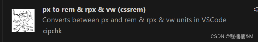
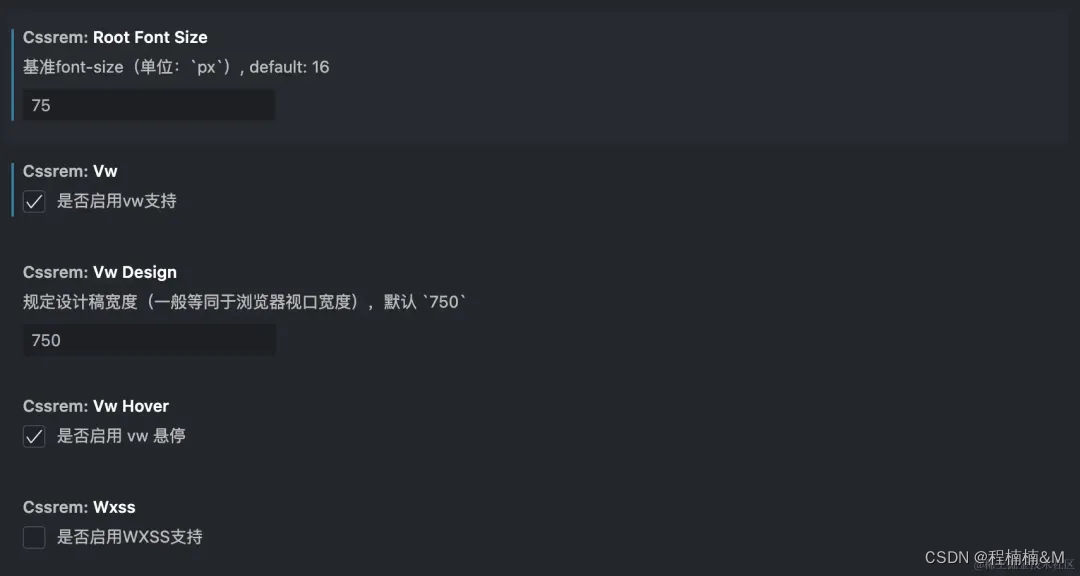
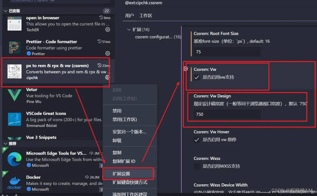
px to vw 插件,在编写时自动转化:
- 手动换算
-
postcss-px-to-viewport的优缺点
- 优点:
- 实现简单:只需要通过安装插件和配置即可快速实现 px 转换为 vw 或 vh 单位。
- 提高开发效率:使用自适应布局,可以减少对不同屏幕尺寸的适配工作,提高开发效率。
- 适配性强:可以自适应不同设备和屏幕尺寸,适配性强,可以适应各种移动端设备的屏幕尺寸。
- 缺点:
- 不适用于字体大小:由于 vw 和 vh 单位不适用于字体大小,因此需要单独设置字体大小的转换方式。 兼容性问题:一些老版本的浏览器不支持
- vw 和 vh 单位,需要使用兼容性处理或回退方案。 无法把行内样式中的 px 转换成视口单位(vw, vh, vmin, vmax)
- 无法精确 控制样式:由于浏览器的视口宽度和高度不同,转换后的样式可能会有一定的误差,无法精确控制样式
vant的引入
# Vue 3 项目,安装最新版 Vant
npm i vant

# Vue 2 项目,安装 Vant 2
npm i vant@latest-v2
- 1
- 2
- 3
- 4
- 5
- 配置支持适配 build\vite\plugin\imagemin.ts文件配置
import { createStyleImportPlugin, VantResolve } from 'vite-plugin-style-import';
  const styleImportPlugin = createStyleImportPlugin({
      {
        libraryName: 'vant',
        esModule: true,
        resolveStyle: (name) => {
          if (name == 'show-toast') {
            return `../es/toast/style/index`; //修改vant show-toast引入路径
          } else if (name == 'show-confirm-dialog') {
            return `../es/dialog/style/index`; //修改vant show-toast引入路径
          } else {
            return `../es/${name}/style`; //修改vant引入路径
          }
        },
      },
    ],
    resolves: [VantResolve()],
  });
- 1
- 2
- 3
- 4
- 5
- 6
- 7
- 8
- 9
- 10
- 11
- 12
- 13
- 14
- 15
- 16
- 17
- 18
- 配置支持适配 build\vite\plugin\imagemin.ts文件配置
import pxtovw from 'postcss-px-to-viewport';

const loader_pxtovw = pxtovw({
  unitToConvert: 'px', // 要转化的单位
  viewportWidth: 750, // UI设计稿的宽度
  unitPrecision: 6, // 转换后的精度,即小数点位数
  propList: ['*'], // 指定转换的css属性的单位,*代表全部css属性的单位都进行转换
  viewportUnit: 'vw', // 指定需要转换成的视窗单位,默认vw
  fontViewportUnit: 'vw', // 指定字体需要转换成的视窗单位,默认vw
  selectorBlackList: ['ignore-'], // 指定不转换为视窗单位的类名,
  minPixelValue: 1, // 默认值1,小于或等于1px则不进行转换
  mediaQuery: true, // 是否在媒体查询的css代码中也进行转换,默认false
  replace: true, // 是否转换后直接更换属性值
  exclude: [
    /node_modules/,
    /sys/,
    /layouts/,
    /Application/,
    /approvalProcess/,
    /Authority/,
    /AvatarPreview/,
    /Basic/,
    /Button/,
    /CardList/,
    /ClickOutSide/,
    /CodeEditor/,
    /Container/,
    /ContextMenu/,
    /CountDown/,
    /CountTo/,
    /Cropper/,
    /CustomerModal/,
    /CustomRecorder/,
    /CustomTinymce/,
    /Drawer/,
    /Dropdown/,
    /Excel/,
    /FlowChart/,
    /Form/,
    /Icon/,
    /JVxeTable/,
    /Loading/,
    /Markdown/,
    /Menu/,
    /Modal/,
    /Page/,
    /Poi/,
    /Preview/,
    /Qrcode/,
    /Scrollbar/,
    /Signature/,
    /SimpleMenu/,
    /StrengthMeter/,
    /Table/,
    /Time/,
    /Tinymce/,
    /Transition/,
    /Tree/,
    /Upload/,
    /Verify/,
    /VirtualScroll/,
    /VxeTable/,
    /Verify/,
    /design/,
    /directives/,
    /enums/,
    /hooks/,
    /basic/,
    /business/,
    /dashboard/,
    /demo/,
    /devOperation/,
    /ecommerce/,
    /form-design/,
    /lamp/,
    /medical/,
    /medical-Group/,
    /medical-Shop/,
    /shop/,
    /supplyChain/,
    /index.html/,
  ], // 设置忽略文件,用正则做目录名匹配
  include: [/vant/, /pda/], // 如果设置了include,那将只有匹配到的文件才会被转换
  landscape: false, // 是否处理横屏情况
});
css: {
    postcss: {
      plugins: [loader_pxtovw],
    },
    preprocessorOptions: {
      less: {
        modifyVars: generateModifyVars(),
        javascriptEnabled: true,
      },
    },
  },
- 1
- 2
- 3
- 4
- 5
- 6
- 7
- 8
- 9
- 10
- 11
- 12
- 13
- 14
- 15
- 16
- 17
- 18
- 19
- 20
- 21
- 22
- 23
- 24
- 25
- 26
- 27
- 28
- 29
- 30
- 31
- 32
- 33
- 34
- 35
- 36
- 37
- 38
- 39
- 40
- 41
- 42
- 43
- 44
- 45
- 46
- 47
- 48
- 49
- 50
- 51
- 52
- 53
- 54
- 55
- 56
- 57
- 58
- 59
- 60
- 61
- 62
- 63
- 64
- 65
- 66
- 67
- 68
- 69
- 70
- 71
- 72
- 73
- 74
- 75
- 76
- 77
- 78
- 79
- 80
- 81
- 82
- 83
- 84
- 85
- 86
- 87
- 88
- 89
- 90
- 91
- 92
- 93
- 94
- 95
- 96
由于是web端ui组件和vantUI组件兼容所有设置的 exclude和include
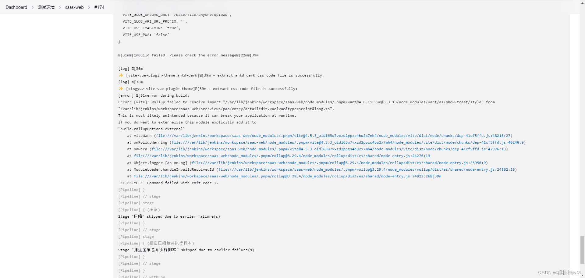
开发以及打包过程中遇到的问题
打包报如下图展示
解决方法:
 if (name == 'show-toast') {
   return `../es/toast/style/index`; //修改vant show-toast引入路径
 } else if (name == 'show-confirm-dialog') {
    return `../es/dialog/style/index`; //修改vant show-toast引入路径
  } else {
    return `../es/${name}/style`; //修改vant引入路径
  }
- 1
- 2
- 3
- 4
- 5
- 6
- 7
引入样式报错
import 'vant/lib/index.css';
- 1