
热门标签
热门文章
- 1AI人工智能在2020年的7个发展趋势_aiscratch手机自动化功能的市场趋势
- 2Java 性能优化实战工具实践:如何获取代码性能数据?_代码的性能报告除了在代码中插入性能监测代码获取,还可以怎么获取
- 3速通老韩LINUX_centos 7查询chkconfig里面的服务路径
- 4ubuntu 14.04 安装与软件重装说明_ubuntu14.04
- 550万年薪大数据大佬学习总结之MySQL数据库学习
- 6OpenCV-高斯滤波cv::GaussianBlur
- 7《Google SRE工作手册》系列读书分享之 美图SRE团队的「稳定性运营」实践篇三(视频+文字版)
- 8WPF MVVM框架:CommunityToolkit.Mvvm包使用介绍
- 9Linux云计算运维工程师day02_云计算linux运维工程师
- 10第3章——深度学习入门(鱼书)_深度学习鱼书
当前位置: article > 正文
css 优惠券样式大全_css优惠券样式
作者:神奇cpp | 2024-08-09 01:54:18
赞
踩
css优惠券样式
优惠券一
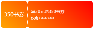
- // 优惠券一
- <div class="card">
- <div class="card-left">350书券</div>
- <div class="card-right">
- <p class="card-info">满30元送350书券</p>
- <strong class="card-time">仅剩 04:48:49</strong>
- </div>
- </div>
-
-
- <style>
- .card{
- display: flex;
- align-items: center;
- width: 16%;
- padding: 10px 0;
- background: #fff;
- border-radius: 8px;
- -webkit-mask-image: radial-gradient(circle at 88px 4px, transparent 4px, red 4.5px),radial-gradient(closest-side circle at 50%, red 99%, transparent 100%);
- -webkit-mask-size: 100%, 2px 4px;
- -webkit-mask-repeat: repeat, repeat-y;
- -webkit-mask-position: 0 -4px, 87px;
- -webkit-mask-composite: source-out;
- mask-composite: subtract;
- background: linear-gradient(45deg, orange, red);
- }
- .card-left{
- width: 88px;
- text-align: center;
- font-size: 18px;
- color: #fff;
- }
- .card-right{
- padding: 16px 12px;
- display: flex;
- flex: 1;
- flex-direction: column;
- }
- .card-info{
- margin: 0;
- font-size: 14px;
- line-height: 20px;
- color:#fff;
- }
- .card-time{
- font-size: 12px;
- line-height: 16px;
- font-weight: normal;
- color: #fff;
- margin-top: 4px;
- }
- </style>
优惠券二
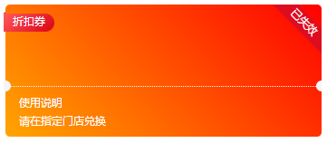
- // 优惠券二
- <div class="item">
- <div class="box">
- <div class="content">
- <div class="page-group">
- <i class="fold-page"></i>
- <span class="page">折扣券</span>
- </div>
- <i class="dot-left"></i>
- <i class="dot-right"></i>
- </div>
- <div class="footer">
- <div class="footer-label">使用说明</div>
- <div>请在指定门店兑换</div>
- </div>
- <div class="ribbon">已失效</div>
- </div>
- </div>
-
- <style>
- .item {
- width: 349px;
- overflow: hidden;
- margin-bottom: 10px;
- padding-left: 2px;
- position: relative;
- }
- .box {
- background: #fff;
- border-radius: 5px;
- background: linear-gradient(45deg, orange, red);
- }
- .item .dot-left,.item .dot-right {
- display: block;
- width: 12px;
- height: 12px;
- border-radius: 50%;
- background: #f5f5f5;
- position: absolute;
- z-index: 999;
- }
- .item .dot-left {
- bottom: -6px;
- left: -6px;
- }
- .item .dot-right {
- bottom: -6px;
- right: -6px;
- }
- .item .page-group {
- position: absolute;
- top: 10px;
- left: -2px;
- width: 100%;
- max-width: 120px;
- }
- .item .page-group .fold-page {
- display: block;
- width: 2px;
- height: 5px;
- background: #db0113;
- transform: skewY(-40deg);
- position: absolute;
- top: -1px;
- left: 0;
- z-index: 0;
- }
- .item .page-group .page {
- position: absolute;
- z-index: 1;
- display: block;
- padding: 0 10px;
- height: 20px;
- background: linear-gradient(137deg, #ff5b5b 0%, #db0113 100%);
- border-radius: 0 20px 20px 0;
- color: #fff;
- text-align: center;
- font-size: 12px;
- overflow: hidden;
- }
- .item .content {
- width: 100%;
- height: 90px;
- border-bottom: 1px dotted #f5f5f5;
- position: relative;
- z-index: 2;
- }
- .item .footer {
- color: #fff;
- font-size: 12px;
- padding: 5px 15px 10px 15px;
- }
- .footer-label {
- line-height: 24px;
- }
- .item .ribbon {
- width: 80px;
- height: 20px;
- background: #dd0d1f;
- position: absolute;
- right: -20px;
- top: 10px;
- transform: rotateZ(45deg);
- text-align: center;
- color: #fff;
- font-size: 12px;
- }
- </style>
优惠券三

- // 优惠券三
- <div class="content"></div>
-
- .content {
- width: 300px;
- height: 150px;
- margin: auto;
- -webkit-mask: radial-gradient(circle at 10px, transparent 10px, red 0) -10px / 100% 30px;
- background: linear-gradient(45deg, orange, red);
- }
优惠券四

- // 优惠券四
- <div class="content"></div>
-
- .content {
- width: 300px;
- height: 130px;
- margin: auto;
- -webkit-mask: radial-gradient( circle at 50%, red 5px, transparent 0) 50% 50% / 100% 20px, radial-gradient(circle at 20px 20px, transparent 20px, red 0) -20px -20px / 50%;
- -webkit-mask-composite: destination-out;
- background: linear-gradient(45deg, orange, red);
- }
优惠券五

- // 优惠券五
- <div class="content"></div>
-
- .content {
- width: 300px;
- height: 130px;
- margin: auto;
- -webkit-mask: radial-gradient( circle at 5px, red 5px, transparent 0) -5px 50% / 100% 20px, radial-gradient(circle at 20px 20px, transparent 20px, red 0) -20px -20px / 50%;
- -webkit-mask-composite: destination-out;
- background: linear-gradient(45deg, orange, red);
- }
优惠券六

- // 优惠券六
- <div class="content"></div>
-
- .content {
- width: 300px;
- height: 150px;
- margin: auto;
- -webkit-mask: radial-gradient(circle at 20px 20px, transparent 20px, red 0) -20px -20px / 50%;
- background: linear-gradient(45deg, orange, red);
- }
优惠券七

- // 优惠券七
- <div class="content"></div>
-
- .content {
- width: 300px;
- height: 130px;
- margin: auto;
- -webkit-mask: radial-gradient(circle at 20px, transparent 20px, red 0) -20px;
- background: linear-gradient(45deg, orange, red);
- }
延伸:css 常见图形 (心形、五角星、梯形、椭圆形、钻石形、蛋形、八卦、圆锥形、月亮形)
https://wangxinyan.blog.csdn.net/article/details/126762028?spm=1001.2014.3001.5502
推荐阅读

相关标签

