
- 1基于FreeRTOS的ESP32环境监测系统:利用Arduino框架实现SD卡数据记录与FTP服务器集成(一)_arduino esp32 ftp服务器
- 2linux中查看是否运行sshd,linux – 如何检查sshd是否在远程机器上运行
- 3git中将分支代码合并到master_将分支合并到master
- 4【C语言】全面解析冒泡排序
- 5BLE跳频算法_channel selection algorithm #2
- 6网络安全工程师需要学什么?零基础怎么从入门到精通,看这一篇就够了
- 7CompressImage、Image传输时出现size=0的情况!_acdbrasterimage imagesize为0
- 8Git 如何获取执行tag的代码_git如何根据tags拉代码
- 9提高软件测试团队能力和个人能力之浅见
- 10vitest 单元测试应用与配置_vitest配置
自定义适配单选和多选情况的RadioButton和RadioGroup_安卓开发利用radio button实现单选
赞
踩
一、效果展示
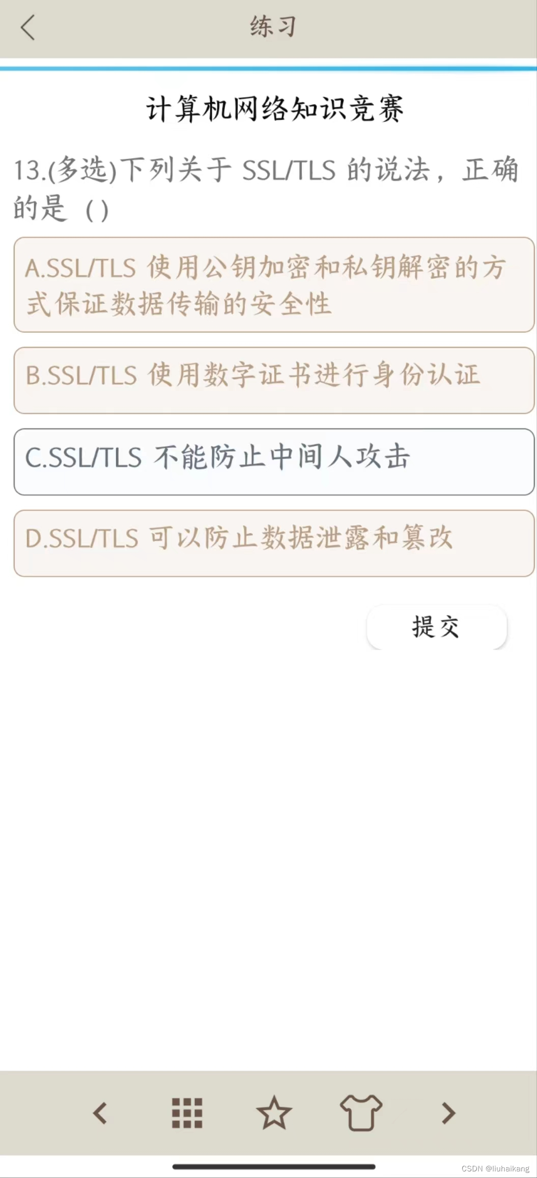
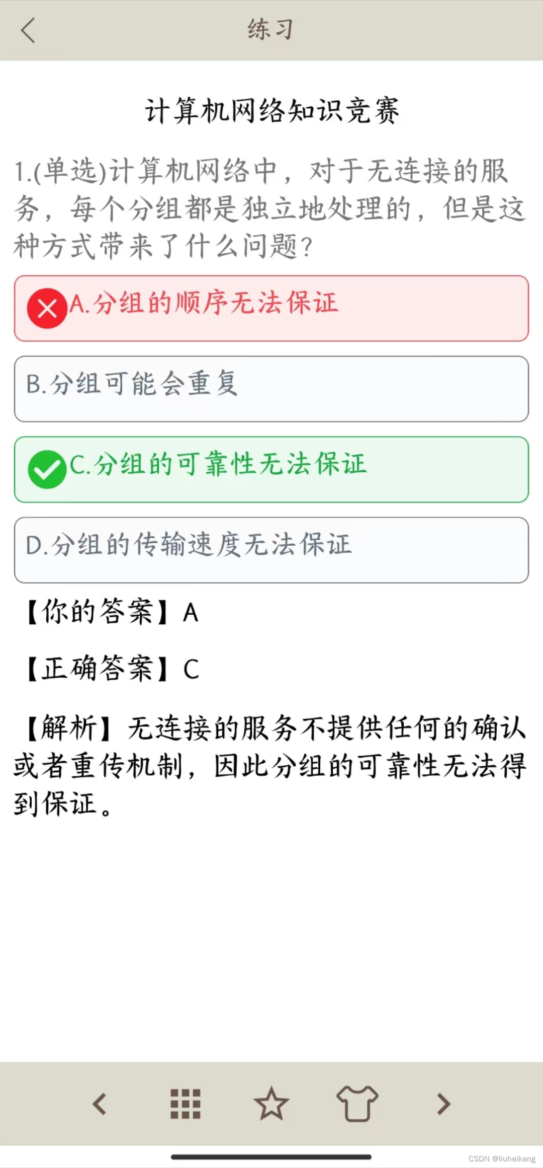
在 Android 应用程序开发中,按钮是常见的 UI 元素。虽然 Android 提供了各种默认的按钮样式,但有时您可能需要自定义按钮以满足特定的设计需求。为此,我创建了一个自定义 RadioButton 类 CustomRadioButton,它继承自 AndroidX 中的 AppCompatTextView,实现单选题和多选题的效果,如上图所示。
在左侧的多选题中,如果选择了ABD三个选项但未提交,选中的文字、背景和边框会呈现棕色,未选中的则会呈现灰色。
右侧的单选题中,如果选择了A选项但正确答案是C选项,你会看到正确选项和错误选项有不同的效果。正确选项会显示一个绿色的勾,而错误选项则会显示一个红色的叉,它们的文字、背景和边框颜色也是有区别的。
以下是在xml中使用的代码:
- <com.noblel.baselibrary.view.CustomRadioButtonGroup
- android:id="@+id/rgOptions"
- android:layout_width="match_parent"
- android:layout_height="wrap_content"
- android:layout_marginLeft="10dp"
- android:layout_marginRight="10dp"
- android:orientation="vertical">
- <com.noblel.baselibrary.view.CustomRadioButton
- android:id="@+id/cb_choice1"
- android:padding="8dp"
- android:layout_width="match_parent"
- android:minHeight="48dp"
- android:layout_height="wrap_content"/>
- <com.noblel.baselibrary.view.CustomRadioButton
- android:id="@+id/cb_choice2"
- android:layout_marginTop="10dp"
- android:padding="8dp"
- android:layout_width="match_parent"
- android:minHeight="48dp"
- android:layout_height="wrap_content"/>
- <com.noblel.baselibrary.view.CustomRadioButton
- android:id="@+id/cb_choice3"
- android:layout_marginTop="10dp"
- android:padding="8dp"
- android:layout_width="match_parent"
- android:minHeight="48dp"
- android:layout_height="wrap_content"/>
- <com.noblel.baselibrary.view.CustomRadioButton
- android:id="@+id/cb_choice4"
- android:layout_marginTop="10dp"
- android:padding="8dp"
- android:layout_width="match_parent"
- android:minHeight="48dp"
- android:layout_height="wrap_content"/>
- </com.noblel.baselibrary.view.CustomRadioButtonGroup>

那么,应该如何实现这种效果呢?
二、CustomRadioButton 实现
CustomRadioButton 中包含了多种状态,如普通状态、选中状态、正确状态和错误状态。它还包含了 isChecked 和 isCorrect 属性来标记当前是否选中和是否为正确答案。以下是 CustomRadioButton 类的代码:
- public class CustomRadioButton extends androidx.appcompat.widget.AppCompatTextView {
- //当前状态
- private State mState;
- //普通状态
- NormalState normalState;
- //选中状态
- CheckedState checkedState;
- //正确状态
- CorrectState correctState;
- //错误状态
- WrongState wrongState;
- //是否选中
- private boolean isChecked = false;
- //是否正确
- private boolean isCorrect = false;
-
- public CustomRadioButton(Context context) {
- super(context);
- init(context);
- }
-
- public CustomRadioButton(Context context, AttributeSet attrs) {
- super(context, attrs);
- init(context, attrs);
- }
-
- public CustomRadioButton(Context context, AttributeSet attrs, int defStyle) {
- super(context, attrs, defStyle);
- init(context, attrs);
- }
-
- // 设置状态方法
- private void setState(State state, TypedArray styleAttrs) {
- mState = state;
- mState.applyStyle(this);
- mState.setMargin(this, styleAttrs);
- mState.setPadding(this, styleAttrs);
- }
-
- @Override
- public void setText(CharSequence text, BufferType type) {
- // 调用父类方法设置文字
- super.setText(text, type);
- // 如果状态对象不为空,则应用状态样式
- if (mState != null) {
- mState.applyStyle(this);
- }
- }
-
- private void setState(State state) {
- mState = state;
- mState.applyStyle(this);
- }
-
- private void init(Context context, AttributeSet attrs) {
- TypedArray styleAttrs = context.obtainStyledAttributes(attrs, R.styleable.CustomRadioButton);
- try {
- //普通样式
- normalState = new NormalState(context, styleAttrs);
- //选中样式
- checkedState = new CheckedState(context, styleAttrs);
- //正确样式
- correctState = new CorrectState(context, styleAttrs);
- //错误样式
- wrongState = new WrongState(context, styleAttrs);
- setState(normalState, styleAttrs);
- } finally {
- styleAttrs.recycle();
- }
- }
-
- private void init(Context context) {
- normalState = new NormalState(context);
- checkedState = new CheckedState(context);
- correctState = new CorrectState(context);
- wrongState = new WrongState(context);
- setState(normalState);
-
- }
-
- void setTextSize(int size) {
- // 设置文字大小
- setTextSize(TypedValue.COMPLEX_UNIT_PX, size);
- }
-
- void setIcon(Drawable drawable) {
- // 设置左侧图标
- setCompoundDrawablesWithIntrinsicBounds(drawable, null, null, null);
- }
-
- public boolean isChecked() {
- return isChecked;
- }
-
- public void setChecked(boolean doCheckOrNot) {
- isChecked = doCheckOrNot;
- // 更新当前选中的选项
- //还可以点击
- if (isEnabled()) {
- if (isChecked) {
- setState(checkedState);
- } else {
- setState(normalState);
- }
- }
- }
-
- public boolean isCorrect() {
- return isCorrect;
- }
-
- public void setCorrect(boolean correct) {
- isCorrect = correct;
- }
-
- public void setAfterSubmit() {
- if (isCorrect) {
- setState(correctState);
- } else {
- if (isChecked) {
- setState(wrongState);
- } else {
- setState(normalState);
- }
- }
- }
- }
CustomRadioButton是一个自定义的RadioButton,继承自AppCompatTextView,通过设置不同的状态,可以实现不同的按钮样式。
其中,CustomRadioButton包含四种状态:NormalState(普通状态)、CheckedState(选中状态)、CorrectState(正确状态)和WrongState(错误状态),分别表示四种不同的按钮状态。
在CustomRadioButton中,定义了以下方法:
- setState(State state):设置CustomRadioButton的状态,参数为State类型,表示要设置的状态。
- setTextSize(int size):设置CustomRadioButton的文本大小。
- setIcon(Drawable drawable):设置CustomRadioButton的左侧图标。
- isChecked():获取CustomRadioButton是否被选中。
- setChecked(boolean doCheckOrNot):设置CustomRadioButton是否被选中,参数为boolean类型,表示是否被选中。
- isCorrect():获取CustomRadioButton是否为正确选项。
- setCorrect(boolean correct):设置CustomRadioButton是否为正确选项,参数为boolean类型,表示是否为正确选项。
- setAfterSubmit():设置CustomRadioButton的状态,表示用户提交答案后的状态。
CustomRadioButton使用了状态模式来管理不同状态下的样式。
状态模式是一种行为型设计模式,它允许对象在内部状态改变时改变其行为。状态模式将状态封装到单独的类中,并将对象的行为委托给当前状态的对象。
在CustomRadioButton中,状态对象被封装到不同的类中,包括NormalState、CheckedState、CorrectState和WrongState。每个状态都继承了State父类,它包含了在状态改变时需要执行的操作。
当CustomRadioButton被创建时,它会初始化所有状态,并将初始状态设置为NormalState。当CustomRadioButton的状态发生变化时,它会调用setState方法来设置新的状态。在setState方法中,CustomRadioButton会将新状态应用于当前View,并更新视图的外观和行为。
通过使用状态模式,CustomRadioButton能够更好地管理不同状态下的样式,并且能够更加灵活地处理状态变化,使得代码更加简洁和易于维护。
三、RadioButtonGroup实现
这是自定义的 RadioButtonGroup 类,可以和 CustomRadioButton 配合使用,实现单选或多选功能。该类继承自 LinearLayout,可以在布局中直接使用。该类主要包含以下成员变量和方法:
- public class CustomRadioButtonGroup extends LinearLayout {
- private OnCheckedChangeListener mCheckedChangeListener;
- //选中了哪些按钮
- private List<CustomRadioButton> mSelectedRadioButtonList;
- //是否为单选
- private boolean singleChoose = false;
-
- public boolean isSingleChoose() {
- return singleChoose;
- }
-
- public void setSingleChoose(boolean singleChoose) {
- this.singleChoose = singleChoose;
- }
-
- // 设置选中状态变化的监听器
- public void setOnCheckedChangeListener(OnCheckedChangeListener listener) {
- mCheckedChangeListener = listener;
- }
-
- // 定义一个选中状态变化的监听器接口
- public interface OnCheckedChangeListener {
- void onCheckedChanged(CustomRadioButtonGroup group, int checkedId);
- }
-
- private void init() {
-
- }
-
- @Override
- protected void onFinishInflate() {
- super.onFinishInflate();
-
- // 使用 Handler 添加一个延时任务
- new Handler().postDelayed(new Runnable() {
- @Override
- public void run() {
- // 在延时任务中获取子视图的数量
- // 这里可以对子视图进行操作,例如获取子视图的属性或者进行其他逻辑处理
- // ...
- int count = getChildCount();
- for (int i = 0; i < count; i++) {
- View child = getChildAt(i);
- if (child instanceof CustomRadioButton) {
- final CustomRadioButton radioButton = (CustomRadioButton) child;
- radioButton.setOnClickListener(new OnClickListener() {
- @Override
- public void onClick(View view) {
- selectRadioButton(radioButton);
- }
- });
- }
- }
- }
- }, 150); // 这里的延时时间可以根据实际情况进行调整,单位为毫秒
- }
-
- /**
- * 设置按钮的点击事件
- *
- * @param radioButton 按钮
- */
- private void selectRadioButton(CustomRadioButton radioButton) {
- //判断是否已经选中
- boolean checked = radioButton.isChecked();
-
- if (singleChoose) {
- // 如果是单选模式,先清除之前选中的按钮
- clearSelectedRadioButtons();
- }
-
- //设置选中或者未选中状态转变
- radioButton.setChecked(!checked);
-
- //选中按钮list集合
- if (mSelectedRadioButtonList == null) {
- mSelectedRadioButtonList = new ArrayList<>();
- }
-
- //如何当前按钮是选中了
- if (radioButton.isChecked()) {
- //将当前按钮添加到list集合
- if (!mSelectedRadioButtonList.contains(radioButton)) {
- mSelectedRadioButtonList.add(radioButton);
- }
- } else {
- //从list集合中移除按钮
- mSelectedRadioButtonList.remove(radioButton);
- }
-
- //通知点击状态已经改变
- if (mCheckedChangeListener != null) {
- mCheckedChangeListener.onCheckedChanged(this, radioButton.getId());
- }
- }
-
- private void clearSelectedRadioButtons() {
- if (mSelectedRadioButtonList != null) {
- for (CustomRadioButton radioButton : mSelectedRadioButtonList) {
- radioButton.setChecked(false);
- }
- mSelectedRadioButtonList.clear();
- }
- }
-
- //获取选择的button
- public List<CustomRadioButton> getSelectedIndex() {
- List<CustomRadioButton> selectedCheckBoxes = new ArrayList<>();
- if (mSelectedRadioButtonList != null) {
- for (CustomRadioButton cb : mSelectedRadioButtonList) {
- if (cb.isChecked()) {
- selectedCheckBoxes.add(cb);
- cb.setChecked(true);
- }
- }
- }
- return selectedCheckBoxes;
- }
-
- public void setShowAnswer() {
- int count = getChildCount();
- for (int i = 0; i < count; i++) {
- View child = getChildAt(i);
- if (child instanceof CustomRadioButton) {
- final CustomRadioButton radioButton = (CustomRadioButton) child;
- radioButton.setEnabled(false);
- radioButton.setAfterSubmit();
- }
- }
- }
-
- public CustomRadioButtonGroup(Context context) {
- super(context);
- init();
- }
-
- public CustomRadioButtonGroup(Context context, AttributeSet attrs) {
- super(context, attrs);
- init();
- }
-
- public CustomRadioButtonGroup(Context context, AttributeSet attrs, int defStyle) {
- super(context, attrs, defStyle);
- init();
- }
-
- }
RadioButtonGroup 是一种自定义的 View 组,可以用于组合多个 CustomRadioButton 控件,从而实现单选或多选的功能。其主要作用是方便用户在一组选项中进行选择,使得用户可以在多个选项中选择一个或多个,从而满足用户不同的需求,提升用户体验。同时,通过在 RadioButtonGroup 中设置 OnCheckedChangeListener 接口,可以监听 RadioButton 的选中状态变化,从而实现相应的逻辑操作。
完整代码见:https://gitee.com/liuhaikang/custom-radio-button.git
使用的位置在:
- question/app/src/main/java/com/lidan/xiao/danquestion/activity/QuestionActivity.java
- question/app/src/main/res/layout/queitem.xml
定义的位置在:
- question/baselibrary/src/main/java/com/noblel/baselibrary/view/CustomRadioButton.java
- question/baselibrary/src/main/java/com/noblel/baselibrary/view/CustomRadioButtonGroup.java
直接按关键字全局搜索一下就能找到。
最后,对此篇文章有任何疑问欢迎在评论区提出。


