
- 1在rhel8中配置文件权限_(1)新建个文件/var/tmp/hosts并按要求配置/var/tmp/hosts 的权限有以下各
- 2梯度爆炸解决办法——梯度截断--clip-norm 0.0_clip norm
- 3jieba模块中文分词应用场景案例
- 4搭建正版GPT4.0!不用ChatGPT账号,不要API!_gpt4.0免费版本
- 5网络安全和黑客技能:15本必读书籍推荐_黑客学习的书籍阅读顺序
- 6React 掌握及对比常用的8个Hooks,优化及使用场景
- 7【独家源码】ssm高校实验室设备预约小程序xj63a应对计算机毕业设计困难的解决方案_实验室预约小程序缺陷
- 8flutter 指令_flutter create application
- 9【一步步开发AI运动小程序】十、姿态动作相似度比较_微信小程序实现ai跳绳开发
- 10ssm+jsp计算机毕业设计在线投票系统的设计与实现q8sw3(程序+lw+源码+远程部署)
WPF-基础及进阶扩展合集(持续更新)_wpf 中文扩展
赞
踩
目录
一、基础
了解更多控件介绍请点击:官方文档查询
1、GridSplitter分割线
将分割线加入Grid某行或某列,用户即可通过拖拽改变行或列的尺寸。
垂直拖拽,示例:
- <Grid>
- <Grid.RowDefinitions>
- <RowDefinition Height="*" />
- <RowDefinition Height="3" />
- <RowDefinition Height="*" />
- </Grid.RowDefinitions>
- <hc:TextBox Background="LightGray" />
- <GridSplitter Grid.Row="1" HorizontalAlignment="Stretch" />
- <hc:TextBox Grid.Row="2" Background="LightBlue" />
- </Grid>
水平拖拽 ,示例:
- <Grid>
- <Grid.ColumnDefinitions>
- <ColumnDefinition Width="*"/>
- <ColumnDefinition Width="3"/>
- <ColumnDefinition Width="*"/>
- </Grid.ColumnDefinitions>
- <hc:TextBox Background="LightGray" />
- <GridSplitter Grid.Column="1" HorizontalAlignment="Stretch" />
- <hc:TextBox Grid.Column="2" Background="LightBlue" />
- </Grid>
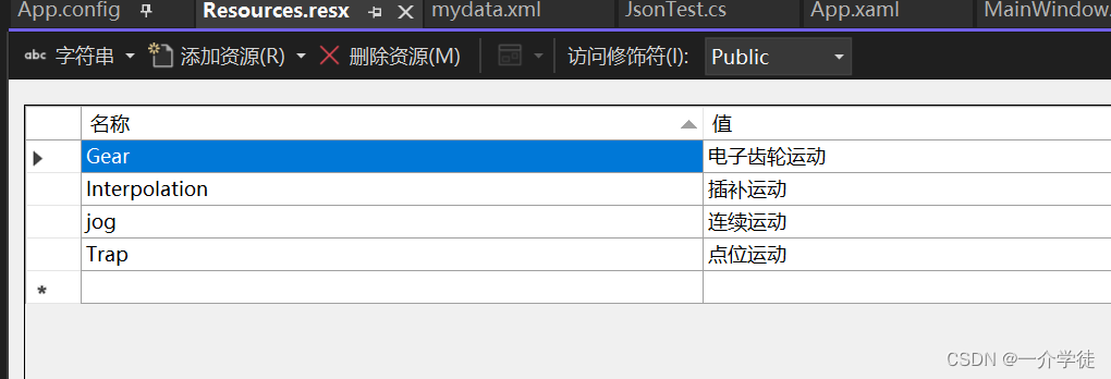
2、x:static访问资源文件
注意:资源文件访问权限须更改为Public
- <TextBlock x:Name="tBk"
- Height="50"
- Background="LemonChiffon"
- Text="{x:Static prop:Resources.Gear}" />
3、wpf触发器
三类型: 属性触发器、数据触发器、事件触发器
使用场景:
样式:Style.Triggers
数据模板:DataTemplate.Triggers
控件模板:ControlTemplate.Triggers
元素中定义触发器:FrameworkElement.Triggers //仅支持事件触发器,否则报错
- <Style TargetType="Button">
- <Setter Property="Background" Value="Gray" />
- <Setter Property="Template">
- <Setter.Value>
- <ControlTemplate TargetType="Button">
- <Border Background="{TemplateBinding Background}"
- BorderBrush="Black"
- BorderThickness="1">
- <ContentPresenter HorizontalAlignment="Center" VerticalAlignment="Center" />
- </Border>
- <ControlTemplate.Triggers>
- <Trigger Property="IsMouseOver" Value="true">
- <Setter Property="Background" Value="LightGreen" />
- </Trigger>
- </ControlTemplate.Triggers>
- </ControlTemplate>
- </Setter.Value>
- </Setter>
- </Style>

4、添加xaml资源文件
pack://application:,,, 可省略
- <Application.Resources>
- <ResourceDictionary>
- <ResourceDictionary.MergedDictionaries>
- <ResourceDictionary Source="pack://application:,,,/HandyControl;component/Themes/SkinDefault.xaml" />
- <ResourceDictionary Source="pack://application:,,,/HandyControl;component/Themes/Theme.xaml" />
- </ResourceDictionary.MergedDictionaries>
- </ResourceDictionary>
- </Application.Resources>
5、Convert转换器
①继承IValueConverter接口(Convert方向为Source->Target,ConvertBack反向)实现一个转换器,示例如下:
- public class BoolToColorConvert : IValueConverter
- {
- public object Convert(object value, Type targetType, object parameter, CultureInfo culture)
- {
- if (value is true) return Brushes.LightBlue;
- else return Brushes.LightGreen;
- }
-
- public object ConvertBack(object value, Type targetType, object parameter, CultureInfo culture)
- {
- throw new NotImplementedException();
- }
- }
②新建一个转换器资源对象,与Binding绑定,如下:
- <Grid.Resources>
- <convert:BoolToColorConvert x:Key="myconv"/>
- </Grid.Resources>
- <TextBox Background="{Binding IsCheck,Converter={StaticResource myconv}}" Text="{Binding IsCheck}" />
6、多路绑定与多路转换器
注意:MultiBinding必须实现转换器
实现IMultiValueConverter接口的多路转换器,示例如下:
- public class MultiConvert : IMultiValueConverter
- {
- public object Convert(object[] values, Type targetType, object parameter, CultureInfo culture)
- {
- var high = values[0].ToString();
- if (values[1] is true)
- return $"{high} true";
- else return $"{high} false";
- }
-
- public object[] ConvertBack(object value, Type[] targetTypes, object parameter, CultureInfo culture)
- {
- throw new NotImplementedException();
- }
- }
- <Grid.Resources>
- <convert:MultiConvert x:Key="mconv" />
- </Grid.Resources>
- <hc:TextBox>
- <hc:TextBox.Text>
- <MultiBinding Converter="{StaticResource mconv}">
- <Binding ElementName="tbox" Path="Width" />
- <Binding Path="IsCheck" />
- </MultiBinding>
- </hc:TextBox.Text>
- </hc:TextBox>
二、进阶扩展
1、HierarchicalDataTemplate
HierarchicalDataTemplate:助层级控件(TreeView、MenuItem)显示层级数据模板
注意:若结点为同类型(同节点名、同属性名),使用一个Template就行,会自动迭代;
可通过路由事件方式取出XML数据;
- <Window.Resources>
- <XmlDataProvider x:Key="xdp" XPath="School">
- <x:XData>
- <School xmlns="" Name="魔法学院">
- <Grade Name="一年级">
- <Class Name="一班" />
- <Class Name="二班" />
- </Grade>
- <Grade Name="二年级">
- <Class Name="一班" />
- <Class Name="二班" />
- </Grade>
- </School>
- </x:XData>
- </XmlDataProvider>
- <HierarchicalDataTemplate DataType="School" ItemsSource="{Binding XPath=Grade}">
- <TextBlock Text="{Binding XPath=@Name}" />
- </HierarchicalDataTemplate>
- <HierarchicalDataTemplate DataType="Grade" ItemsSource="{Binding XPath=Class}">
- <RadioButton Content="{Binding XPath=@Name}" GroupName="gp" />
- </HierarchicalDataTemplate>
- <HierarchicalDataTemplate DataType="Class">
- <CheckBox Content="{Binding XPath=@Name}" IsThreeState="True" />
- </HierarchicalDataTemplate>
- </Window.Resources>
2、XmlDataProvider从外部文件获取源
代码如下:
- <Grid.Resources>
- <XmlDataProvider x:Key="xmldata"
- Source="Xml/mydata.xml"
- XPath="ArrayOfJsonTest" />
- </Grid.Resources>
- <ListBox Height="80"
- d:ItemsSource="{d:SampleData ItemCount=3}"
- Background="LightYellow"
- BorderBrush="DarkOrange"
- BorderThickness="3"
- ItemsSource="{Binding Source={StaticResource xmldata}, XPath=JsonTest}">
- <ListBox.ItemTemplate>
- <DataTemplate>
- <Border BorderBrush="DarkOrchid" BorderThickness="3">
- <StackPanel Width="200"
- Height="30"
- Orientation="Horizontal">
- <TextBlock Width="NaN"
- Margin="5"
- Text="{Binding XPath=Name}" />
- <TextBlock Width="NaN"
- Margin="5"
- Text="{Binding XPath=Value}" />
- <TextBlock Width="NaN"
- Margin="5"
- Text="{Binding XPath=Id}" />
- </StackPanel>
- </Border>
- </DataTemplate>
- </ListBox.ItemTemplate>
- </ListBox>
3、TextBox在CellTemplate中的焦点问题
当使用GridView作为ListView的View属性时,若某一列使用TextBox作为CellTemplate,那么TextBox获取焦点时目标控件并不会把该项作为SelectedItem
解决方式:通过TextBox的GotFocus事件的事件处理器去追溯到目标控件,获取业务逻辑数据,并将其设置为选中项;
/*********访问业务逻辑数据***************/
TextBox tb=e.OriginalSource as TextBox;//获取事件发起的源头
ContentPresenter cp=tb.TemplateParent as ContentPresenter;//获取模板目标
Student stu=cp.Content as Student;//获取业务逻辑数据
this.listViewStudent.SelectedItem=stu;//设置ListView的选中项
/****************访问界面元素*************************/
ListViewItem lvi=this.listViewStudent.
itemContainerGenerator.ContainerFromItem(stu) as ListViewItem;//通过条目容器自上而下寻找
CheckBox chb=this.FindVisualChild<CheckBox>(lvi);//借助VisualTreeHelper封装的方法
MessageBox.Show(chb.Name);
注意:寻找DataTemplate生成的控件,若结构简单可使用DataTemplate对象的FindName方法,对于结构复杂的控件,只能借助VisualTreeHelper来实现了。
4、让窗体可裁减
前提:窗体AllowsTransparency属性设为true
WindowStyle属性设为None
再使用Clip方法裁剪,指定一个裁剪路径
5、ScrollViewer自动滚动到尾部
通过ScrollChanged路由事件实现该功能:
- private void ScrollViewer_ScrollChanged(object sender, ScrollChangedEventArgs e)
- {
- var scrollViewer = (ScrollViewer)sender;
- // 检查是否已滚动到底部
- bool isAtBottom = scrollViewer.VerticalOffset >= scrollViewer.ScrollableHeight - 1;
- // 如果已滚动到底部,自动滚动到底部
- if (isAtBottom)
- {
- try
- {
- scrollViewer.ScrollToBottom();
- }
- catch
- {
- // ignored
- }
- }
- }
6、wpf的Behavior行为
引用System.Windows.Interactivity库
使用事件触发行为
- <Button Width="90"
- Height="90"
- Background="LightBlue"
- Content="Ok"
- FontSize="30" >
- <i:Interaction.Behaviors>
- <inter:MyBehavior/>
- </i:Interaction.Behaviors>
- </Button>
- public class MyBehavior:Behavior<Button>
- {
- protected override void OnAttached()
- {
- base.OnAttached();
- AssociatedObject.Click += AssociatedObject_Click;
- }
-
- private void AssociatedObject_Click(object sender, RoutedEventArgs e)
- {
- AssociatedObject.Background = Brushes.LightGreen;
- AssociatedObject.Content = "Green";
- }
-
- protected override void OnDetaching()
- {
- base.OnDetaching();
- AssociatedObject.Click-= AssociatedObject_Click;
- }
- }
7、导航、Page、Hyperlink
导航:
1、NavigationService.GoBack(); //向下,使用前判断CanGoBack()
2、NavigationService.GoForward(); //向上,使用前判断CanGoForward()
3、NavigationService.Navigate(new Uri("Page3.xaml", UriKind.RelativeOrAbsolute));//导航
使用方法1:
- <TextBlock x:Name="tblk" Background="LightGray">
- <Hyperlink Click="Hyperlink_Click" NavigateUri="https://cn.bing.com">
- BiYin
- </Hyperlink>
- </TextBlock>
- private void Hyperlink_Click(object sender, RoutedEventArgs e)
- {
- Hyperlink hyperlink = (Hyperlink)sender;
- Process.Start(new ProcessStartInfo(hyperlink.NavigateUri.AbsoluteUri));
- //Process.Start(new ProcessStartInfo("https://www.csdn.net/"));
- }
使用2:结合Page使用
- <Frame x:Name="fram"
- Height="200"
- Source="Page1.xaml" />
this.fram.Navigate(new Uri("Page2.xaml", UriKind.RelativeOrAbsolute));
8、Cursor光标属性
FrameworkElement的属性,可设置控件区域光标的不同状态
9、ListView布局、滚动条
1、ItemsPanel:可设置数据项布局水平或垂直
2、ItemContainerStyle :设置每个项的样式,
BasedOn:继承指定对象
3、Template:可通过模板给无ScrollViewer功能的容器添加ScrollViewer
1、ScrollViewer控件:封装了水平、垂直ScrollBar和一个内容容器
2、ItemsPresenter:itemsControl不负责呈现控件,通过子元素ItemsPresenter负责,放在模板内部,该子元素会检测其父元素是否为集合控件,若是则添至视觉树中
————————————————更详细点击:
转到示例
10、DataGrid文本过长换行
通过Column的ElementStyle设置TextBlock的属性如下(注意:Width属性必须设置后才有效)
,该方法会多显示一行,如果太长仍不能显示全部:
- <DataGrid.Columns>
- <DataGridTextColumn Width="*"
- Binding="{Binding}"
- Header="Head1">
- <DataGridTextColumn.ElementStyle>
- <Style>
- <Setter Property="TextBlock.TextWrapping" Value="Wrap" />
- <Setter Property="TextBlock.TextAlignment" Value="Left"/>
- </Style>
- </DataGridTextColumn.ElementStyle>
- </DataGridTextColumn>
- </DataGrid.Columns>
11、指定字体集FontFamily
①添加字体资源文件;
②双击字体文件可查看字体名称;
③指定字体集;
- <TextBlock Height="NaN"
- Margin="5"
- FontFamily="./Fonts/#Algerian"
- FontSize="40"
- Text="My Test" />
12、窗体可拖动
- <Border Grid.ColumnSpan="2"
- Background="Transparent"
- ClipToBounds="True"
- CornerRadius="5 5 0 0"
- MouseLeftButtonDown="Top_MouseLeftButtonDown">
- </Border>
- private void Top_MouseLeftButtonDown(object sender, MouseButtonEventArgs e)
- {
- if (e.LeftButton == MouseButtonState.Pressed) DragMove();
- }

