
热门标签
热门文章
- 1Typora + 阿里云OSS + PicGo搭建图床_typora图床
- 2MySQL运算符_写出mysql运算符的分类,并分别写出对应的运算符及名称。
- 3文本比较算法Ⅲ——计算文本的相似度
- 4css实现优惠券样式_css 优惠券
- 5量子计算关键技术及应用发展分析_全球光量子计算机研究进展
- 6ChatTTS增强版V3【已开源】,长文本修复,中英混读,导入音色,批量SRT、TXT
- 7关于Stable diffusion的各种模型,看这篇就可以了!_stable diffusion常用模型
- 8Mac root 用户报无权限_mac root wheel没有权限
- 9AI大模型知识点大梳理_ai大模型是什么
- 10git commit提交规范_gitcommit规范
当前位置: article > 正文
WPF前端:一个简单的数值设置样式卡片,支持MVVM绑定
作者:木道寻08 | 2024-07-31 23:51:16
赞
踩
WPF前端:一个简单的数值设置样式卡片,支持MVVM绑定
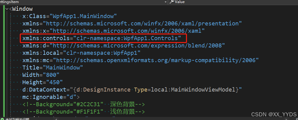
默认是两套笔刷,如果是浅色背景,要把深色背景的画笔注释掉,然后把浅色画笔解除注释。
用于数量、范围是确定的,并且点击不需要太多次的情况(如果范围太大,需要点击太多次,使用滑动条而不是按钮)
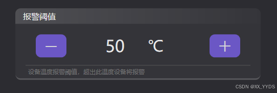
为什么不用输入框?因为在触控屏上不方便输入,有时候范围比较小,举例:设置模块温度报警阈值,50-100℃,每5℃一个档位,就可以使用上面的自定义控件来设置。
使用时只需要设置如下几个简单参数即可,非常简单:
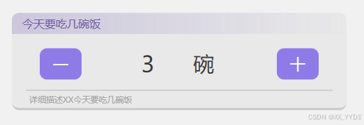
Describe:最下方的详细描述
ItemTitle:最上方显示的标题
MaxValue和MinValue:最大和最小值,对能更改的数值进行限制
Step:按钮每点击一次,更改的数值大小
Unit:单位
Value:实际数值,支持MVVM绑定,需要设置Mode为双向
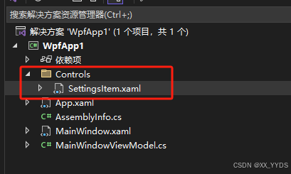
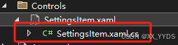
引用:项目中添加Controls文件夹,存放自定义控件,然后新建一个用户控件,命名为SettingsItem
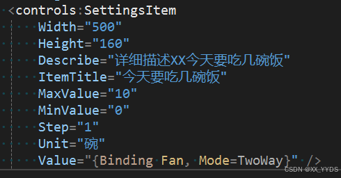
代码(前端):x:Class后面需要换成自己项目里的
- <UserControl
- x:Class="WpfApp1.Controls.SettingsItem"
- xmlns="http://schemas.microsoft.com/winfx/2006/xaml/presentation"
- xmlns:x="http://schemas.microsoft.com/winfx/2006/xaml"
- xmlns:d="http://schemas.microsoft.com/expression/blend/2008"
- xmlns:mc="http://schemas.openxmlformats.org/markup-compatibility/2006"
- d:DesignHeight="160"
- d:DesignWidth="540"
- mc:Ignorable="d">
- <UserControl.Resources>
- <!-- 浅色背景 -->
- <!--<SolidColorBrush x:Key="MainForegroundBrush" Color="#DD000000" />
- <SolidColorBrush x:Key="TitleForegroundBrush" Color="#DD5F3F9F" />
- <SolidColorBrush x:Key="MainBorderBackgroundBrush" Color="#0A222222" />
- <SolidColorBrush x:Key="MainBorderBorderBrush" Color="#33222222" />
- <Color x:Key="MainBorderTitleColor1">#015940A8</Color>
- <Color x:Key="MainBorderTitleColor2">#335940A8</Color>
- <SolidColorBrush x:Key="LineBrush" Color="#CCAAAAAA" />-->
-
- <!-- 深色背景 -->
- <SolidColorBrush x:Key="MainForegroundBrush" Color="#CCFFFFFF" />
- <SolidColorBrush x:Key="TitleForegroundBrush" Color="#CCFFFFFF" />
- <SolidColorBrush x:Key="MainBorderBackgroundBrush" Color="#0AFFFFFF" />
- <SolidColorBrush x:Key="MainBorderBorderBrush" Color="#33FFFFFF" />
- <Color x:Key="MainBorderTitleColor1">#01FFFFFF</Color>
- <Color x:Key="MainBorderTitleColor2">#22FFFFFF</Color>
- <SolidColorBrush x:Key="LineBrush" Color="#555555" />
-
- <Style x:Key="SettingItemBorderStyle" TargetType="Border">
- <Setter Property="Height" Value="140" />
- <Setter Property="Background" Value="{StaticResource MainBorderBackgroundBrush}" />
- <Setter Property="Margin" Value="10" />
- <Setter Property="CornerRadius" Value="10" />
- </Style>
- <Style x:Key="IconButton" TargetType="Button">
- <Setter Property="Width" Value="200" />
- <Setter Property="Height" Value="70" />
- <Setter Property="FontSize" Value="35" />
- <Setter Property="Opacity" Value=".8" />
- <Setter Property="Foreground" Value="White" />
- <Setter Property="FontWeight" Value="Bold" />
- <Setter Property="FontFamily" Value="MicrosoftYahei" />
- <Setter Property="Background" Value="#7960E8" />
- <Setter Property="Template">
- <Setter.Value>
- <ControlTemplate TargetType="Button">
- <Grid
- x:Name="grid"
- Width="{TemplateBinding Width}"
- Height="{TemplateBinding Height}"
- Background="Transparent">
- <Border
- x:Name="bd"
- Width="{TemplateBinding Width}"
- Height="{TemplateBinding Height}"
- Background="{TemplateBinding Background}"
- CornerRadius="10" />
- <Label
- HorizontalAlignment="Center"
- VerticalAlignment="Center"
- Content="{TemplateBinding Tag}"
- FontFamily="{TemplateBinding FontFamily}"
- FontSize="{TemplateBinding FontSize}"
- FontWeight="{TemplateBinding FontWeight}"
- Foreground="{TemplateBinding Foreground}" />
- </Grid>
- <ControlTemplate.Triggers>
- <Trigger Property="IsMouseOver" Value="True">
- <Setter TargetName="bd" Property="Background" Value="#9980E8" />
- <!--<Setter TargetName="bd" Property="Background" Value="#426FFF" />-->
- </Trigger>
- <Trigger Property="IsEnabled" Value="False">
- <Setter TargetName="bd" Property="Background" Value="#777777" />
- </Trigger>
- <Trigger Property="IsPressed" Value="True">
- <Setter Property="Opacity" Value="0.6" />
- </Trigger>
- </ControlTemplate.Triggers>
- </ControlTemplate>
- </Setter.Value>
- </Setter>
- </Style>
- </UserControl.Resources>
- <Grid>
- <Border
- BorderBrush="{StaticResource MainBorderBorderBrush}"
- BorderThickness="0,0,0,3"
- Style="{StaticResource SettingItemBorderStyle}">
- <Grid>
- <Grid.RowDefinitions>
- <RowDefinition Height="35" />
- <RowDefinition />
- <RowDefinition Height="25" />
- </Grid.RowDefinitions>
- <Border VerticalAlignment="Top" CornerRadius="10,10,0,0">
- <Border.Background>
- <LinearGradientBrush StartPoint="0.5,0" EndPoint="0.5,1">
- <LinearGradientBrush.RelativeTransform>
- <TransformGroup>
- <ScaleTransform CenterX="0.5" CenterY="0.5" />
- <SkewTransform CenterX="0.5" CenterY="0.5" />
- <RotateTransform Angle="90" CenterX="0.5" CenterY="0.5" />
- <TranslateTransform />
- </TransformGroup>
- </LinearGradientBrush.RelativeTransform>
- <GradientStop Color="{StaticResource MainBorderTitleColor1}" />
- <GradientStop Offset="1" Color="{StaticResource MainBorderTitleColor2}" />
- </LinearGradientBrush>
- </Border.Background>
- <Label
- Margin="10,0,0,0"
- HorizontalAlignment="Left"
- VerticalAlignment="Center"
- Content="{Binding ItemTitle, RelativeSource={RelativeSource AncestorType=UserControl}, UpdateSourceTrigger=PropertyChanged}"
- FontSize="16"
- Foreground="{StaticResource TitleForegroundBrush}" />
- </Border>
- <Grid Grid.Row="1" Margin="30,0,30,0">
- <Button
- Name="btn_Dec"
- Width="60"
- Height=" 45"
- Margin="10"
- HorizontalAlignment="Left"
- Click="btn_Dec_Click"
- Foreground="White"
- Style="{StaticResource IconButton}"
- Tag="-" />
- <StackPanel HorizontalAlignment="Center" Orientation="Horizontal">
- <Label
- MinWidth="100"
- VerticalAlignment="Center"
- HorizontalContentAlignment="Center"
- Content="{Binding Value, RelativeSource={RelativeSource AncestorType=UserControl}, UpdateSourceTrigger=PropertyChanged}"
- FontSize="32"
- Foreground="{StaticResource MainForegroundBrush}" />
- <Label
- MinWidth="80"
- Margin="10,0,0,0"
- HorizontalAlignment="Center"
- VerticalAlignment="Center"
- Content="{Binding Unit, RelativeSource={RelativeSource AncestorType=UserControl}, UpdateSourceTrigger=PropertyChanged}"
- FontSize="30"
- Foreground="{StaticResource MainForegroundBrush}" />
- </StackPanel>
- <Button
- Name="btn_Inc"
- Width="60"
- Height=" 45"
- Margin="10"
- HorizontalAlignment="Right"
- Click="btn_Inc_Click"
- Style="{StaticResource IconButton}"
- Tag="+" />
- </Grid>
- <Border
- Grid.Row="1"
- Height="1"
- Margin="20,0,20,0"
- VerticalAlignment="Bottom"
- Background="{StaticResource LineBrush}" />
- <Label
- Grid.Row="2"
- Margin="20,0,0,0"
- Content="{Binding Describe, RelativeSource={RelativeSource AncestorType=UserControl}, UpdateSourceTrigger=PropertyChanged}"
- Foreground="#BB888888" />
- </Grid>
- </Border>
- </Grid>
- </UserControl>
后端代码(.cs文件中):替换掉默认的类
- /// <summary>
- /// SettingsItem.xaml 的交互逻辑
- /// </summary>
- public partial class SettingsItem : UserControl
- {
- // 依赖属性注册 标题
- public static readonly DependencyProperty TiTleProperty =
- DependencyProperty.Register(
- "ItemTiTle",
- typeof(string),
- typeof(SettingsItem),
- new PropertyMetadata(default(string)));
- public string ItemTitle
- {
- get { return (string)GetValue(TiTleProperty); }
- set { SetValue(TiTleProperty, value); }
- }
-
- // 依赖属性注册 单位
- public static readonly DependencyProperty UnitProperty =
- DependencyProperty.Register(
- "Unit",
- typeof(string),
- typeof(SettingsItem),
- new PropertyMetadata(default(string)));
- public string Unit
- {
- get { return (string)GetValue(UnitProperty); }
- set { SetValue(UnitProperty, value); }
- }
-
- // 依赖属性注册 描述
- public static readonly DependencyProperty DescribeProperty =
- DependencyProperty.Register(
- "Describe",
- typeof(string),
- typeof(SettingsItem),
- new PropertyMetadata(default(string)));
- public string Describe
- {
- get { return (string)GetValue(DescribeProperty); }
- set { SetValue(DescribeProperty, value); }
- }
- // 依赖属性注册 加减按钮步长
- public static readonly DependencyProperty StepProperty =
- DependencyProperty.Register(
- "Step",
- typeof(float),
- typeof(SettingsItem),
- new PropertyMetadata(default(float)));
- public float Step
- {
- get { return (float)GetValue(StepProperty); }
- set { SetValue(StepProperty, value); }
- }
-
- // 依赖属性注册 显示数值
- public static readonly DependencyProperty ValueProperty =
- DependencyProperty.Register(
- "Value",
- typeof(float),
- typeof(SettingsItem),
- new PropertyMetadata(default(float)));
- public float Value
- {
- get { return (float)GetValue(ValueProperty); }
- set { SetValue(ValueProperty, value); }
- }
-
- // 依赖属性注册 最大值
- public static readonly DependencyProperty MaxValueProperty =
- DependencyProperty.Register(
- "MaxValue",
- typeof(float),
- typeof(SettingsItem),
- new PropertyMetadata(default(float)));
- public float MaxValue
- {
- get { return (float)GetValue(MaxValueProperty); }
- set { SetValue(MaxValueProperty, value); }
- }
-
- // 依赖属性注册 最小值
- public static readonly DependencyProperty MinValueProperty =
- DependencyProperty.Register(
- "MinValue",
- typeof(float),
- typeof(SettingsItem),
- new PropertyMetadata(default(float)));
- public float MinValue
- {
- get { return (float)GetValue(MinValueProperty); }
- set { SetValue(MinValueProperty, value); }
- }
-
- public SettingsItem()
- {
- InitializeComponent();
- }
-
- private void btn_Inc_Click(object sender, RoutedEventArgs e)
- {
- float f = this.Value + this.Step;
- if (f <= this.MaxValue)
- {
- this.Value = f;
- }
- }
-
- private void btn_Dec_Click(object sender, RoutedEventArgs e)
- {
- float f = this.Value - this.Step;
- if (f>=this.MinValue)
- {
- this.Value = f;
- }
- }
- }
在主页使用时:先引用名称空间:Controls(项目名称换成自己的)
使用:
- <controls:SettingsItem
- Grid.Row="1"
- Width="500"
- Height="160"
- Describe="设备温度报警阈值,超出此温度设备将报警"
- ItemTitle="报警阈值"
- MaxValue="100"
- MinValue="50"
- Step="5"
- Unit="℃"
- Value="{Binding Temp, Mode=TwoWay}" />
完整代码(含MVVM绑定示例) https://download.csdn.net/download/XX_YZDY/89574685上传了一份简单的源码
声明:本文内容由网友自发贡献,不代表【wpsshop博客】立场,版权归原作者所有,本站不承担相应法律责任。如您发现有侵权的内容,请联系我们。转载请注明出处:https://www.wpsshop.cn/w/木道寻08/article/detail/911336
推荐阅读
相关标签

