
- 1LREC'22 | 机器翻译中细粒度领域自适应的数据集和基准实验
- 2VMware Workstation17安装教程及安装Ubuntu22.04系统_vwworksation17
- 3感想篇:8)关于提升机械结构工程师地位的畅想
- 4yolov5控制测试视频窗口大小_yolo放大视频
- 5做好职业规划,做一个平凡而不平庸的自己_二三线城市职业规划
- 6神经网络 Embedding层理解; Embedding层中使用预训练词向量_embedding 神经网络
- 7Apollo planning之交规决策技术_dpc traffic_light
- 8前后端分离架构
- 9SpringBoot打的jar包瘦身
- 10基于Java+SpringBoot+vue前后端分离在线教育系统设计实现_基于springboot和vue的大学生在线教育平台的设计与实现
学习响应式布局_@media screen
赞
踩
针对性内容
- 页面设计在不同设备的显示情况
- 布局只会使用float+定位,而不会掌握flex
- 不能很好的使用rem作为设计单位
- 掌握响应式布局、弹性等常见布局
学习内容
- css中媒体查询的作用和使用方法
- flex弹性盒子的用法
- rem的作用和使用方法
目录
MediaQuery(媒体查询)
主要是为了不同尺寸的屏幕设定不同的css样式(移动端用的较多)
- <!DOCTYPE html>
- <html lang="en">
- <head>
- <meta charset="UTF-8">
- <meta http-equiv="X-UA-Compatible" content="IE=edge">
- <meta name="viewport" content="width=device-width, initial-scale=1.0">
- <title>Document</title>
- <style>
- #div0{
- width: 100px;
- height: 200px;
- }
- /* 屏幕尺寸在200px到300px之间的样式 */
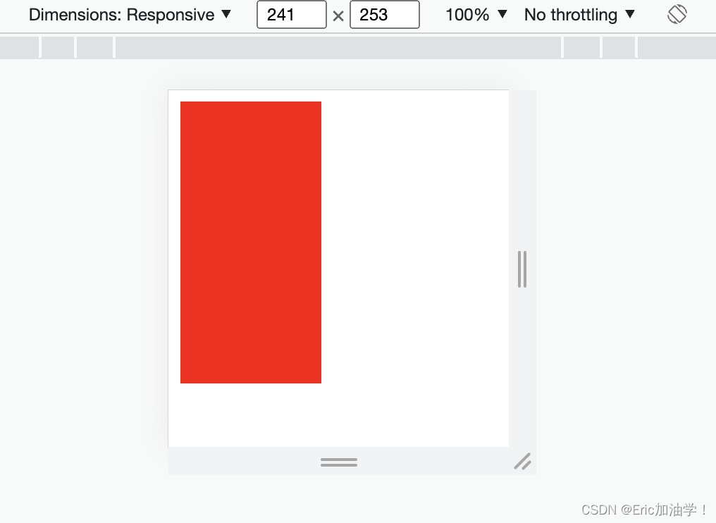
- @media screen and (min-device-width:200px) and (max-device-width:300px){
- #div0{
- background-color: red;
- }
- /*
- 可以写其他的样式
- */
- }
- @media screen and (min-device-width:301px) and (max-device-width:500px){
- #div0{
- background-color: blue;
- }
- }
- </style>
- </head>
- <body>
- <div id="div0"></div>
- </body>
- </html>

@media常用参数
| 属性名称 | 作用 |
| width、height | 浏览器可视宽度、高度 |
| device-width | 设备屏幕的宽度 |
| device-height | 设备屏幕的高度 |
- <style>
- #div0{
- width: 200px;
- height: 300px;
- }
- /* 浏览器尺寸在200px到300px之间的样式 */
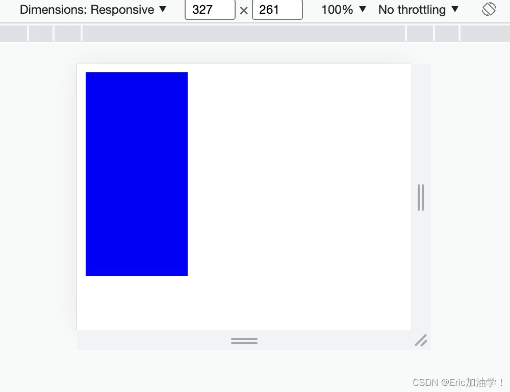
- @media screen and (min-width:500px) and (max-width:700px){
- #div0{
- background-color: red;
- }
- /*
- 可以写其他的样式
- */
- }
- @media screen and (min-width:701px){
- #div0{
- background-color: blue;
- }
- }
- </style>
获取浏览器的宽度 min-width max-width
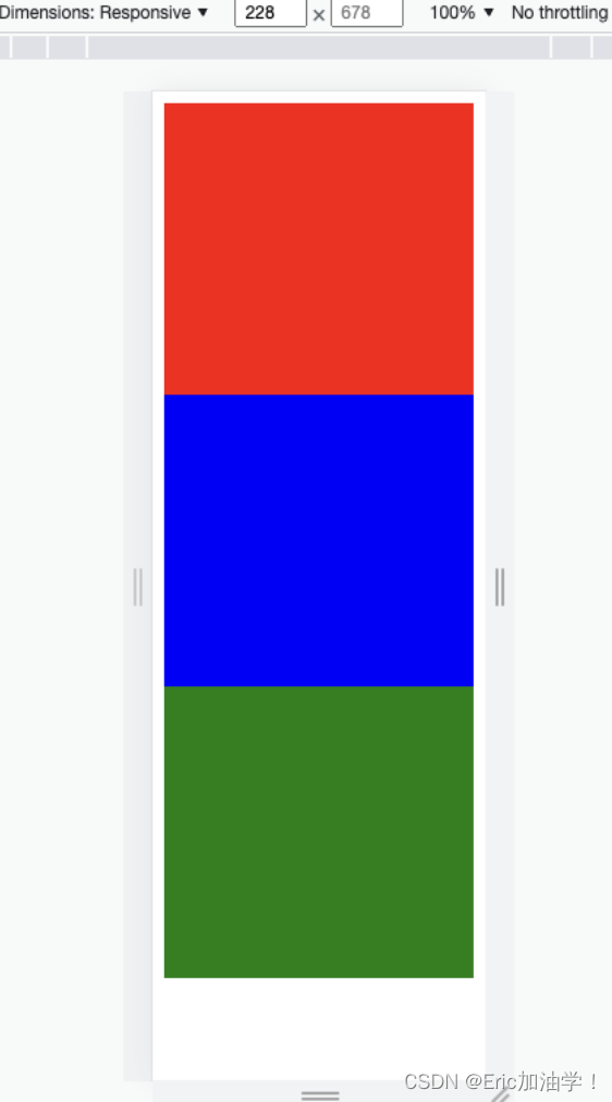
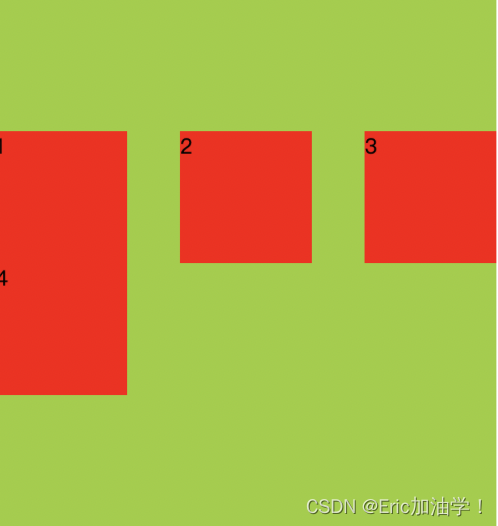
小案例:让三个块随着屏幕变化从一行放3个变成一行2个和一行1个
- <!DOCTYPE html>
- <html lang="en">
- <head>
- <meta charset="UTF-8">
- <meta http-equiv="X-UA-Compatible" content="IE=edge">
- <meta name="viewport" content="width=device-width, initial-scale=1.0">
- <title>Document</title>
- <style>
- #div0{
- width: 100%;
- height: 500px;
- }
- #div0 div {
- float: left;
- height: 200px;
- }
- /* 1行显示三个div */
- @media screen and (min-device-width:400px){
- #div0 div {
- width: 33.3%;
- }
- #div0 div:nth-child(1){
- background-color: red;
- }
- #div0 div:nth-child(2){
- background-color: blue;
- }
- #div0 div:nth-child(3){
- background-color: green;
- }
- }
- /* 2行显示三个div */
- @media screen and (min-device-width:300px) and (max-device-width:399px){
- #div0 div {
- width: 50%;
- }
- #div0 div:nth-child(1){
- background-color: red;
- }
- #div0 div:nth-child(2){
- background-color: blue;
- }
- #div0 div:nth-child(3){
- background-color: green;
- }
- }
- /* 3行显示三个div */
- @media screen and (max-device-width:299px){
- #div0 div {
- width: 100%;
- }
- #div0 div:nth-child(1){
- background-color: red;
- }
- #div0 div:nth-child(2){
- background-color: blue;
- }
- #div0 div:nth-child(3){
- background-color: green;
- }
- }
- </style>
- </head>
- <body>
- <div id="div0">
- <div></div>
- <div></div>
- <div></div>
- </div>
- </body>
- </html>


媒体查询其他引入方式---1
写在style标签中,有条件的执行某个内部样式表
- <!DOCTYPE html>
- <html lang="en">
- <head>
- <meta charset="UTF-8">
- <meta http-equiv="X-UA-Compatible" content="IE=edge">
- <meta name="viewport" content="width=device-width, initial-scale=1.0">
- <title>Document</title>
- <style>
- #div0{
- width: 100%;
- height: 500px;
- }
- #div0 div {
- float: left;
- height: 200px;
- }
- #div0 div:nth-child(1){
- background-color: red;
- }
- #div0 div:nth-child(2){
- background-color: blue;
- }
- #div0 div:nth-child(3){
- background-color: green;
- }
- </style>
- <style media="(min-device-width:300px) and (max-device-width:399px)">
- #div0 div {
- width: 50%;
- }
- </style>
- <style media="(min-device-width:400px) and (max-device-width:499px)">
- #div0 div {
- width: 33.3%;
- }
- </style>
- </head>
- <body>
- <div id="div0">
- <div></div>
- <div></div>
- <div></div>
- </div>
- </body>
- </html>
媒体查询其他引入方式---2
写在link标签中,有条件的引入外部样式表
- <link href="css/test.css" rel="stylesheet">
-
-
- <link href="css/css1.css" rel="stylesheet"
- media="(min-device-width:300px) and (max-device-width:399px)">
flex弹性布局
Flexiable Box即为弹性盒子,用来进行弹性布局,可以配合rem处理尺寸的适配问题
用来为盒装模型提供最大的灵活性。任何一个容器都可以指定为Flex布局。
更加符合响应式设计的特点

主轴和交叉轴并不是固定的,而是需要看里面元素的排列方式。如上图所示,子元素是水平排列的,所以水平方向就是主轴,竖直方向就是交叉轴。 如果子元素是竖直排列的,则竖直方向就是主轴。
子元素不说 高和宽, 而是说 占主轴的多少,占交叉轴的多少
flex-direction
作用: 子元素在父元素盒子中的排列方式
| 属性值 | 作用 |
|---|---|
| row | 默认值。按从左到右的顺序显示 |
| row-reverse | 与row相同,但是以相反的顺序 |
| column | 灵活的项目将垂直显示,按从上到下的顺序 |
| column-reverse | 与column相同,但是以相反的顺序 |
- <!DOCTYPE html>
- <html lang="en">
- <head>
- <meta charset="UTF-8">
- <meta http-equiv="X-UA-Compatible" content="IE=edge">
- <meta name="viewport" content="width=device-width, initial-scale=1.0">
- <title>Document</title>
- <style>
- #div0{
- width: 500px;
- background-color: yellowgreen;
- }
- #div0 div {
- width: 100px;
- height: 100px;
- background-color: red;
- }
- </style>
- </head>
- <body>
- <div id="div0">
- <div>1</div>
- <div>2</div>
- <div>3</div>
- <div>4</div>
- </div>
- </body>
- </html>
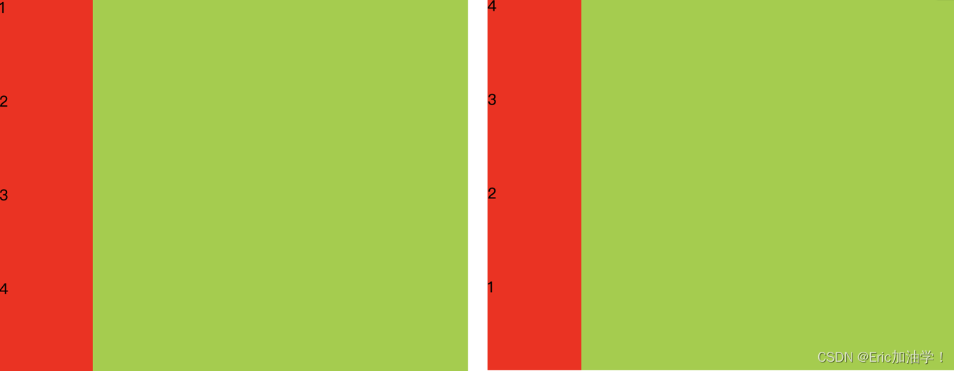
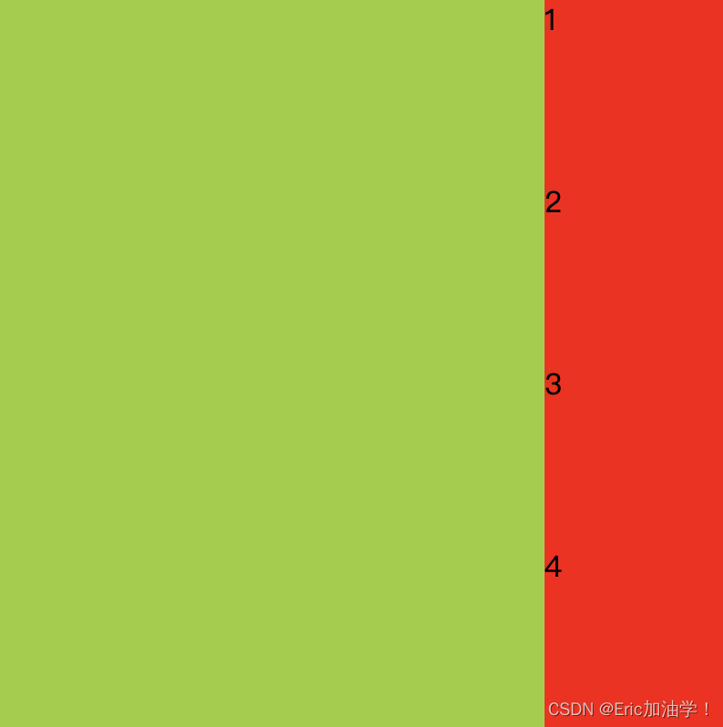
(左): display: flex; flex-direction: column; (右) flex-direction: column-reverse;
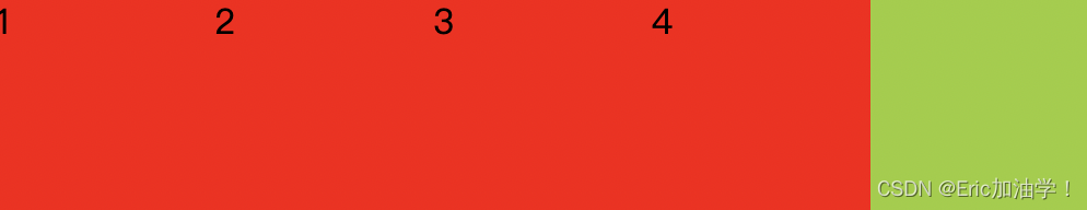

(上)flex-direction: row (下)flex-direction: row-reverse;
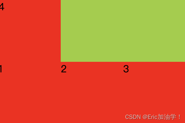
上述例子是父元素的宽度足够大(500px),如果父元素的宽度不够,只有300p。则会对子元素的宽度进行压缩,使得四个子元素都能放在父元素中(每个子元素的宽度都变为了75px)
flex-wrap
作用: 子元素在父元素盒子中是否换行(列)
| 属性值 | 作用 |
|---|---|
| nowrap | 默认值。不换行或不换列 |
| wrap | 换行或换列 |
| wrap-reverse | 换行或换列,但以相反的顺序 |
- <style>
- #div0{
- width: 300px;
- background-color: yellowgreen;
- display: flex;
- flex-direction: row;
- flex-wrap: wrap;
- }
- #div0 div {
- width: 100px;
- height: 100px;
- background-color: red;
- }
- </style>
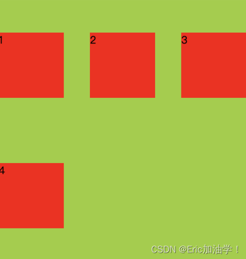
在上面的例子中,如果父元素的宽度只有300px,不够4个子元素一行放置,他会压缩子元素的宽。
但如果设置了换行,则子元素的宽还是100px,多余的会进行换行

wrap wrap-reverse
flex-flow
作用: flex-direction和flex-wrap属性的简写形式
- 语法:
- flex-flow: <flex-direction> || <flex-wrap>
-
- 如
- display: flex;
- flex-flow: row wrap;
- /* flex-direction: row;
- flex-wrap: wrap-reverse; */
剩余空间调整为间距 justify-content
作用:用来在存在剩余空间时,设置为间距的方式
| 属性值 | 作用 |
|---|---|
| flex-start | 默认值。从左到右,挨着行的开头 |
| flex-end | 从右到左,挨着行的结尾 |
| center | 居中显示 |
| space-between | 平均分布在该行上,两边不留间隔空间 |
| space-around | 平均分布在该行上,两边留有一半的间隔空间 |
- <style>
- #div0{
- width: 350px;
- background-color: yellowgreen;
- display: flex;
- flex-flow: row wrap;
- /* flex-direction: row;
- flex-wrap: wrap-reverse; */
- justify-content: center;
- /*justify-content: space-between;*/
- }
- #div0 div {
- width: 100px;
- height: 100px;
- background-color: red;
- }
- </style>


align-items
作用:设置每个flex元素在交叉轴上的默认对齐方式
| 属性值 | 作用 |
|---|---|
| flex-start | 位于容器的开头 |
| flex-end | 位于容器的结尾 |
| center | 居中显示 |
- <style>
- #div0{
- width: 400px;
- height: 400px;
- background-color: yellowgreen;
- display: flex;
- flex-flow: column wrap;
- justify-content: space-between;
- align-items: flex-end;
- }
- #div0 div {
- width: 100px;
- height: 100px;
- background-color: red;
- }
- </style>
- <style>
- #div0{
- width: 400px;
- height: 400px;
- background-color: yellowgreen;
- display: flex;
- flex-flow: row wrap;
- justify-content: space-between;
- align-items: flex-end;
- }
- #div0 div {
- width: 100px;
- height: 100px;
- background-color: red;
- }
- </style>

align-content
作用:设置每个flex元素在交叉轴上的默认对齐方式
与align-items的区别就是 align-items会把每一行都单独处理,而align-content把多行当成一个整体处理
| 属性值 | 作用 |
|---|---|
| flex-start | 位于容器的开头 |
| flex-end | 位于容器的结尾 |
| center | 位于容器的中心 |
| space-between | 之间留有空白 |
| space-around | 两端都留有空白 |
- <style>
- #div0{
- width: 380px;
- height: 400px;
- background-color: yellowgreen;
- display: flex;
- flex-flow: row wrap;
- justify-content: space-between;
- align-items: center;
- }
- #div0 div {
- width: 100px;
- height: 100px;
- background-color: red;
- }
- </style>
- <style>
- #div0{
- width: 380px;
- height: 400px;
- background-color: yellowgreen;
- display: flex;
- flex-flow: row wrap;
- justify-content: space-between;
- align-content: center;
- }
- #div0 div {
- width: 100px;
- height: 100px;
- background-color: red;
- }
- </style>
其他属性
| 属性值 | 作用 |
|---|---|
| flex-basis | 设置弹性盒伸缩基准值 |
| flex-grow | 设置弹性盒子的扩展比率 |
| flex-shrink | 设置弹性盒子的缩小比率 |
| flex | flex-grow、flex-shrink、flex-basis的缩写 |
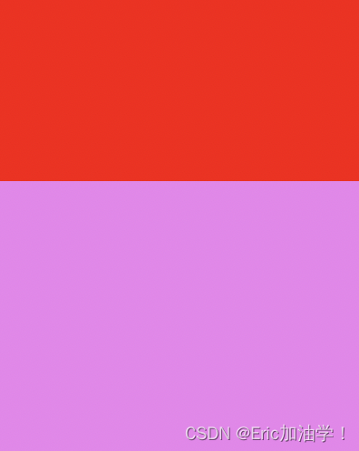
flex-basis
- <!DOCTYPE html>
- <html lang="en">
- <head>
- <meta charset="UTF-8">
- <meta http-equiv="X-UA-Compatible" content="IE=edge">
- <meta name="viewport" content="width=device-width, initial-scale=1.0">
- <title>Document</title>
- <style>
- #div0{
- display: flex;
- width: 400px;
- height: 500px;
- background-color: violet;
- }
- #div0 div {
- width: 200px;
- height: 200px;
- background-color: red;
- }
- </style>
- </head>
- <body>
- <div id="div0">
- <div></div>
- <div></div>
- </div>
- </body>
- </html>
先搞一个基础的,子盒子宽为200px,父盒子宽为400px,所以图中两个子盒子贴在一起
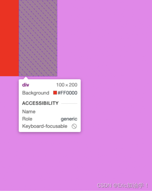
- #div0 div {
- width: 200px;
- height: 200px;
- background-color: red;
- flex-basis: 50px;
- /* flex-basis: 30%; */
- }
给子盒子加上基准以后,原来的宽度200px就不生效了,变成了两个都是50px的宽。也可以设置百分比,30%就是400px*0.3 = 120px 。 也可以用rem单位

也可以分别用于不同的元素
- <style>
- #div0{
- display: flex;
- width: 400px;
- height: 500px;
- background-color: violet;
- }
- #div0 div {
- width: 200px;
- height: 200px;
- background-color: red;
- flex-basis: 50px;
- /* flex-basis: 30%; */
- }
- #div0 div:nth-child(1){
- flex-basis: 50px;
- }
- #div0 div:nth-child(2){
- flex-basis: 100px;
- }
- </style>
flex-grow
主要是用于子对象不足以填充满父对象的宽度。 就比如上面的例子中,两个子对象都是50px,宽度还剩下300px
- <style>
- #div0{
- display: flex;
- width: 400px;
- height: 500px;
- background-color: violet;
- }
- #div0 div {
- width: 200px;
- height: 200px;
- background-color: red;
- flex-basis: 50px;
- }
- /*
- flex-grow的具体算法
- 整体父盒子宽度为400px, 第一个div 50px,第二个div 100px,还剩下250px的空闲区
- 由于两个子div的flex-grow都是1,所以250分成2份,各1份 250/2=125px
- */
- #div0 div:nth-child(1){
- flex-basis: 50px;
- flex-grow: 1;
- }
- #div0 div:nth-child(2){
- flex-basis: 100px;
- flex-grow: 1;
- }
- </style>
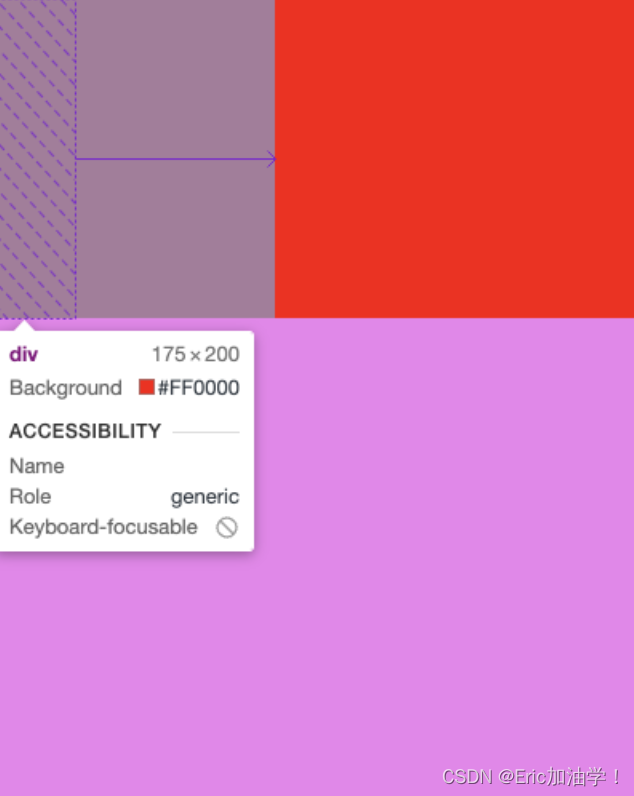
如果第一个子div flex-grow:1; 第二个子div flex-grow:3; 则一共把250px的剩余分4份,第一个占1份
flex-shrink
一般用于子元素宽度较高,放不下,这时候考虑缩小比率
- <style>
- #div0{
- display: flex;
- width: 400px;
- height: 500px;
- background-color: violet;
- }
- #div0 div {
- width: 200px;
- height: 200px;
- background-color: red;
- flex-basis: 50px;
- }
- #div0 div:nth-child(1){
- flex-basis: 300px;
- }
- #div0 div:nth-child(2){
- flex-basis: 300px;
- }
- </style>
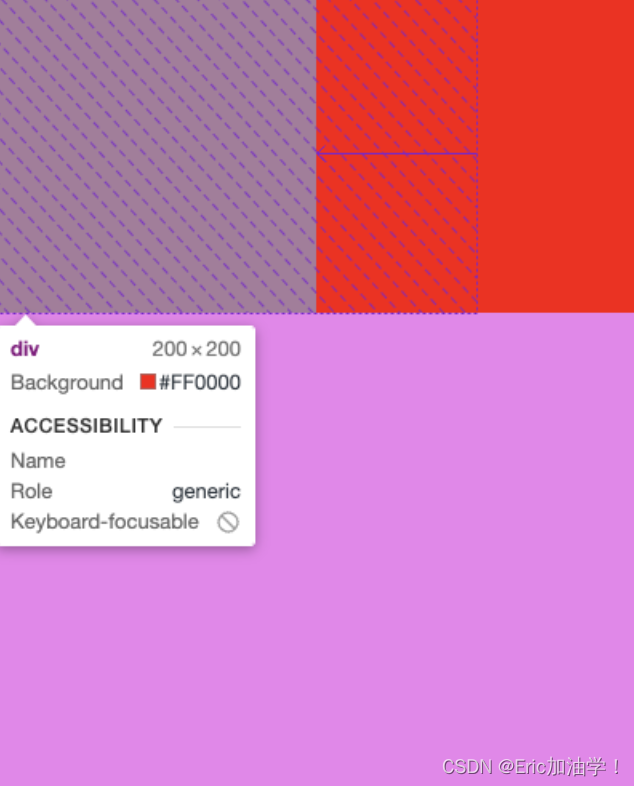
设置两个子盒子都是300px,让他们两个的宽度和 超过400。发现他们自动缩小成200 200了
- <style>
- #div0{
- display: flex;
- width: 400px;
- height: 500px;
- background-color: violet;
- }
- #div0 div {
- width: 200px;
- height: 200px;
- background-color: red;
- flex-basis: 50px;
- }
- #div0 div:nth-child(1){
- flex-basis: 300px;
- flex-grow: 1;
- /* 0代表不允许缩小 */
- flex-shrink: 0;
- }
- #div0 div:nth-child(2){
- flex-basis: 300px;
- flex-grow: 1;
- flex-shrink: 0;
- }
- </style>
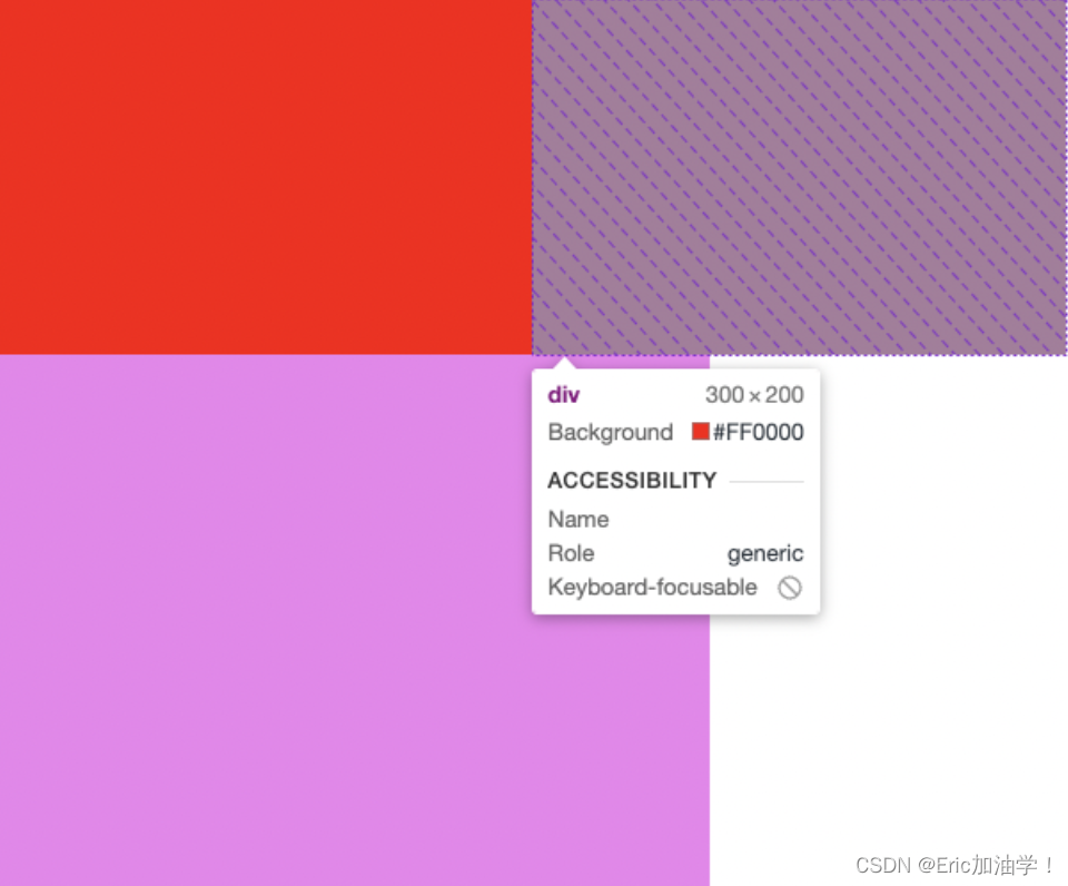
设置flex-shrink:0 让他们不能缩小,这时候两个子盒子都是300px,且超出了父元素的宽
- <style>
- #div0{
- display: flex;
- width: 400px;
- height: 500px;
- background-color: violet;
- }
- #div0 div {
- width: 200px;
- height: 200px;
- background-color: red;
- flex-basis: 50px;
- }
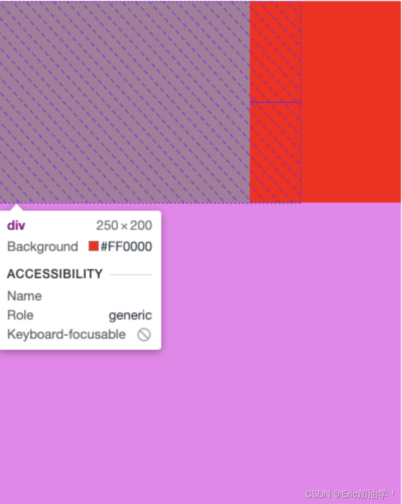
- /*
- flex-shrink算法
- 400 - 600 = -200
- 200 / (1+3) = 50
- 所以第一个div是 300 - 50 = 250 第二个div是 300 - 150 = 150
- */
- #div0 div:nth-child(1){
- flex-basis: 300px;
- flex-grow: 1;
- /* 0代表不允许缩小 */
- flex-shrink: 1;
- }
- #div0 div:nth-child(2){
- flex-basis: 300px;
- flex-grow: 1;
- flex-shrink: 3;
- }
- </style>
flex
当写缩写的时候,一定要注意顺序 先 flex-grow扩大比率、再 flex-shrink缩小比率,最后 flex-basis基准值
- <style>
- #div0{
- display: flex;
- width: 400px;
- height: 500px;
- background-color: violet;
- }
- #div0 div {
- width: 200px;
- height: 200px;
- background-color: red;
- flex-basis: 50px;
- }
- #div0 div:nth-child(1){
- /* flex-basis: 300px;
- flex-grow: 1;
- flex-shrink: 1; */
- flex: 1 1 300px;
- }
- #div0 div:nth-child(2){
- /* flex-basis: 300px;
- flex-grow: 4;
- flex-shrink: 3; */
- flex: 4 3 300px;
- }
- </style>
特殊写法
| 属性 | 作用 |
|---|---|
| flex:auto; | flex: 1 1 auto; |
| flex: none; | flex: 0 0 auto |
| flex: 0%; flex: 100px; | flex: 1 1 0% flex: 1 1 100px |
| flex: 1; | flex: 1 1 0%; |
rem的使用
指相对于根元素的字体大小的单位
- <style>
- html{
- /* 根字体的大小,如果要搭配rem使用,通常会设置为10px 这样方便计算 */
- font-size: 10px;
- }
- div{
- font-size: 1rem;
- }
- </style>
这样的话,div的字体大小就是1rem也就是10px; 这样的好处就是如果随着屏幕的变化,需要改变字体大小的话,只需要改根字体即可
与em的区别有哪些?
rem是相对于根字体而言的, 而 em是相对于父一级的对象而言的。所以em可能出现集联等情况,计算会繁琐。

