
热门标签
热门文章
- 1IDEA配置Maven教程(非常详细)从零基础入门到精通,看完这一篇就够了_idea maven配置教程
- 2modelsim仿真ROM IP核遇到无法读取mif文件的解决方法_ram ip核不能打开mif文件
- 3HTML特殊字符集大全_是什么字符集
- 4hutool Http 工具发送POST请求的几种方式_hutool post
- 5Stable Diffusion 本地部署_stable diffusion本地部署
- 6Markdown公式笔记(二):累加累乘和积分求导_累加求导
- 7CRNN——卷积循环神经网络结构_循环卷积神经网络
- 8进程间通信_lexiaoyaosw
- 9【LangChain】使用LangChain(而非OpenAI)回答有关文档的问题_langchain faiss 找不到from_document
- 10【JS】纯web端使用ffmpeg实现的视频编辑器_ffmpeg.js
当前位置: article > 正文
WPF按钮相关
作者:我家小花儿 | 2024-03-21 01:00:01
赞
踩
WPF按钮相关
跟着官网敲的按钮相关的内容,还涉及了wpf很多其他的知识
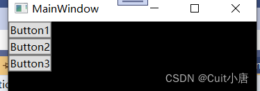
1.创建基本按钮
- <Grid>
- <StackPanel HorizontalAlignment="Left">
- <Button>Button1</Button>
- <Button>Button2</Button>
- <Button>Button3</Button>
- </StackPanel>
- </Grid>
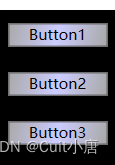
2.设置基本属性
有两种方式,直接在button后面添加 ,但是我这里有三个按钮,你在项目之中会有出现更多按钮的情况,所以我们这了选择另一种方式:写按钮的样式style
这里在App.xaml下面进行创建style,即表示把这个style应用到全局:
- <!--创建样式-->
- <Style TargetType="Button">
- <Setter Property="Width" Value="90"></Setter>
- <Setter Property="Margin" Value="10"></Setter>
- </Style>
这里的TargetType表示目标对象即button,下面的setter是设计器,property是button拥有的属性,value是我们设置的值.

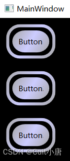
3. 设置渐变静态资源并运用到按钮上面
x:Key = "B1" 是上面资源的命名,下面引用的是{StaticResource B1}
- <LinearGradientBrush x:Key="B1" StartPoint="0,0" EndPoint="1,1">
- <GradientStop Color="DarkGray" Offset="0"></GradientStop>
- <GradientStop Color="#CCCCFF" Offset="0.5"></GradientStop>
- <GradientStop Color="DarkGray" Offset="1"></GradientStop>
- </LinearGradientBrush>
-
- <Style TargetType="{x:Type Button}">
- <Setter Property="Background" Value="{StaticResource B1}"></Setter>
- <Setter Property="Width" Value="80"></Setter>
- <Setter Property="Margin" Value="10"></Setter>
- </Style>
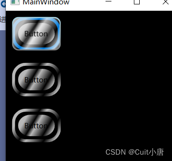
4.模板自定义按钮外观
更改按钮呈现:自定义模板。 添加以下突出显示的标记。 此标记指定两个具有圆角的 Rectangle 元素,后跟一个 DockPanel。 DockPanel 用于托管按钮的 ContentPresenter。 ContentPresenter 显示按钮的内容。 在本演练中,内容为文本(“Button 1”、“Button 2”、“Button 3”)。 所有模板组件(矩形和 DockPanel)都布置在 Grid 内.
- <Setter Property="Template">
- <Setter.Value>
- <ControlTemplate TargetType="Button">
- <!--
- 使用了Grid布局容器来组织按钮的内部元素。
- Width和Height属性被绑定到模板自身的宽度和高度,确保Grid的大小与按钮的大小相匹配。
- ClipToBounds设置为True,意味着任何超出Grid边界的内容都会被裁剪。
- -->
- <Grid Width="{TemplateBinding Width}" Height="{TemplateBinding Height}" ClipToBounds="True">
- <!-- Outer Rectangle with rounded corners. -->
- <Rectangle x:Name="outerRectangle" HorizontalAlignment="Stretch" VerticalAlignment="Stretch" Stroke="{TemplateBinding Background}" RadiusX="20" RadiusY="20" StrokeThickness="5" Fill="Transparent" />
- <!-- Inner Rectangle with rounded corners. -->
- <Rectangle x:Name="innerRectangle" HorizontalAlignment="Stretch" VerticalAlignment="Stretch" Stroke="Transparent" StrokeThickness="20" Fill="{TemplateBinding Background}" RadiusX="20" RadiusY="20" />
- <!-- Present Content (text) of the button. -->
- <DockPanel Name="myContentPresenterDockPanel">
- <ContentPresenter x:Name="myContentPresenter" Margin="20" Content="{TemplateBinding Content}" TextBlock.Foreground="Black" />
- </DockPanel>
- </Grid>
- </ControlTemplate>
- </Setter.Value>
- </Setter>

5.设置触发器
- <ControlTemplate.Triggers>
-
- <!-- Set properties when mouse pointer is over the button. -->
- <Trigger Property="IsMouseOver" Value="True">
-
- <!-- Below are three property settings that occur when the
- condition is met (user mouses over button). -->
- <!-- Change the color of the outer rectangle when user mouses over it. -->
- <Setter Property ="Rectangle.Stroke" TargetName="outerRectangle"
- Value="{DynamicResource {x:Static SystemColors.HighlightBrushKey}}" />
-
- <!-- Sets the glass opacity to 1, therefore, the glass "appears" when user mouses over it. -->
- <Setter Property="Rectangle.Opacity" Value="1" TargetName="glassCube" />
-
- <!-- Makes the text slightly blurry as though you were looking at it through blurry glass. -->
- <Setter Property="ContentPresenter.BitmapEffect" TargetName="myContentPresenter">
- <Setter.Value>
- <BlurBitmapEffect Radius="1" />
- </Setter.Value>
- </Setter>
- </Trigger>
- <!-- Set properties when button has focus. -->
- <Trigger Property="IsFocused" Value="true">
- <Setter Property="Rectangle.Opacity" Value="1" TargetName="glassCube" />
- <Setter Property="Rectangle.Stroke" TargetName="outerRectangle" Value="{DynamicResource {x:Static SystemColors.HighlightBrushKey}}" />
- <Setter Property="Rectangle.Opacity" Value="1" TargetName="glassCube" />
- </Trigger>
-
- </ControlTemplate.Triggers>
声明:本文内容由网友自发贡献,不代表【wpsshop博客】立场,版权归原作者所有,本站不承担相应法律责任。如您发现有侵权的内容,请联系我们。转载请注明出处:https://www.wpsshop.cn/w/我家小花儿/article/detail/277251
推荐阅读

相关标签

