
热门标签
热门文章
- 1Python 打包配置文件 setup.py 详解_python 中setup.py在哪
- 2【云原生 | 从零开始学istio】二、Istio核心特性与架构
- 3unity karting导入时的编译问题_all compiler errors have to be
- 4小程序实现无限级树形菜单_小程序 树菜单
- 5“IT小百科”之“Windows自带的服务和系统进程详解”_windows服务 打开exef进程
- 6DRF学习之权限验证(十五)_permission_classes=[isauthenticated]
- 7分布式事务概念及理论
- 8#每日一题# 25. K 个一组翻转链表 - 20191021_给你一个链表,每 k 个节点一组进行翻转,请你返回翻转后的链表。 k 是一个正整数,
- 9开源大型语言模型概览:多语种支持与中文专注
- 10Unity pc端内嵌网页插件Embedded Browser基本使用流程(转载)
当前位置: article > 正文
css 圆柱体 水瓶样式_css圆柱资源池
作者:小蓝xlanll | 2024-02-16 21:33:50
赞
踩
css圆柱资源池
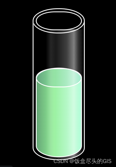
<!--html-->
<input type="radio" name="water" class="water--0" id="r0">
<label for="r0">empty</label>
<input type="radio" name="water" class="water--30" id="r1">
<label for="r1">30%</label>
<input type="radio" name="water" class="water--50" id="r2">
<label for="r2">50%</label>
<input type="radio" name="water" class="water--90" id="r3">
<label for="r3">90%</label>

<div class="cylinder">
	<div class="circle"></div>
	<div class="bg"></div>
	<div class="water"></div>
</div>
- 1
- 2
- 3
- 4
- 5
- 6
- 7
- 8
- 9
- 10
- 11
- 12
- 13
- 14
- 15
// css
body {
	padding: 50px 0;
	text-align: center;
	background: #000;
}

input {
	margin-bottom: 30px;
}

.cylinder {
	position: relative;
	overflow: hidden;
	margin: 0 auto;
	width: 100px;
	height: 300px;
	border-radius: 50px/25px;
	border: 2px solid #fff;
}

.bg{
	position: relative;
	overflow: hidden;
	margin: 0 auto;
	top: 40px;
	width: 100px;
	height: 260px;
	background: linear-gradient(90deg, rgba(255,255,255,0) 0%, rgba(255,255,255,0) 24%, rgba(255,255,255,0.15) 34%, rgba(255,255,255,0.1) 44%, rgba(255,255,255,0.25) 66%, rgba(255,255,255,0.5) 80%, rgba(255,255,255,0.2) 89%, rgba(255,255,255,0) 100%);
}

.circle{
	position: absolute;
	left: 4px;
	top: 4px;
	width: 88px;
	height: 34px;
	border-radius: 50px/25px;
	border: 2px solid #fff;
	background-color: rgba(160, 160, 160, 0);
	content: '';
}

.cylinder:before {
	position: absolute;
	left: -2px;
	top: -2px;
	width: 100px;
	height: 46px;
	border-radius: 50px/25px;
	border: 2px solid #fff;
	background-color: rgba(160, 160, 160, 0);
	content: '';
}

.cylinder:after {
	position: absolute;
	left: 0;
	bottom: 0;
	width: 100px;
	height: 50px;
	border-radius: 50px/25px;
	background-color: rgba(160, 160, 160, 0);
	content: '';
}

.water {
	position: absolute;
	z-index: -1;
	left: 4px;
	bottom: 4px;
	width: 88px;
	height: 0;
	padding-top: 50px;
	border-radius: 50px/25px;
	border: 2px solid #fff;
/* 	background-color: rgba(0, 160, 160, 0.5); */
	background: linear-gradient(270deg, #5EFFD3 0%, #00F193 61%, #20A876 100%);
	transition: 0.3s linear;
}

.water:before {
	position: absolute;
	left: -2px;
	top: -1px;
	width: 88px;
	height: 34px;
	border-radius: 50px/25px;
	border: 2px solid #fff;
	background-color: rgba(0, 160, 160, 0.2);
	content: '';
}

.water:after {
	position: absolute;
	left: 0;
	bottom: 0;
	width: 88px;
	height: 34px;
	border-radius: 50px/25px;
	background-color: rgba(0, 160, 160, 0);
	content: '';
}

.water--0:checked ~ .cylinder .water {
	bottom: -50px;
}

.water--30:checked ~ .cylinder .water {
	height: calc(250px * 0.3);
}

.water--50:checked ~ .cylinder .water {
	height: calc(250px * 0.5);
}

.water--90:checked ~ .cylinder .water {
	height: calc(238px * 1);
}

- 1
- 2
- 3
- 4
- 5
- 6
- 7
- 8
- 9
- 10
- 11
- 12
- 13
- 14
- 15
- 16
- 17
- 18
- 19
- 20
- 21
- 22
- 23
- 24
- 25
- 26
- 27
- 28
- 29
- 30
- 31
- 32
- 33
- 34
- 35
- 36
- 37
- 38
- 39
- 40
- 41
- 42
- 43
- 44
- 45
- 46
- 47
- 48
- 49
- 50
- 51
- 52
- 53
- 54
- 55
- 56
- 57
- 58
- 59
- 60
- 61
- 62
- 63
- 64
- 65
- 66
- 67
- 68
- 69
- 70
- 71
- 72
- 73
- 74
- 75
- 76
- 77
- 78
- 79
- 80
- 81
- 82
- 83
- 84
- 85
- 86
- 87
- 88
- 89
- 90
- 91
- 92
- 93
- 94
- 95
- 96
- 97
- 98
- 99
- 100
- 101
- 102
- 103
- 104
- 105
- 106
- 107
- 108
- 109
- 110
- 111
- 112
- 113
- 114
- 115
- 116
- 117
- 118
- 119
声明:本文内容由网友自发贡献,不代表【wpsshop博客】立场,版权归原作者所有,本站不承担相应法律责任。如您发现有侵权的内容,请联系我们。转载请注明出处:https://www.wpsshop.cn/w/小蓝xlanll/article/detail/96875
推荐阅读