
- 1端口映射和端口转发的区别(一个菜比的理解)_端口转发和端口映射的区别
- 2Unity URP 渲染管线着色器编程 103 之 创建高级水体材质--几何波_urp 水材质
- 3【C语言】-猜数字游戏_猜数字游戏是令游戏机随机产生一个100以内的正整数,用户输入一个数对其进行猜测,
- 4【网站项目】尤文图斯足球俱乐部网上商城系统
- 5重装虚拟机后MobaXterm无法连接虚拟机,本机网络适配器中不显示虚拟网卡的解决办法_mobaxterm链接虚拟机
- 6ArcGIS批量添加字段 AddField
- 7putty使用教程
- 8JDK21协程-虚线程 openjdk源码解读 底层从Java代码到C/C++代码初次深度解读 虚线程调优_openjdk21
- 9如何对大数据进行处理与分析_设备运行数据大数据处理
- 10vscode快速生成vue文件初始结构配置_vscode vue怎么初始化结构
HarmonyOS应用开发03-基础组件-让我们来码出复杂酷炫的UI
赞
踩
系列文章目录
HarmonyOS应用开发02-程序框架UIAbility、启动模式与路由跳转
HarmonyOS应用开发03-基础组件-让我们来码出复杂酷炫的UI
文章目录
- 系列文章目录
- 前言
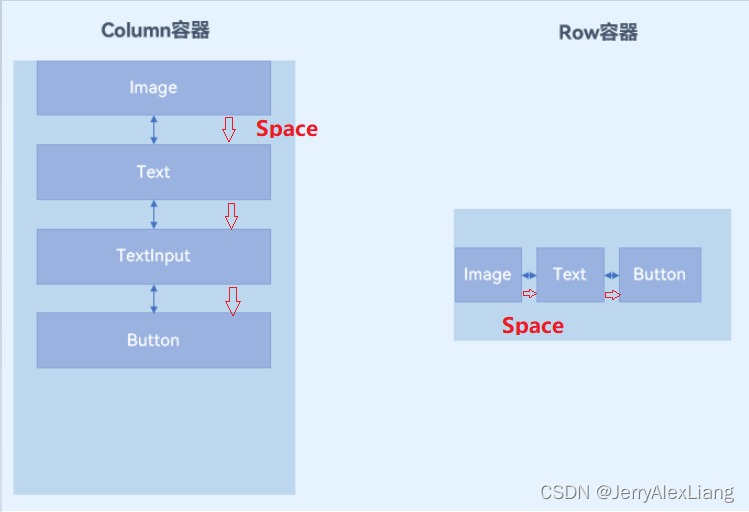
- 一、Column&Row组件的使用
- 1、主轴和交叉轴概念
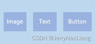
- 2、主轴方向的对齐(justifyContent)
- (1)、Start:元素在主轴方向首端对齐,第一个元素与行首对齐,同时后续的元素与前一个对齐。
- (2)、Center:元素在主轴方向中心对齐,第一个元素与行首的距离以及最后一个元素与行尾距离相同。
- (3)、End:元素在主轴方向尾部对齐,最后一个元素与行尾对齐,其他元素与后一个对齐。
- (4)、SpaceBetween:元素在主轴方向均匀分配弹性元素,相邻元素之间距离相同。 第一个元素与行首对齐,最后一个元素与行尾对齐。
- (5)、SpaceAround:元素在主轴方向均匀分配弹性元素,相邻元素之间距离相同。 第一个元素到行首的距离和最后一个元素到行尾的距离是相邻元素之间距离的一半。
- (6)、SpaceEvenly:元素在主轴方向等间距布局,无论是相邻元素还是边界元素到容器的间距都一样。
- 3、交叉轴方向的对齐(alignItems)
- (1)、Column容器的主轴是垂直方向,交叉轴是水平方向,其参数类型为HorizontalAlign(水平对齐),HorizontalAlign定义了以下几种类型:
- Start:设置子组件在水平方向上按照起始端对齐。
- Center(默认值):设置子组件在水平方向上居中对齐。
- End:设置子组件在水平方向上按照末端对齐。
- (2)、Row容器的主轴是水平方向,交叉轴是垂直方向,其参数类型为VerticalAlign(垂直对齐),VerticalAlign定义了以下几种类型:
- Top:设置子组件在垂直方向上居顶部对齐。
- Center(默认值):设置子组件在竖直方向上居中对齐。
- Bottom:设置子组件在竖直方向上居底部对齐。
- 4、主轴方向的间距
- 二、列表List组件与Grid网格组件
- 1、List组件
- 2、Grid组件
- (1)、Grid组件一般和子组件GridItem一起使用,Grid列表中的每一个条目对应一个GridItem组件。
- (2)、使用ForEach渲染网格布局
- `columnsTemplate` : 设置当前网格布局列的数量,不设置时默认1列。设置columnsTemplate的值为'1fr 1fr 1fr 1fr',表示这个网格为4列,将Grid允许的宽分为4等分,每列占1份;
- `rowsTemplate` :设置当前网格布局行的数量,不设置时默认1行。rowsTemplate的值为'1fr 1fr 1fr 1fr',表示这个网格为4行,将Grid允许的高分为4等分,每行占1份。
- `columnsGap` :设置列与列的间距。eg:使用columnsGap设置列间距为10vp.
- `rowsGap` :设置行与行的间距。eg:使用rowsTemplate设置行间距也为10vp。
- (3)、设置Grid排列方向
- 注意:
- 代码示例
- 三、Tabs组件
- 四、Swiper组件
- 总结
前言
想要实现一个列表,在前面是使用 ForEach 循环 StudentListItem.est 构建的,不会由滑动效果,数据源增加时,会发现现在这个“列表”显示不全,而且也是无法滑动的。对于数据源数量较多、需要分页加载的列表,我们使用 List去实现。
接下来学习使用HarmonyOS-ArkTS语言开发方式中的基本组件,这样我们就可以使用基本组件去实现较为复杂丰富的UI。
一、Column&Row组件的使用
参考链接:
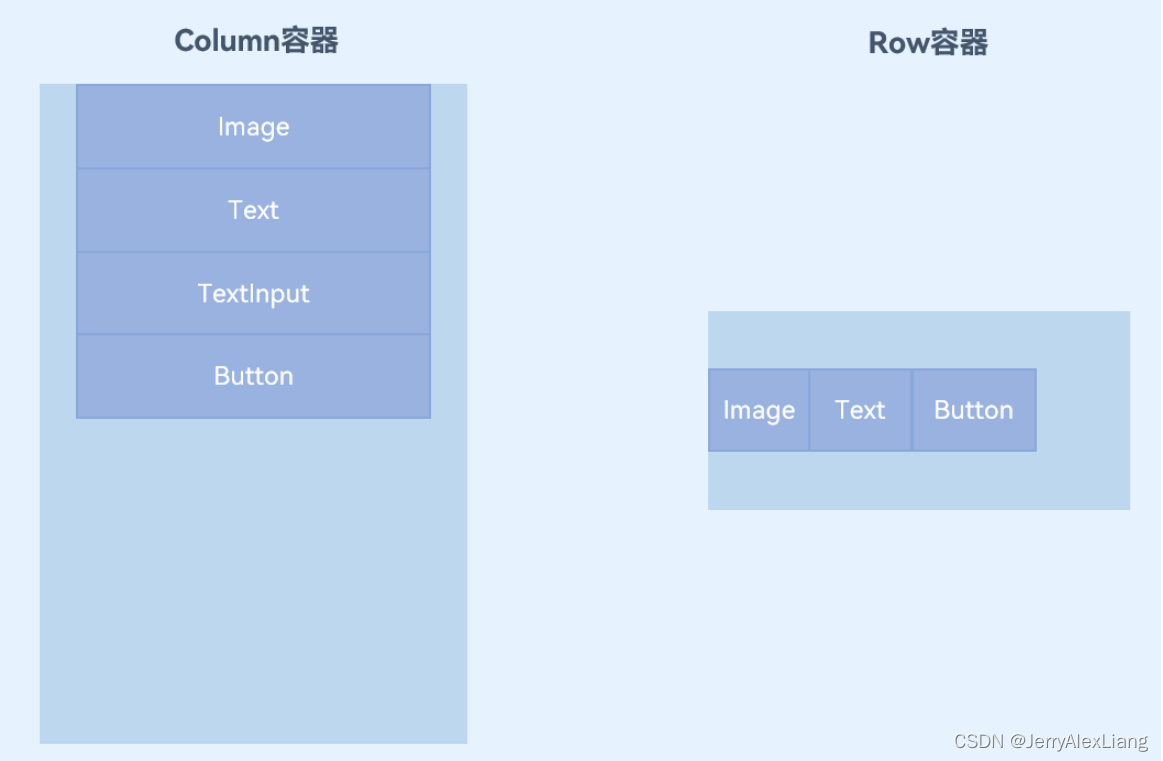
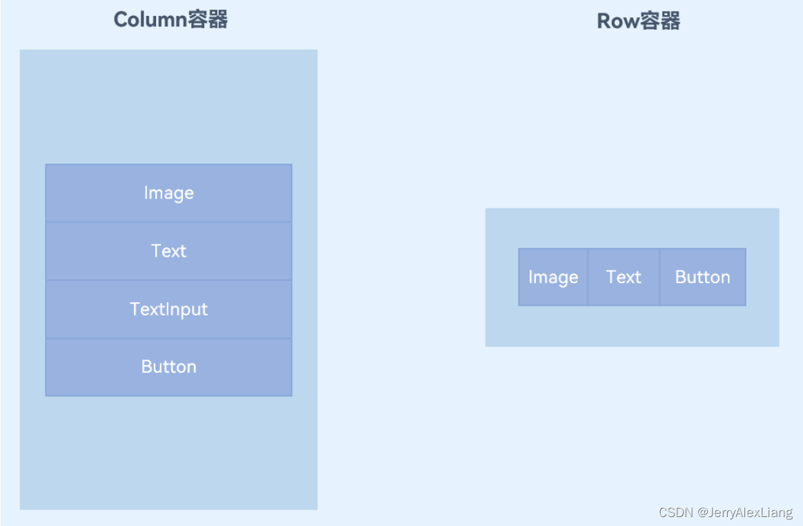
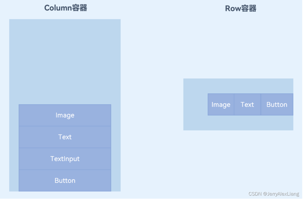
Column表示沿垂直方向布局的容器。Row表示沿水平方向布局的容器。
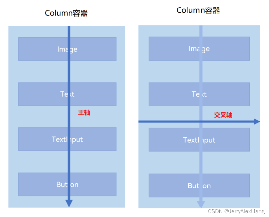
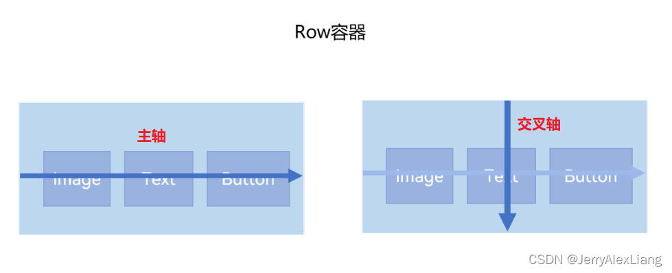
1、主轴和交叉轴概念
在布局容器中,默认存在两根轴,分别是主轴和交叉轴,这两个轴始终是相互垂直的。不同的容器中主轴的方向不一样的。
- 主轴:在Column容器中的子组件是按照从上到下的垂直方向布局的,其主轴的方向是垂直方向;在Row容器中的组件是按照从左到右的水平方向布局的,其主轴的方向是水平方向。
- 交叉轴:与主轴垂直相交的轴线,如果主轴是垂直方向,则交叉轴就是水平方向;如果主轴是水平方向,则交叉轴是垂直方向。
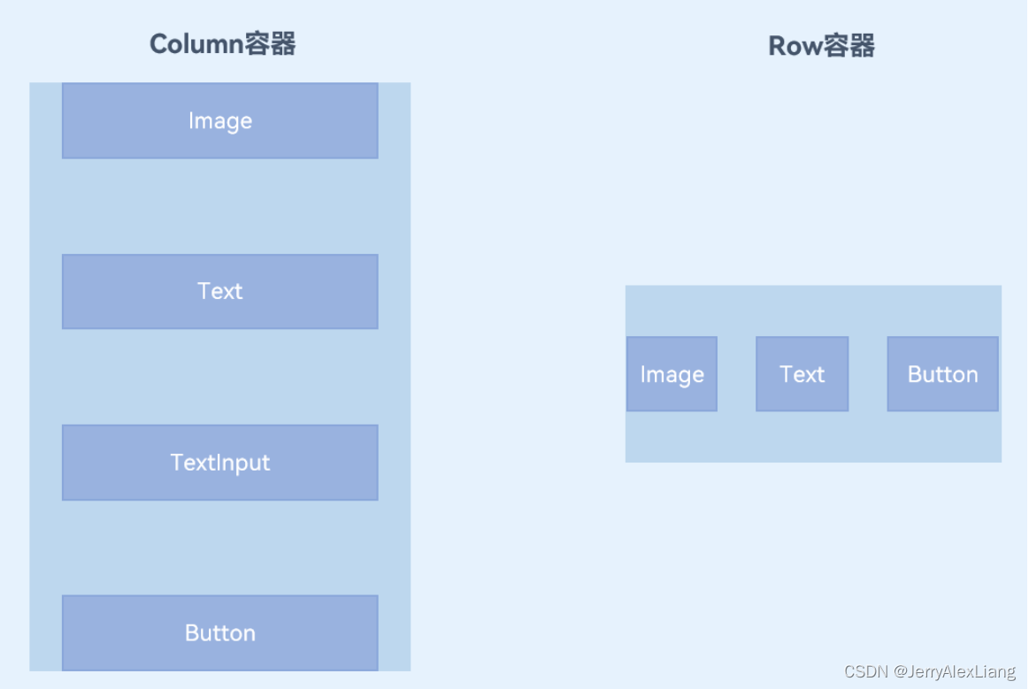
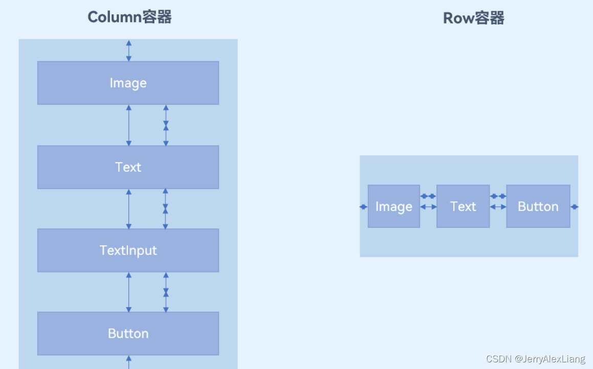
2、主轴方向的对齐(justifyContent)
子组件在主轴方向上的对齐使用justifyContent属性来设置,其参数类型是FlexAlign。FlexAlign定义了以下几种类型:
(1)、Start:元素在主轴方向首端对齐,第一个元素与行首对齐,同时后续的元素与前一个对齐。
(2)、Center:元素在主轴方向中心对齐,第一个元素与行首的距离以及最后一个元素与行尾距离相同。
(3)、End:元素在主轴方向尾部对齐,最后一个元素与行尾对齐,其他元素与后一个对齐。
(4)、SpaceBetween:元素在主轴方向均匀分配弹性元素,相邻元素之间距离相同。 第一个元素与行首对齐,最后一个元素与行尾对齐。
(5)、SpaceAround:元素在主轴方向均匀分配弹性元素,相邻元素之间距离相同。 第一个元素到行首的距离和最后一个元素到行尾的距离是相邻元素之间距离的一半。
(6)、SpaceEvenly:元素在主轴方向等间距布局,无论是相邻元素还是边界元素到容器的间距都一样。
3、交叉轴方向的对齐(alignItems)
子组件在交叉轴方向上的对齐方式使用alignItems属性来设置。
(1)、Column容器的主轴是垂直方向,交叉轴是水平方向,其参数类型为HorizontalAlign(水平对齐),HorizontalAlign定义了以下几种类型:
(2)、Row容器的主轴是水平方向,交叉轴是垂直方向,其参数类型为VerticalAlign(垂直对齐),VerticalAlign定义了以下几种类型:
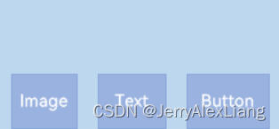
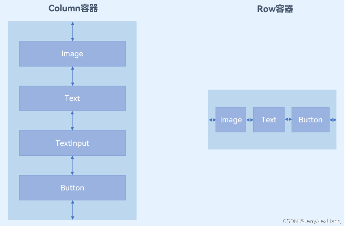
4、主轴方向的间距
Column和Row容器的接口都有一个可选参数space,表示子组件在主轴方向上的间距。
| 容器组件 | 接口 |
|---|---|
| Column | Column(value?:{space?: string |
| Row | Row(value?:{space?: string |
二、列表List组件与Grid网格组件
参考链接:
List组件的相关API参考:List组件
Grid组件的相关API参考:Grid组件
循环渲染(ForEach):循环渲染
在上文Demo中增加 getStudentList2 返回数据数量:
import { DataItemBean } from './DataItemBean';

export class DataModel {
  getStudentList2(): Array<DataItemBean> {
    let studentList: DataItemBean[] = [
      {
        "title": "丁程鑫",
        "image": "https://c-ssl.duitang.com/uploads/item/201805/06/20180506084619_2svWA.jpeg",
      },
      {
        "title": "贺峻霖",
        "image": "https://c-ssl.duitang.com/uploads/blog/202107/05/20210705215458_36c2b.jpg",
      },
      {
        "title": "肖战",
        "image": "https://c-ssl.duitang.com/uploads/blog/202112/17/20211217211133_85430.jpeg",
      },

      ...

      {
        "title": "丁程鑫2",
        "image": "https://c-ssl.duitang.com/uploads/item/201805/06/20180506084619_2svWA.jpeg",
      },
      {
        "title": "贺峻霖2",
        "image": "https://c-ssl.duitang.com/uploads/blog/202107/05/20210705215458_36c2b.jpg",
      },
      {
        "title": "肖战2",
        "image": "https://c-ssl.duitang.com/uploads/blog/202112/17/20211217211133_85430.jpeg",
      },

      ...

    ];
    return studentList;
  }
}

export default new DataModel();

- 1
- 2
- 3
- 4
- 5
- 6
- 7
- 8
- 9
- 10
- 11
- 12
- 13
- 14
- 15
- 16
- 17
- 18
- 19
- 20
- 21
- 22
- 23
- 24
- 25
- 26
- 27
- 28
- 29
- 30
- 31
- 32
- 33
- 34
- 35
- 36
- 37
- 38
- 39
- 40
- 41
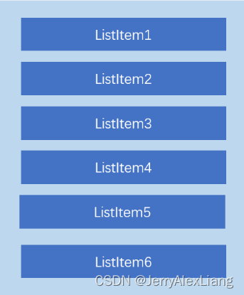
再次运行APP,会发现数据充满整个屏幕,而且是不能进行滑动的,数据显示不全。要想可以滑动列表显示全部数据,这时就需要用到现行列表组件。常见的列表有线性列表(List列表)和网格布局(Grid列表)。
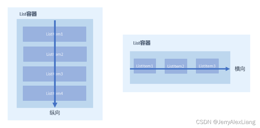
1、List组件
(1)、List是很常用的滚动类容器组件,一般和子组件ListItem一起使用,List列表中的每一个列表项对应一个ListItem组件;
(2)、使用ForEeach渲染列表
列表往往由多个列表项组成,所以我们需要在List组件中使用多个ListItem组件来构建列表,这就会导致代码的冗余。使用循环渲染(ForEach)遍历数组的方式构建列表,可以减少重复代码
对比代码:
在 StudentListPage.ets 代码中:
ForEach(this.studentList2, (item: DataItemBean) => {
     StudentListItem({ studentData: item })
}, (item: string) => JSON.stringify(item))
- 1
- 2
- 3
List组件:
// 列表
List({ space: 16 }) {
	ForEach(this.studentList2, (item: DataItemBean) => {
          ListItem() {
            StudentListItem({ studentData: item })
    }
   }, (item: string) => JSON.stringify(item))
}
.width('100%')
.height('50%')
- 1
- 2
- 3
- 4
- 5
- 6
- 7
- 8
- 9
- 10
运行代码,即可滑动显示所有数据。
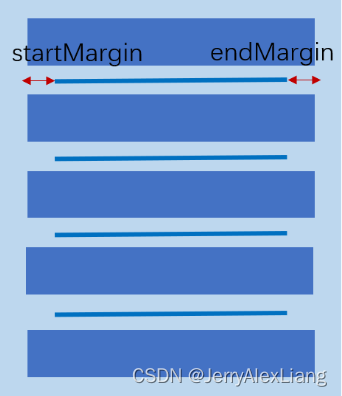
(3)、设置列表分割线
List组件子组件ListItem之间默认是没有分割线的,部分场景子组件ListItem间需要设置分割线,这时候您可以使用List组件的divider属性。divider属性包含四个参数:
- strokeWidth: 分割线的线宽。
- color: 分割线的颜色。
- startMargin:分割线距离列表侧边起始端的距离。
- endMargin: 分割线距离列表侧边结束端的距离。
代码实现:
List({ space: 16 }) {
   ForEach(this.studentList2, (item: DataItemBean) => {
       ListItem() {
          StudentListItem({ studentData: item })
       }
   }, (item: string) => JSON.stringify(item))
}
.width('100%')
.height('50%')
.divider({ strokeWidth: 3, color: Color.Gray, startMargin: 30, endMargin: 0 })
- 1
- 2
- 3
- 4
- 5
- 6
- 7
- 8
- 9
- 10
- 11
(4)、设置List排列方向
List组件里面的列表项默认是按垂直方向排列的,如果您想让列表沿水平方向排列,您可以将List组件的listDirection属性设置为Axis.Horizontal。
listDirection参数类型是Axis,定义了以下两种类型:
-
Vertical(默认值):子组件ListItem在List容器组件中呈纵向排列。
listDirection(Axis.Vertical) -
Horizontal:子组件ListItem在List容器组件中呈横向排列。
listDirection(Axis.Horizontal)
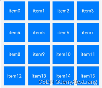
2、Grid组件
(1)、Grid组件一般和子组件GridItem一起使用,Grid列表中的每一个条目对应一个GridItem组件。
(2)、使用ForEach渲染网格布局
使用ForEach渲染网格布局
-
columnsTemplate: 设置当前网格布局列的数量,不设置时默认1列。设置columnsTemplate的值为’1fr 1fr 1fr 1fr’,表示这个网格为4列,将Grid允许的宽分为4等分,每列占1份; -
rowsTemplate:设置当前网格布局行的数量,不设置时默认1行。rowsTemplate的值为’1fr 1fr 1fr 1fr’,表示这个网格为4行,将Grid允许的高分为4等分,每行占1份。 -
columnsGap:设置列与列的间距。eg:使用columnsGap设置列间距为10vp. -
rowsGap:设置行与行的间距。eg:使用rowsTemplate设置行间距也为10vp。
(3)、设置Grid排列方向
Grid组件使用 layoutDirection 设置布局的主轴方向。默认值:GridDirection.Row
注意:
1、网格布局如果使用了固定的行数和列数,则构建出的网格是不可滚动的。
2、有时候因为内容较多,需要通过滚动的方式来显示更多的内容,就需要一个可以滚动的网格布局。只需要设置rowsTemplate和columnsTemplate中的一个即可。
代码示例
(1)、在 StudentListItem.ets 代码中修改Item布局:
import router from '@ohos.router';
import CommonConstants from '../common/constants/CommonConstants';
import { DataItemBean } from '../viewmodel/DataItemBean';

@Component
export default struct StudentListItem {
  @State isChecked: boolean = false;

  private studentData?: DataItemBean;

  aboutToAppear() {
    console.log("DataItemBean", this.studentData.title)
    console.log("DataItemBean", this.studentData.image)
  }

  @Builder checkIcon(icon: Resource) {
    Image(icon)
      .objectFit(ImageFit.Contain)
      .width($r('app.float.checkbox_width'))
      .height($r('app.float.checkbox_height'))
      .margin($r('app.float.checkbox_margin'))
  }

  build() {
    Column() {
        Row() {
          Text(this.studentData.title)
            .fontColor(this.isChecked ? Color.Red : Color.Black)
            .fontSize(this.isChecked ? $r('app.float.item_checked_font_size') : $r('app.float.item_font_size'))
            .fontWeight(500)
            .opacity(this.isChecked ? 0.5 : 1.0)
            .decoration({ type: this.isChecked ? TextDecorationType.LineThrough : TextDecorationType.None })

          Blank()

          Image($r('app.media.ic_arrow_next'))
            .width('30vp')
            .height('30vp')
            .onClick(() => {
              // console.log('Next Click' + this.name);
              console.log('Next Click' + this.studentData.title);
              console.log('Next Click' + this.studentData.image);

              router.pushUrl({
                // url: 'pages/StudentDetailPage',
                url: CommonConstants.STUDENT_DETAIL_URL,
                params: {
                  // name: this.name,
                  studentData: this.studentData
                }
              }).catch((error) => {
                console.log('Next Click', 'IndexPage push error' + JSON.stringify(error));
              })
            })
        }
        .width('100%')
        .padding({ left: 10, right: 10 })

        if (this.isChecked) {
          this.checkIcon($r('app.media.ic_checked'))
        } else {
          this.checkIcon($r('app.media.ic_unchecked'))
        }

      }
      .borderRadius(10)
      .backgroundColor($r('app.color.start_window_background'))
      .width('100%')
      .height($r('app.float.grid_item_height'))
      .padding({ top: 10 })
      .justifyContent(FlexAlign.SpaceEvenly)
      .onClick(() => {
        this.isChecked = !this.isChecked;
      })
  }
}
- 1
- 2
- 3
- 4
- 5
- 6
- 7
- 8
- 9
- 10
- 11
- 12
- 13
- 14
- 15
- 16
- 17
- 18
- 19
- 20
- 21
- 22
- 23
- 24
- 25
- 26
- 27
- 28
- 29
- 30
- 31
- 32
- 33
- 34
- 35
- 36
- 37
- 38
- 39
- 40
- 41
- 42
- 43
- 44
- 45
- 46
- 47
- 48
- 49
- 50
- 51
- 52
- 53
- 54
- 55
- 56
- 57
- 58
- 59
- 60
- 61
- 62
- 63
- 64
- 65
- 66
- 67
- 68
- 69
- 70
- 71
- 72
- 73
- 74
- 75
- 76
(2)、在 StudentListPage.ets 代码中修改List组件为Grid组件:
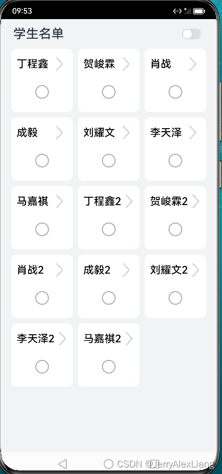
import DataModel from '../viewmodel/DataModel';
import StudentListItem from '../view/StudentListItem';
import router from '@ohos.router';
import prompt from '@system.prompt';
import { DataItemBean } from '../viewmodel/DataItemBean';
// import DataItemBean from '../viewmodel/DataItemBean';

const TAG = '[StudentListPage]';

@Entry
@Component
export struct StudentListPage {
  // private studentList: Array<string> = [];
  private studentList2: Array<DataItemBean> = [];
  @State backMessage: string = '';
  @State isRowModel: boolean = true;

  // 调用router.back()方法,不会新建页面,返回的是原来的页面,在原来页面中@State声明的变量不会重复声明,
  // 以及也不会触发页面的aboutToAppear()生命周期回调,因此无法直接在变量声明以及页面的aboutToAppear()
  // 生命周期回调中接收和解析router.back()传递过来的自定义参数。
  onPageShow() {
    this.backMessage = router.getParams()?.['backMessage'];
    console.log(TAG, 'StudentDetailPage返回数据:StudentListPage => ' + this.backMessage)

    if (this.backMessage != undefined && this.backMessage != "") {
      this.showToast(this.backMessage)
    }
  }

  aboutToAppear() {
    // this.studentList = DataModel.getStudentList();
    this.studentList2 = DataModel.getStudentList2();
    // this.backMessage = router.getParams()?.['backMessage'];
  }

  showToast(message: string) {
    prompt.showToast({
      message: message
    })
  }

  build() {
    Navigation() {
      Row() {
        if (this.isRowModel) {
          Grid() {
            ForEach(this.studentList2, (item: DataItemBean) => {
              GridItem() {
                StudentListItem({ studentData: item, isRowModel: false })
              }
            }, (item: string) => JSON.stringify(item))
          }
          // .width('90%')
          .columnsTemplate('1fr 1fr 1fr')
          // .rowsTemplate('1fr 1fr 1fr')
          .columnsGap(10)
          .rowsGap(10)
          // .layoutDirection(GridDirection.Row)
      }
      .width('90%')
      // .margin({ left: 10, right: 10 })
    }
    .title('学生名单')
    .size({ width: '100%', height: '100%' })
    .titleMode(NavigationTitleMode.Mini)
    .hideBackButton(true)
    .menus(this.NavigationMenus())
    .backgroundColor($r('app.color.page_background'))
  }
}
- 1
- 2
- 3
- 4
- 5
- 6
- 7
- 8
- 9
- 10
- 11
- 12
- 13
- 14
- 15
- 16
- 17
- 18
- 19
- 20
- 21
- 22
- 23
- 24
- 25
- 26
- 27
- 28
- 29
- 30
- 31
- 32
- 33
- 34
- 35
- 36
- 37
- 38
- 39
- 40
- 41
- 42
- 43
- 44
- 45
- 46
- 47
- 48
- 49
- 50
- 51
- 52
- 53
- 54
- 55
- 56
- 57
- 58
- 59
- 60
- 61
- 62
- 63
- 64
- 65
- 66
- 67
- 68
- 69
- 70
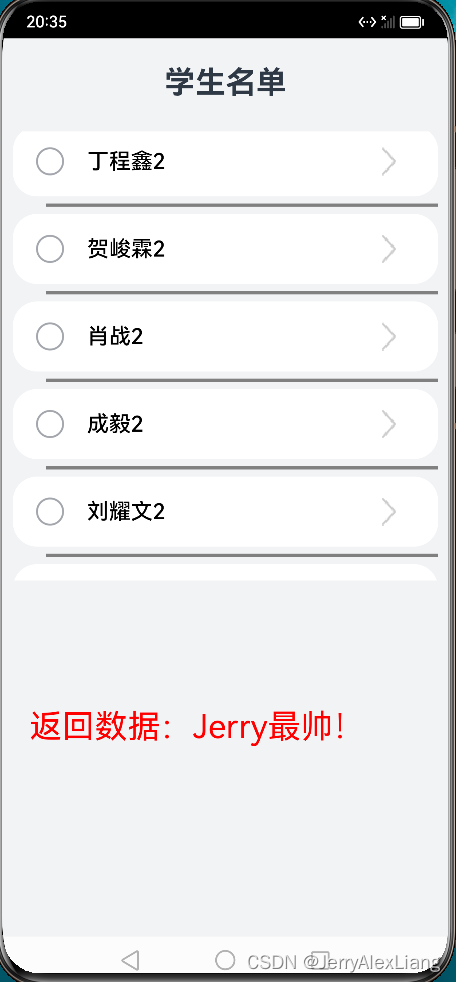
效果图:
三、Tabs组件
参考链接:
Tabs组件的更多属性和参数的使用,可以参考API:Tabs
@Builder装饰器的使用,可以参考:@Builder
使用Tabs组件来实现类似Android开发中的BottomNavigationBar组件效果、TabIndicator效果;
1、属性介绍
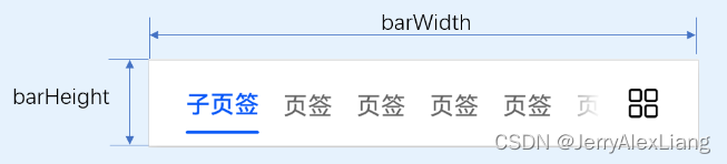
(1)、通过 TabContent 的属性设 tabBar 置 TabBar 的显示内容。使用通用属性width和height设置了Tabs组件的宽高,使用barWidth和barHeight设置了TabBar的宽度和高度
(2)、通过 barMode 设置TabBar布局模式
Tabs的布局模式有Fixed(默认)和Scrollable两种:
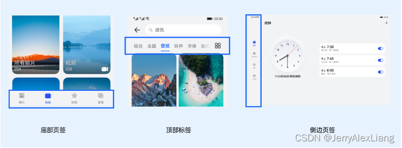
(3)、设置TabBar位置和排列方向
使用Tabs组件接口中的参数barPosition设置页签位置。此外页签显示位置还与vertical属性相关联,vertical属性用于设置页签的排列方向,当vertical的属性值为false(默认值)时页签横向排列,为true时页签纵向排列。
barPosition的值可以设置为BarPosition.Start(默认值)和BarPosition.End:
-
BarPosition.Startvertical属性方法设置为false(默认值)时,页签位于容器顶部。
vertical属性方法设置为true时,页签位于容器左侧。 -
BarPosition.Endvertical属性方法设置为false时,页签位于容器底部。
vertical属性方法设置为true时,页签位于容器右侧。
(4)、自定义TabBar样式
TabContent的tabBar属性除了支持string类型,还支持使用@Builder装饰器修饰的函数。您可以使用@Builder装饰器,构造一个生成自定义TabBar样式的函数,实现自定义的底部页签效果。
代码实现:
@State currentIndex: number = CommonConstants.STUDENT_LIST_TAB_INDEX

  // 设置Tabs控制器 Tabs组件的控制器,用于控制Tabs组件进行页签切换。不支持一个TabsController控制多个Tabs组件
  private tabsController: TabsController = new TabsController();

  // TabContent的tabBar属性除了支持string类型,还支持使用@Builder装饰器修饰的函数。
  // 可以使用@Builder装饰器,构造一个生成自定义TabBar样式的函数,实现上面的底部页签效果
  @Builder TabBuilder(title: string, index: number, selectImage: Resource, normalImage: Resource) {
    Column() {
      Image(this.currentIndex === index ? selectImage : normalImage)
        .width($r('app.float.mainPage_baseTab_size'))
        .height($r('app.float.mainPage_baseTab_size'))

      Text(title)
        .margin({ top: $r('app.float.mainPage_baseTab_top') })
        .fontSize(this.currentIndex === index ? $r('app.float.main_tab_selected_fontSize')
                                              : $r('app.float.main_tab_normal_fontSize'))
        .fontColor(this.currentIndex === index ? $r('app.color.mainPage_selected_color')
                                               : $r('app.color.mainPage_normal_color'))
    }
    .justifyContent(FlexAlign.Center)
    .height($r('app.float.mainPage_barHeight'))
    .width(CommonConstants.FULL_WIDTH)
    .onClick(() => {
      this.currentIndex = index;
      // 控制Tabs切换到指定页签
      this.tabsController.changeIndex(this.currentIndex);
    })
  }
- 1
- 2
- 3
- 4
- 5
- 6
- 7
- 8
- 9
- 10
- 11
- 12
- 13
- 14
- 15
- 16
- 17
- 18
- 19
- 20
- 21
- 22
- 23
- 24
- 25
- 26
- 27
- 28
- 29
2、代码实现
新建 MainPage.ets,初始化TabsController去设置Tabs组件;
import CommonConstants from '../common/constants/CommonConstants'
import GalleryPage from '../view/GalleryPage';
import { StudentListPage } from './StudentListPage';

@Entry
@Component
struct MainPage {
  @State currentIndex: number = CommonConstants.STUDENT_LIST_TAB_INDEX

  // 设置Tabs控制器 Tabs组件的控制器,用于控制Tabs组件进行页签切换。不支持一个TabsController控制多个Tabs组件
  private tabsController: TabsController = new TabsController();

  // TabContent的tabBar属性除了支持string类型,还支持使用@Builder装饰器修饰的函数。
  // 可以使用@Builder装饰器,构造一个生成自定义TabBar样式的函数,实现上面的底部页签效果
  @Builder TabBuilder(title: string, index: number, selectImage: Resource, normalImage: Resource) {
    Column() {
      Image(this.currentIndex === index ? selectImage : normalImage)
        .width($r('app.float.mainPage_baseTab_size'))
        .height($r('app.float.mainPage_baseTab_size'))

      Text(title)
        .margin({ top: $r('app.float.mainPage_baseTab_top') })
        .fontSize(this.currentIndex === index ? $r('app.float.main_tab_selected_fontSize')
                                              : $r('app.float.main_tab_normal_fontSize'))
        .fontColor(this.currentIndex === index ? $r('app.color.mainPage_selected_color')
                                               : $r('app.color.mainPage_normal_color'))
    }
    .justifyContent(FlexAlign.Center)
    .height($r('app.float.mainPage_barHeight'))
    .width(CommonConstants.FULL_WIDTH)
    .onClick(() => {
      this.currentIndex = index;
      // 控制Tabs切换到指定页签
      this.tabsController.changeIndex(this.currentIndex);
    })
  }

  build() {
    Tabs({
      barPosition: BarPosition.End,
      controller: this.tabsController,
    }) {
      TabContent() {
        StudentListPage()
      }
      .tabBar(
        this.TabBuilder(
          CommonConstants.STUDENT_LIST_TITLE, CommonConstants.STUDENT_LIST_TAB_INDEX,
          $r('app.media.ic_home_selected'), $r('app.media.ic_home_normal')
        ))

      TabContent() {
        GalleryPage()
      }
      .tabBar(
        this.TabBuilder(
          CommonConstants.PICTURE_TITLE, CommonConstants.PICTURE_TAB_INDEX,
          $r('app.media.ic_checked'), $r('app.media.ic_unchecked')
        ))
    }
    .vertical(true)
    .scrollable(true) // 设置为true时可以通过滑动页面进行页面切换,为false时不可滑动切换页面。默认值:true
    .width(CommonConstants.FULL_WIDTH) // 设置Tabs组件宽度
    .height(CommonConstants.FULL_HEIGHT) // 设置Tabs组件高度
    .backgroundColor(Color.White) // 设置Tabs组件背景颜色
    .barWidth(CommonConstants.FULL_WIDTH) // 设置TabBar宽度
    .barHeight($r('app.float.mainPage_barHeight')) // 设置TabBar高度
    .barMode(BarMode.Scrollable) // Tabs的布局模式有Fixed(默认)和Scrollable两种
    .onChange((index: number) => {
      // Tabs的布局模式有Fixed(默认)和Scrollable两种
      this.currentIndex = index;
    })
  }
}
- 1
- 2
- 3
- 4
- 5
- 6
- 7
- 8
- 9
- 10
- 11
- 12
- 13
- 14
- 15
- 16
- 17
- 18
- 19
- 20
- 21
- 22
- 23
- 24
- 25
- 26
- 27
- 28
- 29
- 30
- 31
- 32
- 33
- 34
- 35
- 36
- 37
- 38
- 39
- 40
- 41
- 42
- 43
- 44
- 45
- 46
- 47
- 48
- 49
- 50
- 51
- 52
- 53
- 54
- 55
- 56
- 57
- 58
- 59
- 60
- 61
- 62
- 63
- 64
- 65
- 66
- 67
- 68
- 69
- 70
- 71
- 72
- 73
- 74
其中在 GalleryPage().ets 中先放置一个Text组件显示页面;
@Component
export default struct GalleryPage {
  build() {
    Column() {
      Text('Gallery')
        .fontSize('22fp')
    }
    .width('100%')
    .height('100%')
    .justifyContent(FlexAlign.Center)
    .backgroundColor($r('app.color.page_background'))
  }
}
- 1
- 2
- 3
- 4
- 5
- 6
- 7
- 8
- 9
- 10
- 11
- 12
- 13
实现效果:
底部导航栏效果:
设置 Tabs 组件的属性 barPosition: BarPosition.End ,并且设置 .vertical(false),就将页签位于容器底部,设置TabBar宽度为 100%,高度设置为 56vp
@Entry
@Component
struct MainPage {

  ...

  build() {
    Tabs({
      barPosition: BarPosition.End,
      controller: this.tabsController,
    }) {
      ...
    }
    .vertical(false)
    .scrollable(true) // 设置为true时可以通过滑动页面进行页面切换,为false时不可滑动切换页面。默认值:true
    .width(CommonConstants.FULL_WIDTH) // 设置Tabs组件宽度
    .height(CommonConstants.FULL_HEIGHT) // 设置Tabs组件高度
    .backgroundColor(Color.White) // 设置Tabs组件背景颜色
    .barWidth(CommonConstants.FULL_WIDTH) // 设置TabBar宽度
    .barHeight($r('app.float.mainPage_barHeight')) // 设置TabBar高度
    .barMode(BarMode.Fixed) // Tabs的布局模式有Fixed(默认)和Scrollable两种
    .onChange((index: number) => {
      // Tabs的布局模式有Fixed(默认)和Scrollable两种
      this.currentIndex = index;
    })
  }
}
- 1
- 2
- 3
- 4
- 5
- 6
- 7
- 8
- 9
- 10
- 11
- 12
- 13
- 14
- 15
- 16
- 17
- 18
- 19
- 20
- 21
- 22
- 23
- 24
- 25
- 26
- 27
侧边导航栏效果:
设置 Tabs 组件的属性 barPosition: BarPosition.End ,并且设置 .vertical(true),就将页签位于容器底部,设置TabBar宽度为 56vp,高度设置为100%
@Entry
@Component
struct MainPage {

  ...

  build() {
    Tabs({
      barPosition: BarPosition.End,
      controller: this.tabsController,
    }) {
      ...
    }
    .vertical(true)
    .scrollable(true) // 设置为true时可以通过滑动页面进行页面切换,为false时不可滑动切换页面。默认值:true
    .width(CommonConstants.FULL_WIDTH) // 设置Tabs组件宽度
    .height(CommonConstants.FULL_HEIGHT) // 设置Tabs组件高度
    .backgroundColor(Color.White) // 设置Tabs组件背景颜色
    .barWidth($r('app.float.mainPage_barHeight')) // 设置TabBar宽度
    .barHeight(CommonConstants.FULL_WIDTH) // 设置TabBar高度
    .barMode(BarMode.Fixed) // Tabs的布局模式有Fixed(默认)和Scrollable两种
    .onChange((index: number) => {
      // Tabs的布局模式有Fixed(默认)和Scrollable两种
      this.currentIndex = index;
    })
  }
}
- 1
- 2
- 3
- 4
- 5
- 6
- 7
- 8
- 9
- 10
- 11
- 12
- 13
- 14
- 15
- 16
- 17
- 18
- 19
- 20
- 21
- 22
- 23
- 24
- 25
- 26
- 27
四、Swiper组件
参考链接:
滑块视图容器,提供子组件滑动轮播显示的能力
1、属性介绍
(1)、控制器 SwiperController
给组件绑定一个控制器,用来控制组件翻页
- showNext : 翻至下一页。翻页带动效切换过程,时长通过duration指定。
- showPrevious : 翻至上一页。翻页带动效切换过程,时长通过duration指定。
- finishAnimation : 停止播放动画。
(2)、autoPlay
子组件是否自动播放。默认值:false
loop为false时,自动轮播到最后一页时停止轮播。手势切换后不是最后一页时继续播放。
(3)、interval
使用自动播放时播放的时间间隔,单位为毫秒。默认值:3000
(4)、indicator
是否启用导航点指示器。默认值:true
(5)、loop
是否开启循环。默认值:true
设置为true时表示开启循环,在LazyForEach懒循环加载模式下,加载的组件数量建议大于5个。
(6)、duration
子组件切换的动画时长,单位为毫秒。默认值:400
(7)、vertical
是否为纵向滑动。默认值:false
(8)、itemSpace
设置子组件与子组件之间间隙。默认值:0
说明:不支持设置百分比。
(9)、disableSwipe
禁用组件滑动切换功能。默认值:false
(10)、indicatorStyle {}
设置导航点样式:
-
left: 设置导航点距离Swiper组件左边的距离。
-
top: 设置导航点距离Swiper组件顶部的距离。
-
right: 设置导航点距离Swiper组件右边的距离。
-
bottom: 设置导航点距离Swiper组件底部的距离。
-
size: 设置导航点的直径。不支持设置百分比。默认值:6vp。
-
mask: 设置是否显示导航点蒙层样式。
-
color: 设置导航点的颜色。
-
selectedColor: 设置选中的导航点的颜色。
2、事件 onChange
onChange(event: (index: number) => void)
- 1
* 当前显示的子组件索引变化时触发该事件,返回值为当前显示的子组件的索引值。
* 说明:Swiper组件结合LazyForEach使用时,不能在onChange事件里触发子页面UI的刷新。
* 返回值:index:number , 代表当前显示元素的索引。
3、代码示例
实现效果:在List组件、Grid组件上面增加Swiper轮播组件,整体滑动:

在 StudentListPage.ets 中修改:
使用@Builder构建Swiper自定义组件:
@Builder SwiperBuilder(studentList: Array<DataItemBean>) {
    Swiper(this.swiperController) {
      ForEach(studentList, (item: DataItemBean) => {
        Image(item.image)
          .borderRadius($r('app.float.home_swiper_borderRadius'))
          .width('100%')
          .height('240vp')
          .objectFit(ImageFit.Fill)
          .onClick(() => {
            router.pushUrl({
              // url: 'pages/StudentDetailPage',
              url: CommonConstants.STUDENT_DETAIL_URL,
              params: {
                studentData: item
              }
            }).catch((error) => {
              console.log('Next Click', 'IndexPage push error' + JSON.stringify(error));
            })
          })
      }, (item: DataItemBean) => JSON.stringify(item))
    }
    .autoPlay(true)
    .indicatorStyle({ mask: true, bottom: '10vp' })
    .margin({ top: $r('app.float.home_swiper_margin'), bottom: $r('app.float.home_swiper_margin') })
  }
- 1
- 2
- 3
- 4
- 5
- 6
- 7
- 8
- 9
- 10
- 11
- 12
- 13
- 14
- 15
- 16
- 17
- 18
- 19
- 20
- 21
- 22
- 23
- 24
- 25
(1)、List列表中修改:
嵌入 Scroll 列表中:
import DataModel from '../viewmodel/DataModel';
import StudentListItem from '../view/StudentListItem';
import router from '@ohos.router';
import prompt from '@system.prompt';
import { DataItemBean } from '../viewmodel/DataItemBean';
import CommonConstants from '../common/constants/CommonConstants';

const TAG = '[StudentListPage]';

@Entry
@Component
export struct StudentListPage {

  private studentList2: Array<DataItemBean> = [];

 ...

  // Swiper控制器
  private swiperController: SwiperController = new SwiperController();

  ...

  @Builder NavigationMenus() {
    Row() {
      Toggle({ type: ToggleType.Switch, isOn: true })
        .selectedColor(Color.Red)
        .switchPointColor(Color.White)
        .onChange((isOn: boolean) => {
          // this.isListModel = !this.isListModel
          this.isListModel = isOn
        })
    }
  }

  @Builder SwiperBuilder(studentList: Array<DataItemBean>) {
    Swiper(this.swiperController) {
      ForEach(studentList, (item: DataItemBean) => {
        Image(item.image)
          .borderRadius($r('app.float.home_swiper_borderRadius'))
          .width('100%')
          .height('240vp')
          .objectFit(ImageFit.Fill)
          .onClick(() => {
            router.pushUrl({
              // url: 'pages/StudentDetailPage',
              url: CommonConstants.STUDENT_DETAIL_URL,
              params: {
                studentData: item
              }
            }).catch((error) => {
              console.log('Next Click', 'IndexPage push error' + JSON.stringify(error));
            })
          })
      }, (item: DataItemBean) => JSON.stringify(item))
    }
    .autoPlay(true)
    .indicatorStyle({ mask: true, bottom: '10vp' })
    .margin({ top: $r('app.float.home_swiper_margin'), bottom: $r('app.float.home_swiper_margin') })
  }

  build() {
    Navigation() {
      Row() {
        Scroll() {
            Column() {
              // Swiper组件
              this.SwiperBuilder(this.studentList2)
              // 列表
              // List组件子组件ListItem之间默认是没有分割线的,部分场景子组件ListItem间需要设置分割线,
              // 这时候可以使用List组件的divider属性。divider属性包含四个参数:
              // 1、strokeWidth: 分割线的线宽。
              // 2、color: 分割线的颜色。
              // 3、startMargin:分割线距离列表侧边起始端的距离。
              // 4、endMargin: 分割线距离列表侧边结束端的距离
              List({ space: 16 }) {
                ForEach(this.studentList2, (item: DataItemBean) => {
                  ListItem() {
                    StudentListItem({ studentData: item, isRowModel: true })
                  }
                }, (item: string) => JSON.stringify(item))
              }
              // .width('90%')
              .divider({ strokeWidth: 1, color: Color.Gray, startMargin: 30, endMargin: 0 })
              // .listDirection(Axis.Horizontal)

              Text('---没有更多了---').fontSize('22vp').margin('30vp')
            }
          }
          .scrollBar(BarState.Off)
          .edgeEffect(EdgeEffect.Spring)
      }
      .width('90%')
    }
    .title('学生名单')
    .size({ width: '100%', height: '100%' })
    .titleMode(NavigationTitleMode.Mini)
    .hideBackButton(true)
    .menus(this.NavigationMenus())
    .backgroundColor($r('app.color.page_background'))
  }
}
- 1
- 2
- 3
- 4
- 5
- 6
- 7
- 8
- 9
- 10
- 11
- 12
- 13
- 14
- 15
- 16
- 17
- 18
- 19
- 20
- 21
- 22
- 23
- 24
- 25
- 26
- 27
- 28
- 29
- 30
- 31
- 32
- 33
- 34
- 35
- 36
- 37
- 38
- 39
- 40
- 41
- 42
- 43
- 44
- 45
- 46
- 47
- 48
- 49
- 50
- 51
- 52
- 53
- 54
- 55
- 56
- 57
- 58
- 59
- 60
- 61
- 62
- 63
- 64
- 65
- 66
- 67
- 68
- 69
- 70
- 71
- 72
- 73
- 74
- 75
- 76
- 77
- 78
- 79
- 80
- 81
- 82
- 83
- 84
- 85
- 86
- 87
- 88
- 89
- 90
- 91
- 92
- 93
- 94
- 95
- 96
- 97
- 98
- 99
- 100
- 101
(1)、Grid列表中修改:
嵌入 Scroll 列表中:
import DataModel from '../viewmodel/DataModel';
import StudentListItem from '../view/StudentListItem';
import router from '@ohos.router';
import prompt from '@system.prompt';
import { DataItemBean } from '../viewmodel/DataItemBean';
import CommonConstants from '../common/constants/CommonConstants';

const TAG = '[StudentListPage]';

@Entry
@Component
export struct StudentListPage {

  private studentList2: Array<DataItemBean> = [];

  ...

  // Swiper控制器
  private swiperController: SwiperController = new SwiperController();

  ...

  build() {
    Navigation() {
      Row() {
        Scroll() {
            Column() {
              // Swiper组件
              this.SwiperBuilder(this.studentList2)

              Grid() {
                ForEach(this.studentList2, (item: DataItemBean) => {
                  GridItem() {
                    StudentListItem({ studentData: item, isRowModel: false })
                  }
                }, (item: string) => JSON.stringify(item))
              }
              .columnsTemplate('1fr 1fr 1fr')
              .rowsTemplate('1fr 1fr 1fr 1fr 1fr')
              .columnsGap('10vp')
              .rowsGap('10vp')
              .height('640vp')
              // .layoutDirection(GridDirection.Row)

              Text('---没有更多了---').fontSize('22vp').margin('30vp')
            }
          }
          .scrollBar(BarState.Off)
          .edgeEffect(EdgeEffect.Spring)
      }
      .width('90%')
      // .margin({ left: 10, right: 10 })
    }
    .title('学生名单')
    .size({ width: '100%', height: '100%' })
    .titleMode(NavigationTitleMode.Mini)
    .hideBackButton(true)
    .menus(this.NavigationMenus())
    .backgroundColor($r('app.color.page_background'))
  }
}
- 1
- 2
- 3
- 4
- 5
- 6
- 7
- 8
- 9
- 10
- 11
- 12
- 13
- 14
- 15
- 16
- 17
- 18
- 19
- 20
- 21
- 22
- 23
- 24
- 25
- 26
- 27
- 28
- 29
- 30
- 31
- 32
- 33
- 34
- 35
- 36
- 37
- 38
- 39
- 40
- 41
- 42
- 43
- 44
- 45
- 46
- 47
- 48
- 49
- 50
- 51
- 52
- 53
- 54
- 55
- 56
- 57
- 58
- 59
- 60
- 61
附 StudentListPage.ets 完整代码:
import DataModel from '../viewmodel/DataModel';
import StudentListItem from '../view/StudentListItem';
import router from '@ohos.router';
import prompt from '@system.prompt';
import { DataItemBean } from '../viewmodel/DataItemBean';
import CommonConstants from '../common/constants/CommonConstants';
// import DataItemBean from '../viewmodel/DataItemBean';

const TAG = '[StudentListPage]';

@Entry
@Component
export struct StudentListPage {
  // private studentList: Array<string> = [];
  private studentList2: Array<DataItemBean> = [];

  // 返回上一层数据
  @State backMessage: string = '';

  // 是否是List组件模式
  @State isListModel: boolean = true;

  // Swiper控制器
  private swiperController: SwiperController = new SwiperController();

  // 调用router.back()方法,不会新建页面,返回的是原来的页面,在原来页面中@State声明的变量不会重复声明,
  // 以及也不会触发页面的aboutToAppear()生命周期回调,因此无法直接在变量声明以及页面的aboutToAppear()
  // 生命周期回调中接收和解析router.back()传递过来的自定义参数。
  onPageShow() {
    this.backMessage = router.getParams()?.['backMessage'];
    console.log(TAG, 'StudentDetailPage返回数据:StudentListPage => ' + this.backMessage)

    if (this.backMessage != undefined && this.backMessage != "") {
      this.showToast(this.backMessage)
    }
  }

  aboutToAppear() {
    // this.studentList = DataModel.getStudentList();
    this.studentList2 = DataModel.getStudentList2();
    // this.backMessage = router.getParams()?.['backMessage'];
  }

  showToast(message: string) {
    prompt.showToast({
      message: message
    })
  }

  @Builder NavigationMenus() {
    Row() {
      Toggle({ type: ToggleType.Switch, isOn: true })
        .selectedColor(Color.Red)
        .switchPointColor(Color.White)
        .onChange((isOn: boolean) => {
          // this.isListModel = !this.isListModel
          this.isListModel = isOn
        })
    }
  }

  @Builder SwiperBuilder(studentList: Array<DataItemBean>) {
    Swiper(this.swiperController) {
      ForEach(studentList, (item: DataItemBean) => {
        Image(item.image)
          .borderRadius($r('app.float.home_swiper_borderRadius'))
          .width('100%')
          .height('240vp')
          .objectFit(ImageFit.Fill)
          .onClick(() => {
            router.pushUrl({
              // url: 'pages/StudentDetailPage',
              url: CommonConstants.STUDENT_DETAIL_URL,
              params: {
                studentData: item
              }
            }).catch((error) => {
              console.log('Next Click', 'IndexPage push error' + JSON.stringify(error));
            })
          })
      }, (item: DataItemBean) => JSON.stringify(item))
    }
    .autoPlay(true)
    .indicatorStyle({ mask: true, bottom: '10vp' })
    .margin({ top: $r('app.float.home_swiper_margin'), bottom: $r('app.float.home_swiper_margin') })
  }

  build() {
    Navigation() {
      Row() {
        if (this.isListModel) {
          Scroll() {
            Column() {
              // Swiper组件
              this.SwiperBuilder(this.studentList2)
              // 列表
              // List组件子组件ListItem之间默认是没有分割线的,部分场景子组件ListItem间需要设置分割线,
              // 这时候可以使用List组件的divider属性。divider属性包含四个参数:
              // 1、strokeWidth: 分割线的线宽。
              // 2、color: 分割线的颜色。
              // 3、startMargin:分割线距离列表侧边起始端的距离。
              // 4、endMargin: 分割线距离列表侧边结束端的距离
              List({ space: 16 }) {
                ForEach(this.studentList2, (item: DataItemBean) => {
                  ListItem() {
                    StudentListItem({ studentData: item, isRowModel: true })
                  }
                }, (item: string) => JSON.stringify(item))
              }
              // .width('90%')
              .divider({ strokeWidth: 1, color: Color.Gray, startMargin: 30, endMargin: 0 })
              // .listDirection(Axis.Horizontal)

              Text('---没有更多了---').fontSize('22vp').margin('30vp')
            }
          }
          .scrollBar(BarState.Off)
          .edgeEffect(EdgeEffect.Spring)
        } else {
          Scroll() {
            Column() {
              // Swiper组件
              this.SwiperBuilder(this.studentList2)

              Grid() {
                ForEach(this.studentList2, (item: DataItemBean) => {
                  GridItem() {
                    StudentListItem({ studentData: item, isRowModel: false })
                  }
                }, (item: string) => JSON.stringify(item))
              }
              .columnsTemplate('1fr 1fr 1fr')
              .rowsTemplate('1fr 1fr 1fr 1fr 1fr')
              .columnsGap('10vp')
              .rowsGap('10vp')
              .height('640vp')
              // .layoutDirection(GridDirection.Row)

              Text('---没有更多了---').fontSize('22vp').margin('30vp')
            }
          }
          .scrollBar(BarState.Off)
          .edgeEffect(EdgeEffect.Spring)
        }
      }
      .width('90%')
      // .margin({ left: 10, right: 10 })
    }
    .title('学生名单')
    .size({ width: '100%', height: '100%' })
    .titleMode(NavigationTitleMode.Mini)
    .hideBackButton(true)
    .menus(this.NavigationMenus())
    .backgroundColor($r('app.color.page_background'))
  }
}
- 1
- 2
- 3
- 4
- 5
- 6
- 7
- 8
- 9
- 10
- 11
- 12
- 13
- 14
- 15
- 16
- 17
- 18
- 19
- 20
- 21
- 22
- 23
- 24
- 25
- 26
- 27
- 28
- 29
- 30
- 31
- 32
- 33
- 34
- 35
- 36
- 37
- 38
- 39
- 40
- 41
- 42
- 43
- 44
- 45
- 46
- 47
- 48
- 49
- 50
- 51
- 52
- 53
- 54
- 55
- 56
- 57
- 58
- 59
- 60
- 61
- 62
- 63
- 64
- 65
- 66
- 67
- 68
- 69
- 70
- 71
- 72
- 73
- 74
- 75
- 76
- 77
- 78
- 79
- 80
- 81
- 82
- 83
- 84
- 85
- 86
- 87
- 88
- 89
- 90
- 91
- 92
- 93
- 94
- 95
- 96
- 97
- 98
- 99
- 100
- 101
- 102
- 103
- 104
- 105
- 106
- 107
- 108
- 109
- 110
- 111
- 112
- 113
- 114
- 115
- 116
- 117
- 118
- 119
- 120
- 121
- 122
- 123
- 124
- 125
- 126
- 127
- 128
- 129
- 130
- 131
- 132
- 133
- 134
- 135
- 136
- 137
- 138
- 139
- 140
- 141
- 142
- 143
- 144
- 145
- 146
- 147
- 148
- 149
- 150
- 151
- 152
- 153
- 154
- 155
- 156
总结
本节梳理了HarmonyOS中使用ArkTs语言开发实现基本组件、容器组件、List组件、Grid组件、轮播组件Swiper以及页签切换组件Tabs等基本组件的使用,实现了 一个可以左右滑动切换视图的 带有顶部轮播Banner的
Star List,并且通过Toggle({ type: ToggleType.Switch, isOn: true })组件切换List视图与Grid列表视图功能。

