
热门标签
热门文章
- 1《数据结构》学习笔记-第八章 高级搜索树(ABST)_第8章 高级搜索树
- 2SensorService启动-Android12_android重启sensor
- 3无头单向链表_无头链表
- 4Python中的异常处理:try, except, else, finally详解_python try if else
- 5信创=国产化?一文带你快速了解信创和国产化_信创国产化
- 6Docker - Windows 11 下 Docker Desktop 的 下载 安装 配置 使用_dockerdesktop
- 7Vite+Vue3+Ts配置ESllint_vite+vue3+ts 配置eslint
- 8javaScript中String中配合正则匹配的一些方法_string正则匹配
- 9git的基本理解_git的解释
- 10Prometheus(六):Blackbox监控安装配置_prometheus blackbox
当前位置: article > 正文
前端 CSS 经典:文字描边
作者:代码探险家 | 2024-06-28 21:44:41
赞
踩
前端 CSS 经典:文字描边
前言:文字描边有两种实现方式
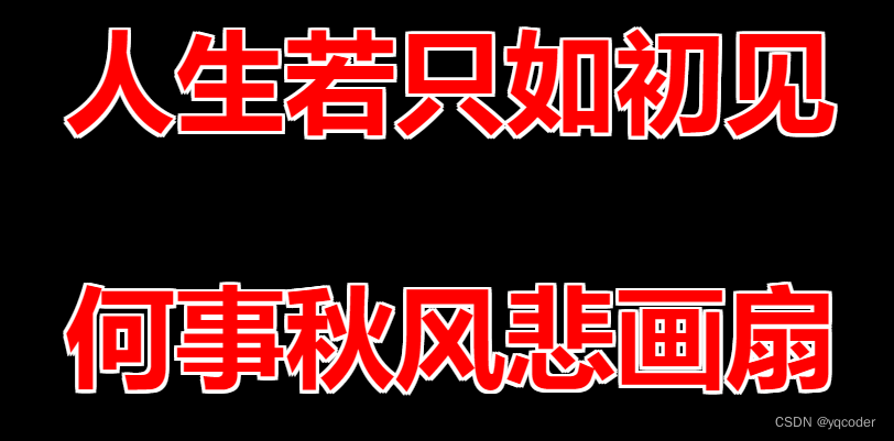
1. text-shadow
设置 8 个方向的文字阴影,缺点是只有八个方向,文字转角处可能有锯齿状。不支持文字透明,设置 color: transparent,文字会成描边颜色。
- <!DOCTYPE html>
- <html lang="en">
- <head>
- <meta charset="utf-8" />
- <meta http-equiv="X-UA-Compatible" content="IE=edge" />
- <meta
- name="viewport"
- content="initial-scale=1.0, user-scalable=no, width=device-width"
- />
- <title>document</title>
- <style>
- body {
- background: #000;
- }
-
- p {
- text-align: center;
- font-weight: bold;
- font-size: 5em;
- color: red;
- text-shadow: 0 -2px #fff, 2px 0px #fff, 0 2px #fff, -2px 0 #fff,
- -2px -2px #fff, 2px 2px #fff, 2px -2px #fff, -2px 2px #fff;
- }
- </style>
- </head>
- <body>
- <p>人生若只如初见</p>
- <p>何事秋风悲画扇</p>
- <script></script>
- </body>
- </html>

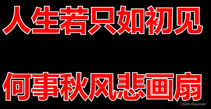
2. -webkit-text-stroke
描边属性,支持文字透明。只留描边。缺点是兼容性,文字会变细,文字变细可以通过 JS 解决。
- <!DOCTYPE html>
- <html lang="en">
- <head>
- <meta charset="utf-8" />
- <meta http-equiv="X-UA-Compatible" content="IE=edge" />
- <meta
- name="viewport"
- content="initial-scale=1.0, user-scalable=no, width=device-width"
- />
- <title>document</title>
- <style>
- body {
- background: #000;
- }
-
- p {
- font-weight: bold;
- font-size: 5em;
- color: red;
- -webkit-text-stroke: 4px #fff;
- position: relative;
- }
- p::after {
- content: attr(data-text);
- position: absolute;
- left: 0;
- top: 0;
- text-align: center;
- -webkit-text-stroke: 0;
- }
- </style>
- </head>
- <body>
- <p>人生若只如初见</p>
- <p>何事秋风悲画扇</p>
- <script>
- const ps = document.querySelectorAll("p");
- ps.forEach((p) => {
- p.dataset.text = p.textContent;
- });
- </script>
- </body>
- </html>
声明:本文内容由网友自发贡献,版权归原作者所有,本站不承担相应法律责任。如您发现有侵权的内容,请联系我们。转载请注明出处:【wpsshop博客】
推荐阅读
相关标签

