
热门标签
热门文章
- 1Redis --- 高级篇_redis高级
- 2YOLOX可视化训练工具(webyolox)_yolo训练工具
- 3sql语句大全
- 4百度地图api接口获得密钥_百度地图api的访问密钥是什么
- 5OKR大决战:英特尔的总市值只有英伟达的一个零头_英伟达英特尔市值
- 6C# Web控件与数据感应之属性统一设置
- 7解决git报错 “remote: Please remove the file from history and try again.”
- 8敏捷迭代就是小瀑布吗?为什么创业团队更敏捷?_敏捷是瀑布的微型
- 9微调Llama2自我认知_自我认知数据集
- 10【信道估计】基于最小二乘法LS+最小均方误差MMSE+线性最小均方误差法LMMSE OFDM信道估计附Matlab代码_mmse lmmse
当前位置: article > 正文
Python最全的曲线绘制示例_python 绘制曲线
作者:人工智能uu | 2024-07-20 07:20:45
赞
踩
python 绘制曲线
废话少说,直接上代码:
- import numpy as np
- import pandas as pd
- import matplotlib.pylab as plt
- from pylab import *
- from proplot import rc
-
- #设置坐标刻度在内侧显示,需放在程序的最前面才可以生效
- plt.rcParams['xtick.direction'] = 'in' # 将x周的刻度线方向设置向内
- plt.rcParams['ytick.direction'] = 'in' # 将y轴的刻度方向设置向内`
- #设置在图形中可显示中文
- plt.rcParams['font.sans-serif'] = ['SimHei']
- #字号和线宽用于对绘制曲线中字号和线宽的设置
- zihao = 16
- xiankuan = 0.5
- # 统一设置轴刻度标签的字体大小
- rc['tick.labelsize'] = zihao
- # 统一设置xy轴名称的字体大小
- rc["axes.labelsize"] = zihao
- rc["axes.titlesize"] = zihao
- # 统一设置轴刻度标签的字体粗细
- rc["axes.labelweight"] = "light"
- # 统一设置xy轴名称的字体粗细
- rc["tick.labelweight"] = "bold"
- #设置图例的字体大小
- plt.rc("legend", fontsize=zihao)
-
- #建立一个图形画布
- fig, axs = plt.subplots()
- #在画布上绘制两条曲线
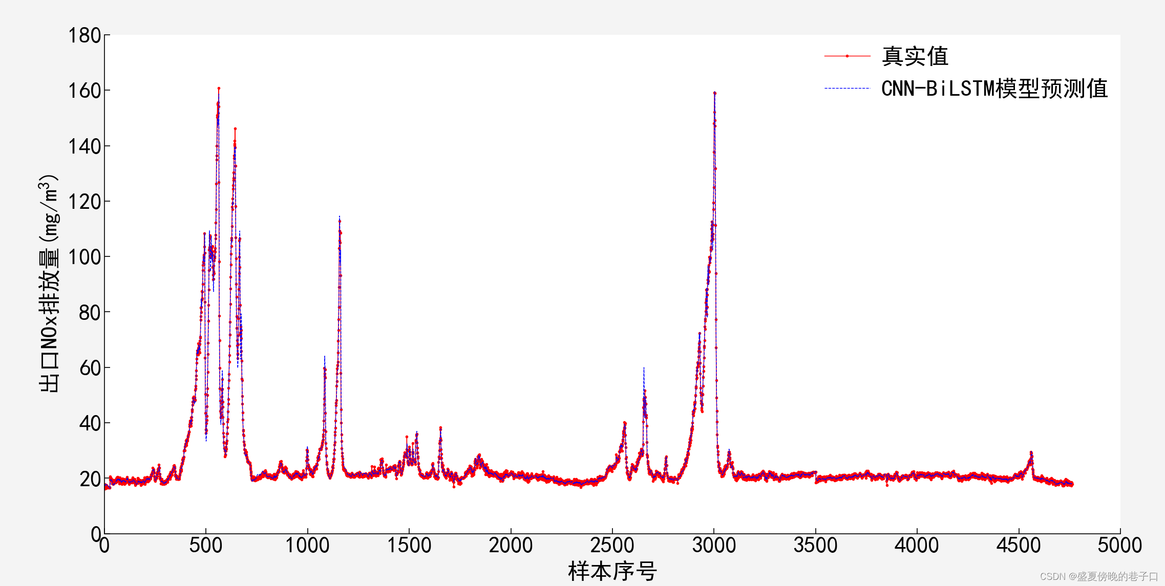
- axs.plot(np.arange(len(y_test)), y_test[:, 0], '.-', color='red', label='真实值', linewidth=xiankuan,markersize="2") #第一条曲线
- axs.plot(np.arange(len(y_test)), y_test_pred[:, 0], '--', color='blue', label='CNN-BiLSTM模型预测值', linewidth=xiankuan, markersize="2") #第二条曲线
- #设置x轴和y轴的标签
- axs.set_xlabel('样本序号',y=-0.2) #y用来调整x轴标签显示的上下位置,还可以通过设置x的值来调整左右的位置
- axs.set_ylabel('出口NOx排放量(mg/$m^{3}$)') #$$:latex中特殊字符的显示,此处为m的3次方的显示
- #设置显示图例
- plt.legend()
- # 调整 x 轴和 y 轴的范围
- axs.set_xlim(left=0, right=5000)
- axs.set_ylim(bottom=0, top=180)
- # 将 x 轴和 y 轴的零点对齐
- axs.spines['left'].set_position(('data', 0))
- axs.spines['bottom'].set_position(('data', 0))
- # 获取当前的刻度列表
- x_ticks = axs.get_xticks()
- y_ticks = axs.get_yticks()
- x_ticks = np.arange(0, x_ticks[-1], 500) # 生成0到5500之间,步长为500的刻度值
- y_ticks = np.arange(0, y_ticks[-1], 20) # 生成0到5500之间,步长为500的刻度值
- # 去除非 5 的倍数的刻度线
- x_ticks = [tick if (tick % 500 == 0) else None for tick in x_ticks]
- y_ticks = [tick if (tick % 20 == 0) else None for tick in y_ticks]
- # 设置新的刻度列表
- plt.gca().xaxis.set_major_locator(plt.FixedLocator(x_ticks)) # 设置主刻度位置为 0 和 1
- plt.gca().xaxis.set_minor_locator(plt.NullLocator()) # 隐藏次刻度
- plt.gca().tick_params(axis='x', which='both', bottom=True, top=False, labelbottom=True) # 只显示底部刻度线和标签
- plt.gca().yaxis.set_major_locator(plt.FixedLocator(y_ticks)) # 设置主刻度位置为 0 和 1
- plt.gca().yaxis.set_minor_locator(plt.NullLocator()) # 隐藏次刻度
- plt.gca().tick_params(axis='y', which='both', bottom=True, top=False, labelbottom=True) # 只显示底部刻度线和标签
- #设置上边界和右边界不显示边框
- axs.spines['top'].set_visible(False)
- axs.spines['right'].set_visible(False)
- #设置图例不显示边框
- axs.legend(frameon=False)
- #设置不显示背景网格线
- axs.grid(False)
- #开启图形显示
- plt.show()

运行示例:
注意,本文代码无法直接运行,只是展示了在使用Python绘制曲线图形是的一些曲线形式调整方法,使其更美观,更满足于论文中需要。代码中的x,y的数据是本人原始数据,大家在使用的过程中需要换成自己的数据,不然是运行不了的。
声明:本文内容由网友自发贡献,不代表【wpsshop博客】立场,版权归原作者所有,本站不承担相应法律责任。如您发现有侵权的内容,请联系我们。转载请注明出处:https://www.wpsshop.cn/w/人工智能uu/article/detail/855764
推荐阅读
相关标签

