
热门标签
热门文章
- 1Manifest merger failed with multiple errors, see logs 错误解决
- 2基于javaweb网上茶叶商城系统作品成品_基于javaweb的购物网站
- 3refusing to merge unrelated histories的解决方案
- 4C++线程安全是如何保证的?线程不安全是如何出现的?有什么处理方案呢
- 5人工智能的目标分类_人工智能模型按各类型分类
- 6编译开源LibreOffice的Android版本——开源Office文档查看器_libreoffice android
- 7Java中File类中getAbsolutePath、getPath、getName、length普通方法用法示例代码
- 8【PyTorch】使用手册_pytorch手册
- 9蓝桥杯比赛总结_蓝桥杯策划
- 10PyQt5 基本语法(一):基类控件_pyqt语法
当前位置: article > 正文
机器学习实战4-教育领域:学生成绩的可视化分析与成绩预测-详细分析_如何通过深度学习方式预测学生的学习成绩
作者:IT小白 | 2024-07-12 15:42:35
赞
踩
如何通过深度学习方式预测学生的学习成绩
大家好,我是微学AI,今天给大家带来机器学习实战4-学生成绩的可视化分析与成绩预测,机器学习在教育中的应用具有很大的潜力,特别是在学生成绩的可视化分析与成绩预测方面。
机器学习可以通过对学生的父母教育情况和学校表现等数据进行分析和挖掘,从而揭示潜在的学习模式和趋势。这种可视化分析可以帮助教师更好地了解学生的学习状况,并针对性地调整教学策略。机器学习还可以利用学生的历史数据、课程表、出勤记录等信息,建立模型来预测学生未来的成绩。这种预测可以帮助教师及时发现学生可能存在的问题并采取相应的措施加以干预,从而提高学生的学习效果和成绩。
一、导入库和数据
- import numpy as np
- import pandas as pd
- import seaborn as sns
- import matplotlib.pyplot as plt
- from sklearn.svm import SVR
- from sklearn.linear_model import LinearRegression
- from sklearn.tree import DecisionTreeRegressor
- from sklearn.ensemble import RandomForestRegressor
- from sklearn.model_selection import cross_val_score
- from sklearn.model_selection import train_test_split
- from sklearn.metrics import mean_squared_error, r2_score, mean_absolute_error
- plt.rcParams['font.sans-serif'] = ['SimHei']
-
- df_pre = pd.read_csv('exams.csv')
- df_pre[['math score', 'reading score', 'writing score']].agg(['var', 'std'])
-
- correlation_matrix = df_pre.corr()

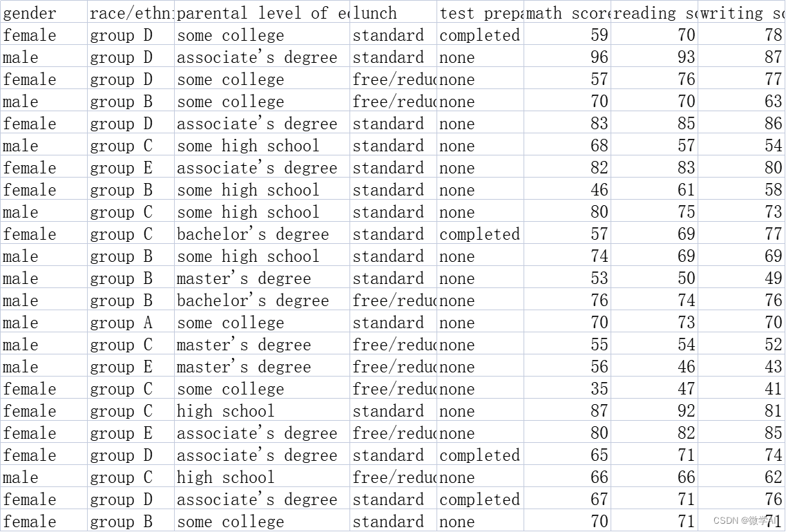
数据样例:
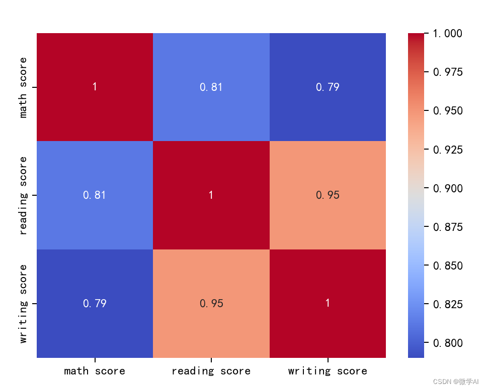
二、创建一个热图的相关矩阵
- sns.heatmap(correlation_matrix, annot=True, cmap='coolwarm')
-
- plt.show()
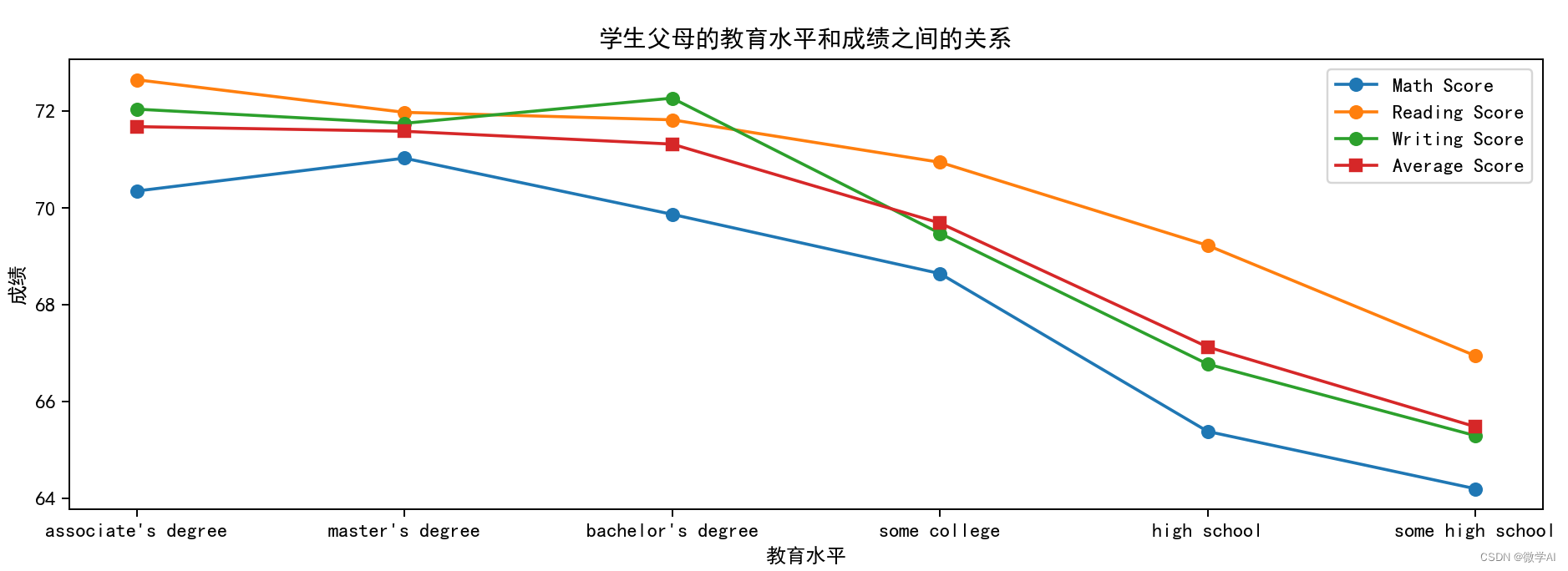
三、学生父母的教育水平和成绩之间的关系
- education_score = df_pre.groupby('parental level of education')[['math score', 'reading score', 'writing score']].mean().reset_index()
- education_score['average score'] = (education_score['math score']+education_score['reading score']+education_score['writing score'])/3
- education_score = education_score.sort_values('average score', ascending=False)
-
- plt.figure(figsize=(13,4))
- plt.plot(education_score['parental level of education'], education_score['math score'], marker='o', label='Math Score')
- plt.plot(education_score['parental level of education'], education_score['reading score'], marker='o', label='Reading Score')
- plt.plot(education_score['parental level of education'], education_score['writing score'], marker='o', label='Writing Score')
- plt.plot(education_score['parental level of education'], education_score['average score'], marker='s', label='Average Score')
-
- plt.title('学生父母的教育水平和成绩之间的关系')
- plt.xlabel('教育水平')
- plt.ylabel('成绩')
-
- plt.legend()
- plt.show()
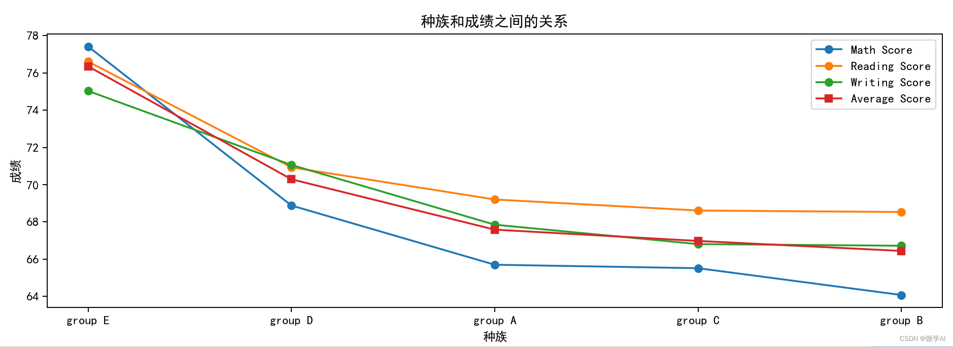
四、种族和成绩之间的关系
- race_score = df_pre.groupby('race/ethnicity')[['math score', 'reading score', 'writing score']].mean().reset_index()
- race_score['average score'] = (race_score['math score']+race_score['reading score']+race_score['writing score'])/3
- race_score = race_score.sort_values('average score', ascending=False)
-
- plt.figure(figsize=(13,4))
- plt.plot(race_score['race/ethnicity'], race_score['math score'], marker='o', label='Math Score')
- plt.plot(race_score['race/ethnicity'], race_score['reading score'], marker='o', label='Reading Score')
- plt.plot(race_score['race/ethnicity'], race_score['writing score'], marker='o', label='Writing Score')
- plt.plot(race_score['race/ethnicity'], race_score['average score'], marker='s', label='Average Score')
-
- plt.title('种族和成绩之间的关系')
- plt.xlabel('种族')
- plt.ylabel('成绩')
-
- plt.legend()
- plt.show()
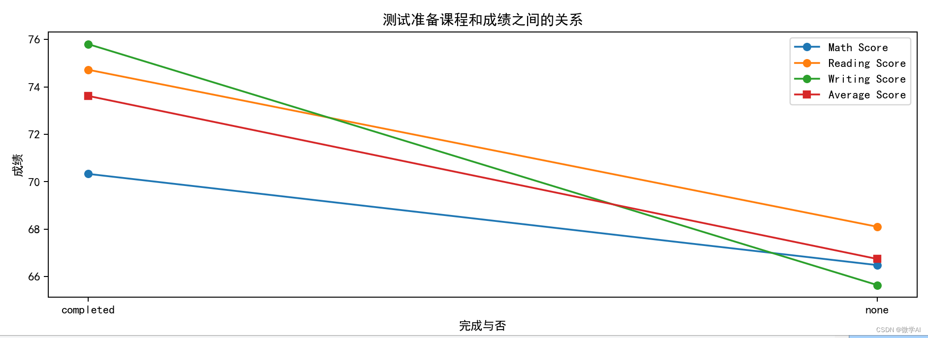
五、测试准备课程和成绩之间的关系
- prep_score = df_pre.groupby('test preparation course')[['math score', 'reading score', 'writing score']].mean().reset_index()
- prep_score['average score'] = (prep_score['math score']+prep_score['reading score']+prep_score['writing score'])/3
- prep_score = prep_score.sort_values('average score', ascending=False)
-
- plt.figure(figsize=(13,4))
- plt.plot(prep_score['test preparation course'], prep_score['math score'], marker='o', label='Math Score')
- plt.plot(prep_score['test preparation course'], prep_score['reading score'], marker='o', label='Reading Score')
- plt.plot(prep_score['test preparation course'], prep_score['writing score'], marker='o', label='Writing Score')
- plt.plot(prep_score['test preparation course'], prep_score['average score'], marker='s', label='Average Score')
-
- plt.title('测试准备课程和成绩之间的关系')
- plt.xlabel('完成与否')
- plt.ylabel('成绩')
-
- plt.legend()
- plt.show()
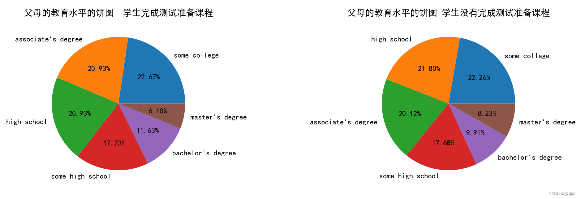
六、父母的教育水平/学生是否完成测试准备课程的饼图
- df_pre.groupby('test preparation course')[['math score', 'reading score', 'writing score']].agg(['var', 'std'])
-
- par_test_count = df_pre[['parental level of education', 'test preparation course']].value_counts().to_frame().reset_index().rename(columns={0:'Count'}).sort_values('Count', ascending=False)
-
- # Create a figure with two subplots
- fig, (ax1, ax2) = plt.subplots(1, 2, figsize=(15,4))
-
- # Create the first pie chart for the count of students who completed the test preparation course
- ax1.pie(par_test_count[par_test_count['test preparation course']=='completed']['Count'],
- labels=par_test_count[par_test_count['test preparation course']=='completed']['parental level of education'],
- autopct='%1.2f%%')
- ax1.set_title('父母的教育水平的饼图 学生完成测试准备课程')
-
- # Create the second pie chart for the count of students who did not complete the test preparation course
- ax2.pie(par_test_count[par_test_count['test preparation course']=='none']['Count'],
- labels=par_test_count[par_test_count['test preparation course']=='none']['parental level of education'],
- autopct='%1.2f%%')
- ax2.set_title('父母的教育水平的饼图 学生没有完成测试准备课程')
-
- # Show the plot
- plt.show()
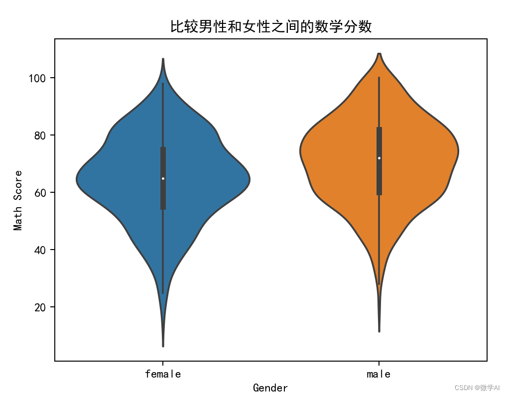
七、比较男性和女性之间的数学分数
- df_pre.groupby('gender').mean()
-
- sns.violinplot(x='gender', y='math score', data=df_pre)
-
- # Add labels and title
- plt.xlabel('Gender')
- plt.ylabel('Math Score')
- plt.title('比较男性和女性之间的数学分数')
- # Show the plot
- plt.show()
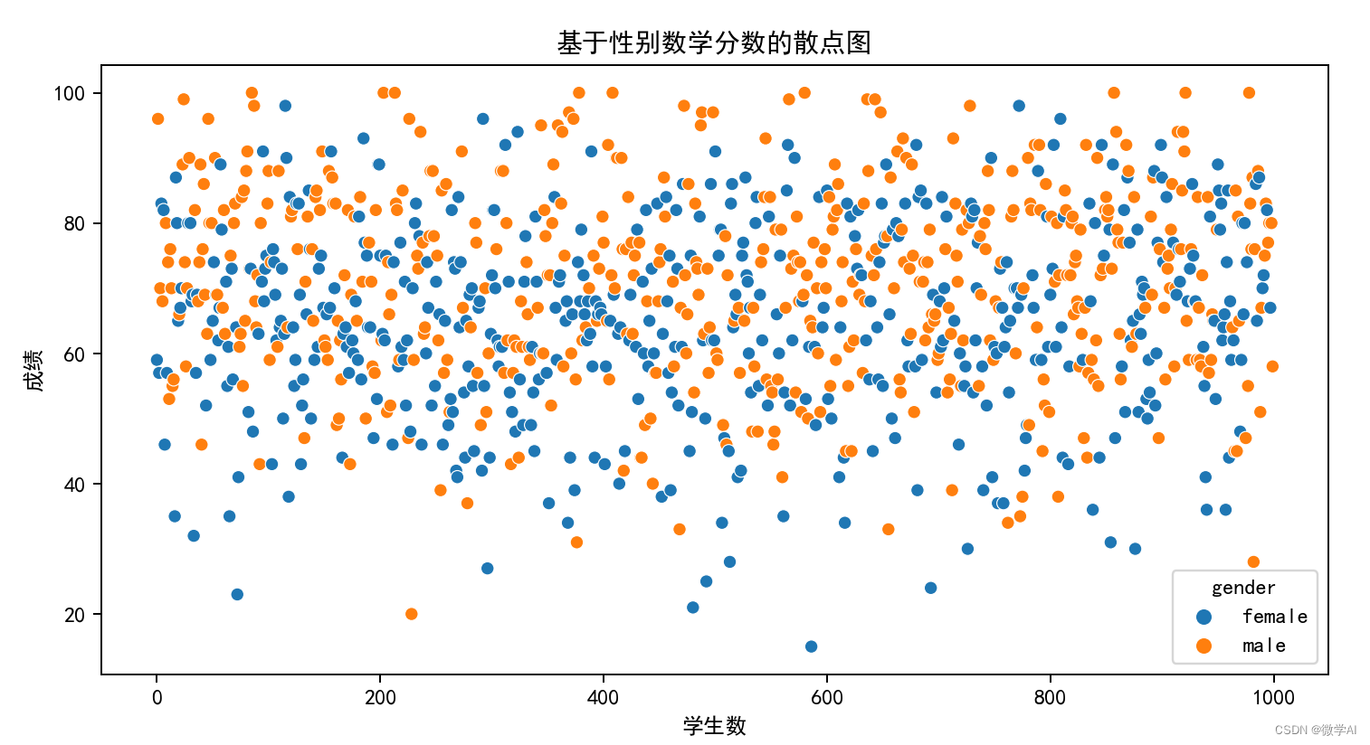
八、基于性别数学分数的散点图
- plt.figure(figsize=(10,5))
- sns.scatterplot(x=range(0, len(df_pre)), y="math score", hue="gender", data=df_pre)
-
- # Add labels and title
- plt.title('基于性别数学分数的散点图')
- plt.xlabel('学生数')
- plt.ylabel('成绩')
-
- # Show the plot
- plt.show()
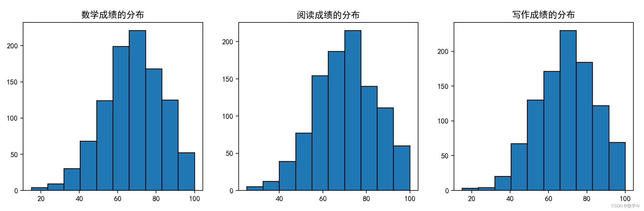
九、学生各科成绩分布图
- fig, (ax1, ax2, ax3) = plt.subplots(1, 3, figsize=(20, 4))
-
- # Plot for math
- ax1.set_title('数学成绩的分布')
- ax1.hist(df_pre['math score'], edgecolor='black')
-
- # Plot for reading
- ax2.set_title('阅读成绩的分布')
- ax2.hist(df_pre['reading score'], edgecolor='black')
-
- # Plot for writing
- ax3.hist(df_pre['writing score'], edgecolor='black')
- ax3.set_title('写作成绩的分布')
-
- # Show plots
- plt.show()
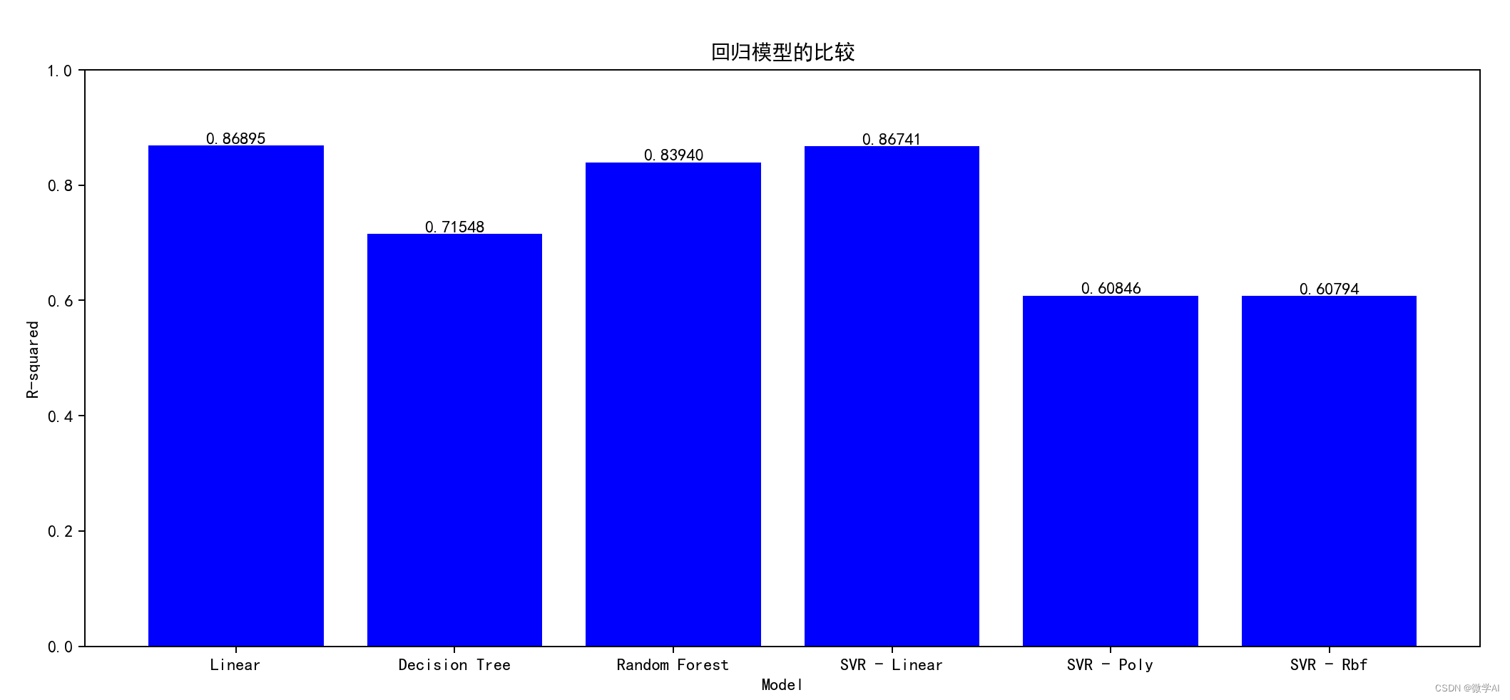
十、机器学习模型比较
- df = pd.get_dummies(df_pre)
-
-
- # Assign variables
- X = df.drop('math score', axis=1)
- y = df['math score']
-
- # Split the data into training and testing sets
- X_train, X_test, y_train, y_test = train_test_split(X, y, test_size=0.4, random_state=42)
-
- models = [LinearRegression(), DecisionTreeRegressor(), RandomForestRegressor(), SVR(kernel='linear'), SVR(kernel='poly'), SVR(kernel='rbf')]
-
- # Use cross-validation to compute the R-squared score for each model
- cv_scores = []
- for model in models:
- scores = cross_val_score(model, X_train, y_train, cv=5, scoring='r2', n_jobs=-1)
- cv_scores.append(scores.mean())
-
- # Plot the results
- fig, ax = plt.subplots(figsize=(15, 6))
- rects = ax.bar(['Linear', 'Decision Tree', 'Random Forest', 'SVR - Linear', 'SVR - Poly', 'SVR - Rbf'], cv_scores, color='orange')
- ax.set_ylim(0, 1)
- ax.set_title('回归模型的比较')
- ax.set_xlabel('Model')
- ax.set_ylabel('R-squared')
-
- # Add labels above each bar
- for rect in rects:
- height = rect.get_height()
- ax.text(rect.get_x() + rect.get_width()/2., height, f'{height:.5f}', ha='center', va='bottom')
-
- # Show the plot
- plt.show()
欢迎大家持续关注,更多机器学习与深度学习的实战案例。
声明:本文内容由网友自发贡献,不代表【wpsshop博客】立场,版权归原作者所有,本站不承担相应法律责任。如您发现有侵权的内容,请联系我们。转载请注明出处:https://www.wpsshop.cn/w/IT小白/article/detail/814671
推荐阅读
相关标签

