
热门标签
热门文章
- 1树莓派ubuntu系统安装+远程桌面vnc+没有显示器进行远程桌面连接设置+虚拟显示器_树莓派ubuntu vnc
- 2【Markdown】 实现上角标和下角标的两种方法(详细讲解!!!)_markdown下标
- 3【企业数字化转型】中台战略
- 4【go基础】切片
- 5软件产品测试的准入准出标准有哪些?_软件测试准出标准
- 6Python获取本机IP地址的三种方式_python 获取本机ip
- 7构造函数对成员变量的初始化_构造函数初始化成员变量
- 8父进程退出后如何通知子进程退出_win10 通知另外一个进程退出
- 9多益网络春招笔试题收集_已知有一个关键字序列27 23 34
- 10win10 文件服务器 群晖,转帖!手把手教您用win10做NAS:搭配emby,VM虚拟群晖,直通......
当前位置: article > 正文
Flutter CircularProgressIndicator圆形进度指示器_flutter circularprogressindicator设置大小
作者:IT小白 | 2024-03-22 17:13:00
赞
踩
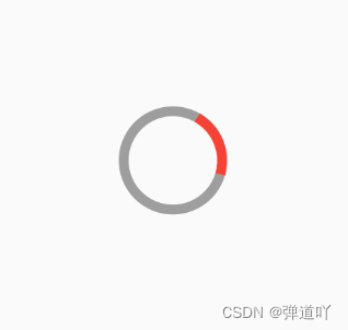
flutter circularprogressindicator设置大小
此组件直接写出来就可以使用了,不需要添加多余的东西
也可以添加各种属性如:
value当前进度:0~1之间的值
valueColor:进度条当前进度颜色,
starokWidth:最小宽,默认4.0
color:Colors.red//进度条颜色
backgroundColor:COlors.grey//背景颜色
- class MyApp1 extends StatefulWidget {
- const MyApp1({Key? key}) : super(key: key);
-
- @override
- _MyApp1State createState() => _MyApp1State();
- }
-
- class _MyApp1State extends State<MyApp1> {
- @override
- Widget build(BuildContext context) {
- return Scaffold(
- body: Center(
- child: AnimatedContainer(
- width: 50,
- height: 50,
- duration: Duration(seconds: 1),
- child: CircularProgressIndicator(
- strokeWidth: 5, //设置进度条的宽
- color: Colors.red, //设置进度条颜色
- backgroundColor: Colors.grey, //设置进度条背景颜色
- ),
- ), //圆形进度指示器
- ),
- );
- }
- }
效果图
声明:本文内容由网友自发贡献,不代表【wpsshop博客】立场,版权归原作者所有,本站不承担相应法律责任。如您发现有侵权的内容,请联系我们。转载请注明出处:https://www.wpsshop.cn/w/IT小白/article/detail/289657
推荐阅读
相关标签

