
热门标签
热门文章
- 1全面超越DPO:陈丹琦团队提出简单偏好优化SimPO,还炼出最强8B开源模型
- 2AI入门指南丨初识AIGC,看这篇文章就够了_aigc大模型工程师要学啥
- 32024年江西省中职组“网络空间安全”赛项模块A解析_殊字符,最小密码长度不少于 8 个字符,密码最长使用期限为 15 天,将该 设置界面截(1)_设置关闭ftp-data端口不使用主动模式,使用ipv4进行监听,将配置文件对应的部分截图
- 4[转帖] 客户端如何与SQL Server交互_sql server怎么与底层交互
- 5Eclipse中使用Github_eclipse github
- 6Java哈希表详解
- 7(七)卷积层——填充和步幅_cnn 卷积层步幅和填充默认值
- 8r语言kmodes_聚类分析——k-means算法及R语言实现
- 9在github.io部署个人博客hugo,2023新教程_github .io
- 10计算机网络——基于UDP与TCP网络编程_基于udp的tcp设计
当前位置: article > 正文
机器学习从入门到精通:Jupyter Notebook实战指南_notebook建模
作者:Gausst松鼠会 | 2024-06-13 06:29:52
赞
踩
notebook建模
机器学习作为人工智能领域的核心组成,是计算机程序学习数据经验以优化自身算法、并产生相应的“智能化的“建议与决策的过程。随着大数据和 AI 的发展,越来越多的场景需要 AI 手段解决现实世界中的真实问题,并产生我们所需要的价值。
机器学习的建模流程包括明确业务问题、收集及输入数据、模型训练、模型评估、模型决策一系列过程。对于机器学习工程师而言,他们更擅长的是算法、模型、数据探索的工作,而对于工程化的能力则并不是其擅长的工作。除此之外,机器学习过程中还普遍着存在的 IDE 本地维护成本高、工程部署复杂、无法线上协同等问题,导致建模成本高且效率低下。
Jupyter 读取文件
- import subprocess
- import pandas as pd
-
- res_list = subprocess.Popen(['ls', '/datasource/testErfenlei'],
- shell=False,
- stdout=subprocess.PIPE,
- stderr=subprocess.PIPE).communicate()
- for res in res_list:
- print(res.decode())
- filenames = res.decode().split() # 将输出结果按空格分割成文件名列表
- for filename in filenames:
- if filename == 'erfenl.csv': # 根据实际文件名来判断
- csv_data = pd.read_csv('/datasource/testErfenlei/' + filename) # 读取CSV文件
- print(csv_data)
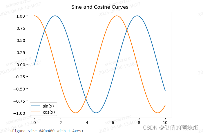
Jupyter Notebook建模-双曲线图
- # 导入所需的库
- import numpy as np
- import pandas as pd
- import matplotlib.pyplot as plt
-
- # 创建一个数组
- x = np.linspace(0, 10, num=100)
-
- # 计算正弦和余弦值
- sin_values = np.sin(x)
- cos_values = np.cos(x)
-
- # 将数据存储在 Pandas 数据帧中
- df = pd.DataFrame({'x': x, 'sin': sin_values, 'cos': cos_values})
-
- # 绘制正弦和余弦曲线
- plt.plot('x', 'sin', data=df, label='sin(x)')
- plt.plot('x', 'cos', data=df, label='cos(x)')
-
- # 添加图例和标题
- plt.legend()
- plt.title('Sine and Cosine Curves')
-
- # 显示图形
- plt.show()

Jupyter Notebook
生成PMML文件1
- from sklearn.datasets import load_iris
- from sklearn.tree import DecisionTreeClassifier
- from sklearn2pmml import PMMLPipeline, sklearn2pmml
-
- # 加载iris数据集
- iris = load_iris()
-
- # 训练决策树模型
- dt = DecisionTreeClassifier()
- dt.fit(iris.data, iris.target)
-
- # 创建PMMLPipeline对象
- pmml_pipeline = PMMLPipeline([
- ("classifier", dt)
- ])
-
- # 导出模型为PMML文件
- sklearn2pmml(pmml_pipeline, "iris_decision_tree.pmml")
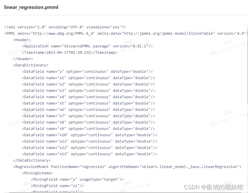
生成PMML文件2
- from sklearn.datasets import load_boston
- from sklearn.linear_model import LinearRegression
- from sklearn2pmml import PMMLPipeline, sklearn2pmml
-
- # 加载波士顿房价数据集
- boston = load_boston()
-
- # 构建线性回归模型
- lr = LinearRegression()
-
- # 使用 PMMLPipeline 包装模型
- pipeline = PMMLPipeline([("lr", lr)])
-
- # 使用数据拟合模型
- pipeline.fit(boston.data, boston.target)
-
- # 将模型保存为 PMML 文件
- sklearn2pmml(pipeline, "linear_regression.pmml")
R Notebook建模 - 散点图
- # 导入所需的库
- library(ggplot2)
-
- # 创建一个数据框
- df <- data.frame(
- x = 1:10,
- y = c(3, 5, 6, 8, 9, 10, 11, 13, 14, 15)
- )
-
- # 绘制散点图
- ggplot(df, aes(x, y)) +
- geom_point() +
- labs(title="Scatter Plot of X and Y", x="X", y="Y")
R Notebook获取训练数据集
- setwd(dir=”/datasource”)
- dir()
PySpark Notebook建模
- # 导入所需库
- from pyspark.sql import SparkSession
- from pyspark.ml.feature import VectorAssembler
- from pyspark.ml.regression import LinearRegression
- from pyspark.ml.evaluation import RegressionEvaluator
-
- # 创建 SparkSession
- spark = SparkSession.builder.appName("LinearRegression").getOrCreate()
-
- # 创建 DataFrame
- data = [(1.2, 3.4, 5.6), (2.3, 4.5, 6.7), (3.4, 5.6, 7.8), (4.5, 6.7, 8.9)]
- columns = ["feature1", "feature2", "label"]
- df = spark.createDataFrame(data, columns)
-
- # 将特征列组合到向量中
- assembler = VectorAssembler(inputCols=["feature1", "feature2"], outputCol="features")
- df = assembler.transform(df)
-
- # 拆分数据集为训练集和测试集
- train_df, test_df = df.randomSplit([0.7, 0.3], seed=42)
-
- # 创建线性回归模型并拟合训练集
- lr = LinearRegression(featuresCol="features", labelCol="label")
- model = lr.fit(train_df)
-
- # 在测试集上进行预测并计算其平均误差
- predictions = model.transform(test_df)
- # mse = predictions.agg({"prediction": "mean_squared_error"}).collect()[0][0]
- # mse = predictions.agg(mean_squared_error(predictions["label"], predictions["prediction"])).collect()[0][0]
-
- evaluator = RegressionEvaluator(predictionCol="prediction", labelCol="label", metricName="mse")
- mse = evaluator.evaluate(predictions)
- # 显示结果
- print(f"Mean Squared Error on Test Set: {mse}")
-
- # 停止 SparkSession
- spark.stop()
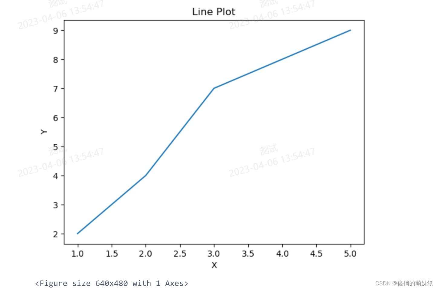
PySpark Notebook建模 -折线图
- # 导入所需库和模块
- import matplotlib.pyplot as plt
- from pyspark.sql.functions import col
- from pyspark.sql import SparkSession
-
- # 创建 SparkSession
- spark = SparkSession.builder.appName("LinePlot").getOrCreate()
-
- # 创建 DataFrame
- data = [(1, 2), (2, 4), (3, 7), (4, 8), (5, 9)]
- columns = ["x", "y"]
- df = spark.createDataFrame(data, columns)
-
- # 提取 x 和 y 列并将其转换为 Pandas 数据框
- pandas_df = df.select("x", "y").orderBy("x").toPandas()
-
- # 绘制折线图
- plt.plot(pandas_df["x"], pandas_df["y"])
-
- # 添加标题和轴标签
- plt.title("Line Plot")
- plt.xlabel("X")
- plt.ylabel("Y")
-
- # 显示图形
- plt.show()
-
- # 停止 SparkSession
- spark.stop()
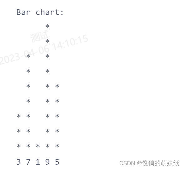
C语言Notebook 建模
- #include <stdio.h>
-
- int main() {
- int arr[] = {3, 7, 1, 9, 5};
- int size = sizeof(arr) / sizeof(arr[0]);
-
- // 找到最大值,以便缩放柱状图
- int max_value = arr[0];
- for (int i = 1; i < size; i++) {
- if (arr[i] > max_value) {
- max_value = arr[i];
- }
- }
-
- // 打印柱状图
- printf("Bar chart:\n");
- for (int i = max_value; i > 0; i--) {
- for (int j = 0; j < size; j++) {
- if (arr[j] >= i) {
- printf("* ");
- } else {
- printf(" ");
- }
- }
- printf("\n");
- }
-
- // 打印横轴标签
- for (int i = 0; i < size; i++) {
- printf("%d ", arr[i]);
- }
- printf("\n");
-
- return 0;
- }
C++Notebook 建模
- #include <iostream>
- using namespace std;
- int f1()
- {
- std::cout <<"hello world1\n";
- return 1;
- }
- int a = 110;
- cout << f1() << endl;
- cout <<1010<<endl;

使用pytorch
- import torch
- import torch.nn as nn
- import torch.optim as optim
-
- # 定义一个简单的神经网络模型
- class SimpleNet(nn.Module):
- def __init__(self, input_size, hidden_size, output_size):
- super(SimpleNet, self).__init__()
- self.fc1 = nn.Linear(input_size, hidden_size)
- self.relu = nn.ReLU()
- self.fc2 = nn.Linear(hidden_size, output_size)
-
- def forward(self, x):
- out = self.fc1(x)
- out = self.relu(out)
- out = self.fc2(out)
- return out
-
- # 准备数据
- input_size = 10
- hidden_size = 20
- output_size = 5
- batch_size = 32
-
- input_data = torch.randn(batch_size, input_size)
- target_data = torch.randn(batch_size, output_size)
-
- # 实例化模型
- model = SimpleNet(input_size, hidden_size, output_size)
-
- # 定义损失函数和优化器
- criterion = nn.MSELoss()
- optimizer = optim.SGD(model.parameters(), lr=0.1)
-
- # 训练模型
- num_epochs = 100
- for epoch in range(num_epochs):
- # 前向传播
- output = model(input_data)
- loss = criterion(output, target_data)
-
- # 反向传播和优化
- optimizer.zero_grad()
- loss.backward()
- optimizer.step()
-
- # 打印训练信息
- if (epoch+1) % 10 == 0:
- print('Epoch [{}/{}], Loss: {:.4f}'.format(epoch+1, num_epochs, loss.item()))

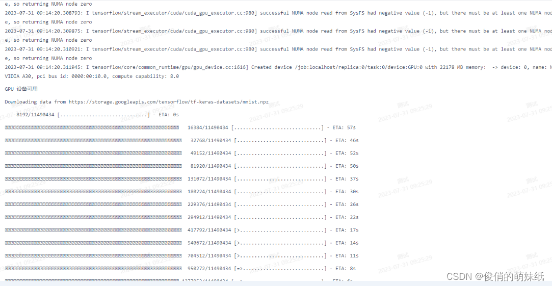
使用TensorFlow
- import tensorflow as tf
-
- # 检查是否有可用的GPU设备
- if tf.test.is_gpu_available():
- print('GPU 设备可用')
- else:
- print('GPU 设备不可用')
-
- # 创建一个简单的神经网络模型
- model = tf.keras.models.Sequential([
- tf.keras.layers.Dense(64, activation='relu', input_shape=(784,)),
- tf.keras.layers.Dense(64, activation='relu'),
- tf.keras.layers.Dense(10, activation='softmax')
- ])
-
- # 准备数据
- (x_train, y_train), (x_test, y_test) = tf.keras.datasets.mnist.load_data()
-
- # 数据预处理
- x_train = x_train.reshape(-1, 784).astype('float32') / 255.0
- x_test = x_test.reshape(-1, 784).astype('float32') / 255.0
- y_train = tf.keras.utils.to_categorical(y_train, num_classes=10)
- y_test = tf.keras.utils.to_categorical(y_test, num_classes=10)
-
- # 编译模型
- model.compile(optimizer='adam',
- loss='categorical_crossentropy',
- metrics=['accuracy'])
-
- # 在GPU上训练模型
- with tf.device('/GPU:0'):
- model.fit(x_train, y_train, batch_size=128, epochs=10, validation_split=0.2)
-
- # 在GPU上评估模型
- with tf.device('/GPU:0'):
- test_loss, test_acc = model.evaluate(x_test, y_test)
- print('Test accuracy:', test_acc)
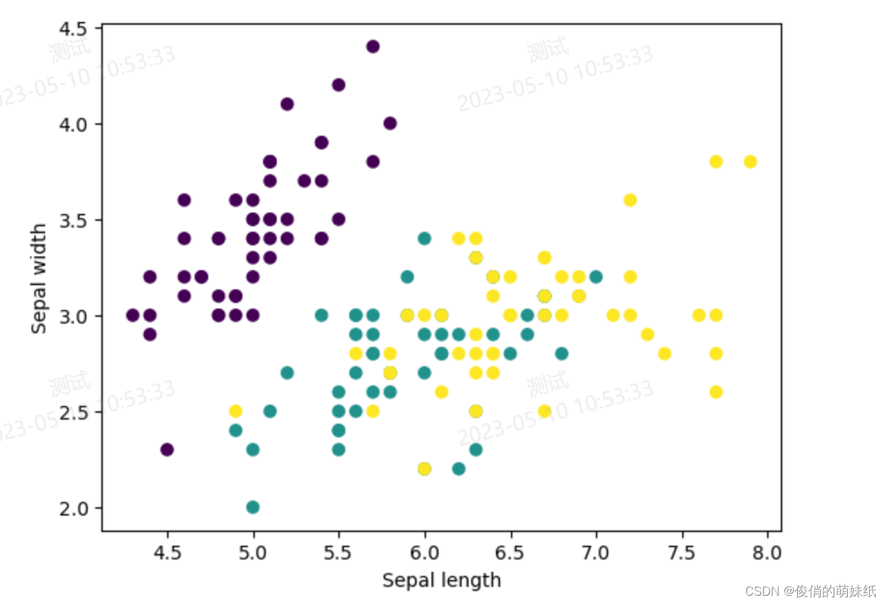
二分类-模型评估脚本
描述:根据花萼长度、花萼宽度、花瓣长度、花瓣宽度四个特征,将鸢尾花分为两个类别
- # 加载数据集
- iris = load_iris()
- X, y = iris.data[:, :2], iris.target
-
- # 划分训练集和测试集
- X_train, X_test, y_train, y_test = train_test_split(X, y, test_size=0.2, random_state=42)
-
- # 创建决策树分类器模型
- clf = DecisionTreeClassifier()
- # 在训练集上拟合模型
- clf.fit(X_train, y_train)
-
- # 在测试集上进行预测并计算准确率
- y_pred = clf.predict(X_test)
- accuracy = accuracy_score(y_test, y_pred)
-
- # 绘制二分类x轴和y轴图像
- plt.scatter(X[:, 0], X[:, 1], c=y, cmap='viridis')
- plt.xlabel('Sepal length')
- plt.ylabel('Sepal width')
- plt.show()
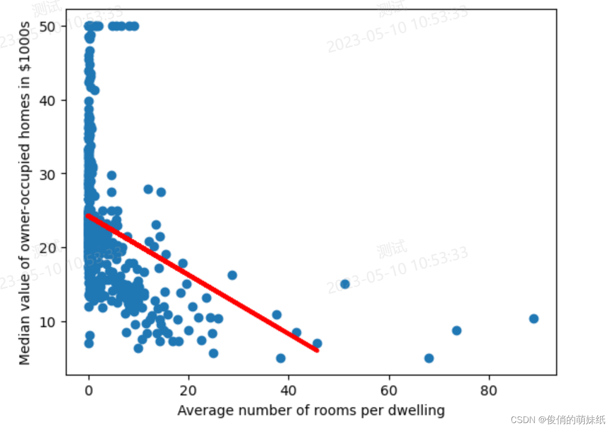
回归-模型评估脚本
描述:使用该镇的人均犯罪率、一氧化碳浓度、低收入人群占比等13个属性,来预测房屋的价格
- # 波士顿房价预测回归类型
- # 导入所需的库
- from sklearn.datasets import load_boston
- from sklearn.model_selection import train_test_split
- from sklearn.linear_model import LinearRegression
- from sklearn.metrics import r2_score
- import matplotlib.pyplot as plt
-
- # 加载数据集
- boston = load_boston()
- X, y = boston.data[:, 0], boston.target
-
- # 划分训练集和测试集
- X_train, X_test, y_train, y_test = train_test_split(X, y, test_size=0.2, random_state=42)
-
- # 创建线性回归模型
- model = LinearRegression()
- # 在训练集上拟合模型
- model.fit(X_train.reshape(-1, 1), y_train)
-
- # 在测试集上进行预测并计算R^2值
- y_pred = model.predict(X_test.reshape(-1, 1))
- r2_score = r2_score(y_test, y_pred)
-
- # 绘制回归类型x轴和y轴图像
- plt.scatter(X, y)
- plt.plot(X_test, y_pred, color='red', linewidth=3)
- plt.xlabel('Average number of rooms per dwelling')
- plt.ylabel('Median value of owner-occupied homes in $1000s')
- plt.show()
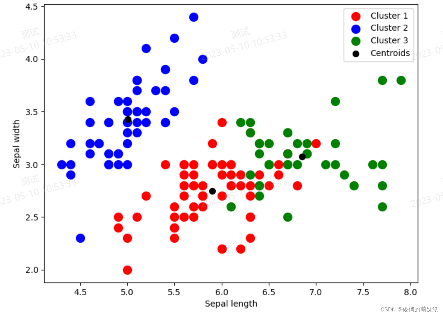
聚类-模型评估脚本
描述:根据花萼长度、花萼宽度、花瓣长度、花瓣宽度四个特征,对鸢尾花进行聚类
- # 鸢尾花聚类
- # 导入所需的库
- from sklearn.datasets import load_iris
- from sklearn.cluster import KMeans
- import matplotlib.pyplot as plt
-
- # 加载数据集
- iris = load_iris()
- X, y = iris.data, iris.target
-
- # 创建KMeans模型并拟合数据
- kmeans = KMeans(n_clusters=3, random_state=42)
- kmeans.fit(X)
-
- # 绘制聚类图表
- fig, ax = plt.subplots(figsize=(8, 6))
- plt.scatter(X[kmeans.labels_ == 0, 0], X[kmeans.labels_ == 0, 1], s = 100, c = 'red', label = 'Cluster 1')
- plt.scatter(X[kmeans.labels_ == 1, 0], X[kmeans.labels_ == 1, 1], s = 100, c = 'blue', label = 'Cluster 2')
- plt.scatter(X[kmeans.labels_ == 2, 0], X[kmeans.labels_ == 2, 1], s = 100, c = 'green', label = 'Cluster 3')
-
- # 绘制聚类中心点
- plt.scatter(kmeans.cluster_centers_[:, 0], kmeans.cluster_centers_[:, 1], s = 200, marker='.', c = 'black', label = 'Centroids')
-
- plt.legend()
- plt.xlabel('Sepal length')
- plt.ylabel('Sepal width')
- plt.show()
统计分析脚本
描述:使用泰坦尼克号数据集进行基本的数据分析
- # 数据分析
- # 导入必要的库
- import seaborn as sns
- import matplotlib.pyplot as plt
-
- # 从 Seaborn 库中加载泰坦尼克号数据集,存储为 DataFrame
- titanic_data = sns.load_dataset('titanic')
-
- # 数据基本情况概览
- print("========== Data Overview ==========")
- print(titanic_data.head())
- print("\n")
-
- # 数据统计信息
- print("========== Data Statistics ==========")
- print(titanic_data.describe())
- print("\n")
-
- # 缺失值数量统计
- print("========== Missing Value Count ==========")
- print(titanic_data.isnull().sum())
- print("\n")
-
- # 幸存者数量统计
- print("========== Survival Count ==========")
- print(titanic_data['survived'].value_counts())
- print("\n")
- # 不同年龄段的存活率比较可视化
- age_bins = [0, 10, 20, 30, 40, 50, 60, 70, 80]
- age_labels = ['0-10', '11-20', '21-30', '31-40', '41-50', '51-60', '61-70', '71-80']
- titanic_data['age_group'] = pd.cut(titanic_data['age'], bins=age_bins, labels=age_labels)
- sns.barplot(x='age_group', y='survived', data=titanic_data)
- plt.title('Survival Rate by Age Group')
- plt.show()

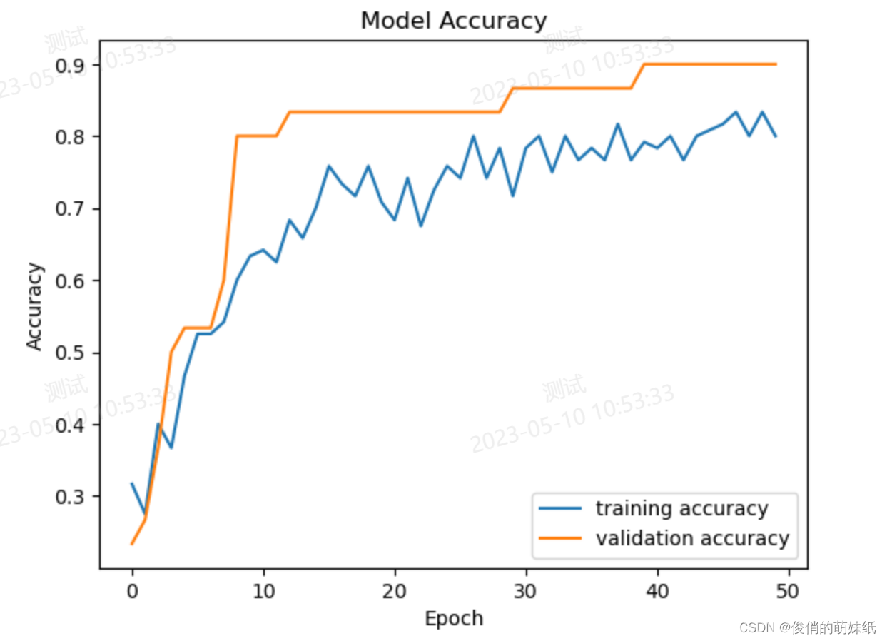
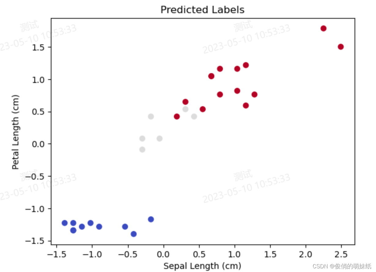
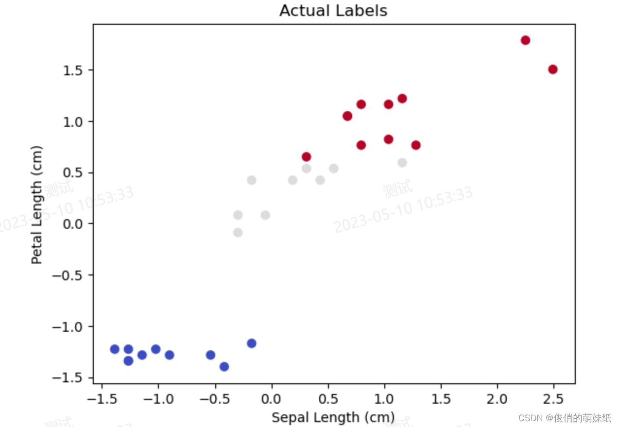
深度学习-多分类-模型评估脚本
描述:利用DNN模型对鸢尾花数据集进行分类
- # 鸢尾花多分类
- # 导入必要的库
- import pandas as pd
- import numpy as np
- import matplotlib.pyplot as plt
- from sklearn.model_selection import train_test_split
- from sklearn.preprocessing import StandardScaler
- import tensorflow as tf
- from tensorflow.keras.utils import to_categorical
-
- # 加载鸢尾花数据集
- iris_data = pd.read_csv('https://archive.ics.uci.edu/ml/machine-learning-databases/iris/iris.data', header=None)
- X = iris_data.iloc[:, :4].values
- y = iris_data.iloc[:, 4].values
-
- # 将类别标签转成数字标签
- label_dict = {k: i for i, k in enumerate(np.unique(y))}
- y = np.array([label_dict[label] for label in y])
-
- # 数据标准化处理
- scaler = StandardScaler()
- X = scaler.fit_transform(X)
-
- # 将标签进行one-hot编码
- y = to_categorical(y)
-
- # 分割训练集和测试集
- X_train, X_test, y_train, y_test = train_test_split(X, y, test_size=0.2, random_state=42)
-
- # 定义DNN模型
- model = tf.keras.models.Sequential([
- tf.keras.layers.Dense(units=16, activation='relu', input_shape=(4,),
- kernel_regularizer=tf.keras.regularizers.L2(0.01)),
- tf.keras.layers.Dropout(rate=0.3),
- tf.keras.layers.Dense(units=3, activation='softmax')
- ])
- model.summary()
-
- # 编译并训练模型
- model.compile(optimizer='adam', loss='categorical_crossentropy', metrics=['accuracy'])
- history = model.fit(X_train, y_train, epochs=50, batch_size=16, validation_data=(X_test, y_test))
-
- # 展示模型的训练曲线
- plt.plot(history.history['accuracy'], label='training accuracy')
- plt.plot(history.history['val_accuracy'], label='validation accuracy')
- plt.title('Model Accuracy')
- plt.xlabel('Epoch')
- plt.ylabel('Accuracy')
- plt.legend()
- plt.show()
-
- # 在测试集上进行分类预测
- y_pred = np.argmax(model.predict(X_test), axis=-1)
-
- # 可视化分类结果与实际结果比较
- plt.scatter(X_test[:, 0], X_test[:, 2], c=y_pred, cmap='coolwarm')
- plt.title('Predicted Labels')
- plt.xlabel('Sepal Length (cm)')
- plt.ylabel('Petal Length (cm)')
- plt.show()
-
- plt.scatter(X_test[:, 0], X_test[:, 2], c=np.argmax(y_test, axis=-1), cmap='coolwarm')
- plt.title('Actual Labels')
- plt.xlabel('Sepal Length (cm)')
- plt.ylabel('Petal Length (cm)')
- plt.show()
当我们在网上搜索相关的 Notebook 代码文件时,搜索的结果比较零散。为了帮助大家更好地整理和使用这些基础代码,特别整理了一些示例,希望对大家有所帮助!
声明:本文内容由网友自发贡献,不代表【wpsshop博客】立场,版权归原作者所有,本站不承担相应法律责任。如您发现有侵权的内容,请联系我们。转载请注明出处:https://www.wpsshop.cn/w/Gausst松鼠会/article/detail/711243
推荐阅读
相关标签

