
热门标签
热门文章
- 1(神经网络)MNIST手写体数字识别MATLAB完整代码_mnist matlab
- 2调研120+模型!腾讯AI Lab联合京都大学发布多模态大语言模型最新综述
- 3安装tokenizers拓展包_tokenizers-0.15.0.tar.gz
- 4解决VMvare仅主机模式下宿主机与虚拟机互相ping不通的问题_三台仅主机模式的虚拟机,两台与主机通,一台与主机不通,什么情况
- 5ASM 和 LVM
- 6mmsegmentation自定义数据集_mmseg 2class
- 7机器学习入门教程_机器学习 教程
- 8只要一个软件让电脑硬盘瞬间扩容10T空间 | 阿里云盘变本地硬盘。
- 9Android实现新闻列表
- 10AI算法工程师 | 01人工智能基础-快速入门_人工智能算法
当前位置: article > 正文
GeoPandas 笔记: GeoDataFrame.plot()_geopandas plot
作者:Gausst松鼠会 | 2024-03-27 07:21:39
赞
踩
geopandas plot
0 数据
- import geopandas as gpd
- world = gpd.read_file(gpd.datasets.get_path('naturalearth_lowres'))
- world

1 画图
1.1 基础plot
world.plot()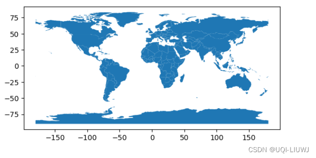
1.2 column:根据geoDataFrame的哪一列来进行着色
world.plot(column='gdp_md_est')
1.3 legend
给出颜色的图例
- world.plot(column='gdp_md_est',
- legend=True)

1.3.1 调整legend 相对于图的布局
- from mpl_toolkits.axes_grid1 import make_axes_locatable
- import matplotlib.pyplot as plt
-
-
- fig, ax = plt.subplots(1, 1)
- divider = make_axes_locatable(ax)
- cax = divider.append_axes("right", size="5%", pad=0.1)
-
-
- world.plot(column='pop_est', ax=ax, legend=True, cax=cax)

1.3.2 legend_kwd 布局
- world.plot(column='pop_est',
- legend=True,
- legend_kwds={'label': "gdp_md_est",
- 'orientation': "horizontal"})

1.4 Cmap 颜色
world.plot(column='pop_est', cmap='OrRd');

1.5 boundary 绘制轮廓
world.boundary.plot()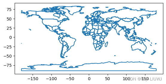
1.6 scheme 颜色映射的放缩方式
可供选择的选项:“box_plot”、“equal_interval”、“fisher_jenks”、“fisher_jenks_sampled”、“headtail_breaks”、“jenks_caspall”、“jenks_caspall_forced”、“jenks_caspall_sampled”、“max_p_classifier”、“maximum_breaks”、“natural_breaks”、“quantiles”、“percentiles”、“std_mean”、“user_defined”
- world.plot(column='pop_est',
- cmap='OrRd',
- scheme='quantiles')

1.7 set_axis_off 不显示边框
- world.plot(column='pop_est',
- cmap='OrRd',
- scheme='quantiles').set_axis_off()

1.8 缺失值处理
1.8.1 构造缺失值
- import numpy as np
- world.loc[np.random.choice(world.index, 40), 'pop_est'] = np.nan
- #选择40个区域,使其值变成nan
1.8.2 直接plot
会发现Nan的部分直接消失了
world.plot(column='pop_est');
1.8.3 missing_kwds
- world.plot(column='pop_est',
- missing_kwds={'color': 'lightgrey'});

- world.plot(
- column="pop_est",
- missing_kwds={
- "color": "lightgrey",
- "edgecolor": "red",
- "hatch": "///"
- },
- );

2 在一种图上叠加另外一种图
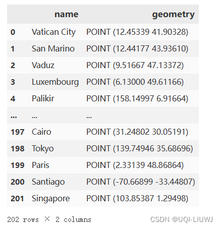
2.0 另一个数据的导入
- cities = gpd.read_file(gpd.datasets.get_path('naturalearth_cities'))
- cities
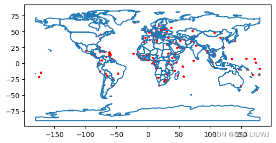
2.1 实现方法1:不使用matplotlib
- ax=world.boundary.plot()
- cities.plot(ax=ax,marker='*',color='red',markersize=10)

2.2 实现方法2:使用matplotlib
- fig,ax=plt.subplots(1,1)
-
- world.boundary.plot(ax=ax)
- cities.plot(ax=ax,marker='*',color='red',markersize=10);
3 绘制其他图
3.1 line——线图
world.plot(kind='line', x="pop_est")
3.2 bar——柱状图
world.plot(kind='bar', x="pop_est") 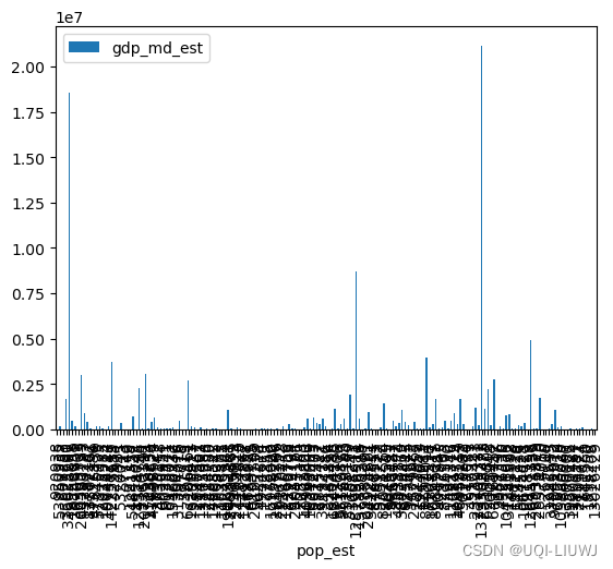
3.3 hist——直方图
world.plot(kind='hist', x="pop_est")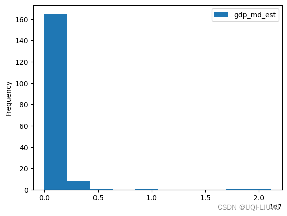
3.4 box——箱式图
world.plot(kind='box', x="pop_est")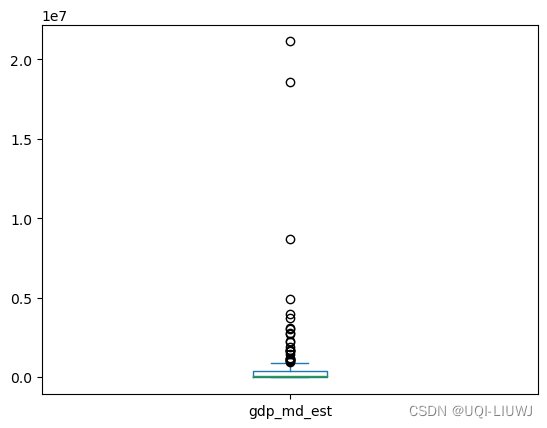
3.5 kde——密度图
world.plot(kind='kde', x="pop_est") 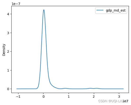
3.6 area——面积图
3.7 scatter——散点图
world.plot(kind='scatter', x="pop_est",y='gdp_md_est')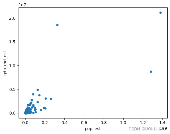
3.8 hexbin——六边形箱图
world.plot(kind='hexbin', x="pop_est",y='gdp_md_est')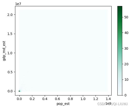
3.9 pie——饼图
world.plot(kind='pie', x="pop_est", y="gdp_md_est")
声明:本文内容由网友自发贡献,不代表【wpsshop博客】立场,版权归原作者所有,本站不承担相应法律责任。如您发现有侵权的内容,请联系我们。转载请注明出处:https://www.wpsshop.cn/w/Gausst松鼠会/article/detail/322586
推荐阅读
相关标签

