- 1【torch安装踩雷】torchtext、torch、anaconda安装问题解决_安装torchcam 结果删除了torch和cuda
- 2二维数组的定义和使用以及冒泡排序_二维数组的定义与使用
- 316进制颜色代码#FF000000 (css颜色值)
- 4django中GET与POST请求_django中获取post和get请求中参数名为’name’值的语句是:
- 5Go语言面试宝典_go 面试宝典
- 6LLama常用命令详解_llama 命令
- 7微信小程序常识——只需4个文件即可构成一个完整的微信小程序项目_微信小程序首次保存app.json 是生成4个
- 8springboot+vue+java+mysql 农产品预售平台 原创
- 9flex弹性布局(详解)_flex布局
- 1015个nosql数据库
CSS3 2D变形 3D变形 过渡 动画_css transform 动画
赞
踩
CSS3 2D变形 3D变形 过渡 动画
在CSS3中,动画效果包括4个部分:变形(transform)、3D变形、过渡(transition)、动画(animation)。
transform(2D变形)
概述
可以使用transform属性来实现元素的各种变形效果,如平移、缩放、旋转、倾斜等。
位移变形和相对定位非常像,也会在“老家留坑”,“行影分离”。
| 方法 | 说明 |
|---|---|
| translate() | 平移 |
| scale() | 缩放 |
| skew() | 倾斜 |
| rotate() | 旋转 |
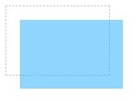
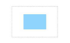
translate() 平移
语法
transform: translateX(x);    /*沿x轴方向平移*/
transform: translateY(y);    /*沿y轴方向平移*/
transform: translate(x, y);   /*沿x轴和y轴同时平移*/
- 1
- 2
- 3
使用
<!DOCTYPE html>
<html>
	<head>
		<meta charset="utf-8" />
		<title></title>
		<style type="text/css">
			div {
				width: 150px;
				height: 100px;
			}

			.box {
				border: 1px dashed silver;
			}

			.current {
				background-color: rgb(30, 170, 250);
				opacity: 0.5;
				transform: translate(20px, 20px);
			}
		</style>
	</head>
	<body>
		<div class="box">
			<div class="current"></div>
		</div>
	</body>
</html>

- 1
- 2
- 3
- 4
- 5
- 6
- 7
- 8
- 9
- 10
- 11
- 12
- 13
- 14
- 15
- 16
- 17
- 18
- 19
- 20
- 21
- 22
- 23
- 24
- 25
- 26
- 27
- 28
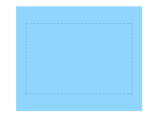
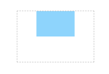
scale() 缩放
语法
transform: scaleX(x);    /*沿x轴方向缩放*/
transform: scaleY(y);    /*沿y轴方向缩放*/
transform: scale(x, y);   /*沿x轴和y轴同时缩放*/
- 1
- 2
- 3
使用
<!DOCTYPE html>
<html>
	<head>
		<meta charset="utf-8" />
		<title></title>
		<style type="text/css">
			div {
				width: 150px;
				height: 100px;
			}

			.box {
				border: 1px dashed silver;
				margin: 50px auto;
			}

			.current {
				background-color: rgb(30, 170, 250);
				opacity: 0.5;
				transform: scale(1.2, 1.5);
			}
		</style>
	</head>
	<body>
		<div class="box">
			<div class="current"></div>
		</div>
	</body>
</html>
- 1
- 2
- 3
- 4
- 5
- 6
- 7
- 8
- 9
- 10
- 11
- 12
- 13
- 14
- 15
- 16
- 17
- 18
- 19
- 20
- 21
- 22
- 23
- 24
- 25
- 26
- 27
- 28
- 29
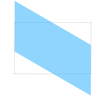
skew() 倾斜
语法
transform: skewX(x);    /*沿x轴方向倾斜*/
transform: skewY(y);    /*沿y轴方向倾斜*/
transform: skew(x, y);   /*沿x轴和y轴同时倾斜*/
- 1
- 2
- 3
使用
<!DOCTYPE html>
<html>
	<head>
		<meta charset="utf-8" />
		<title></title>
		<style type="text/css">
			div {
				width: 150px;
				height: 100px;
			}

			.box {
				border: 1px dashed silver;
				margin: 50px auto;
			}

			.current {
				background-color: rgb(30, 170, 250);
				opacity: 0.5;
				transform: skewY(30deg);
			}
		</style>
	</head>
	<body>
		<div class="box">
			<div class="current"></div>
		</div>
	</body>
</html>
- 1
- 2
- 3
- 4
- 5
- 6
- 7
- 8
- 9
- 10
- 11
- 12
- 13
- 14
- 15
- 16
- 17
- 18
- 19
- 20
- 21
- 22
- 23
- 24
- 25
- 26
- 27
- 28
- 29
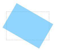
rotate() 旋转
语法
transform: rotate(angle);
- 1
说明
angle参数:表示元素相对于中心原点旋转的度数,单位为deg。如果度数为正,则表示顺时针旋转;如果度数为负,则表示逆时针旋转。
使用
<!DOCTYPE html>
<html>
	<head>
		<meta charset="utf-8" />
		<title></title>
		<style type="text/css">
			div {
				width: 150px;
				height: 100px;
			}

			.box {
				border: 1px dashed silver;
				margin: 50px auto;
			}

			.current {
				background-color: rgb(30, 170, 250);
				opacity: 0.5;
				transform: rotate(30deg);
			}
		</style>
	</head>
	<body>
		<div class="box">
			<div class="current"></div>
		</div>
	</body>
</html>
- 1
- 2
- 3
- 4
- 5
- 6
- 7
- 8
- 9
- 10
- 11
- 12
- 13
- 14
- 15
- 16
- 17
- 18
- 19
- 20
- 21
- 22
- 23
- 24
- 25
- 26
- 27
- 28
- 29
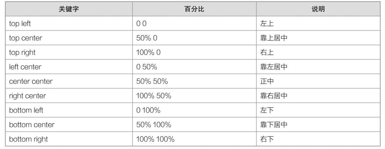
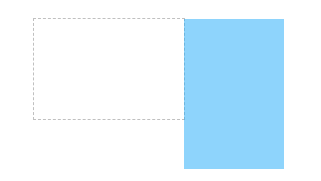
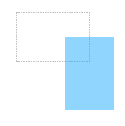
transform-origin 中心原点
语法
transform-origin: 取值;
- 1
说明
transform-origin属性取值有两种:一种是“长度值”,另一种是“关键字”。
当取值为长度值时,单位可以为px、em和百分比等。
当取值为关键字时,transform-origin属性取值跟background-position属性取值是相似的。
使用
<!DOCTYPE html>
<html>
  <head>
    <meta charset="utf-8" />
    <title></title>
    <style type="text/css">
      div {
        width: 150px;
        height: 100px;
      }

      .box {
        border: 1px dashed silver;
        margin: 100px auto;
      }

      .current {
        background-color: rgb(30, 170, 250);
        opacity: 0.5;
        transform-origin: top right;
        transform: rotate(-90deg);
      }
    </style>
  </head>
  <body>
    <div class="box">
      <div class="current"></div>
    </div>
  </body>
</html>
- 1
- 2
- 3
- 4
- 5
- 6
- 7
- 8
- 9
- 10
- 11
- 12
- 13
- 14
- 15
- 16
- 17
- 18
- 19
- 20
- 21
- 22
- 23
- 24
- 25
- 26
- 27
- 28
- 29
- 30
<!DOCTYPE html>
<html>
  <head>
    <meta charset="utf-8" />
    <title></title>
    <style type="text/css">
      div {
        width: 150px;
        height: 100px;
      }

      .box {
        border: 1px dashed silver;
        margin: 100px auto;
      }

      .current {
        background-color: rgb(30, 170, 250);
        opacity: 0.5;
        transform-origin: right center;
        transform: rotate(-90deg);
      }
    </style>
  </head>
  <body>
    <div class="box">
      <div class="current"></div>
    </div>
  </body>
</html>
- 1
- 2
- 3
- 4
- 5
- 6
- 7
- 8
- 9
- 10
- 11
- 12
- 13
- 14
- 15
- 16
- 17
- 18
- 19
- 20
- 21
- 22
- 23
- 24
- 25
- 26
- 27
- 28
- 29
- 30
<!DOCTYPE html>
<html>
  <head>
    <meta charset="utf-8" />
    <title></title>
    <style type="text/css">
      div {
        width: 150px;
        height: 100px;
      }

      .box {
        border: 1px dashed silver;
        margin: 100px auto;
      }

      .current {
        background-color: rgb(30, 170, 250);
        opacity: 0.5;
        transform: scale(0.5, 0.5);
        transform-origin: center center;
      }
    </style>
  </head>
  <body>
    <div class="box">
      <div class="current"></div>
    </div>
  </body>
</html>
- 1
- 2
- 3
- 4
- 5
- 6
- 7
- 8
- 9
- 10
- 11
- 12
- 13
- 14
- 15
- 16
- 17
- 18
- 19
- 20
- 21
- 22
- 23
- 24
- 25
- 26
- 27
- 28
- 29
- 30
<!DOCTYPE html>
<html>
  <head>
    <meta charset="utf-8" />
    <title></title>
    <style type="text/css">
      div {
        width: 150px;
        height: 100px;
      }

      .box {
        border: 1px dashed silver;
        margin: 100px auto;
      }

      .current {
        background-color: rgb(30, 170, 250);
        opacity: 0.5;
        transform: scale(0.5, 0.5);
        transform-origin: center top;
      }
    </style>
  </head>
  <body>
    <div class="box">
      <div class="current"></div>
    </div>
  </body>
</html>
- 1
- 2
- 3
- 4
- 5
- 6
- 7
- 8
- 9
- 10
- 11
- 12
- 13
- 14
- 15
- 16
- 17
- 18
- 19
- 20
- 21
- 22
- 23
- 24
- 25
- 26
- 27
- 28
- 29
- 30
3D变形
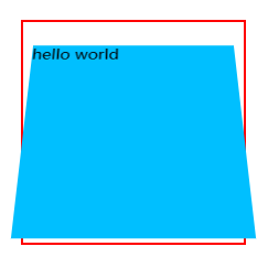
开启3D空间
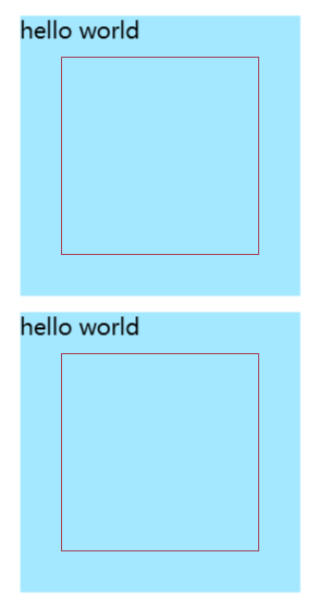
元素进行 3D 变换的首要操作:父元素必须开启 3D 空间。
<!DOCTYPE html>
<html lang="en">
  <head>
    <meta charset="UTF-8" />
    <meta http-equiv="X-UA-Compatible" content="IE=edge" />
    <meta name="viewport" content="width=device-width, initial-scale=1.0" />
    <title>3D变形</title>
    <style>
      .outer {
        width: 200px;
        height: 200px;
        border: 2px solid red;
        margin: 0 auto;
        margin-top: 100px;
        /* 开启3D空间 */
        transform-style: preserve-3d;
        /* 设置景深(产生立体效果) */
        perspective: 500px;
      }
      .inner {
        width: 200px;
        height: 200px;
        background-color: deepskyblue;
        transform: rotateX(30deg);
      }
    </style>
  </head>
  <body>
    <div class="outer">
      <div class="inner">hello world</div>
    </div>
  </body>
</html>
- 1
- 2
- 3
- 4
- 5
- 6
- 7
- 8
- 9
- 10
- 11
- 12
- 13
- 14
- 15
- 16
- 17
- 18
- 19
- 20
- 21
- 22
- 23
- 24
- 25
- 26
- 27
- 28
- 29
- 30
- 31
- 32
- 33
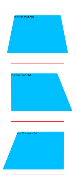
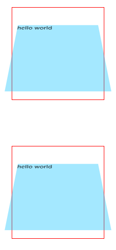
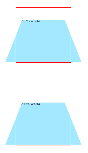
设置透视点位置
所谓透视点位置,就是观察者位置;默认的透视点在元素的中心。
<!DOCTYPE html>
<html lang="en">
  <head>
    <meta charset="UTF-8" />
    <meta http-equiv="X-UA-Compatible" content="IE=edge" />
    <meta name="viewport" content="width=device-width, initial-scale=1.0" />
    <title>3D变形</title>
    <style>
      .outer {
        width: 200px;
        height: 200px;
        border: 2px solid red;
        margin: 0 auto;
        margin-top: 20px;
        /* 开启3D空间 */
        transform-style: preserve-3d;
        /* 设置景深(产生立体效果) */
        perspective: 500px;
      }
      .inner {
        width: 200px;
        height: 200px;
        background-color: deepskyblue;
        transform: rotateX(45deg);
      }
      .outer1 {
        /* 透视点位置 */
        perspective-origin: 102px 102px;
      }
      .outer2 {
        /* 透视点位置 */
        perspective-origin: left;
      }
      .outer3 {
        /* 透视点位置 */
        perspective-origin: right;
      }
    </style>
  </head>
  <body>
    <div class="outer outer1">
      <div class="inner">hello world</div>
    </div>
    <div class="outer outer2">
      <div class="inner">hello world</div>
    </div>
    <div class="outer outer3">
      <div class="inner">hello world</div>
    </div>
  </body>
</html>
- 1
- 2
- 3
- 4
- 5
- 6
- 7
- 8
- 9
- 10
- 11
- 12
- 13
- 14
- 15
- 16
- 17
- 18
- 19
- 20
- 21
- 22
- 23
- 24
- 25
- 26
- 27
- 28
- 29
- 30
- 31
- 32
- 33
- 34
- 35
- 36
- 37
- 38
- 39
- 40
- 41
- 42
- 43
- 44
- 45
- 46
- 47
- 48
- 49
- 50
- 51
平移
3D 位移是在 2D 位移的基础上,可以让元素沿 z 轴位移,具体使用方式如下:
- 先给元素添加 转换属性 transform。
- 编写 transform 的具体值, 3D 相关可选值如下:
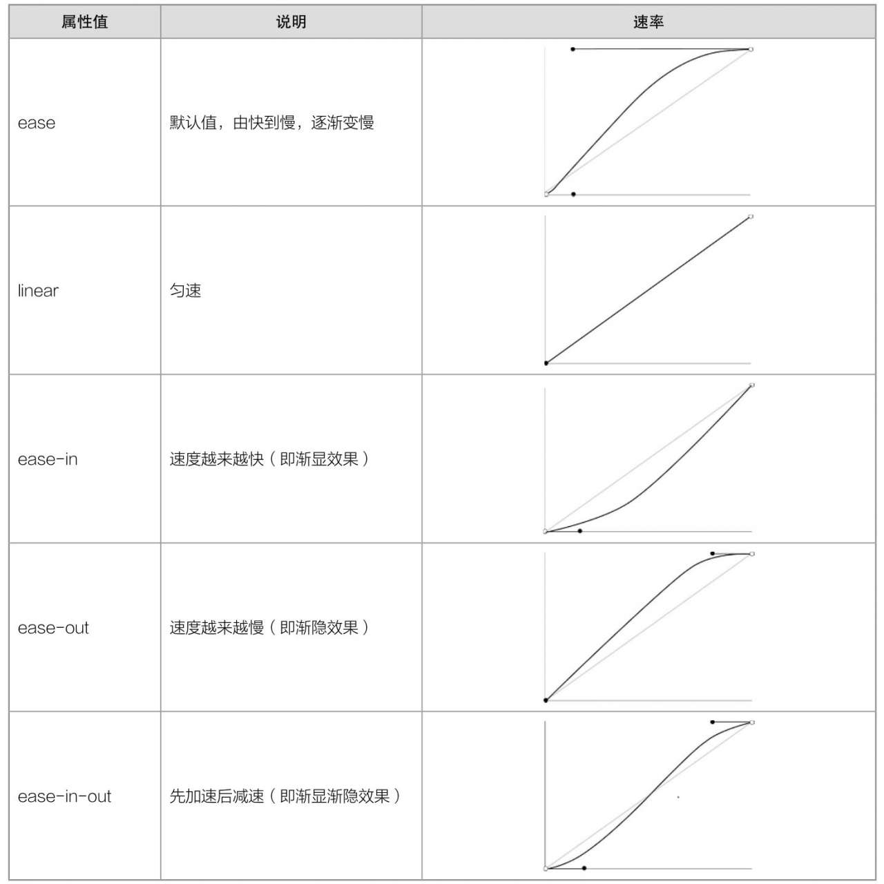
| 属性值 | 说明 |
|---|---|
| translateZ | 设置 z 轴位移,需指定长度值,正值向屏幕外,负值向屏幕里,且不能写百分比。 |
| translate3d | 第1个参数对应 x 轴,第2个参数对应 y 轴,第3个参数对应 z 轴,且均 |
<!DOCTYPE html>
<html lang="en">
  <head>
    <meta charset="UTF-8" />
    <meta http-equiv="X-UA-Compatible" content="IE=edge" />
    <meta name="viewport" content="width=device-width, initial-scale=1.0" />
    <title>3D平移</title>
    <style>
      .outer {
        width: 200px;
        height: 200px;
        border: 2px solid red;
        margin: 0 auto;
        margin-top: 100px;
        /* 开启3D空间 */
        transform-style: preserve-3d;
        /* 设置景深(产生立体效果) */
        perspective: 500px;
      }
      .inner {
        width: 200px;
        height: 200px;
        background-color: rgba(0, 191, 255, 0.356);
        transform: rotateX(45deg);
      }
      .inner1 {
        transform: translateZ(150px);
      }
      .inner2 {
        transform: translate3d(0, 0, 150px);
      }
    </style>
  </head>
  <body>
    <div class="outer">
      <div class="inner inner1">hello world</div>
    </div>
    <div class="outer">
      <div class="inner inner1">hello world</div>
    </div>
  </body>
</html>
- 1
- 2
- 3
- 4
- 5
- 6
- 7
- 8
- 9
- 10
- 11
- 12
- 13
- 14
- 15
- 16
- 17
- 18
- 19
- 20
- 21
- 22
- 23
- 24
- 25
- 26
- 27
- 28
- 29
- 30
- 31
- 32
- 33
- 34
- 35
- 36
- 37
- 38
- 39
- 40
- 41
- 42
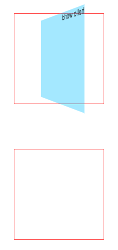
旋转
3D 旋转是在 2D 旋转的基础上,可以让元素沿 x 轴和 y 轴旋转,具体使用方式如下:
- 先给元素添加 转换属性 transform。
- 编写 transform 的具体值, 3D 相关可选值如下:
| 属性值 | 说明 |
|---|---|
| rotateX | 设置 x 轴旋转角度,需指定一个角度值( deg ),面对 x 轴正方向:正值顺时针,负值逆时针 |
| rotateY | 设置 y 轴旋转角度,需指定一个角度值( deg ),面对 y 轴正方向:正值顺时针,负值逆时针。 |
| rotate3d | 前 3 个参数分别表示坐标轴: x , y , z ,第 4 个参数表示旋转的角度,参数不允许省略。 例如: transform: rotate3d(1,1,1,30deg) ,意思是: x 、 y 、 z 分别旋转 |
<!DOCTYPE html>
<html lang="en">
  <head>
    <meta charset="UTF-8" />
    <meta http-equiv="X-UA-Compatible" content="IE=edge" />
    <meta name="viewport" content="width=device-width, initial-scale=1.0" />
    <title>3D旋转</title>
    <style>
      .outer {
        width: 200px;
        height: 200px;
        border: 2px solid red;
        margin: 0 auto;
        margin-top: 100px;
        /* 开启3D空间 */
        transform-style: preserve-3d;
        /* 设置景深(产生立体效果) */
        perspective: 500px;
      }
      .inner {
        width: 200px;
        height: 200px;
        background-color: rgba(0, 191, 255, 0.356);
      }
      .inner1 {
        transform: rotateX(45deg);
      }
      .inner2 {
        transform: rotate3d(1, 0, 0, 45deg);
      }
    </style>
  </head>
  <body>
    <div class="outer">
      <div class="inner inner1">hello world</div>
    </div>
    <div class="outer">
      <div class="inner inner2">hello world</div>
    </div>
  </body>
</html>
- 1
- 2
- 3
- 4
- 5
- 6
- 7
- 8
- 9
- 10
- 11
- 12
- 13
- 14
- 15
- 16
- 17
- 18
- 19
- 20
- 21
- 22
- 23
- 24
- 25
- 26
- 27
- 28
- 29
- 30
- 31
- 32
- 33
- 34
- 35
- 36
- 37
- 38
- 39
- 40
- 41
3D缩放
3D 缩放是在 2D 缩放的基础上,可以让元素沿 z 轴缩放,具体使用方式如下:
-
先给元素添加 转换属性 transform
-
编写 transform 的具体值, 3D 相关可选值如下:
| 属性值 | 说明 |
|---|---|
| scaleZ | 设置 z 轴方向的缩放比例,值为一个数字, 1 表示不缩放,大于 1 放大,小于 1 缩小。 |
| scale3d | 第1个参数对应 x 轴,第2个参数对应 y 轴,第3个参数对应 z 轴,参数不允许省略。 |
<!DOCTYPE html>
<html lang="en">
  <head>
    <meta charset="UTF-8" />
    <meta http-equiv="X-UA-Compatible" content="IE=edge" />
    <meta name="viewport" content="width=device-width, initial-scale=1.0" />
    <title>3D缩放</title>
    <style>
      .outer {
        width: 200px;
        height: 200px;
        border: 2px solid red;
        margin: 0 auto;
        margin-top: 100px;
        /* 开启3D空间 */
        transform-style: preserve-3d;
        /* 设置景深(产生立体效果) */
        perspective: 500px;
      }
      .inner {
        width: 200px;
        height: 200px;
        background-color: rgba(0, 191, 255, 0.356);
      }
      .inner1 {
        transform: scaleZ(2) rotateX(45deg);
      }
      .inner2 {
        transform: scale3d(1, 1, 2) rotateX(45deg);
      }
    </style>
  </head>
  <body>
    <div class="outer">
      <div class="inner inner1">hello world</div>
    </div>
    <div class="outer">
      <div class="inner inner2">hello world</div>
    </div>
  </body>
</html>
- 1
- 2
- 3
- 4
- 5
- 6
- 7
- 8
- 9
- 10
- 11
- 12
- 13
- 14
- 15
- 16
- 17
- 18
- 19
- 20
- 21
- 22
- 23
- 24
- 25
- 26
- 27
- 28
- 29
- 30
- 31
- 32
- 33
- 34
- 35
- 36
- 37
- 38
- 39
- 40
- 41
多重变形
多个变换,可以同时使用一个 transform 来编写。
transform: translateZ(100px) scaleZ(3) rotateY(40deg);
- 1
背部可见性
使用 backface-visibility 指定元素背面,在面向用户时是否可见,常用值如下:
| 属性值 | 说明 |
|---|---|
| visible | 默认值,元素背面可见,允许显示正面的镜像。 |
| hidden | 元素背面不可见。 |
<!DOCTYPE html>
<html lang="en">
  <head>
    <meta charset="UTF-8" />
    <meta http-equiv="X-UA-Compatible" content="IE=edge" />
    <meta name="viewport" content="width=device-width, initial-scale=1.0" />
    <title>3D背部可见性</title>
    <style>
      .outer {
        width: 200px;
        height: 200px;
        border: 2px solid red;
        margin: 0 auto;
        margin-top: 100px;
        /* 开启3D空间 */
        transform-style: preserve-3d;
        /* 设置景深(产生立体效果) */
        perspective: 500px;
      }
      .inner {
        width: 200px;
        height: 200px;
        background-color: rgba(0, 191, 255, 0.356);
        transform: rotateY(118deg);
      }
      .inner1 {
        backface-visibility: visible;
      }
      .inner2 {
        backface-visibility: hidden;
      }
    </style>
  </head>
  <body>
    <div class="outer">
      <div class="inner inner1">hello world</div>
    </div>
    <div class="outer">
      <div class="inner inner2">hello world</div>
    </div>
  </body>
</html>
- 1
- 2
- 3
- 4
- 5
- 6
- 7
- 8
- 9
- 10
- 11
- 12
- 13
- 14
- 15
- 16
- 17
- 18
- 19
- 20
- 21
- 22
- 23
- 24
- 25
- 26
- 27
- 28
- 29
- 30
- 31
- 32
- 33
- 34
- 35
- 36
- 37
- 38
- 39
- 40
- 41
- 42
transition(过渡)
概述
在CSS3中,我们可以使用transition属性将元素的某一个属性从“一个属性值”在指定的时间内平滑地过渡到“另一个属性值”,从而实现动画效果。
CSS变形(transform)呈现的仅仅是一个“结果”,而CSS过渡(transition)呈现的是一个“过程”。这个所谓的“过程”,通俗来说就是一种动画变化过程,如渐渐显示、渐渐隐藏、动画快慢等
说明
语法
transition: 过渡属性 过渡时间 过渡方式 延迟时间;
- 1
transition子属性
| 属性 | 说明 |
|---|---|
| transition-property | 需要操作的属性 |
| transition-duration | 过渡时间 |
| transition-timing-function | 过渡速率 |
| transition-delay | 延迟时间 |
transition-timing-function属性
使用
<!DOCTYPE html>
<html>
	<head>
		<meta charset="utf-8" />
		<title></title>
		<style type="text/css">
			div {
				display: inline-block;
				padding: 5px 10px;
				border-radius: 5px;
				color: white;
				background-color: hotpink;
				cursor: pointer;
				transition: background-color 1s linear 0s;
			}

			div:hover {
				background-color: purple;
			}
		</style>
	</head>
	<body>
		<div>hello</div>
	</body>
</html>
- 1
- 2
- 3
- 4
- 5
- 6
- 7
- 8
- 9
- 10
- 11
- 12
- 13
- 14
- 15
- 16
- 17
- 18
- 19
- 20
- 21
- 22
- 23
- 24
- 25

transition-property取值为all
可以使用transition属性同时对多个CSS属性来实现过渡效果。
<!DOCTYPE html>
<html>
	<head>
		<meta charset="utf-8" />
		<title></title>
		<style type="text/css">
			div {
				display: inline-block;
				width: 100px;
				height: 100px;
				border-radius: 0%;
				background-color: lightskyblue;
				transition: all 1s linear 0s;
			}

			div:hover {
				border-radius: 50%;
				background-color: purple;
			}
		</style>
	</head>
	<body>
		<div></div>
	</body>
</html>
- 1
- 2
- 3
- 4
- 5
- 6
- 7
- 8
- 9
- 10
- 11
- 12
- 13
- 14
- 15
- 16
- 17
- 18
- 19
- 20
- 21
- 22
- 23
- 24
- 25

animation(动画)
概述
在CSS3中,我们可以使用animation属性来实现元素的动画效果。
transition属性(即CSS3过渡)只能实现一次性的动画效果,而animation属性(即CSS3动画)可以实现连续性的动画效果。
说明
语法
animation:动画名称 持续时间 动画方式 延迟时间 动画次数 动画方向;
- 1
说明
animation是一个复合属性,主要包括6个子属性。
animation的子属性
| 属性 | 说明 |
|---|---|
| animation-name | 动画名 |
| animation-duration | 动画持续时间 |
| animation-timing-function | 动画速率变化方式 |
| animation-delay | 延迟时间 |
| animation-iteration-count | 动画播放次数 取值:1.正整数; 2.infinite,循环播放。 |
| animation-direction | 动画播放方向 取值:1.normal,正向播放(默认值); 2.reverse,反向播放; 3.alternate,奇数正向播放,偶数反向播放。 |
| animation-fill-mode | 动画不播放时状态 取值:1.none,等待期间和完成后都为开始样式(默认值); 2.forwards,等待期间为开始样式,完成后保持在最后一帧; 3.backwards,等待期间为第一帧,完成后跳转到开始样式; 4.both,等待期间为第一帧,完成后保持在最后一帧。 |
使用
<!DOCTYPE html>
<html>
	<head>
		<meta charset="utf-8" />
		<title></title>
		<style type="text/css">
			@keyframes mycolor {
				0% {
					background-color: red;
				}

				30% {
					background-color: blue;
				}

				60% {
					background-color: yellow;
				}

				100% {
					background-color: green;
				}
			}

			div {
				width: 100px;
				height: 100px;
				border-radius: 50px;
				background-color: red;
			}

			div:hover {
				animation: mycolor 5s linear;
			}
		</style>
	</head>
	<body>
		<div></div>
	</body>
</html>
- 1
- 2
- 3
- 4
- 5
- 6
- 7
- 8
- 9
- 10
- 11
- 12
- 13
- 14
- 15
- 16
- 17
- 18
- 19
- 20
- 21
- 22
- 23
- 24
- 25
- 26
- 27
- 28
- 29
- 30
- 31
- 32
- 33
- 34
- 35
- 36
- 37
- 38
- 39
- 40
animation-play-state 播放状态
语法
animation-play-state: 取值;
- 1
animation-play-state属性取值
| 属性值 | 说明 |
|---|---|
| running | 播放,默认值 |
| paused | 暂停 |
使用
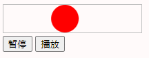
<!DOCTYPE html>
<html>
	<head>
		<meta charset="utf-8" />
		<title></title>
		<style type="text/css">
			@keyframes mytranslate {
				0% {}

				50% {
					transform: translateX(160px);
				}

				100% {}
			}

			#container {
				display: inline-block;
				width: 200px;
				border: 1px solid silver;
			}

			#ball {
				width: 40px;
				height: 40px;
				border-radius: 50%;
				background-color: red;
				animation: mytranslate 2s linear infinite;
			}
		</style>
		<script>
			window.onload = function() {
				var ball = document.getElementById("ball");
				var btn_pause = document.getElementById("btn_pause");
				var btn_play = document.getElementById("btn_play");
				btn_pause.onclick = function() {
					ball.style.animationPlayState = "paused";
				}
				btn_play.onclick = function() {
					ball.style.animationPlayState = "running";
				}
			}
		</script>
	</head>
	<body>
		<div id="container">
			<div id="ball"></div>
		</div>
		<div>
			<button id="btn_pause">暂停</button>
			<button id="btn_play">播放</button>
		</div>
	</body>
</html>
- 1
- 2
- 3
- 4
- 5
- 6
- 7
- 8
- 9
- 10
- 11
- 12
- 13
- 14
- 15
- 16
- 17
- 18
- 19
- 20
- 21
- 22
- 23
- 24
- 25
- 26
- 27
- 28
- 29
- 30
- 31
- 32
- 33
- 34
- 35
- 36
- 37
- 38
- 39
- 40
- 41
- 42
- 43
- 44
- 45
- 46
- 47
- 48
- 49
- 50
- 51
- 52
- 53
- 54
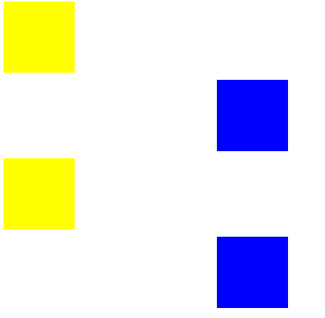
animation-fill-mode 动画不播放时状态
<!DOCTYPE html>
<html lang="en">
    <head>
        <meta charset="UTF-8">
        <meta name="viewport" content="width=device-width, initial-scale=1.0">
        <title>Document</title>
        <style>
            @keyframes test {
                0% {
                    left: 0px;
                    background: red;
                }

                100% {
                    left: 300px;
                    background: blue;
                }
            }

            div {
                width: 100px;
                height: 100px;
                background: yellow;
                position: relative;
                margin: 10px 0px;
            }

            .box1 {
                animation: test 4s linear 2s 1;
                animation-fill-mode: none;
            }

            .box2 {
                animation: test 4s linear 2s 1;
                animation-fill-mode: forwards;
            }

            .box3 {
                animation: test 4s linear 2s 1;
                animation-fill-mode: backwards;
            }

            .box4 {
                animation: test 4s linear 2s 1;
                animation-fill-mode: both;
            }
        </style>
    </head>
    <body>
        <div class="box1"></div>
        <div class="box2"></div>
        <div class="box3"></div>
        <div class="box4"></div>
    </body>
</html>
- 1
- 2
- 3
- 4
- 5
- 6
- 7
- 8
- 9
- 10
- 11
- 12
- 13
- 14
- 15
- 16
- 17
- 18
- 19
- 20
- 21
- 22
- 23
- 24
- 25
- 26
- 27
- 28
- 29
- 30
- 31
- 32
- 33
- 34
- 35
- 36
- 37
- 38
- 39
- 40
- 41
- 42
- 43
- 44
- 45
- 46
- 47
- 48
- 49
- 50
- 51
- 52
- 53
- 54
- 55