
- 1harmonyOS(鸿蒙系统)碎片学习(1)_华为harmony操作系统学习
- 2如何开发微信小程序?微信小程序开发的基础使用,如何使用微信开发者工具,微信小程序语法,基本文件结构,textrich-text,小程序轮播图,微信小程序注册事件,bind:tap 、 bind:inp_微信开发者工具bookkepping文件
- 3WebRTC 实现 Android 传屏 demo_webrtc android demo
- 4关于argmin和argmax的一点说明_argmin和min的区别
- 5regexp_like字符串中的指定字符串或者字符,区分逗号_regexp_like 如果区分1 和11
- 6【Spring】——非事务方法访问事务方法_spring非事务方法调用事务方法
- 7java集成chatGpt完整案例代码(效果和官网一样逐字输出)_java chatgpt
- 8计算机视觉之目标检测——R-CNN、Fast R-CNN和Faster R-CNN详解_实现任何两种对象匹配方法(例如,直方图,lbp,过滤器库,alexnet,yolo,fast r-c
- 9【软件2.0】软件2.0时代来了!特斯拉AI负责人说:神经网络正在改变编程
- 10论文阅读--High-Resolution Image Synthesis with Latent Diffusion Models_**high-resolution image synthesis with latent diff
探讨uniapp的组件使用的问题
赞
踩
1 视图容器
1.1 view
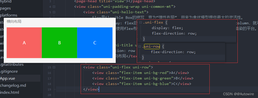
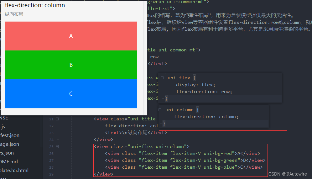
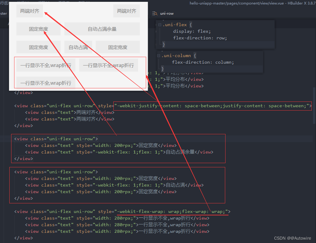
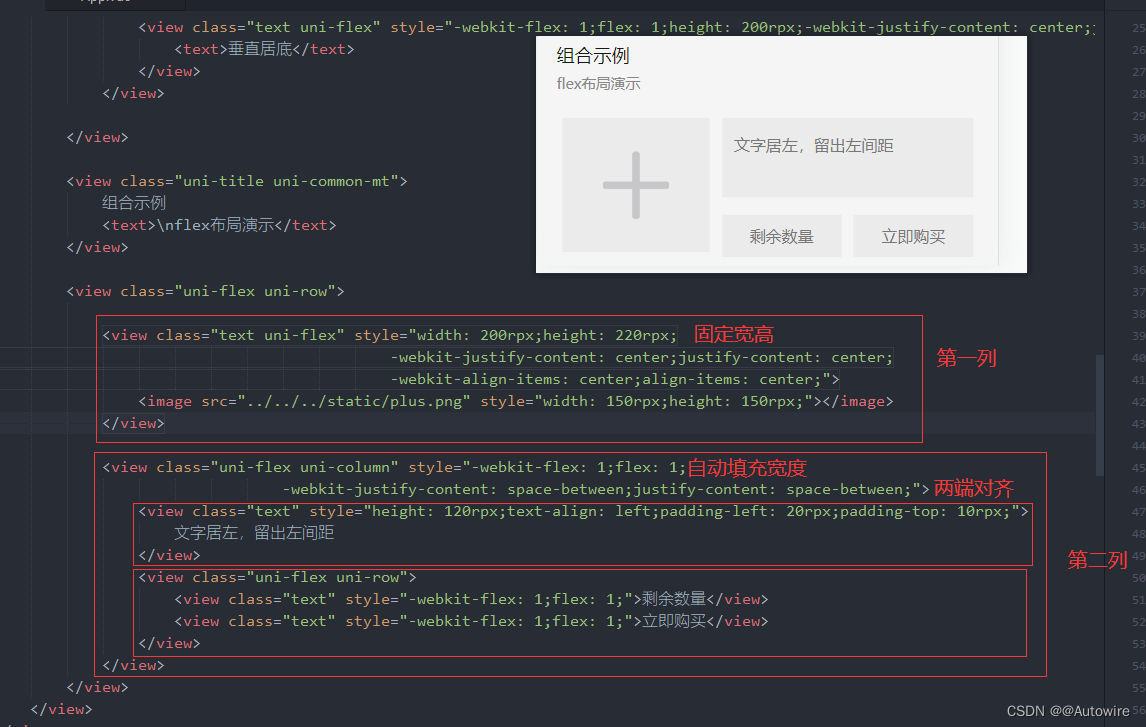
Flex是Flexible Box的缩写,意为“弹性布局”,用来为盒状模型提供最大的灵活性。
当设置display: flex后,继续给view等容器组件设置flex-direction:row或column,就可以在该容器内按行或列排布子组件。uni-app推荐使用flex布局, 因为flex布局有利于跨更多平台,尤其是采用原生渲染的平台。

1.2 scroll-view
- scroll-view是区域滚动,不会触发页面滚动,无法触发pages.json配置的下拉刷新、页面触底onReachBottomDistance、titleNView的transparent透明渐变
- 可滚动视图区域。用于区域滚动。
- 需注意在webview渲染的页面中,区域滚动的性能不及页面滚动。
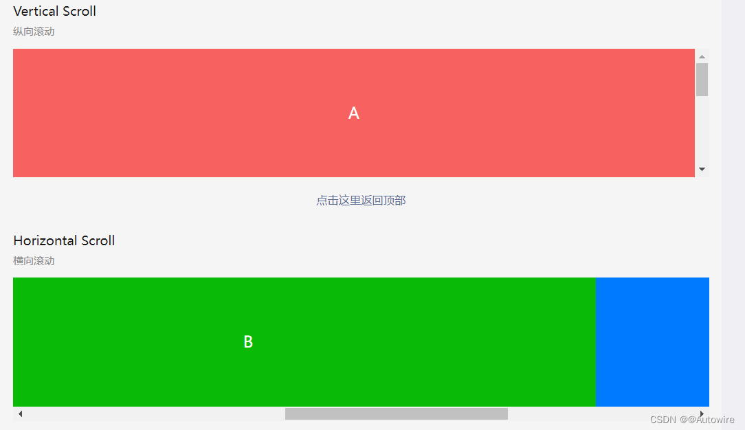
<template>
	<view>
		<page-head title="scroll-view,区域滚动视图"></page-head>
		<view class="uni-padding-wrap uni-common-mt">
			<view class="uni-title uni-common-mt">
				Vertical Scroll
				<text>\n纵向滚动</text>
			</view>
			<view>
				<!-- scroll-top	Number/String		设置竖向滚动条位置 -->
				<!-- scroll-y	Boolean	false	允许纵向滚动 -->
				<!-- @scrolltoupper	EventHandle		滚动到顶部/左边,会触发 scrolltoupper 事件 -->
				<!-- @scrolltolower	EventHandle		滚动到底部/右边,会触发 scrolltolower 事件 -->
				<!-- @scroll	EventHandle		滚动时触发,event.detail = {scrollLeft, scrollTop, scrollHeight, scrollWidth, deltaX, deltaY} -->
				<scroll-view :scroll-top="scrollTop" scroll-y="true" class="scroll-Y" @scrolltoupper="upper" @scrolltolower="lower"
				@scroll="scroll">
					<view id="demo1" class="scroll-view-item uni-bg-red">A</view>
					<view id="demo2" class="scroll-view-item uni-bg-green">B</view>
					<view id="demo3" class="scroll-view-item uni-bg-blue">C</view>
				</scroll-view>
			</view>
			<!-- @tap	(event: MouseEvent) => void	-	手指触摸后马上离开 -->
			<!-- @longpress	(event: Event) => void	-	如果一个组件被绑定了 longpress 事件,那么当用户长按这个组件时,该事件将会被触发。 -->
			<view @tap="goTop" class="uni-link uni-center uni-common-mt">
				点击这里返回顶部
			</view>

			<view class="uni-title uni-common-mt">
				Horizontal Scroll
				<text>\n横向滚动</text>
			</view>
			<view>
				<scroll-view class="scroll-view_H" scroll-x="true" @scroll="scroll" scroll-left="120">
					<view id="demo1" class="scroll-view-item_H uni-bg-red">A</view>
					<view id="demo2" class="scroll-view-item_H uni-bg-green">B</view>
					<view id="demo3" class="scroll-view-item_H uni-bg-blue">C</view>
				</scroll-view>
			</view>
            <view class="uni-common-pb"></view>
		</view>
	</view>
</template>

- 1
- 2
- 3
- 4
- 5
- 6
- 7
- 8
- 9
- 10
- 11
- 12
- 13
- 14
- 15
- 16
- 17
- 18
- 19
- 20
- 21
- 22
- 23
- 24
- 25
- 26
- 27
- 28
- 29
- 30
- 31
- 32
- 33
- 34
- 35
- 36
- 37
- 38
- 39
- 40
- 41
- 42
自定义下拉刷新
- 注意,在webview渲染时,自定义下拉刷新的性能不及pages.json中配置的原生下拉刷新。
1.3 pages.json中配置的原生下拉刷新
实现思路:
第一步,在pages.json中配置该页面,允许进行下拉刷新
第二步,在下拉刷新的生命周期函数中,处理逻辑
- 在pages.json中配置该页面,允许进行下拉刷新
{
  "pages": [{
      "path": "pages/index/index",
      "style": {
        "navigationBarTitleText": "首页",//设置页面标题文字
        "enablePullDownRefresh":true//开启下拉刷新
      }
    },
    ...
  ]
}
- 1
- 2
- 3
- 4
- 5
- 6
- 7
- 8
- 9
- 10
- 11
- 12
- 在下拉刷新的生命周期函数中,处理逻辑
onPullDownRefresh() {
	console.log('onPullDownRefresh');
	this.initData();
},
- 1
- 2
- 3
- 4
1.4swiper
滑块视图容器。一般用于左右滑动或上下滑动,比如banner轮播图。
注意滑动切换和滚动的区别,滑动切换是一屏一屏的切换。swiper下的每个swiper-item是一个滑动切换区域,不能停留在2个滑动区域之间。

		<view class="uni-margin-wrap">
			<!-- circular	Boolean	false	是否采用衔接滑动,即播放到末尾后重新回到开头 -->
			<!-- indicator-dots	Boolean	false	是否显示面板指示点 -->
			<!-- autoplay	Boolean	false	是否自动切换 -->
			<!-- interval	Number	5000	自动切换时间间隔 -->
			<!-- duration	Number	500	滑动动画时长 -->
			<swiper class="swiper" circular :indicator-dots="indicatorDots" :autoplay="autoplay" :interval="interval" :duration="duration">
				<swiper-item>
					<view class="swiper-item uni-bg-red">A</view>
				</swiper-item>
				<swiper-item>
					<view class="swiper-item uni-bg-green">B</view>
				</swiper-item>
				<swiper-item>
					<view class="swiper-item uni-bg-blue">C</view>
				</swiper-item>
			</swiper>
		</view>
- 1
- 2
- 3
- 4
- 5
- 6
- 7
- 8
- 9
- 10
- 11
- 12
- 13
- 14
- 15
- 16
- 17
- 18
2 基础内容
2.1 icon图标
uniapp中自带的icon很少,不管哪个UI框架都有这个问题,最好就是引用来自iconfont之类的自定义项目文件,我见过很多项目是将文件直接下载下来使用,弊端是操作麻烦,颜色不可修改,只能用已下载的颜色,最好的方式当然是使用字体文件来实现,这里就详细说下操作流程
方案步骤
步骤主要分两块,一块是iconfont上的项目管理,一块是本地uniapp项目中的配置
iconfont端
iconfont端主要分3步:
-
创建项目

-
选择图标

-
导出字体文件

项目端引用
项目端引用主要分3步:
4. 文件下载

- CSS引用
然后进入到App.vue中的style进行CSS引用
<style>
	@import '@/static/icon/iconfont.css';
</style>
- 1
- 2
- 3
- CSS引用路径修改
这里是个小坑,因为默认网页中css引用当前文件夹下的字体文件是没问题的,但是在uniapp中需要去修改iconfont.css中的引用字体的文件位置
@font-face {
  font-family: "iconfont"; /* Project id 3355581 */
  src: url(iconfont.woff2?t=1650891154292') format('woff2'),
       url('iconfont.woff?t=1650891154292') format('woff'),
       url('iconfont.ttf?t=1650891154292') format('truetype');
}
- 1
- 2
- 3
- 4
- 5
- 6
- 7
改为如下(记得按你自己的路径来修改)
@font-face {
  font-family: "iconfont"; /* Project id 3355581 */
  src: url('/static/icon/iconfont.woff2?t=1650891154292') format('woff2'),
       url('/static/icon/iconfont.woff?t=1650891154292') format('woff'),
       url('/static/icon/iconfont.ttf?t=1650891154292') format('truetype');
}
- 1
- 2
- 3
- 4
- 5
- 6
- 7
至此就可以在前端进行引用了,eg:
		<view>
			<view class="iconfont icon-huiju2" style="font-size: 100rpx; color: green;;"></view>
		</view>
- 1
- 2
- 3

2.2 text组件
文本组件。用于包裹文本内容。

- 支持 \n 方式换行。
			<view class="text-box">
				<text>{{text}}</text>
			</view>
- 1
- 2
- 3
2.3 rich-text
富文本。支持默认事件,包括:click、touchstart、touchmove、touchcancel、touchend、longpress。


	export default {
		data() {
			return {
				title: 'rich-text',
				nodes: [{
					// name	标签名	String	是	支持部分受信任的 HTML 节点
					name: 'div',
					// attrs	属性	Object	否	支持部分受信任的属性,遵循 Pascal 命名法
					attrs: {
						class: 'div-class',
						style: 'line-height: 60px; color: red; text-align:center;'
					},
					// children	子节点列表	Array	否	结构和 nodes 一致
					children: [{
						type: 'text',
						text: 'Hello uni-app!'
					}]
				}],
				strings: '<div style="text-align:center;"><img src="https://web-assets.dcloud.net.cn/unidoc/zh/uni@2x.png"/></div>'
			}
		}
	}
- 1
- 2
- 3
- 4
- 5
- 6
- 7
- 8
- 9
- 10
- 11
- 12
- 13
- 14
- 15
- 16
- 17
- 18
- 19
- 20
- 21
- 22

- nodes 不推荐使用 String 类型,性能会有所下降。
- rich-text 组件内屏蔽所有节点的事件。所以如果内容中有链接、图片需要点击,则不能使用rich-text
- attrs 属性不支持 id ,支持 class
2.4 progress
进度条。
        <view class="uni-padding-wrap uni-common-mt">
            <view class="progress-box">
				<!-- 属性名	    类型	   默认值	说明 -->
				<!-- percent	Number	无	百分比0~100 -->
				<!-- show-info	Boolean	false	在进度条右侧显示百分比 -->
				<!-- stroke-width	Number	6	进度条线的宽度,单位px -->
                <progress :percent="pgList[0]" show-info stroke-width="3" />
            </view>
            <view class="progress-box">
                <progress :percent="pgList[1]" stroke-width="3" />
                <uni-icons type="close" class="progress-cancel" color="#dd524d"></uni-icons>
            </view>
            <view class="progress-box">
                <progress :percent="pgList[2]" stroke-width="3" />
            </view>
            <view class="progress-box">
				<!-- activeColor	Color	#09BB07(百度为#E6E6E6)	已选择的进度条的颜色 -->
                <progress :percent="pgList[3]" activeColor="#10AEFF" stroke-width="3" />
            </view>
            <view class="progress-control">
                <button type="primary" @click="setProgress">设置进度</button>
                <button type="warn" @click="clearProgress">清除进度</button>
            </view>
        </view>
- 1
- 2
- 3
- 4
- 5
- 6
- 7
- 8
- 9
- 10
- 11
- 12
- 13
- 14
- 15
- 16
- 17
- 18
- 19
- 20
- 21
- 22
- 23
- 24

3 表单组件
3.1 button

button 组件的点击遵循 vue 标准的 @click事件。
button 组件没有 url 属性,如果要跳转页面,可以在@click中编写,也可以在button组件外面套一层 navigator 组件。举例,如需跳转到about页面,可按如下几种代码写法执行:
<template>
	<view>
		<navigator url="/pages/about/about"><button type="default">通过navigator组件跳转到about页面</button></navigator>
		<button type="default" @click="goto('/pages/about/about')">通过方法跳转到about页面</button>
		<button type="default" @click="navigateTo('/pages/about/about')">跳转到about页面</button><!-- 这种写法只有h5平台支持,不跨端,不推荐使用 -->
	</view>
</template>
<script>
	export default {
		methods: {
			goto(url) {
				uni.navigateTo({
					url:url
				})
			}
		}
	}
</script>
- 1
- 2
- 3
- 4
- 5
- 6
- 7
- 8
- 9
- 10
- 11
- 12
- 13
- 14
- 15
- 16
- 17
- 18
- 19
3.2 checkbox-group
多项选择器,内部由多个 checkbox 组成。


<template>
	<view>
		<page-head :title="title"></page-head>
		<view class="uni-padding-wrap uni-common-mt">
			<view class="uni-title uni-common-mt">默认样式</view>
			<view>
				<checkbox-group>
					<label>
						<!-- checked	Boolean	false	当前是否选中,可用来设置默认选中 -->
						<checkbox value="cb1" checked="true" />选中
					</label>
					<label>
						<checkbox value="cb" />未选中
					</label>
				</checkbox-group>
			</view>
			<view class="uni-title uni-common-mt">不同颜色和尺寸的checkbox</view>
			<view>
				<checkbox-group>
					<label>
						<checkbox value="cb1" checked="true" color="#FFCC33" style="transform:scale(0.7)" />选中
					</label>
					<label>
						<!-- color	Color	checkbox的颜色,同css的color -->
						<checkbox value="cb" color="#FFCC33" style="transform:scale(0.7)" />未选中
					</label>
				</checkbox-group>
			</view>
		</view>

		<view class="uni-padding-wrap">
			<view class="uni-title uni-common-mt">
				推荐展示样式
				<text>\n使用 uni-list 布局</text>
			</view>
		</view>
		<!-- .uni-list {
				background-color: #FFFFFF;
				position: relative;
				width: 100%;
				display: flex;
				flex-direction: column;
			} -->
		<view class="uni-list">
			<!-- @change	EventHandle	<checkbox-group>中选中项发生改变是触发 change 事件 -->
			<checkbox-group @change="checkboxChange">
				<label class="uni-list-cell uni-list-cell-pd" v-for="item in items" :key="item.value">
					<view>
						<checkbox :value="item.value" :checked="item.checked" />
					</view>
					<view>{{item.name}}</view>
				</label>
			</checkbox-group>
		</view>
	</view>
</template>
<script>
	export default {
		data() {
			return {
				title: 'checkbox 复选框',
				items: [{
						value: 'USA',
						name: '美国'
					},
					{
						value: 'CHN',
						name: '中国',
						checked: 'true'
					},
					{
						value: 'BRA',
						name: '巴西'
					},
					{
						value: 'JPN',
						name: '日本'
					},
					{
						value: 'ENG',
						name: '英国'
					},
					{
						value: 'FRA',
						name: '法国'
					}
				]
			}
		},
		methods: {
			checkboxChange: function(e) {
				console.log('e = ', e);
				var items = this.items,
					values = e.detail.value;
				for (var i = 0, lenI = items.length; i < lenI; ++i) {
					const item = items[i]
					if (values.indexOf(item.value) >= 0) {
						this.$set(item, 'checked', true)
					} else {
						this.$set(item, 'checked', false)
					}
				}
			}
		}
	}
</script>

<style>
	/* justify-content是用于设置或检索弹性盒子元素在主轴(横轴)方向上的对齐方式。它常用于CSS的Flexbox布局。

		以下是justify-content的常用属性值:

		flex-start:默认值,项目位于容器的开头。
		flex-end:项目位于容器的结尾。
		center:项目位于容器的中心。
		space-between:项目位于各行之间留有空白的容器内,第一行在容器开头,最后一行在容器结尾。
		space-around:每个项目的左右撑开距离相等,项目与项目之间以及头尾的间距相等。
		space-evenly:每个间距,均匀分布为容器宽度的一半。
		需要注意的是,justify-content属性在Internet Explorer和Safari浏览器中不被支持。 */
	.uni-list-cell {
		justify-content: flex-start
	}
</style>
- 1
- 2
- 3
- 4
- 5
- 6
- 7
- 8
- 9
- 10
- 11
- 12
- 13
- 14
- 15
- 16
- 17
- 18
- 19
- 20
- 21
- 22
- 23
- 24
- 25
- 26
- 27
- 28
- 29
- 30
- 31
- 32
- 33
- 34
- 35
- 36
- 37
- 38
- 39
- 40
- 41
- 42
- 43
- 44
- 45
- 46
- 47
- 48
- 49
- 50
- 51
- 52
- 53
- 54
- 55
- 56
- 57
- 58
- 59
- 60
- 61
- 62
- 63
- 64
- 65
- 66
- 67
- 68
- 69
- 70
- 71
- 72
- 73
- 74
- 75
- 76
- 77
- 78
- 79
- 80
- 81
- 82
- 83
- 84
- 85
- 86
- 87
- 88
- 89
- 90
- 91
- 92
- 93
- 94
- 95
- 96
- 97
- 98
- 99
- 100
- 101
- 102
- 103
- 104
- 105
- 106
- 107
- 108
- 109
- 110
- 111
- 112
- 113
- 114
- 115
- 116
- 117
- 118
- 119
- 120
- 121
- 122
- 123
- 124

3.3 editor
富文本编辑器,可以对图片、文字格式进行编辑和混排。
3.4 form
表单,将组件内的用户输入的<switch> <input> <checkbox> <slider> <radio> <picker> 提交。
当点击 <form> 表单中 formType 为 submit 的 <button> 组件时,会将表单组件中的 value 值进行提交,需要在表单组件中加上 name 来作为 key。


<template>
	<view>
		<page-head title="form"></page-head>
		<view class="uni-padding-wrap uni-common-mt">
			<form @submit="formSubmit" @reset="formReset">
				<view class="uni-form-item uni-column">
					<view class="title">姓名</view>
					<!-- .uni-input {
							height: 50rpx;
							padding: 15rpx 25rpx;
							line-height:50rpx;
							font-size:28rpx;
							background:#FFF;
							flex: 1;
						} -->
					<!-- flex: 1表示项目的放大比例和缩小比例都为1,
					即当存在剩余空间时,该项目将自动放大以占据更多的空间,
					而在超出父容器时,超出部分将等分缩小的比例。
					这是一种常用的自适应布局方式,可以将父容器的空间自动分配给子元素,以达到自动调整布局的效果。 -->
					<input class="uni-input" name="nickname" placeholder="请输入姓名" />
				</view>
				<view class="uni-form-item uni-column">
					<view class="title">性别</view>
					<radio-group name="gender">
						<label>
							<radio value="男" /><text>男</text>
						</label>
						<label>
							<radio value="女" /><text>女</text>
						</label>
					</radio-group>
				</view>
				<view class="uni-form-item uni-column">
					<view class="title">爱好</view>
					<checkbox-group name="loves">
						<label>
							<checkbox value="读书" /><text>读书</text>
						</label>
						<label>
							<checkbox value="写字" /><text>写字</text>
						</label>
					</checkbox-group>
				</view>
				<view class="uni-form-item uni-column">
					<view class="title">年龄</view>
					<slider value="20" name="age" show-value></slider>
				</view>
				<view class="uni-form-item uni-column">
					<view class="title">保留选项</view>
					<view>
						<switch name="switch" />
					</view>
				</view>
				<view class="uni-btn-v">
					<button form-type="submit">Submit</button>
					<button type="default" form-type="reset">Reset</button>
				</view>
			</form>
		</view>
	</view>
</template>
<script>
	import graceChecker from "../../../common/graceChecker.js"
	export default {
		data() {
			return {
			}
		},
		methods: {
			formSubmit: function(e) {
				console.log('form发生了submit事件,携带数据为:' + JSON.stringify(e.detail.value))
                //定义表单规则
                var rule = [
                    {name:"nickname", checkType : "string", checkRule:"1,3",  errorMsg:"姓名应为1-3个字符"},
                    {name:"gender", checkType : "in", checkRule:"男,女",  errorMsg:"请选择性别"},
                    {name:"loves", checkType : "notnull", checkRule:"",  errorMsg:"请选择爱好"}
                ];
                //进行表单检查
                var formData = e.detail.value;
                var checkRes = graceChecker.check(formData, rule);
                if(checkRes){
                    uni.showToast({title:"验证通过!", icon:"none"});
                }else{
                    uni.showToast({ title: graceChecker.error, icon: "none" });
                }
			},
			formReset: function(e) {
				console.log('清空数据')
			}
		}
	}
</script>

<style>
	.uni-form-item .title {
		padding: 20rpx 0;
	}
</style>
- 1
- 2
- 3
- 4
- 5
- 6
- 7
- 8
- 9
- 10
- 11
- 12
- 13
- 14
- 15
- 16
- 17
- 18
- 19
- 20
- 21
- 22
- 23
- 24
- 25
- 26
- 27
- 28
- 29
- 30
- 31
- 32
- 33
- 34
- 35
- 36
- 37
- 38
- 39
- 40
- 41
- 42
- 43
- 44
- 45
- 46
- 47
- 48
- 49
- 50
- 51
- 52
- 53
- 54
- 55
- 56
- 57
- 58
- 59
- 60
- 61
- 62
- 63
- 64
- 65
- 66
- 67
- 68
- 69
- 70
- 71
- 72
- 73
- 74
- 75
- 76
- 77
- 78
- 79
- 80
- 81
- 82
- 83
- 84
- 85
- 86
- 87
- 88
- 89
- 90
- 91
- 92
- 93
- 94
- 95
- 96
- 97
- 98
- 99
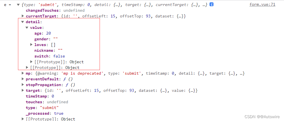
解读一下代码:
<form @submit="formSubmit" @reset="formReset">
- 1
			formSubmit: function(e) {
				console.log('e = ', e);
				console.log('form发生了submit事件,携带数据为:' + JSON.stringify(e.detail.value))
                //定义表单规则
                var rule = [
                    {name:"nickname", checkType : "string", checkRule:"1,3",  errorMsg:"姓名应为1-3个字符"},
                    {name:"gender", checkType : "in", checkRule:"男,女",  errorMsg:"请选择性别"},
                    {name:"loves", checkType : "notnull", checkRule:"",  errorMsg:"请选择爱好"}
                ];
                //进行表单检查
                var formData = e.detail.value;
                var checkRes = graceChecker.check(formData, rule);
                if(checkRes){
                    uni.showToast({title:"验证通过!", icon:"none"});
                }else{
                    uni.showToast({ title: graceChecker.error, icon: "none" });
                }
			}
- 1
- 2
- 3
- 4
- 5
- 6
- 7
- 8
- 9
- 10
- 11
- 12
- 13
- 14
- 15
- 16
- 17
- 18
为方便做表单验证,uni ui提供了组件,参考:https://ext.dcloud.net.cn/plugin?id=2773
3.5 uni-forms
uni-app的内置组件已经有了 <form>组件,用于提交表单内容。
然而几乎每个表单都需要做表单验证,为了方便做表单验证,减少重复开发,uni-ui 又基于 <form>组件封装了 <uni-forms>组件,内置了表单验证功能。
<uni-forms> 提供了 rules属性来描述校验规则、<uni-forms-item>子组件来包裹具体的表单项,以及给原生或三方组件提供了 onFieldChange() 来校验表单值。
每个要校验的表单项,不管input还是checkbox,都必须放在<uni-forms-item>组件中,且一个<uni-forms-item>组件只能放置一个表单项。
<uni-forms-item>组件内部预留了显示error message的区域,默认是在表单项的底部。
另外,<uni-forms>组件下面的各个表单项,可以通过<uni-group>包裹为不同的分组。同一<uni-group>下的不同表单项目将聚拢在一起,同其他group保持垂直间距。<uni-group>仅影响视觉效果。
基本用法
uni-forms 组件通常用来做表单校验和提交。每一个 uni-forms-item 是它的一个表单域组件,用来承载表单具体内容,uni-forms-item 中可以嵌套 uni-easyinput、uni-data-checkbox 和 uni-app 内置的表单组件。
<template>
	<view class="">
		<uni-forms :modelValue="formData">
			<uni-forms-item label="姓名" name="name">
				<uni-easyinput type="text" v-model="formData.name" placeholder="请输入姓名" />
			</uni-forms-item>
			<uni-forms-item label="年龄" name="age">
				<input type="text" v-model="formData.age" placeholder="请输入年龄" />
			</uni-forms-item>
			<uni-forms-item required name="hobby" label="兴趣爱好">
				<uni-data-checkbox multiple v-model="formData.hobby" :localdata="hobby"/>
			</uni-forms-item>
		</uni-forms>
		<button @click="submitForm">Submit</button>
	</view>
</template>
- 1
- 2
- 3
- 4
- 5
- 6
- 7
- 8
- 9
- 10
- 11
- 12
- 13
- 14
- 15
- 16
- 17
对齐方式
使用 label-position 属性可以设置所有表单域的位置,默认在左侧
<template>
	<view class="">
		<uni-forms :modelValue="formData" label-position="top">
			<uni-forms-item label="姓名" name="name">
				<uni-easyinput type="text" v-model="formData.name" placeholder="请输入姓名" />
			</uni-forms-item>
			<uni-forms-item required name="hobby" label="兴趣爱好">
				<uni-data-checkbox multiple v-model="formData.hobby" :localdata="hobby"/>
			</uni-forms-item>
		</uni-forms>
	</view>
</template>
- 1
- 2
- 3
- 4
- 5
- 6
- 7
- 8
- 9
- 10
- 11
- 12
- 13
表单校验
- uni-forms 需要通过 rules 属性传入约定的校验规则,详细描述下文校验规则说明。
<!-- rules 内容详见下方完整示例 -->
<uni-forms ref="form" :rules="rules">
	...
</uni-forms>
- 1
- 2
- 3
- 4
- 5
- uni-forms 需要绑定model属性,值为表单的 key\value 组成的对象。
<!-- formData、rules 内容详见下方完整示例 -->
<uni-forms ref="form" :model="formData" :rules="rules">
	...
</uni-forms>
- 1
- 2
- 3
- 4
- 5
- uni-forms-item 需要设置 name 属性为当前字段名,字段为 String|Array 类型。
<!-- formData、rules 内容详见下方完整示例 -->
<uni-forms :modelValue="formData" :rules="rules">
	<uni-forms-item label="姓名" name="name">
		<uni-easyinput type="text" v-model="formData.name" placeholder="请输入姓名" />
	</uni-forms-item>
	<uni-forms-item required :name="['data','hobby']" label="兴趣爱好">
		<uni-data-checkbox multiple v-model="formData.data.hobby" :localdata="hobby"/>
	</uni-forms-item>
</uni-forms>
- 1
- 2
- 3
- 4
- 5
- 6
- 7
- 8
- 9
- 10
- 只要使用的组件不管内置组件还是三方组件,只需绑定 v-model,无需其他操作,即可参与校验。
- 如果使用原生 checkbox 或三方组件不支持 v-model 等,只需要给组件绑定 binddata 方法即可触发表单校验,无需绑定事件到 methods 中,见下方完整示例。
- binddata(‘name’,$event.detail.value,‘form’)" 方法接受三个值,
第一个参数传入当前表单组件所在的 name,同当前父组件 uni-forms-item 绑定属性 name 的值
第二个参数传入需要校验的值,内置组件可以通过 $event.detail.value 获取到组件的返回值,自定义组件传入需要校验的值即可
第三个参数传入 uni-forms 组件绑定属性 ref 的值,通常在多表单的时候需要传入,用来区分表单,如页面中仅有一个 uni-forms 可忽略 - 如果内置 binddata 方法无法满足需求,在当前页面的 methods 中复写此方法即可,复写此方法需要调用 uni-forms 的 setValue 来触发表单校验,见下方 setValue方法说明
<template>
	<view>
		<uni-forms ref="form" :model="formData" :rules="rules">
			<uni-forms-item label="姓名" name="name">
				<uni-easyinput type="text" v-model="formData.name" placeholder="请输入姓名" />
			</uni-forms-item>
			<uni-forms-item label="邮箱" name="email">
				<uni-easyinput class="input" v-model="formData.email" type="text" placeholder="请输入邮箱" />

				<!-- <input class="input" type="text" placeholder="请输入邮箱" @input="binddata('email',$event.detail.value)" /> -->
			</uni-forms-item>
		</uni-forms>
		<button @click="submit">Submit</button>
	</view>
</template>


<script>
	export default {
		data() {
			return {
				// 表单数据
				formData: {
					name: 'LiMing',
					// email: 'dcloud@email.com'
					email: ''
				},
				rules: {
					// 对name字段进行必填验证
					name: {
						rules: [{
								required: true,
								errorMessage: '请输入姓名',
							},
							{
								minLength: 3,
								maxLength: 5,
								errorMessage: '姓名长度在 {minLength} 到 {maxLength} 个字符',
							}
						]
					},
					// 对email字段进行必填验证
					email: {
						rules: [{
							required: true,
							errorMessage: '请输入邮箱',
						}, {
							format: 'email',
							errorMessage: '请输入正确的邮箱地址',
						}]
					}
				}
			}
		},
		methods: {
			/**
			 * 复写 binddata 方法,如果只是为了校验,无复杂自定义操作,可忽略此方法
			 * @param {String} name 字段名称
			 * @param {String} value 表单域的值
			 */
			// binddata(name,value){
			// 通过 input 事件设置表单指定 name 的值
			//   this.$refs.form.setValue(name, value)
			// },
			// 触发提交表单
			submit() {
				this.$refs.form.validate().then(res => {
					console.log('表单数据信息:', res);
				}).catch(err => {
					console.log('表单错误信息:', err);
				})
			}
		}
	}
</script>

<style>

</style>
- 1
- 2
- 3
- 4
- 5
- 6
- 7
- 8
- 9
- 10
- 11
- 12
- 13
- 14
- 15
- 16
- 17
- 18
- 19
- 20
- 21
- 22
- 23
- 24
- 25
- 26
- 27
- 28
- 29
- 30
- 31
- 32
- 33
- 34
- 35
- 36
- 37
- 38
- 39
- 40
- 41
- 42
- 43
- 44
- 45
- 46
- 47
- 48
- 49
- 50
- 51
- 52
- 53
- 54
- 55
- 56
- 57
- 58
- 59
- 60
- 61
- 62
- 63
- 64
- 65
- 66
- 67
- 68
- 69
- 70
- 71
- 72
- 73
- 74
- 75
- 76
- 77
- 78
- 79
- 80
- 81
校验规则说明
校验规则接受一个 Object 类型的值,通过传入不同的规则来表示每个表单域的值该如何校验
对象的 key 表示当前表单域的字段名,value 为具体的校验规则

rules: {
	// 对name字段进行必填验证
	name: {
		// name 字段的校验规则
		rules:[
			// 校验 name 不能为空
			{
				required: true,
				errorMessage: '请填写姓名',
			},
			// 对name字段进行长度验证
			{
				minLength: 3,
				maxLength: 5,
				errorMessage: '{label}长度在 {minLength} 到 {maxLength} 个字符',
			}
		],
		// 当前表单域的字段中文名,可不填写
		label:'姓名',
		validateTrigger:'submit'
	}
}
- 1
- 2
- 3
- 4
- 5
- 6
- 7
- 8
- 9
- 10
- 11
- 12
- 13
- 14
- 15
- 16
- 17
- 18
- 19
- 20
- 21
- 22
- 23
- 24
rules 属性说明


validateFunction 自定义校验规则使用说明:
uni-forms 的 rules 基础规则有时候不能满足项目的所有使用场景,这时候可以使用 validateFunction 来自定义校验规则
validateFunction 方法返回四个参数 validateFunction:function(rule,value,data,callback){} ,当然返回参数名开发者可以自定义:
- rule : 当前校验字段在 rules 中所对应的校验规则
- value : 当前校验字段的值
- data : 所有校验字段的字段和值的对象
- callback : 校验完成时的回调,一般无需执行callback,返回true(校验通过)或者false(校验失败)即可,如果需要显示不同的 errMessage,如果校验不通过需要执行callback(‘提示错误信息’),如果校验通过,执行callback()即可
注意:
- 需要注意,如果需要使用 validateFunction 自定义校验规则,则不能采用 uni-forms 的 rules
属性来配置校验规则,这时候需要通过ref,在onReady生命周期调用组件的setRules方法绑定验证规则 - 无法通过props传递变量,是因为微信小程序会过滤掉对象中的方法,导致自定义验证规则无效。
- 如果使用了 validateFunction 且 required 为false的情况,表现为不填写内容不校验,有内容才校验,所以内容为空时 validateFunction 不会执行
<template>
	<view>
		<uni-forms ref="form" :model="formData">
			<uni-forms-item label="兴趣爱好" required name="hobby">
				<uni-data-checkbox v-model="formData.hobby" multiple :localdata="hobbys" />
			</uni-forms-item>
		</uni-forms>
		<button class="button" @click="submit">校验表单</button>
	</view>
</template>
<script>
	export default {
		data() {
			return {
				formData: {
					value: 0
				},
				hobbys: [{
					"value": 0,
					"text": "篮球"
				}, {
					"value": 1,
					"text": "足球"
				}, {
					"value": 2,
					"text": "游泳"
				}],

				rules: {
					hobby: {
						rules: [{
							required: true,
							errorMessage: '请选择兴趣',
						}, {
							validateFunction: function(rule, value, data, callback) {
								if (value.length < 2) {
									callback('请至少勾选两个兴趣爱好')
								}
								return true
							}
						}]
					}
				}
			}
		},
		onReady() {
			// 需要在onReady中设置规则
			this.$refs.form.setRules(this.rules)
		},
		methods: {
			submit(form) {
				this.$refs.form.validate().then(res => {
					console.log('表单数据信息:', res);
				}).catch(err => {
					console.log('表单错误信息:', err);
				})
			}
		}
	}
</script>
- 1
- 2
- 3
- 4
- 5
- 6
- 7
- 8
- 9
- 10
- 11
- 12
- 13
- 14
- 15
- 16
- 17
- 18
- 19
- 20
- 21
- 22
- 23
- 24
- 25
- 26
- 27
- 28
- 29
- 30
- 31
- 32
- 33
- 34
- 35
- 36
- 37
- 38
- 39
- 40
- 41
- 42
- 43
- 44
- 45
- 46
- 47
- 48
- 49
- 50
- 51
- 52
- 53
- 54
- 55
- 56
- 57
- 58
- 59
- 60
实例
<template>
	<view class="container">
		<uni-card :is-shadow="false" is-full>
			<text class="uni-h6">uni-forms 组件一般由输入框、选择器、单选框、多选框等控件组成,用以收集、校验、提交数据。</text>
		</uni-card>
		<uni-section title="基本用法" type="line">
			<view class="example">
				<!-- 基础用法,不包含校验规则 -->
				<uni-forms ref="baseForm" :modelValue="baseFormData">
					<uni-forms-item label="姓名" required>
						<uni-easyinput v-model="baseFormData.name" placeholder="请输入姓名" />
					</uni-forms-item>
					<uni-forms-item label="年龄" required>
						<uni-easyinput v-model="baseFormData.age" placeholder="请输入年龄" />
					</uni-forms-item>
					<uni-forms-item label="性别" required>
						<uni-data-checkbox v-model="baseFormData.sex" :localdata="sexs" />
					</uni-forms-item>
					<uni-forms-item label="兴趣爱好" required>
						<uni-data-checkbox v-model="baseFormData.hobby" multiple :localdata="hobbys" />
					</uni-forms-item>
					<uni-forms-item label="自我介绍">
						<uni-easyinput type="textarea" v-model="baseFormData.introduction" placeholder="请输入自我介绍" />
					</uni-forms-item>
					<uni-forms-item label="日期时间">
						<uni-datetime-picker type="datetime" return-type="timestamp" v-model="baseFormData.datetimesingle"/>
					</uni-forms-item>
				</uni-forms>
			</view>
		</uni-section>

		<uni-section title="对齐方式" type="line">
			<view class="example">
				<view class="segmented-control">
					<uni-segmented-control :current="current" :values="items" @clickItem="onClickItem" styleType="button">
					</uni-segmented-control>
				</view>
				<!-- 展示不同的排列方式 -->
				<uni-forms ref="baseForm" :modelValue="alignmentFormData" :label-position="alignment">
					<uni-forms-item label="姓名" required>
						<uni-easyinput v-model="baseFormData.name" placeholder="请输入姓名" />
					</uni-forms-item>
					<uni-forms-item label="年龄" required>
						<uni-easyinput v-model="baseFormData.age" placeholder="请输入年龄" />
					</uni-forms-item>
				</uni-forms>
			</view>
		</uni-section>

		<uni-section title="表单校验" type="line">
			<view class="example">
				<!-- 基础表单校验 -->
				<uni-forms ref="valiForm" :rules="rules" :modelValue="valiFormData">
					<uni-forms-item label="姓名" required name="name">
						<uni-easyinput v-model="valiFormData.name" placeholder="请输入姓名" />
					</uni-forms-item>
					<uni-forms-item label="年龄" required name="age">
						<uni-easyinput v-model="valiFormData.age" placeholder="请输入年龄" />
					</uni-forms-item>
					<uni-forms-item label="自我介绍" name="introduction">
						<uni-easyinput type="textarea" v-model="valiFormData.introduction" placeholder="请输入自我介绍" />
					</uni-forms-item>
				</uni-forms>
				<button type="primary" @click="submit('valiForm')">提交</button>
			</view>
		</uni-section>

		<uni-section title="自定义校验规则" type="line">
			<view class="example">
				<!-- 自定义表单校验 -->
				<uni-forms ref="customForm" :rules="customRules" :modelValue="customFormData">
					<uni-forms-item label="姓名" required name="name">
						<uni-easyinput v-model="customFormData.name" placeholder="请输入姓名" />
					</uni-forms-item>
					<uni-forms-item label="年龄" required name="age">
						<uni-easyinput v-model="customFormData.age" placeholder="请输入年龄" />
					</uni-forms-item>
					<uni-forms-item label="兴趣爱好" required name="hobby">
						<uni-data-checkbox v-model="customFormData.hobby" multiple :localdata="hobbys" />
					</uni-forms-item>
				</uni-forms>
				<button type="primary" @click="submit('customForm')">提交</button>
			</view>
		</uni-section>


		<uni-section title="动态表单" type="line">
			<view class="example">
				<!-- 动态表单校验 -->
				<uni-forms ref="dynamicForm" :rules="dynamicRules" :modelValue="dynamicFormData">
					<uni-forms-item label="邮箱" required name="email">
						<uni-easyinput v-model="dynamicFormData.email" placeholder="请输入姓名" />
					</uni-forms-item>
					<uni-forms-item v-for="(item,index) in dynamicLists" :key="item.id" :label="item.label+' '+index"
						required :rules="item.rules" :name="'domains[' + item.id + ']'">
						<view class="form-item">
							<uni-easyinput v-model="dynamicFormData.domains[item.id]" placeholder="请输入域名" />
							<button class="button" size="mini" type="default" @click="del(item.id)">删除</button>
						</view>
					</uni-forms-item>
				</uni-forms>
				<view class="button-group">
					<button type="primary" size="mini" @click="add">新增域名</button>
					<button type="primary" size="mini" @click="submit('dynamicForm')">提交</button>
				</view>
			</view>
		</uni-section>
	</view>
</template>

<script>
	export default {
		data() {
			return {
				// 基础表单数据
				baseFormData: {
					name: '',
					age: '',
					introduction: '',
					sex: 2,
					hobby: [5],
					datetimesingle: 1627529992399
				},
				// 表单数据
				alignmentFormData: {
					name: '',
					age: '',
				},
				// 单选数据源
				sexs: [{
					text: '男',
					value: 0
				}, {
					text: '女',
					value: 1
				}, {
					text: '保密',
					value: 2
				}],
				// 多选数据源
				hobbys: [{
					text: '跑步',
					value: 0
				}, {
					text: '游泳',
					value: 1
				}, {
					text: '绘画',
					value: 2
				}, {
					text: '足球',
					value: 3
				}, {
					text: '篮球',
					value: 4
				}, {
					text: '其他',
					value: 5
				}],
				// 分段器数据
				current: 0,
				items: ['左对齐', '顶部对齐'],
				// 校验表单数据
				valiFormData: {
					name: '',
					age: '',
					introduction: '',
				},
				// 校验规则
				rules: {
					name: {
						rules: [{
							required: true,
							errorMessage: '姓名不能为空'
						}]
					},
					age: {
						rules: [{
							required: true,
							errorMessage: '年龄不能为空'
						}, {
							format: 'number',
							errorMessage: '年龄只能输入数字'
						}]
					}
				},
				// 自定义表单数据
				customFormData: {
					name: '',
					age: '',
					hobby: []
				},
				// 自定义表单校验规则
				customRules: {
					name: {
						rules: [{
							required: true,
							errorMessage: '姓名不能为空'
						}]
					},
					age: {
						rules: [{
							required: true,
							errorMessage: '年龄不能为空'
						}]
					},
					hobby: {
						rules: [{
								format: 'array'
							},
							{
								validateFunction: function(rule, value, data, callback) {
									if (value.length < 2) {
										callback('请至少勾选两个兴趣爱好')
									}
									return true
								}
							}
						]
					}

				},
				dynamicFormData: {
					email: '',
					domains: {}
				},
				dynamicLists: [],
				dynamicRules: {
					email: {
						rules: [{
							required: true,
							errorMessage: '域名不能为空'
						}, {
							format: 'email',
							errorMessage: '域名格式错误'
						}]
					}
				}
			}
		},
		computed: {
			// 处理表单排列切换
			alignment() {
				if (this.current === 0) return 'left'
				if (this.current === 1) return 'top'
				return 'left'
			}
		},
		onLoad() {},
		onReady() {
			// 设置自定义表单校验规则,必须在节点渲染完毕后执行
			this.$refs.customForm.setRules(this.customRules)
		},
		methods: {
			onClickItem(e) {
				console.log(e);
				this.current = e.currentIndex
			},
			add() {
				this.dynamicLists.push({
					label: '域名',
					rules: [{
						'required': true,
						errorMessage: '域名项必填'
					}],
					id: Date.now()
				})
			},
			del(id) {
				let index = this.dynamicLists.findIndex(v => v.id === id)
				this.dynamicLists.splice(index, 1)
			},
			submit(ref) {
				this.$refs[ref].validate().then(res => {
					console.log('success', res);
					uni.showToast({
						title: `校验通过`
					})
				}).catch(err => {
					console.log('err', err);
				})
			},
		}
	}
</script>

<style lang="scss">

	.example {
		padding: 15px;
		background-color: #fff;
	}

	.segmented-control {
		margin-bottom: 15px;
	}

	.button-group {
		margin-top: 15px;
		display: flex;
		justify-content: space-around;
	}

	.form-item {
		display: flex;
		align-items: center;
	}

	.button {
		display: flex;
		align-items: center;
		height: 35px;
		margin-left: 10px;
	}
</style>
- 1
- 2
- 3
- 4
- 5
- 6
- 7
- 8
- 9
- 10
- 11
- 12
- 13
- 14
- 15
- 16
- 17
- 18
- 19
- 20
- 21
- 22
- 23
- 24
- 25
- 26
- 27
- 28
- 29
- 30
- 31
- 32
- 33
- 34
- 35
- 36
- 37
- 38
- 39
- 40
- 41
- 42
- 43
- 44
- 45
- 46
- 47
- 48
- 49
- 50
- 51
- 52
- 53
- 54
- 55
- 56
- 57
- 58
- 59
- 60
- 61
- 62
- 63
- 64
- 65
- 66
- 67
- 68
- 69
- 70
- 71
- 72
- 73
- 74
- 75
- 76
- 77
- 78
- 79
- 80
- 81
- 82
- 83
- 84
- 85
- 86
- 87
- 88
- 89
- 90
- 91
- 92
- 93
- 94
- 95
- 96
- 97
- 98
- 99
- 100
- 101
- 102
- 103
- 104
- 105
- 106
- 107
- 108
- 109
- 110
- 111
- 112
- 113
- 114
- 115
- 116
- 117
- 118
- 119
- 120
- 121
- 122
- 123
- 124
- 125
- 126
- 127
- 128
- 129
- 130
- 131
- 132
- 133
- 134
- 135
- 136
- 137
- 138
- 139
- 140
- 141
- 142
- 143
- 144
- 145
- 146
- 147
- 148
- 149
- 150
- 151
- 152
- 153
- 154
- 155
- 156
- 157
- 158
- 159
- 160
- 161
- 162
- 163
- 164
- 165
- 166
- 167
- 168
- 169
- 170
- 171
- 172
- 173
- 174
- 175
- 176
- 177
- 178
- 179
- 180
- 181
- 182
- 183
- 184
- 185
- 186
- 187
- 188
- 189
- 190
- 191
- 192
- 193
- 194
- 195
- 196
- 197
- 198
- 199
- 200
- 201
- 202
- 203
- 204
- 205
- 206
- 207
- 208
- 209
- 210
- 211
- 212
- 213
- 214
- 215
- 216
- 217
- 218
- 219
- 220
- 221
- 222
- 223
- 224
- 225
- 226
- 227
- 228
- 229
- 230
- 231
- 232
- 233
- 234
- 235
- 236
- 237
- 238
- 239
- 240
- 241
- 242
- 243
- 244
- 245
- 246
- 247
- 248
- 249
- 250
- 251
- 252
- 253
- 254
- 255
- 256
- 257
- 258
- 259
- 260
- 261
- 262
- 263
- 264
- 265
- 266
- 267
- 268
- 269
- 270
- 271
- 272
- 273
- 274
- 275
- 276
- 277
- 278
- 279
- 280
- 281
- 282
- 283
- 284
- 285
- 286
- 287
- 288
- 289
- 290
- 291
- 292
- 293
- 294
- 295
- 296
- 297
- 298
- 299
- 300
- 301
- 302
- 303
- 304
- 305
- 306
- 307
- 308
- 309
- 310
- 311
- 312
- 313
- 314
- 315
- 316
- 317
- 318

