
热门标签
热门文章
- 1无法连接到安全检查代理服务器 本地ip地址非法_无法连接到安全检查代理服务器,本地ip地址非法
- 2Qt的信号槽机制
- 3什么是人工智能、机器学习和深度学习,三者之间又有什么差异?_硬编码脚本和人工智能的区别
- 4Javaee学习笔记(一)_javaee是中间件吗
- 5如何生成git密钥私钥SSH key_git private key file: passphrase
- 6基于Java+SpringBoot+Vue的在线教育系统的设计与开发(源码+lw+部署文档+讲解等)_开源在线教育系统多语言
- 7[译] Swift 5 强制独占性原则
- 8【Java书笔记】:《深入理解Java虚拟机:JVM高级特性与最佳实践(第3版)》第2部分-自动内存管理,第3部分-虚拟机执行子系统,第5部分-高效并发_java本机序列化允许由有效负载利用易受攻击的库和类执行未经验证的字节码引起的远
- 909 OpenCV图像的形态学运算
- 10R语言七天入门教程三:学习基本结构_r 教程
当前位置: article > 正文
CSS3-使用transform+animation实现圆弧渐变旋转动画,详细教程+源代码_html 圆形动画旋转代码
作者:2023面试高手 | 2024-03-18 23:31:41
赞
踩
html 圆形动画旋转代码
最近组长要我研究一个开源网站的前端效果,其中有一个弧形旋转的动画,研究了下可以使用css里面的transform+animation组合实现。
先上效果图(忽略水印。。。视频转gif免费版的都有好大的水印)

就是这样一个外圈有渐变移动的动画
实现步骤:
一、html代码:
- <div class="bj">
- <div class="bjzhuan"></div>//旋转的盒子
- <div class="hidBox"></div>//遮蔽的盒子
- </div>
二、css代码:
1、先设置最外层盒子的背景
- .bj {
- width: 600px;
- height: 600px;
- background-image: url("../../../public/bj.svg");
- background-repeat: no-repeat;
- background-size: 100%;
- display: flex;
- align-items: center;
- position: relative;
- }
就是这样一个svg的图片

2、设置需要旋转的盒子
- .bjzhuan {
- position: absolute;//设置绝对定位
- width: 600px;
- height: 300px;
- top: 0;
- left: 0;
- will-change: transform;//提高浏览器的页面渲染性能
- transform-origin: 50% 100%;//设置旋转中心,这里设置成该盒子(bjzhuan)宽的一半,高的全部,刚好就是父盒子(bj)的中心
- border-radius: 50% 50% 0 0/100% 100% 0 0;//为元素添加圆角边框,前的四个数值表示圆角的水平半径,后面四个值表示圆角的垂直半径
- background-image: linear-gradient(
- 60deg,
- rgba(109, 207, 251, 0) 0%,
- rgba(109, 207, 251, 0.2) 40%,
- rgba(109, 207, 251, 0) 100%
- );//实现渐变效果,60度
- clip-path: polygon(100% 0, 20% 0%, 50% 100%, 0 100%, 0 0);//实现不规则图形,这里是四个坐标点,用逗号分隔开
- -webkit-transform: rotate(360deg);//实现360度旋转
- animation: rotation 3s linear infinite;
- -moz-animation: rotation 3s linear infinite;
- -webkit-animation: rotation 3s linear infinite;
- -o-animation: rotation 3s linear infinite;
- }
- @-webkit-keyframes rotation {
- from {
- -webkit-transform: rotate(0deg);
- }
-
- to {
- -webkit-transform: rotate(360deg);
- }
- }

此时的效果:
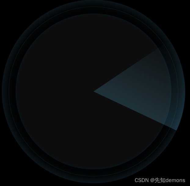
这样一个圆弧三角,并且是360度旋转的。(我这里只截了个图,转成gif又得注册。。)
3、最后再设置遮蔽盒子的css
- .hidBox {
- height: 500px;
- width: 500px;
- position: absolute;
- background-color: #12131b;
- left: 50%;
- top: 50%;
- transform: translate(-50%, -50%);
- border-radius: 50%;
- z-index: 1;
- }
这样里面的三角部分就被挡住了,就会实现想要的效果
大家有什么配置不懂的可以评论区留言,一起探讨
本文内容由网友自发贡献,转载请注明出处:https://www.wpsshop.cn/w/2023面试高手/article/detail/266158
推荐阅读
- article超链接是块级吗"" href="/w/羊村懒王/article/detail/249929" target="_blank">超链接是块级吗"" href="/w/羊村懒王/article/detail/249929" target="_blank">重要] dl (总标签) dt (小标题) dd (围绕标题来说明) 上面有个小标题, 下面有几个围绕着标题来展开的注意...
赞
踩
相关标签

