
热门标签
热门文章
- 1kafka总结:命令+错误+配置项说明_javax.security.auth.login.loginexception: could no
- 2app上架问题整理_app上架问题子在哪里搜
- 3视频大模型 Vidu 支持音视频合成;字节跳动推出语音生成模型 Seed-TTS 丨 RTE 开发者日报 Vol.221_可灵和vidu
- 4Golang go-simplejson_simplejson golang
- 5【云计算原理及实战】初识云计算_2006年在圣何塞的ses
- 6速度秒杀GPT-4o!Mistral开源首个22B代码模型打破记录,支持80+编程语言_codestral
- 7PMP证书烂大街?过来人理性分析
- 8图像处理Python库--图片裁剪、缩放、灰度图、圆角等
- 9RAR、ZIP、7-Zip压缩包忘记密码怎么办?_7z文件解压密码忘了怎么办
- 10web期末作业设计网页:动漫网站设计——千与千寻(10页) HTML+CSS+JavaScript 学生DW网页设计作业成品 动漫网页设计作业 web网页设计与开发 html实训大作业
当前位置: article > 正文
WPF UI框架界面开发教程(十一)
作者:运维做开发 | 2024-07-05 18:13:30
赞
踩
wpf ui框架
在项目开发中,按钮有多种形态,UI样式文件比较散乱,不方便维护和扩展,比如按钮有文本、图标+文本、动画、链接等几种类型。每种类型写一个样式,所以在按钮中增加枚举类型,判断是哪种类型按钮,加载相对应用控件模板,假如是链接按钮,设置local:ButtonFrameHelper.Type ="Link"就完成样式切换。
WPF UI框架界面开发教程
- /// <summary>
- /// 按钮类型
- /// </summary>
- public enum ButtonType
- {
- /// <summary>
- /// 文本
- /// </summary>
- [Description("文本")]
- Text = 0,
-
- /// <summary>
- /// 图标和文本
- /// </summary>
- [Description("图标和文本")]
- IconText = 1,
-
- /// <summary>
- /// 动画
- /// </summary>
- [Description("动画")]
- Animation = 2,
-
- /// <summary>
- /// 链接
- /// </summary>
- [Description("链接")]
- Link = 3,
- }

1:首先添加button类型枚举参数。
- public class ButtonFrameHelper : DependencyObject
- {
- /// <summary>
- /// 按钮类型
- /// </summary>
- public static readonly DependencyProperty TypeProperty = DependencyProperty.Register(
- "Type", typeof(ButtonType), typeof(ButtonFrameHelper), new PropertyMetadata(default(ButtonType)));
-
- public static ButtonType GetType(DependencyObject property)
- {
- return (ButtonType)property.GetValue(TypeProperty);
- }
-
- public static void SetType(DependencyObject property, ButtonType value)
- {
- property.SetValue(TypeProperty, value);
- }
-
- /// <summary>
- /// 按钮图标
- /// </summary>
- public Geometry Icon
- {
- get { return (Geometry)GetValue(IconProperty); }
- set { SetValue(IconProperty, value); }
- }
-
- public static readonly DependencyProperty IconProperty =
- DependencyProperty.Register("Icon", typeof(Geometry), typeof(ButtonFrameHelper));
-
- }
2:添加Button类依赖属性,Type是Button枚举类型,通过设置此参数来切换,Icon是图标+文本按钮需要此属性。
下面把说明样式代码:
- <Style TargetType="{x:Type Button}">
- <Setter Property="Foreground" Value="{StaticResource ForegroundLightBrush}"/>
- <Setter Property="BorderThickness" Value="0"/>
- <Setter Property="Template" Value="{DynamicResource TextButton}"/>
- <Style.Triggers>
- <Trigger Property="local:ButtonFrameHelper.Type" Value="Text">
- <Setter Property="Margin" Value="0,10,0,0"/>
- <Setter Property="Padding" Value="50,10"/>
- <Setter Property="Background" Value="{StaticResource WordOrangeBrush}"/>
- <Setter Property="FontSize" Value="{StaticResource Nb.FontSize.30}"/>
- <Setter Property="local:BusyFrameAnimation.IsBusy" Value="False"/>
- <Setter Property="Template" Value="{DynamicResource TextButton}"/>
- </Trigger>
- <Trigger Property="local:ButtonFrameHelper.Type" Value="IconText">
- <Setter Property="Width" Value="150"/>
- <Setter Property="Height" Value="60"/>
- <Setter Property="Background" Value="{StaticResource WordOrangeBrush}"/>
- <Setter Property="FontSize" Value="{StaticResource Nb.FontSize.30}"/>
- <Setter Property="HorizontalContentAlignment" Value="Center" />
- <Setter Property="VerticalContentAlignment" Value="Center" />
- <Setter Property="local:ButtonFrameHelper.Icon" Value="{DynamicResource Icon-Checked}"/>
- <Setter Property="local:BusyFrameAnimation.IsBusy" Value="False"/>
- <Setter Property="Template" Value="{DynamicResource IconTextButton}"/>
- </Trigger>
-
- <Trigger Property="local:ButtonFrameHelper.Type" Value="Animation">
- <Setter Property="Margin" Value="0,10,0,0"/>
- <Setter Property="Padding" Value="50,10"/>
- <Setter Property="Background" Value="{StaticResource WordOrangeBrush}"/>
- <Setter Property="FontSize" Value="{StaticResource Nb.FontSize.30}"/>
- <Setter Property="local:BusyFrameAnimation.IsBusy" Value="False"/>
- <Setter Property="Template" Value="{DynamicResource AnimationButton}"/>
- </Trigger>
- <Trigger Property="local:ButtonFrameHelper.Type" Value="Link">
- <Setter Property="Background" Value="Transparent"/>
- <Setter Property="BorderThickness" Value="0"/>
- <Setter Property="FontSize" Value="{StaticResource Nb.FontSize.20}"/>
- <Setter Property="Margin" Value="0,10"/>
- <Setter Property="Padding" Value="50,10"/>
- <Setter Property="Cursor" Value="Hand"/>
- <Setter Property="Template" Value="{DynamicResource LinkButton}"/>
- </Trigger>
- </Style.Triggers>
- </Style>
-
- <!--链接类型按钮-->
- <ControlTemplate x:Key="LinkButton" TargetType="{x:Type Button}">
- <Border x:Name="border"
- CornerRadius="10"
- BorderBrush="{TemplateBinding BorderBrush}"
- BorderThickness="{TemplateBinding BorderThickness}"
- Background="{TemplateBinding Background}"
- SnapsToDevicePixels="True">
- <TextBlock Text="{TemplateBinding Content}"
- Focusable="False"
- FontFamily="{TemplateBinding FontFamily}"
- FontSize="{TemplateBinding FontSize}"
- HorizontalAlignment="{TemplateBinding HorizontalContentAlignment}"
- Margin="{TemplateBinding Padding}"
- SnapsToDevicePixels="{TemplateBinding SnapsToDevicePixels}"
- VerticalAlignment="{TemplateBinding VerticalContentAlignment}"/>
- </Border>
- <ControlTemplate.Triggers>
- <Trigger Property="IsMouseOver" Value="True">
- <Setter Property="Foreground" Value="{StaticResource WordOrangeBrush}"/>
- </Trigger>
- <Trigger Property="IsEnabled" Value="False">
- <Setter Property="Foreground" Value="{StaticResource ForegroundDarkBrush}"/>
- </Trigger>
- </ControlTemplate.Triggers>
- </ControlTemplate>
-
- <!--文本类型按钮-->
- <ControlTemplate x:Key="TextButton" TargetType="{x:Type Button}">
- <Border x:Name="border"
- CornerRadius="10"
- BorderBrush="{TemplateBinding BorderBrush}"
- BorderThickness="{TemplateBinding BorderThickness}"
- Background="{TemplateBinding Background}"
- SnapsToDevicePixels="True">
- <Grid>
- <TextBlock Text="{TemplateBinding Content}"
- Visibility="{TemplateBinding local:BusyFrameAnimation.IsBusy, Converter={cv:BoolenToVisiblityConverter}}"
- Focusable="False"
- FontFamily="{TemplateBinding FontFamily}"
- FontSize="{TemplateBinding FontSize}"
- HorizontalAlignment="{TemplateBinding HorizontalContentAlignment}"
- Margin="{TemplateBinding Padding}"
- SnapsToDevicePixels="{TemplateBinding SnapsToDevicePixels}"
- VerticalAlignment="{TemplateBinding VerticalContentAlignment}"/>
- </Grid>
- </Border>
- <ControlTemplate.Triggers>
- <EventTrigger RoutedEvent="MouseEnter">
- <BeginStoryboard>
- <Storyboard>
- <ColorAnimation To="{StaticResource WordBlue}" Duration="0:0:0.3" Storyboard.TargetName="border" Storyboard.TargetProperty="Background.Color"/>
- </Storyboard>
- </BeginStoryboard>
- </EventTrigger>
- <EventTrigger RoutedEvent="MouseLeave">
- <BeginStoryboard>
- <Storyboard>
- <ColorAnimation From="{StaticResource WordBlue}" Duration="0:0:0.3" Storyboard.TargetName="border" Storyboard.TargetProperty="Background.Color"/>
- </Storyboard>
- </BeginStoryboard>
- </EventTrigger>
- <Trigger Property="IsEnabled" Value="False">
- <Setter Property="Background" TargetName="border" Value="{StaticResource ForegroundDarkBrush}"/>
- </Trigger>
- </ControlTemplate.Triggers>
- </ControlTemplate>
-
- <!--图标和文本类型按钮-->
- <ControlTemplate x:Key="IconTextButton" TargetType="{x:Type Button}">
- <Border x:Name="border"
- CornerRadius="10"
- BorderBrush="{TemplateBinding BorderBrush}"
- BorderThickness="{TemplateBinding BorderThickness}"
- Background="{TemplateBinding Background}"
- SnapsToDevicePixels="True">
- <Grid>
- <StackPanel Orientation="Horizontal" VerticalAlignment="{TemplateBinding VerticalContentAlignment}" HorizontalAlignment="{TemplateBinding HorizontalContentAlignment}">
- <Viewbox x:Name="IconBox" Width="{TemplateBinding FontSize}" Height="{TemplateBinding FontSize}" HorizontalAlignment="{TemplateBinding HorizontalContentAlignment}" VerticalAlignment="{TemplateBinding VerticalContentAlignment}">
- <Path Data="{TemplateBinding local:ButtonFrameHelper.Icon}" Fill="{TemplateBinding Foreground}" Stretch="Fill"></Path>
- </Viewbox>
- <Grid x:Name="IconSplit" Width="5"></Grid>
- <TextBlock Text="{TemplateBinding Content}"
- Focusable="False"
- FontFamily="{TemplateBinding FontFamily}"
- FontSize="{TemplateBinding FontSize}"
- HorizontalAlignment="{TemplateBinding HorizontalContentAlignment}"
- Margin="{TemplateBinding Padding}"
- SnapsToDevicePixels="{TemplateBinding SnapsToDevicePixels}"
- VerticalAlignment="{TemplateBinding VerticalContentAlignment}"/>
- </StackPanel>
- </Grid>
- </Border>
- <ControlTemplate.Triggers>
- <EventTrigger RoutedEvent="MouseEnter">
- <BeginStoryboard>
- <Storyboard>
- <ColorAnimation To="{StaticResource WordBlue}" Duration="0:0:0.3" Storyboard.TargetName="border" Storyboard.TargetProperty="Background.Color"/>
- </Storyboard>
- </BeginStoryboard>
- </EventTrigger>
- <EventTrigger RoutedEvent="MouseLeave">
- <BeginStoryboard>
- <Storyboard>
- <ColorAnimation From="{StaticResource WordBlue}" Duration="0:0:0.3" Storyboard.TargetName="border" Storyboard.TargetProperty="Background.Color"/>
- </Storyboard>
- </BeginStoryboard>
- </EventTrigger>
- <Trigger Property="IsEnabled" Value="False">
- <Setter Property="Background" TargetName="border" Value="{StaticResource ForegroundDarkBrush}"/>
- </Trigger>
- <Trigger Property="local:ButtonFrameHelper.Icon" Value="{x:Null}">
- <Setter TargetName="IconBox" Property="Visibility" Value="Collapsed" />
- <Setter TargetName="IconSplit" Property="Visibility" Value="Collapsed" />
- </Trigger>
- </ControlTemplate.Triggers>
- </ControlTemplate>
-
- <!--动画类型按钮-->
- <ControlTemplate x:Key="AnimationButton" TargetType="{x:Type Button}">
- <Border x:Name="border"
- CornerRadius="10"
- BorderBrush="{TemplateBinding BorderBrush}"
- BorderThickness="{TemplateBinding BorderThickness}"
- Background="{TemplateBinding Background}"
- SnapsToDevicePixels="True">
- <Grid>
- <TextBlock Text="{TemplateBinding Content}"
- Visibility="{TemplateBinding local:BusyFrameAnimation.IsBusy, Converter={cv:BoolenToVisiblityConverter}}"
- Focusable="False"
- FontFamily="{TemplateBinding FontFamily}"
- FontSize="{TemplateBinding FontSize}"
- HorizontalAlignment="{TemplateBinding HorizontalContentAlignment}"
- Margin="{TemplateBinding Padding}"
- SnapsToDevicePixels="{TemplateBinding SnapsToDevicePixels}"
- VerticalAlignment="{TemplateBinding VerticalContentAlignment}"/>
-
- <Label Style="{DynamicResource SpinningLabel}"
- FontSize="{TemplateBinding FontSize}"
- Foreground="{TemplateBinding Foreground}"
- HorizontalContentAlignment="{TemplateBinding HorizontalContentAlignment}"
- VerticalContentAlignment="{TemplateBinding VerticalContentAlignment}"
- Visibility="{TemplateBinding local:BusyFrameAnimation.IsBusy, Converter={cv:BoolenToVisiblityConverter}, ConverterParameter=True}"/>
- </Grid>
- </Border>
- <ControlTemplate.Triggers>
- <EventTrigger RoutedEvent="MouseEnter">
- <BeginStoryboard>
- <Storyboard>
- <ColorAnimation To="{StaticResource WordBlue}" Duration="0:0:0.3" Storyboard.TargetName="border" Storyboard.TargetProperty="Background.Color"/>
- </Storyboard>
- </BeginStoryboard>
- </EventTrigger>
- <EventTrigger RoutedEvent="MouseLeave">
- <BeginStoryboard>
- <Storyboard>
- <ColorAnimation From="{StaticResource WordBlue}" Duration="0:0:0.3" Storyboard.TargetName="border" Storyboard.TargetProperty="Background.Color"/>
- </Storyboard>
- </BeginStoryboard>
- </EventTrigger>
- <Trigger Property="IsEnabled" Value="False">
- <Setter Property="Background" TargetName="border" Value="{StaticResource ForegroundDarkBrush}"/>
- </Trigger>
- </ControlTemplate.Triggers>
- </ControlTemplate>
TriggerProperty="local:ButtonFrameHelper.Type"Value="Text" 设置是文本类型,<SetterProperty="Template"Value="{DynamicResource TextButton}"/> 设置模板动态加载资源 TextButton,其它类型以此类推。
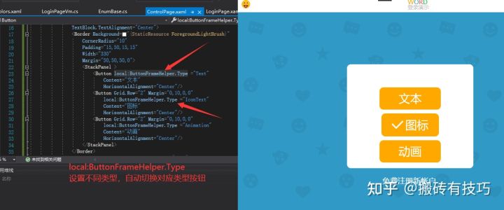
最后添加page页测试这几种按钮类型
- <Page x:Class="Fashion.Word.Pages.ControlPage"
- xmlns="http://schemas.microsoft.com/winfx/2006/xaml/presentation"
- xmlns:x="http://schemas.microsoft.com/winfx/2006/xaml"
- xmlns:mc="http://schemas.openxmlformats.org/markup-compatibility/2006"
- xmlns:d="http://schemas.microsoft.com/expression/blend/2008"
- xmlns:local="clr-namespace:Fashion.Word"
- mc:Ignorable="d"
- d:DesignHeight="450" d:DesignWidth="600"
- Title="ControlPage">
-
- <Border>
- <Grid>
- <StackPanel
- VerticalAlignment="Center"
- HorizontalAlignment="Center"
- TextBlock.TextAlignment="Center">
- <Border Background="{StaticResource ForegroundLightBrush}"
- CornerRadius="10"
- Padding="15,50,15,15"
- Width="330"
- Margin="50,50,50,0">
- <StackPanel >
- <Button local:ButtonFrameHelper.Type ="Text"
- Content="文本"
- HorizontalAlignment="Center"/>
- <Button Grid.Row="2" Margin="0,10,0,0"
- local:ButtonFrameHelper.Type ="IconText"
- Content="图标"
- HorizontalAlignment="Center"/>
- <Button Grid.Row="2" Margin="0,10,0,0"
- local:ButtonFrameHelper.Type ="Animation"
- Content="动画"
- HorizontalAlignment="Center"/>
- </StackPanel>
- </Border>
- <Button local:ButtonFrameHelper.Type ="Link"
- Command="{Binding RegisterCommand}"
- Content="免费注册新帐户."
- HorizontalAlignment="Center">
- </Button>
- </StackPanel>
- </Grid>
- </Border>
- </Page>
这样就不需要找有哪些样式button。
声明:本文内容由网友自发贡献,不代表【wpsshop博客】立场,版权归原作者所有,本站不承担相应法律责任。如您发现有侵权的内容,请联系我们。转载请注明出处:https://www.wpsshop.cn/w/运维做开发/article/detail/790695?site
推荐阅读
相关标签

