
热门标签
热门文章
- 1GT高速收发器_gt收发器
- 2golang windows打包为linux可执行文件_windows上打包linux的golang应用
- 3前端小案例——轮播图(HTML+CSS+JS, 附源码)_前端轮播图
- 4uniapp 在手机上导出excel
- 5ElasticSearch 实战:管道(pipeline)的使用_java es 使用 pipeline
- 6【YOLOv8改进】Polarized Self-Attention: 极化自注意力 (论文笔记+引入代码)
- 7数据结构——跳表Skip List
- 8mybatis insert foreach循环插入_mybatis利用foreach复用insert标签
- 9VS code开发工具的使用教程_vs code.怎么用
- 10GTX的64B66B编码(高速收发器十九)_rxheader[2:0]
当前位置: article > 正文
用 element ui 实现季度选择器_elementui季度选择器
作者:知新_RL | 2024-06-14 11:11:51
赞
踩
elementui季度选择器
由于在数据项目中经常以各种时间条件查询数据,所以时间选择器(DatePicker)组件是很常用的组件。但是在我使用的 Element UI 中,缺少了季度选择器的功能。
简易实现
一开始我根据时间范围使用 select 去遍历,如 2024-Q1、2023-Q4、2023-Q3 如此类推。
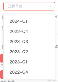
element 并无季度选择器
其实也算是快速解决了 element ui 无法选择季度的问题。但总感觉特别的 low,后来有时间了就去隔壁 ant design 看了看。
发现在新版的 ant design 都支持季度和季度范围选择器了……
查了查新的 element plus 也只是只支持了 'year' | 'years' |'month' | 'date' | 'dates' | 'datetime' | 'week' | 'datetimerange' | 'daterange' | 'monthrange' 这些个类型。
工具不给力,又不想用其他库的情况下只能手搓了。
手搓季度选择器
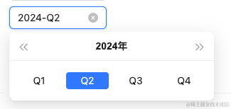
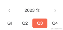
季度面板
参考 ant design 做了一个类似的面板。
<template>
  <div class="quarter-panel">
    <div class="quarter-panel-header">
      <i
        class="quarter-panel-header-icon el-icon-arrow-left"
        @click="currentYear--"
      />
      <div class="quarter-panel-header-title">{{ currentYear }} 年</div>
      <i
        class="quarter-panel-header-icon el-icon-arrow-right"
        @click="currentYear++"
      />
    </div>
    <div class="quarter-panel-content">
      <div
        v-for="option in quarterOptions"
        class="quarter-panel-item-btn"
        :class="getComputedClass(option.value)"
        :key="option.value"
        @click="emitClick(option.value)"
      >
        {{ option.label }}
      </div>
    </div>
  </div>
</template>

<script>
import dayjs from 'dayjs'
import customParseFormat from 'dayjs/plugin/customParseFormat'

dayjs.extend(customParseFormat)

export default {
  name: 'QuarterPanel',
  props: {
    value: String,
    dice: Number,
    min: String,
    max: String,
    todayDisabled: Boolean,
    featureDisabled: Boolean,
  },
  data() {
    return {
      currentYear: 2023,
    }
  },
  computed: {
    day() {
      if (this.value) {
        return dayjs(this.value, 'YYYY-MM-DD')
      }
      return dayjs()
    },
    computedDate() {
      return this.day.startOf('quarter').format('YYYY-MM-DD')
    },
    quarterOptions() {
      return [
        { label: 'Q1', value: `${this.currentYear}-01-01` },
        { label: 'Q2', value: `${this.currentYear}-04-01` },
        { label: 'Q3', value: `${this.currentYear}-07-01` },
        { label: 'Q4', value: `${this.currentYear}-10-01` },
      ]
    },
  },
  mounted() {
    this.currentYear = dayjs().year()
  },
  methods: {
    getDisabled(value) {
      let isFeature = false

      if (this.todayDisabled) {
        isFeature = dayjs()
          .subtract(1, 'day')
          .startOf('quarter')
          .isBefore(dayjs(value))
      } else if (this.featureDisabled) {
        isFeature = dayjs().startOf('quarter').isBefore(dayjs(value))
      }

      const isMin = this.min
        ? dayjs(this.min, 'YYYY-MM-DD')
            .startOf('quarter')
            .isAfter(dayjs(value, 'YYYY-MM-DD'))
        : false

      const isMax = this.max
        ? dayjs(this.max, 'YYYY-MM-DD')
            .startOf('quarter')
            .isBefore(dayjs(value, 'YYYY-MM-DD'))
        : false

      return isFeature || isMin || isMax
    },
    getComputedClass(value) {
      if (this.computedDate === value) {
        return 'quarter-panel-item-btn-active'
      }
      if (this.getDisabled(value)) {
        return 'quarter-panel-item-btn-disabled'
      }
      return ''
    },
    emitClick(value) {
      if (this.getDisabled(value)) {
        return
      }
      this.$emit('input', value)
    },
  },
  watch: {
    dice() {
      this.currentYear = this.day.year()
    },
  },
}
</script>

<style lang="scss" scoped>
$--gw-primary-color: #f6674f;

.quarter-panel {
  width: 200px;
  color: #303133;

  .quarter-panel-header {
    height: 30px;
    padding: 12px;
    display: flex;
    align-items: center;

    .quarter-panel-header-icon {
      font-size: 12;
      margin: 5px;
      cursor: pointer;

      &:hover {
        color: $--gw-primary-color;
      }
    }

    .quarter-panel-header-title {
      flex: 1;
      text-align: center;
      font-size: 16;
    }
  }

  .quarter-panel-content {
    display: flex;
    align-items: center;

    .quarter-panel-item-btn {
      flex: 1;
      font-size: 14;
      height: 30px;
      line-height: 30px;
      text-align: center;
      cursor: pointer;
      border: solid 1px transparent;
      border-radius: 5px;

      &:hover {
        color: $--gw-primary-color;
        border: solid 1px $--gw-primary-color;
      }
    }

    .quarter-panel-item-btn-active {
      background: $--gw-primary-color;
      color: #ffffff;

      &:hover {
        color: #ffffff;
      }
    }

    .quarter-panel-item-btn-disabled {
      color: #909399;
      background: #f2f6fc;
      cursor: not-allowed;

      &:hover {
        color: #909399;
        background: #f2f6fc;
      }
    }
  }
}
</style>

- 1
- 2
- 3
- 4
- 5
- 6
- 7
- 8
- 9
- 10
- 11
- 12
- 13
- 14
- 15
- 16
- 17
- 18
- 19
- 20
- 21
- 22
- 23
- 24
- 25
- 26
- 27
- 28
- 29
- 30
- 31
- 32
- 33
- 34
- 35
- 36
- 37
- 38
- 39
- 40
- 41
- 42
- 43
- 44
- 45
- 46
- 47
- 48
- 49
- 50
- 51
- 52
- 53
- 54
- 55
- 56
- 57
- 58
- 59
- 60
- 61
- 62
- 63
- 64
- 65
- 66
- 67
- 68
- 69
- 70
- 71
- 72
- 73
- 74
- 75
- 76
- 77
- 78
- 79
- 80
- 81
- 82
- 83
- 84
- 85
- 86
- 87
- 88
- 89
- 90
- 91
- 92
- 93
- 94
- 95
- 96
- 97
- 98
- 99
- 100
- 101
- 102
- 103
- 104
- 105
- 106
- 107
- 108
- 109
- 110
- 111
- 112
- 113
- 114
- 115
- 116
- 117
- 118
- 119
- 120
- 121
- 122
- 123
- 124
- 125
- 126
- 127
- 128
- 129
- 130
- 131
- 132
- 133
- 134
- 135
- 136
- 137
- 138
- 139
- 140
- 141
- 142
- 143
- 144
- 145
- 146
- 147
- 148
- 149
- 150
- 151
- 152
- 153
- 154
- 155
- 156
- 157
- 158
- 159
- 160
- 161
- 162
- 163
- 164
- 165
- 166
- 167
- 168
- 169
- 170
- 171
- 172
- 173
- 174
- 175
- 176
- 177
- 178
- 179
- 180
- 181
- 182
- 183
- 184
- 185
- 186
- 187
- 188
- 189
- 190
- 191
- 192
- 193
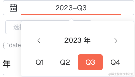
季度选择器
将面板放到 el-popover 中实现类似 DatePicker 的效果。并且提供了像清空数据、最大值、最小值等常用功能。
<template>
  <div class="quarter-picker" :class="{ 'quarter-picker-disabled': disabled }">
    <div class="quarter-picker-date-button">
      <i class="iconfont icon-date-select-icon quarter-picker-time-icon" />
      <el-popover
        placement="bottom-start"
        width="200"
        trigger="click"
        ref="datePopover"
        :disabled="disabled"
        @show="initPopover"
      >
        <div
          class="quarter-picker-date-button-item quarter-picker-date-button-item-long"
          slot="reference"
        >
          <span v-if="form.date" class="button-item-span">
            {{ dateQuarterStr }}
          </span>
          <span v-else class="button-item-span">选择时间</span>
          <div class="bottom-line" />
        </div>
        <quarterPanel
          v-model="form.date"
          :dice="dice"
          :min="min"
          :max="max"
          :featureDisabled="featureDisabled"
          :todayDisabled="todayDisabled"
          @input="emitDateChange()"
        />
      </el-popover>
      <i
        v-show="form.date && clearable"
        class="el-icon-close quarter-picker-clear-icon"
        @click.stop="clearCurrentDate"
      />
    </div>
  </div>
</template>

<script>
import dayjs from 'dayjs'
import customParseFormat from 'dayjs/plugin/customParseFormat'
import quarterOfYear from 'dayjs/plugin/quarterOfYear'

import quarterPanel from './quarterPanel.vue'

dayjs.extend(customParseFormat)
dayjs.extend(quarterOfYear)

/**
 * date 日期
 */
export default {
  name: 'QuarterPicker',
  components: {
    quarterPanel,
  },
  props: {
    date: String,
    min: String,
    max: String,
    featureDisabled: Boolean,
    todayDisabled: Boolean,
    disabled: Boolean,
    clearable: Boolean,
  },
  data() {
    return {
      form: {
        date: '',
      },
      dice: 0,
    }
  },
  mounted() {
    this.syncData()
  },
  computed: {
    dateQuarterStr() {
      if (!this.form.date) return '选择季'

      const dj = dayjs(this.form.date).startOf('quarter')
      return `${dj.year()}-Q${dj.quarter()}`
    },
  },
  methods: {
    initPopover() {
      this.dice++
    },
    syncData() {
      this.form.date = this.date
    },
    clearCurrentDate() {
      if (this.disabled) return
      this.form.date = ''

      this.emitDateChange()
    },
    emitDateChange() {
      this.$emit('change', this.form)

      this.closePopovers()
    },
    closePopovers() {
      this.$refs.datePopover.doClose()
    },
  },
  watch: {
    date() {
      if (this.form.date !== this.date) {
        this.syncData()
      }
    },
  },
}
</script>

<style scoped lang="scss">
$--gw-primary-color: #f6674f;

.quarter-picker {
  display: flex;
  flex-direction: row;
  align-items: center;
  justify-content: flex-end;

  .quarter-picker-date-button {
    display: flex;
    position: relative;
    flex-direction: row;
    align-items: center;
    justify-content: center;
    user-select: none;
    margin-left: 5px;
    width: 250px;
    padding-left: 10px;
    height: 28px;
    background: #ffffff;
    border: 1px solid #dcdfe6;
    font-size: 14px;
    font-family: Microsoft YaHei;
    font-weight: 400;
    color: #282c32;
    border-radius: 4px;

    .quarter-picker-time-icon {
      position: absolute;
      left: 12px;
    }

    .quarter-picker-date-button-item {
      position: relative;
      height: 28px;
      line-height: 28px;
      text-align: center;
      width: 70px;
      cursor: pointer;

      .bottom-line {
        position: absolute;
        bottom: 0;
        left: 0;
        right: 0;
        height: 2px;
        border-radius: 1px;
        background: transparent;
      }

      &:hover {
        .bottom-line {
          background: $--gw-primary-color;
        }
      }
    }

    .quarter-picker-date-button-item-long {
      width: 200px;

      .button-item-span {
        display: inline-block;
        width: 90px;
        text-align: center;
      }

      .button-item-span-active {
        color: $--gw-primary-color;
      }
    }

    .quarter-picker-clear-icon {
      position: absolute;
      right: 12px;
      font-size: 14;
      cursor: pointer;

      &:hover {
        color: $--gw-primary-color;
      }
    }
  }
}

.quarter-picker-disabled {
  .quarter-picker-date-button {
    color: #c0c4cc;
    background-color: #f2f6fc;

    .quarter-picker-date-button-item {
      cursor: not-allowed;
    }
  }

  .quarter-picker-date-button-item {
    &:hover {
      .bottom-line {
        background: transparent !important;
      }
    }
  }

  .quarter-picker-clear-icon {
    cursor: not-allowed !important;

    &:hover {
      color: #c0c4cc !important;
    }
  }
}
</style>
- 1
- 2
- 3
- 4
- 5
- 6
- 7
- 8
- 9
- 10
- 11
- 12
- 13
- 14
- 15
- 16
- 17
- 18
- 19
- 20
- 21
- 22
- 23
- 24
- 25
- 26
- 27
- 28
- 29
- 30
- 31
- 32
- 33
- 34
- 35
- 36
- 37
- 38
- 39
- 40
- 41
- 42
- 43
- 44
- 45
- 46
- 47
- 48
- 49
- 50
- 51
- 52
- 53
- 54
- 55
- 56
- 57
- 58
- 59
- 60
- 61
- 62
- 63
- 64
- 65
- 66
- 67
- 68
- 69
- 70
- 71
- 72
- 73
- 74
- 75
- 76
- 77
- 78
- 79
- 80
- 81
- 82
- 83
- 84
- 85
- 86
- 87
- 88
- 89
- 90
- 91
- 92
- 93
- 94
- 95
- 96
- 97
- 98
- 99
- 100
- 101
- 102
- 103
- 104
- 105
- 106
- 107
- 108
- 109
- 110
- 111
- 112
- 113
- 114
- 115
- 116
- 117
- 118
- 119
- 120
- 121
- 122
- 123
- 124
- 125
- 126
- 127
- 128
- 129
- 130
- 131
- 132
- 133
- 134
- 135
- 136
- 137
- 138
- 139
- 140
- 141
- 142
- 143
- 144
- 145
- 146
- 147
- 148
- 149
- 150
- 151
- 152
- 153
- 154
- 155
- 156
- 157
- 158
- 159
- 160
- 161
- 162
- 163
- 164
- 165
- 166
- 167
- 168
- 169
- 170
- 171
- 172
- 173
- 174
- 175
- 176
- 177
- 178
- 179
- 180
- 181
- 182
- 183
- 184
- 185
- 186
- 187
- 188
- 189
- 190
- 191
- 192
- 193
- 194
- 195
- 196
- 197
- 198
- 199
- 200
- 201
- 202
- 203
- 204
- 205
- 206
- 207
- 208
- 209
- 210
- 211
- 212
- 213
- 214
- 215
- 216
- 217
- 218
- 219
- 220
- 221
- 222
- 223
- 224
- 225
- 226
- 227
- 228
- 229
- 230
- 231
组件的使用
最后就是组件的使用了:
  <QuarterPicker
    type="quarter"
    :date="quarter.date"
    :min="minDate"
    :max="maxDate"
    :featureDisabled="options.featureDisabled"
    :todayDisabled="options.todayDisabled"
    :disabled="options.disabled"
    :clearable="options.clearable"
    @change="handleQuarterPickerChange"
  />
- 1
- 2
- 3
- 4
- 5
- 6
- 7
- 8
- 9
- 10
- 11
handleQuarterPickerChange({ date }) {
  this.quarter.date = date

  this.$message({
    message: '触发查询请求',
    type: 'success',
  })
},
- 1
- 2
- 3
- 4
- 5
- 6
- 7
- 8
最后
另外,季度范围选择器也可以用类似的思路来实现。以上就是个人解决季度选择器的方式。希望能对有类似需求的同学一些帮助。
声明:本文内容由网友自发贡献,不代表【wpsshop博客】立场,版权归原作者所有,本站不承担相应法律责任。如您发现有侵权的内容,请联系我们。转载请注明出处:https://www.wpsshop.cn/w/知新_RL/article/detail/717722?site
推荐阅读
相关标签

