- 1【LLM_02】LangChain知识库+Lora微调chatglm2-6b模型+提示词Prompt的使用原则_langchain-chatchat微调
- 2自己定义 Advisor 实现自定义注解修饰的方法增强_java advisor
- 3语音识别中强制对齐_AI语音评测技术简述与应用层级
- 4windows系统 简单地生成python的小巧的独立运行程序_最小 python可执行程序
- 5工程建材企业必看:应用集中采购协同系统,实现降本增效,提升企业效益!
- 6用Python实现的这五个小游戏,你真的学会了嘛?_python做小游戏
- 7Python开发毕业第六篇(Python+Django)外卖点餐系统_python点单系统开发
- 8为什么开源大模型终将胜出?_使用claude,win10不支持了
- 9基于confluent的kafka和kafka-rest代理配置
- 10Stable Diffusion:网页版 体验 / AI 绘图_stable diffusion网页版
html+css编写简单构造跳动爱心_html 跳动的心
赞
踩
目录
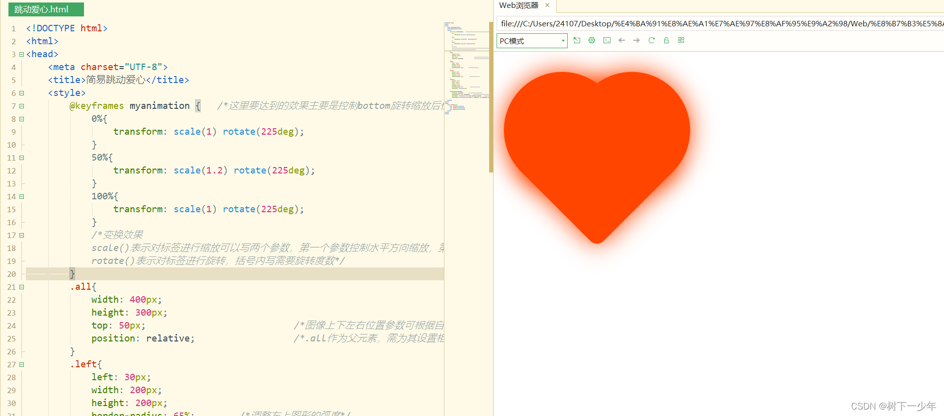
一.主要思路是
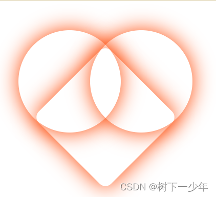
构造一个大盒子,里面放left、right、bottom三个小盒子,并将三个盒子设置好边框宽度、高度、弧度达到想要的形状(大致为上面两个圆下面一个矩形),为三个小盒子设置好背景色和阴影效果,最后为其设置动画效果
二.完整参考代码:
- <!DOCTYPE html>
- <html>
- <head>
- <meta charset="UTF-8">
- <title>简易跳动爱心</title>
- <style>
- @keyframes myanimation {
- 0%{
- transform: scale(1) rotate(225deg);
- }
- 50%{
- transform: scale(1.2) rotate(225deg);
- }
- 100%{
- transform: scale(1) rotate(225deg);
- }
- }
- .all{
- width: 400px;
- height: 300px;
- top: 50px;
- position: relative;
- }
- .left{
- left: 30px;
- width: 200px;
- height: 200px;
- border-radius: 65%;
- }
- .right{
- right: 30px;
- width: 200px;
- height: 200px;
- border-radius: 65%;
- }
- .bottom{
- bottom: 30px;
- left: 100px;
- width: 200px;
- height: 200px;
- transform: rotate(45deg);
- border-radius: 8%;
- }
- .left,.right,.bottom{
- position: absolute;
- box-shadow:0 0 40px orangered;
- animation: myanimation 1.5s ease infinite normal;
- background: linear-gradient(-90deg, orangered 0%, orangered 100%);
- }
- </style>
- </head>
- <body>
- <div class="all">
- <div class="left"></div>
- <div class="right"></div>
- <div class="bottom"></div>
- </div>
- </body>
- </html>
三.附上部分参考注释
当然也可以尝试用用z-index属性来设置重叠效果是否满意
| <!DOCTYPE html> /*这里要达到的效果主要是控制bottom盒子旋转缩放后位置通过角度计算达到重合*/ transform: rotate(45deg); /*将下面的盒子旋转45度达到目标图形*/ /*设置盒子阴影效果,四个参数含义:x轴偏移值,y轴偏移值,模糊度,颜色*/ /*调用animation属性为跳动激活属性,以常规动画方向无限循环跳动,每次跳动1.5秒*/ /*为三个子元素的背景设置渐变颜色,表示的意思是以负90度为渐变轴,从开始橘红色渐变到最后为橘红色,颜色建议选择相近色或相同色*/ |
四.最终效果