
热门标签
热门文章
- 1避坑丨一次看懂软著软件著作权登记避免「补正」的“方法”……_软著重复登记或者虚假登记
- 2Vue如何给页面加水印(超简单)_vue给背景加水印 简书
- 3智能网联汽车数据安全认识与思考_智能网联汽车数据安全标准化研究项目认识
- 4文献阅读笔记:RoBERTa:A Robustly Optimized BERT Pretraining Approach_roberta模型论文
- 5【专题】2023年新能源汽车、智能汽车、车险行业报告汇总PDF合集分享(附原数据表)...
- 6Python使用re库处理正则详解_re_extract_question
- 7万万没想到,我用文心一言开发了一个儿童小玩具
- 8使用fastlane match自动化管理证书和描述文件
- 9Wireshark基本使用_wireshark使用
- 10MySQL - 基础题练习题 - 查询篇(9)_mysql查询名字为朱旭东或者年龄为18的学生信息
当前位置: article > 正文
vue3.2二次封装antd vue 中的Table组件,原有参数属性不变
作者:程序语言诗人 | 2024-01-18 11:52:27
赞
踩
vue3.2二次封装antd vue 中的Table组件,原有参数属性不变
vue3.2中的<script setup>语法
在项目中多处使用到表格组件,所以进行了一个基础的封装,主要是通过antd vue 中表格的slots配置项,通过配合插槽来进行封装自定义表格;
这次主要的一个功能是编辑之后变成input框 修改了之后变成完成发送请求重新渲染表格:
子组件的代码:这样封装不会改变antd 官网示例参数的传递方式
- <template>
- <!-- v-bind处理a-table 传递过来的参数-->
- <a-table ref="KldTable" class="kld-table" v-bind="attrs">
- <!-- 处理 slots ,动态渲染插槽需要使用这种方式-->
- <template v-for="key in renderArr " #[key]="{ record, column, text, index }">
-
- <!-- 通过这个插槽传递数据给父组件,做一些编辑提交的操作等等 -->
- <slot :name="key" :text="text" :column="column" :record="record" :index="index"></slot>
- </template>
- </a-table>
- </template>
-
- <script lang="ts">
- import { ref,useSlots } from 'vue';
-
- import { Table } from 'ant-design-vue';
- export default {
- name: "KldTable",
- setup(_, { attrs, emit }) {
- // 插槽的实例
- const slots = useSlots()
- const renderArr = Object.keys(slots)
- return {
- attrs,
- listeners: emit,
- KldTable: ref(),
- renderArr
- };
- },
- components: {
- ATable: Table
- }
- };
- </script>
-

父组件的使用:子组件全局注册了,所以父组件没有引入
- <template>
- <kld-table :columns="columns" :data-source="dataSource">
- <!-- 通过columns 里面对象来遍历生成 可编辑的组件, 不能编辑序号是因为是因为没有传过去slots , 所以及时columns里面包含序号,但是由于表格组件渲染插槽没有他,所以不会序号不可编辑,通过给操作自定义一个属性,来避免渲染生成操作-->
- <template v-slot:[item.dataIndex]="{ record, text, column }" v-for="item in columns">
- <!-- 通过v-for生成 因为每个选项都需要变成input框所以用遍历,但是操作一列有自己的方式所以不需要,于是我就在操作一列无需添加插件属性slots,表示他不一样 -->
- <div :key="item.dataIndex">
- <span v-if="!record.isEdit">
- <span v-if="item.type === 'Select'">
- {{ getLabel(column.options, text) }}
- </span>
- <span v-else>
- {{ text }}
- </span>
- </span>
- <span v-else>
- <a-input-number size="small" v-model:value="record[item.dataIndex]"
- v-if="item.type === 'inputNumber'"></a-input-number>
- <a-select v-else-if="item.type === 'Select'" v-model:value="record[item.dataIndex]">
- <a-select-option v-for="option in column.options" :key="option.value" :value="option.value">
- {{ option.label }}
- </a-select-option>
- </a-select>
- <a-input size="small" v-else v-model:value="record[item.dataIndex]"></a-input>
- </span>
- </div>
- </template>
- <!-- 自定义表头样式 -->
- <template #headerCell="{ column }">
- <template v-if="column.dataIndex === 'ResourceName'">
- <span>
- <smile-outlined />
- {{ column.title }}
- </span>
- </template>
- </template>
- <!-- 自定义操作区域 -->
- <template #bodyCell="{ column, record, index }">
- <template v-if="column.dataIndex === 'operation'">
- <a-button :type="record.isEdit ? 'primary' : 'text'" @click="editPoint(record, column, index)">{{
- record.isEdit ? '完成' : '编辑' }}</a-button>
- <span v-if="!record.isEdit">
- <a-button type="text">详情</a-button>
- <a-popconfirm placement="top" ok-text="确认" cancel-text="取消">
- <template #title>
- <p>确定删除该扫描节点?</p>
- </template>
- <a-button type="text">删除</a-button>
- </a-popconfirm>
- </span>
- <span v-else>
- <a-button type="text" @click="cancelEdit(record)">取消</a-button>
- </span>
- </template>
- </template>
- </kld-table>
- </template>
- <script setup lang="ts">
- // import MyTable from './table.vue'
- import { SmileOutlined, } from '@ant-design/icons-vue';
- import { message, SelectProps } from 'ant-design-vue';
-
- const isEdit = ref<boolean>(false)
- const columns = [
- {
- title: '序号',
- dataIndex: 'numbers',
- key: 'numbers',
- width: '6%'
- },
- {
- title: '资源名称',
- dataIndex: 'ResourceName',
- slots: { customRender: 'ResourceName' }, //slots这个是重点,通过这个相当于告诉表格组件我有一个具名插槽要用,名字就是customRender后面的名字, 父组件中的useSlots插槽的实例就有这个ResourceName,下面也一样
- width: '12%'
- },
- {
- title: '资源名称IP',
- dataIndex: 'IP',
- slots: { customRender: 'IP' },
- width: '12%'
- },
- {
- title: '数据库类型',
- dataIndex: 'DatabaseType',
- slots: { customRender: 'DatabaseType' },
- width: '12%'
- },
- {
- title: '数据库名',
- dataIndex: 'Dbname',
- slots: { customRender: 'Dbname' },
- width: '12%',
- },
- {
- title: 'Select选择器',
- dataIndex: 'Username',
- slots: { customRender: 'Username' },
- width: '12%',
- type: 'Select',
- options: [] as any,
- },
- {
- title: '数字类型',
- dataIndex: 'Quantity',
- slots: { customRender: 'Quantity' },
- width: '12%',
- type: 'inputNumber'
- },
- {
- title: '操作',
- dataIndex: 'operation',
- }
- ]
- const dataSource = ref([
- {
- numbers: 1,
- Username: '1',
- Dbname: '测试2',
- DatabaseType: '3',
- ResourceName: 'ces1',
- IP: '3333',
- Quantity: 99
- }, {
- numbers: 2,
- Username: '2',
- Dbname: '测试2',
- DatabaseType: '8900',
- ResourceName: '777',
- IP: '55',
- Quantity: 101
- }
- ])
- //当前组件挂载时设置初始 Select选择器的下拉数据
- onMounted(async () => {
- const i = columns.findIndex((ele: any) => ele.dataIndex === 'Username');
- columns[i].options = [
- {
- value: '1',
- label: '文本',
- },
- {
- value: '2',
- label: '数字',
- },
- ];
- });
- const editPoint = (record: any, column: any, index: any) => {
- console.log(record, 666, column, index);
- if (isEdit.value) {
- message.warning('有其他项正在编辑,请先完成');
- } else {
- // 触发显示input框
- record.isEdit = true
- isEdit.value = true
- }
- }
- // 取消编辑
- const cancelEdit = (record: any) => {
- record.isEdit = false
- isEdit.value = false
- }
- // 处理下拉数据回显
- const getLabel = (options: SelectProps['options'], value: string) => {
- if (options?.length !== 0 && (value || value === '0')) {
- return options.find((item) => {
- return item.value === value;
- })?.label;
- }
- };
- </script>
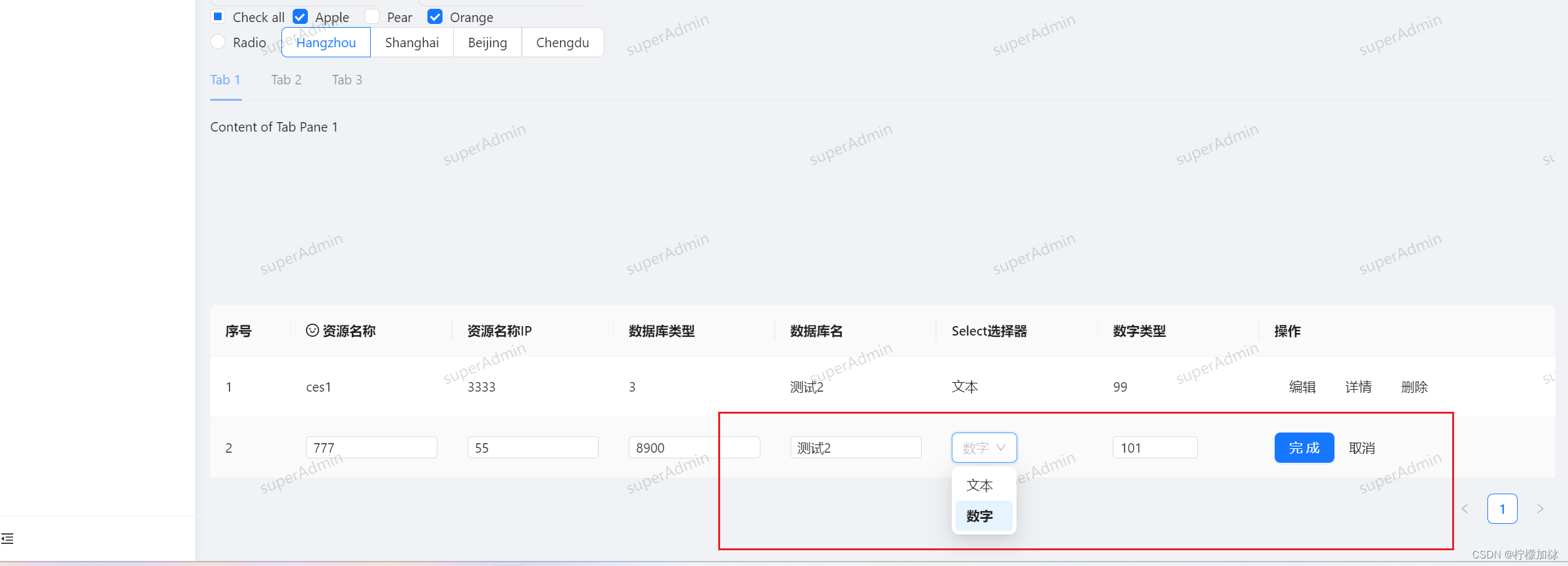
效果图如下:追加显示下拉选择器,数字,已经正常输入框

追加效果图
父组件中的删除,详情,取消,完成,按钮功能自行发挥这里就不写具体的操作细节,父组件功能还在不断更新中
仅供参考,如果有不对的还请各位大佬指教
本文内容由网友自发贡献,转载请注明出处:https://www.wpsshop.cn/article/detail/41365
推荐阅读

相关标签

